About
Randy Krum
President of InfoNewt.
Data Visualization and Infographic Design

Infographic Design

Infographics Design | Presentations
Consulting | Data Visualizations

DFW DataViz Meetup

Join the DFW Data Visualization and Infographics Meetup Group if you're in the Dallas/Fort Worth area!

Search the Cool Infographics site

Custom Search

Subscriptions:


Feedburner

The Cool Infographics® Gallery:

How to add the
Cool Infographics button to your:

Cool Infographics iOS icon

- iPhone
- iPad
- iPod Touch


Read on Flipboard for iPad and iPhone

Featured in the Tech & Science category

Flipboard icon

Twitter Feed
From the Bookstore

Caffeine Poster

The Caffeine Poster infographic

Entries in real time (31)

Tuesday
Apr142009

Apple's 1 Billion Apps live countdown


Apple is using a live countdown timer for is 1 Billion App Countdown promotion.  It's almost real-time, and is a step better than when they did the 1 Billion Song Download a few years ago.

At the rate its going, they'll reach a billion before the end of the week!

Download an app and you’ll automatically get the chance to win a $10,000 iTunes Gift Card, an iPod touch, a Time Capsule, and a MacBook Pro.
 Also, there a link to enter the contest without buying an App.  You can enter 25 times a day.

Friday
Mar202009

SXSW Twitter Visualizer from Pepsi


The 2009 SXSW PepsiCo Zeitgeist Twitter Visualizer (long name isn't it?) was a great experiment during the 5-day South By Southwest symposium/conference/party in Austin, TX.  Developed by Slash7, the site contains a number of dufferent visualizations using the Twitter APIs.


These real-time visualizations were able to capture only Tweets about the event using the hash-tag #SXSW and highlight the popular topics and show where people were Twittering on a map.  PepsiCo has a bigger site with some additional content at http://pepsico.com/sxsw

Found on Information Aesthetics and of course, Twitter.

Monday
Mar092009

Microsoft's Vision 2019

Apparently by 2019, we will all live in an infographic world, and that's good news for us.  Microsoft had the first public showing of the video at the Wharton Business Technology Conference.  Some found Microsoft's video inspiring, and some were not impressed.

I love some of the ideas shown in the video, but much of it also felt like the magic of Hollywood.  Because this blog is focused on infographics, I understand how much thought and effort from the designer goes into making just one infographic image useful and easy to understand.

Monday
Jan192009

This Is Now!


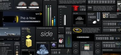
Take a few minutes to enjoy the Sprint website http://now.sprint.com/widget/, a collection of widgets showing seemingly real-time information.

Found on See What You Mean

Thursday
Dec182008

Chess: Watch the Artificial Intelligence


This is really awesome.  Thinking Machine 4 has an online chess game that lets you watch the computer evaluate all of the future moves in real time each time its the computer's turn.
When the machine (Black) is thinking, a network of curves is overlaid on the board.  The curves show potential moves--often several turns in the future--considered by the computer. Orange curves are moves by black; green curves are ones by white. The brighter curves are thought by the program to be better for white. 
I found this posted by Nathan on Simple Complexity.

Wednesday
Aug202008

Olympics Schedule Tracker


The Olympics Tracker is an interactive schedule of the events.  It now only shows which events are scheduled each day and hour, but you can drag them to rearrange your favorites to the top.  Clicking on past events shows the results, and clicking on future events shows the upcoming event details.  Medal awarding events marked with a small medal icon.  You can even download a desktop version for Mac or Windows.

Wednesday
Jul022008

Map of Local Gas Prices

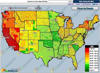
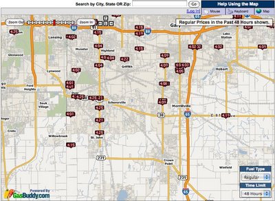
GasBuddy.com has a cool interactive temperature map of gas prices across the U.S. and Canada that allows you to zoom in to the street level to see prices at specific gas stations.  Prices are all removed from the database when they become over 72 hours old to keep the map current.


Thanks for sending in the link Karen!

Tuesday
May202008

TweetWheel


I just found TweetWheel, and its really cool. Made by Augusto Becciu.

Enter a Twitter ID (I used my ID: rtkrum), and in real time it will generate a connection wheel built from 100 people that person is following. Hover the mouse over any of the names, and it will show the connections that that person is also following on Twitter.

It takes a few minutes to load the user data.

Tuesday
Apr222008

One Day Poem Pavilion


Sort of crossing the line between infographics and art. A very cool project called the One Day Poem, from Experimental Typography. The geodesic structure is aligned to the sun, and perforated in a very specific pattern to show different parts of the poem over the course of a day, and even a different poem at different times of the year.

The specific arrangements of the perforations reveal different poems according to the solar calendar: a theme of new-life during the summer solstice. During summer solstice, the poem will contain the theme of “new life”. During winter solstice, the poem will be on “reflection and the passing of time.”
Found on digg.com

Monday
Apr142008

Treemaps for drive space

I don't think I've posted much about specific software programs, but there are a number of infographic programs that anyone can use. These two are programs that analyze what's on your hard drive, and show it you in a treemap display.

The one above is Disk Inventory X for the Mac (which I use), and the one below is WinDirStat for Windows. Both are free, and are real-life examples of how you can use infographics in your life. So take a minute, and clean off some of that old junk taking up space on your hard drive.