About
Randy Krum
President of InfoNewt.
Data Visualization and Infographic Design

Infographic Design

Infographics Design | Presentations
Consulting | Data Visualizations

DFW DataViz Meetup

Join the DFW Data Visualization and Infographics Meetup Group if you're in the Dallas/Fort Worth area!

Search the Cool Infographics site

Custom Search

Subscriptions:


Feedburner

The Cool Infographics® Gallery:

How to add the
Cool Infographics button to your:

Cool Infographics iOS icon

- iPhone
- iPad
- iPod Touch


Read on Flipboard for iPad and iPhone

Featured in the Tech & Science category

Flipboard icon

Twitter Feed
From the Bookstore

Caffeine Poster

The Caffeine Poster infographic

Entries in online (23)

Tuesday
Sep192017

40 Facts About the Psychology of Color

40 Facts About How the Psychology of Color Can Boost Your Website Conversions infographic

Color has always been a determining factor in a consumer's decision to buy a product. But with today's online shopping market, color decision is even more important than ever. It takes a consumer 90 seconds to make a product assessment and Marketing Profs says that 62%-90% of this judgment is based on product color alone! The 40 Facts About How the Psychology of Color Can Boost Your Website Conversions infographic outlines popular uses for the colors as well as some of the brands that use them. They have also included popular colors for specific shoppers like impulse buyers.

The infographic breaks down the rainbow and explains emotions associated with each hue, as well as in which industries each color is popular, and in which industries each color is not recommended.

For example, white and silver signify perfection, and you can see that in brands like Apple and Ralph Lauren, but many food brands—which prefer characteristics such as energy or excitement—opt for brighter colors.

Furthermore, certain colors speak to the psychology of certain types of buyers, according to the infographic. For example, navy blue and teal are often used to target budget shoppers, whereas pink, rose, and sky blue speak to traditional clothing buyers.

Notice how some of the statistics are visualized and others are just shown in text alone. The non-visualized data is perceived as secondary information or footnotes to the more prominent visualized data.

I also think they overuse the Radial Bar Chart style of visualizing data. I'm not a big fan of these since they are harder for readers to understand the comparisons.

Found on https://www.marketingprofs.com

Tuesday
Mar282017

Will Your Meeting Suck?

Will Your Meeting Suck? infographic

Are you in charge of scheduling meetings? We all know that nobody tends to like meetings. But you can use the Will Your Meeting Suck flowchart from Join Me to help schedule your next meeting. Avoid some mistakes and maybe you'll be the hero!

Take a spin through our infographic below to consider all the variables of your next meeting – time, location, snack situation – to help determine if your meeting will suck. Once you find out your risk level, you can do something about it

Decision diagrams and flow charts are good at sucking readers in to follow along the different paths.

Thanks to Don for sending in the link!

Thursday
Oct272016

9 Great DataViz & Infographics Tools with Education Discounts

Data visualization and data literacy are necessary life skills, and you should start developing them now! Whether you need to make a diagram for a Science project, a presentation for your History class, or a chart to solve that Math problem, you should start learning how to use data visualization tools while you’re in school. These tools are being used in classrooms from elementary school up through colleges and universities. While many online design tools offer free trials, these tools offer exclusive educational prices for students, teachers and educators to give them the means to more easily visualize information at a great price.

Here I share some of today’s most popular online data visualization and infographic tools, all offering educational prices. Because these are all online tools, they are all cross-platform, making them great for any computer a student may have; Windows, Mac or Linux. Follow the links to find the current education pricing deals!

I love that all of these online tools are helping to improve data literacy for students and educators all over the world! Which are you favorites? Any more online tools with education pricing plans for students and teachers that I missed?
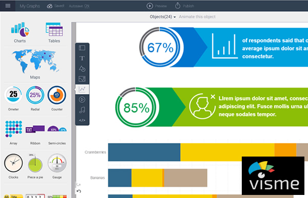

Visme

Visme is an online tool used to visually present your ideas in the form of infographics, presentations, reports, and much more. Visme has a built-in charting tool gives you the power to easily transform your data into visual content and with their easy-to-use editor. Hundreds of fonts, millions of free images, and thousands of quality icons for use in your designs. Share your designs online with a direct link, post on social media, embed on a website, or download for offline use.

Contact for educational pricing: http://support.visme.co/
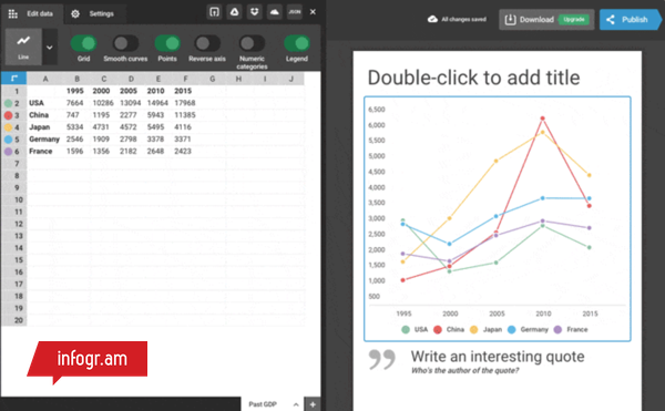


Infogram Education Pricing

Infogr.am

With Infogr.am, you have the power to make your data look its best. Users can easily create interactive charts and graphics that require zero coding. And to make sure your data is always up-to-date, you have the option to connect your chart to live sources like Google Sheets a Dropbox file, or a JSON feed. Educators can create a team account for an entire class.

Contact for educational pricing: https://infogr.am/education
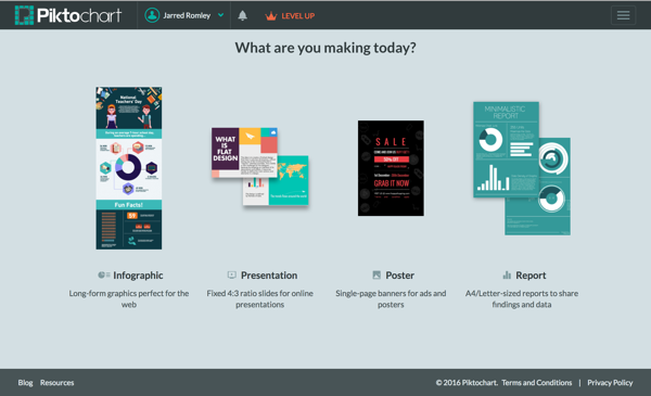


Piktochart Education Pricing

Piktochart

Take your visual communication to the next level with Piktochart, an easy-to-use infographic maker. Create your charts by importing your data from a Microsoft Excel file or a Google spreadsheet. With a library of hundreds of professionally-designed templates, creating infographics, reports, posters, and presentations has never been easier. Educational pricing for individuals or whole classrooms.

Individual and classroom prices: https://piktochart.com/pricing/education/
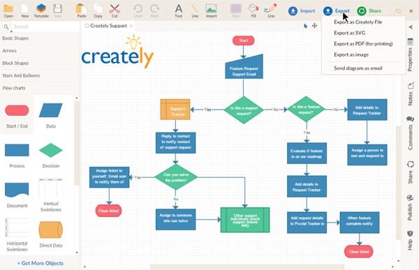


Creately Education Pricing

Creately

With Creately, you can easily make beautiful diagrams in no time. Flow charts, mind maps, organization charts, Venn diagrams, Gantt charts, network diagrams and more. Thousands of ready-made subject-specific templates and over 40 types of diagrams with specialized shape sets are available to make sure your diagram looks its best. And real-time online collaboration allows you to work with fellow students.

Contact for educational pricing: http://creately.com/diagram-products#education


Venngage Education Pricing

Venngage

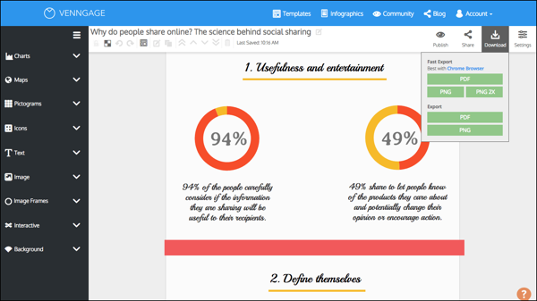
Venngage allows users to create infographics in just three easy steps: choose a template, add charts and visuals, and customize your design. In just minutes you can create a visual story in the form of posters, social media posts, and infographics. Post your final designs on social media, embed on websites, or download as an image or PDF file.

Register for a classroom Education account, includes 35 users: https://venngage.com/education-pricing/


Prezi Education Pricing

Prezi

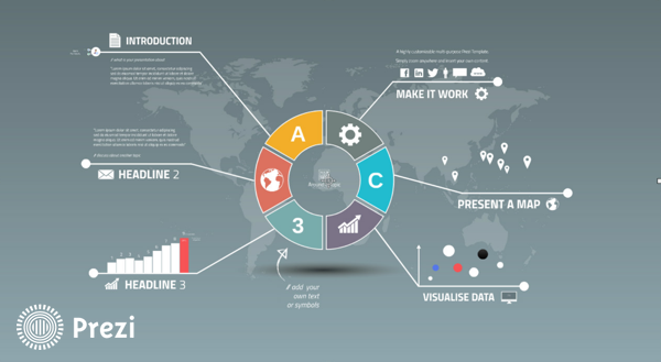
Prezi is the tool for creating engaging and memorable presentations with the charting tool, editable images, and embedded videos. Give your presentations online or offline, using the library of templates as your starting point. Prezi presentations are built on an open canvas and spatial movement transitions that are unique and easy-to-use.  

Choose an educational pricing package: https://prezi.com/pricing/edu/


Lucidchart Education Pricing

Lucidchart

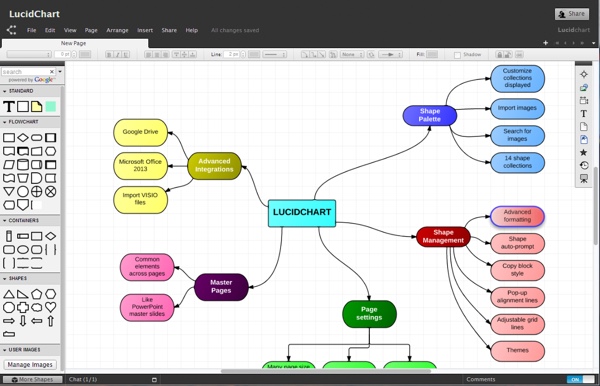
Lucidchart is an online diagramming tool for everyone. You  can create flow charts, Venn diagrams, mobile app mockups, network diagrams and more using the extensive shape libraries, or perform a Google image search right in the editor. You can even add a YouTube video to your diagram!

FREE accounts for students and teachers: https://www.lucidchart.com/pages/usecase/education


Easelly Education Pricing

Easel.ly

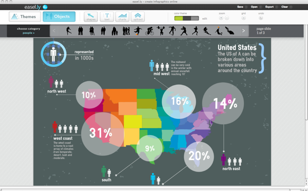
With over thousands of infographic templates to chose from, Easel.ly makes creating and sharing your visual ideas easy. The drag-and-drop interface helped Easel.ly win the Best Websites for Teaching and Learning Award from the American Association of School Librarians (AASL) in 2013. Create your infographic, and then publish online or download a high-resolution file for offline use. Check out their free ebook: How to Use Easel.ly in your Classroom (https://www.easel.ly/blog/infographicsforeducation)

Contact for educational pricing: https://www.easel.ly/contactus
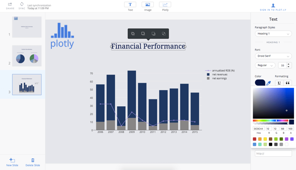


Plotly Education Pricing

Plot.ly

Plot.ly is a higher-level, advanced data visualization platform that helps data science, engineering, and analytics students create create informative graphics using an open source visualization library and an online chart creation tool. With Plotly, users can easily import data, create charts, and share their findings by embedding them on a website, exporting them, or creating presentations and dashboards. Create technical visuals using tools and APIs for D3.js, Python, R, MATLAB, Excel and more.

Student pricing for Professional features: http://marketing.plot.ly/education.html


Article was reposted by The Huffington Post

Wednesday
Oct222014

2014 Higher Education Technology Landscape

2014 Higher Education Technology Landscape infographic

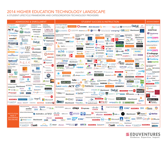
The 2014 Higher Education Technology Landscape infographic from EDUVENTURES is the effort to make sense of the higher education technology landscape for the decision-makers who are tasked with determining new ways to provide better learning outcomes, building and maintaining a modern technology infrastructure, and rationalizing investment decisions.

Leaders in higher education face mounting pressure to deliver and account for better learning outcomes, embrace digital disruption, and replace aging and ineffective infrastructure with newer, cloud-based solutions. To take advantage of this opportunity, new and established vendors have flooded the education technology market, making it one of the most dynamic segments of the high-tech landscape.

It’s estimated that colleges and universities will spend between $20B and $25B this year on technology and services, enabling institutions to support faculty, and administration, as well as effectively market, recruit, enroll, instruct, engage, and prepare students and alums. The solutions span many categories, including enrollment management specialists, adaptive learning platforms, retention solutions, online program managers, social engagement networks, crowdsourcing applications, software-defined networks, big data platforms, and enterprise resource planning (ERP).  The market is vast, confusing, and ill-defined. We hear from our clients regularly that while they want to take advantage of these new tools and solutions, they are perplexed by the ever-growing number of categories and technology vendors, and struggle with how to best to evaluate them.

To meet this growing need among our clients, Eduventures has initiated a new research focus to provide on-going analysis of the technology market to support higher education decision-makers. Our goal is to make the market more understandable, evaluate the strengths and weaknesses of technology and service offerings, and help leaders make informed decisions when selecting and implementing solutions that meet their unique institutional and learner needs.

Eduventures has developed a taxonomy to make sense of this technology landscape as a foundation for on-going research and analysis on this dynamic market:

  • A student lifecycle framework for understanding the overall market and segments
  • An initial categorization of hundreds of vendors serving the market

We have identified over 50 categories and hundreds of providers that market and sell technology and services to post-secondary institutions, which demonstrates how daunting this market can be for higher education leaders. Even with this preliminary analysis, we recognize that there are additional categories and companies to that can be added—our intention is to respond dynamically as new companies emerge and to update this landscape as it continues to mature, converge and evolve.

Complexity is the key message of this design. A lot of work went into identifying and categorizing all of these different services, but the message is clear that it’s a difficult job to setup the technology services any higher educational institution needs.

Any infographic design is going to be shared on it’s own, without the accompanying article, so designers should always include the URL address back to the original in the infographic image. Most people that share infographics don’t include the link back to the infographic landing page, and including that as text in the image file will help your readers find their way back to the full-size, original version you posted.

Thanks to Heather for posting on Linkedin

Thursday
Oct022014

Online Sales Trends - Color Matters

Online Sales Trends- Color Matters infographic

Apparently your product’s color could be hindering it’s ability to be sold! Online Sales Trends - Color Matters from Stitch Labs has released an infographic describing the trendiest product colors.

Managing inventory well can be the difference between success and failure. As you look to increase profit, seemingly insignificant manufacturing and purchasing decisions are often overlooked. Using product-level data lets you prevent lost sales and excess inventory by making data-driven decisions.

A good analysis using their own internal sales data gathered from online orders synced in the Stitch system for shopping carts and marketplaces.

The 3D stacks of bills are hard to compare. 3D bar charts always have this problem of reducing the ability for readers to see the specific differences. The footer should include the URL link back to the infographics landing page so readers can find the full-size original version. Most people that share infographics don’t link back to the original, and you shouldn’t make viewers search your site.

Thursday
Apr242014

Smart Ways to Combine Content Marketing With SEO

Smart Ways to Combine Content Marketing With SEO infographic

The Smart Ways to Combine Content Marketing With SEO infographic is essentially a big list of the most popular online services in a number of different categories.  Published by blogmost, it’s meant as a reference tool for Marketers to help plan out their content strategies.

Trying to build High Quality Links without paying anyone? This infographic reveals techniques to build them and complete details of good website + mentioned Great SEO & SMO tools for better Marketing.

No data or numbers, the most prominent sites and companies are shown for 26 different online service categories.  The randomness of circle sizes appears to visualize some type of information, but there’s no data behind them.  It’s just the designer sizing them to fit the different logos and icons.

The design does a fantastic job of using logos and icons in place of text.  This makes the overall design faster and easier for the audience to read through.  It’s a much more enjoyable experience than reading the text name of all the different companies, brands and sites.

Some description at the top would be helpful to describe how the sites were chosen for readers that find the infographic on other sites.  The URL of the infographic Landing Page on the blogmost site in the footer would also be helpful for the readers to be able to find the original full-size version and associated text.

Found on Visual.ly

Wednesday
Nov202013

The Online Shopping Cart Experience

Shopping Cart Experience infographic

Online shopping is a convenience that a lot of people take advantage of. But the convenience varies. The Shopping Cart Experience infographic from checkoutoptimization.com finds the optimal situation to make customers happy.

Over the course of the last few years, I have been in and out of the details of conversion rate optimization. My career at a digital marketing agency affords me the privilege of working with some of the top brands in the world. I am equally lucky to know some great entrepreneurs with very small businesses. Among the fascinating things that I get to see every day and across the spectrum is how much of an impact a small improvement at the checkout makes.

Simply, more sales equals more sales. Given finite resources to optimize a thousand different things, I’m awestruck that the shopping cart is not a greater focus. And as sites have changed in incredible ways over the last few years, shopping carts remain unchanged.

In 2009 I thought about this issue and started researching attributes across a number of shopping carts. It was a story of small diversity and great uniformity. I started writing a book on the subject, but I shifted focus to double down and grow a separate business. (Which has been extremely rewarding and I now get to work with a growing group of talented, bright, extremely funny people that are accomplishing amazing things for the world’s coolest brands, but that’s another story.) A couple of months ago, I came back to the idea of checkout optimization, and thought it would be really interesting to compare my 2009 research to the current state of things.

And that’s how this infographic came to be. My hope is that this is useful to anyone curious about shopping cart design patterns, or perhaps someone looking for a standard to measure up against. Let me know what you think, and you want more like this, you can sign up here.

Nice overview of the differences sites choose when setting up checkout pages on e-commerce sites.  Some of the subtle visualizations work very well, like the multiple pages shown behind the numbers in the User Friendly section.  However, some values aren’t visualized at all, like the percentages for the different merchant features.

The infographic landing page explicitly asks people to repost the infographic with links back to the original page, but sadly, most people don’t do that.  The landing page URL should be included in the infographic image itself so readers can find the original when bloggers don’t include the link.

Thanks to Nicholas for sending in the link!

Friday
Jul052013

The Conversation Prism 4.0 for 2013

The Conversation Prism 4.0 for 2013 infographic

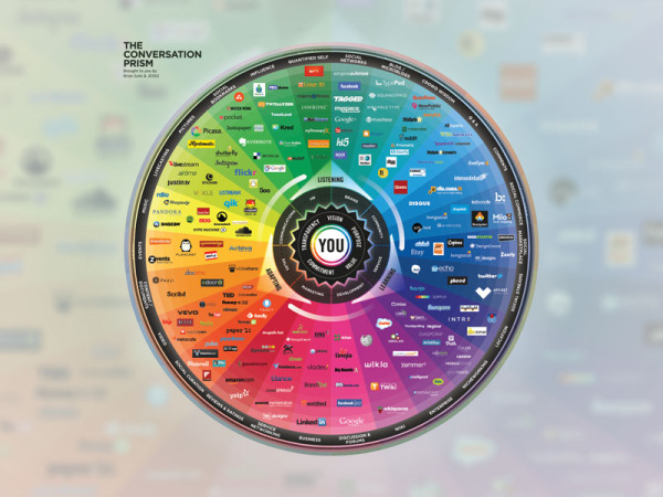
Brian Solis has released the new Conversation Prism 4.0, with updated companies and categories for 2013.  This project series has been a favorite on Cool Infographics since version 1.0 was released in 2008, and we haven’t seen an update since version 3.0 was released in 2010.

What is The Conversation Prism?

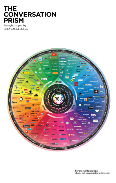
Developed in 2008 by Brian Solis, The Conversation Prism is a visual map of the social media landscape. It’s an ongoing study in digital ethnography that tracks dominant and promising social networks and organizes them by how they’re used in everyday life.

Version 4.0 brings about some of the most significant changes since the beginning. In this round, we moved away from the flower-like motif to simplify and focus the landscape. With all of the changes in social media, it would have been easier to expand the lens. Instead, we narrowed the view to focus on those that are on a path to mainstream understanding or acceptance. The result was the removal of 122 services while only adding 111. This introduces an opportunity for a series of industry or vertical-specific Prisms to be introduced so stay tuned.

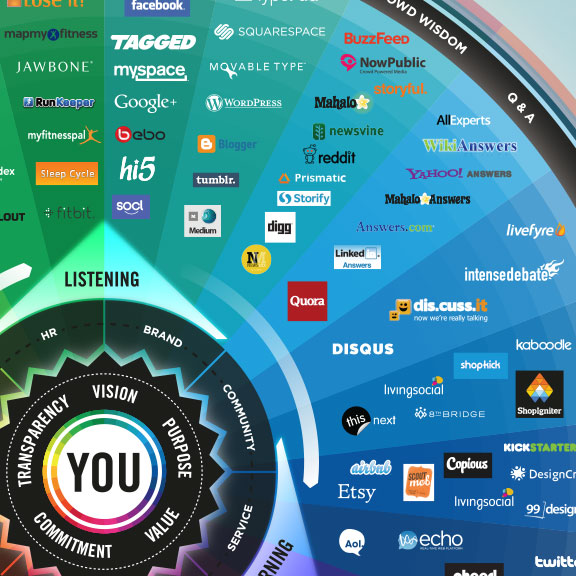
The Conversation Prism 4.0 for 2013 closeup

The design highlights the major companies in 26 different categories of social networking services.  This update loses the flower-like design style of the last three versions, and changes to a more straightforward circle with equal sized pie slices.

The inner circles have always been a little confusing for readers and marketers because the intent is that the inner labels can be adjusted depending on the user.  They don’t necessarily relate specifically to the services they are located near in the outer slices.

As a snapshot of the current social media landscape, this is a fantastic tool for marketers to consider the tools and services they want to engage for any particular campaign.  Three years was too long to wait for an update, since this landscape is changing and evolving very quickly.  That’s why 122 individual services were removed and 111 services were added. 

The Conversation Prism 4.0 for 2013 poster

The Conversation Prism 4.0 is available as a free high resolution JPG image download (great for computer wallpaper/desktop) of for purchase as a 22”x28” wall poster for $19.

Thanks to Jarred for sending in the link!  Also found on Mashable and The Next Web.


Thursday
Apr252013

The 2012 Adobe U.S. Digital Video Benchmark

Cool infographic video from the team at Adobe that shares the results of their own 2012 Digital Video Benchmark research.

As you relax at home, walk through stores, and sit in airports, you see people watching video on more screens than ever before. But don’t rely on the eyeball test. The Adobe Digital Index team looked at 19.6 billion video starts on media websites to confirm the growth of broadcast video consumption across connected devices. See the latest video trends they uncovered for device use, ad placement, social media, and more. 

Learn more about what they found here: http://adobe.ly/ZeXLoI.

Adobe Digital Index publishes research on digital marketing based on the analysis of anonymous, aggregated data from over 5,000 companies worldwide that use Adobe Marketing Cloud.

The information is about all videos and ad placements in online videos, but the data also applies to infographic videos.  Online videos are still on the rise, and have become a very effective content and advertising platform for companies.

Clean data visualizations that I would assume were created in Adobe After Effects.  The bar charts that change size and shape in multiple directions are disconcerting though.  I can’t tell if they were appropriately adjusting the area of each bar, but I doubt it.  It looks more like a designer thought it would look unique and different without realizing that it corrupts the visualization of the data.

Thanks to Jordan from Say It Visually for sending in the linK!

Monday
Jan072013

Can You Protect Yourself from Hackers at CES?

Can You Protect Yourself from Hackers at CES? infographic

Are you headed to CES in Las Vegas this week?  Do you know how to protect your electronic devices?  The Is Your Device Safe at CES? infographic from Novell shows us some heartbreaking stats.

The Numbers Don’t Lie

You don’t think it will ever happen to you, do you? Well, think again. With a laptop or tablet being stolen every 53 seconds you can literally lose your mobile device at any minute. Oh, and by the way, you’re losing a lot more than that precious device: sensitive company documents, passwords, credit card information, etc. So what are you doing to protect that phone/iPad/laptop? Apparently very little as only 4% of smartphones have Mobile Device Management security installed on them. Take a look at a few of the scary numbers and some ideas you could implement to protect your device and your precious content.

This design is long, but there’s a lot of information to share.  I like the simple color scheme, and there’s some really good data included in here.  However, most of the statistics are shown in text only, which is disappointing.

I’ve said it many times here on Cool Infographics.  Big fonts are not data visualizations.  You want your readers to comprehend and remember the numbers you are showing them in your infographic design.  To be successful at that you need to put the numbers into context for the reader, by visually comparing them to another value or showing them the scale of the value.

Thanks to Mat for sending in the link!