About
Randy Krum
President of InfoNewt.
Data Visualization and Infographic Design

Infographic Design

Infographics Design | Presentations
Consulting | Data Visualizations

DFW DataViz Meetup

Join the DFW Data Visualization and Infographics Meetup Group if you're in the Dallas/Fort Worth area!

Search the Cool Infographics site

Custom Search

Subscriptions:


Feedburner

The Cool Infographics® Gallery:

How to add the
Cool Infographics button to your:

Cool Infographics iOS icon

- iPhone
- iPad
- iPod Touch


Read on Flipboard for iPad and iPhone

Featured in the Tech & Science category

Flipboard icon

Twitter Feed
From the Bookstore

Caffeine Poster

The Caffeine Poster infographic

Entries in shopping (6)

Monday
Apr072014

Women and Fashion In the Digital Age

Women and Fashion: In the Digital Age infographic

The Women and Fashion In the Digital Age infographic from Digital Surgeons breaks down how much a women spends on each item. This infographic also creates categories for each woman based on her style sense. 

A household CPO (Chief Purchasing Officer), women dictate trends across fashion and media. Let’s take a look at where she’s spending her time & money.

Good data and simple graphics that add context to the numbers.  Love the icons and silhouettes and the minimal color palette.  Simple character illustrations like these keep the focus on the data, and not the illustrations.  However, there are two major infographic design lessons that can be learned form this design.

First, shading portions of odd shapes is always tricky, so in this design the shaded shopping bags and bottles don’t actually match the data.  The reader’s eye sees the area of the colored shapes, and this is usually straightforward when working with basic shapes like rectangles and circles.  However, even with simple circles, the designer can’t just calculate the height of shaded regions like a bar chart.  That only works with rectangles, because the area is directly proportional to the height.  The math to calculate the correct area of a circle segment requires a little more math from geometry.  There’s no clear formula to calculate the area of a wine bottle or a shopping bag, so the designer had to take their best guess.

Second, big fonts are not data visualizations!  I hate to see values on an infographic that aren’t visualized.  They provide no context for the readers, and are perceived as less important than the numbers that are visualized.  The job of a good infographic is to make information easier to understand, not just to share information.  Even simple bars under each component of a woman’s outfit in the first section would have helps make the data meaningful to the audience.

You won’t find a link to this infographic on the Digital Surgeons home page, so the infographic image file itself should include the URL back to the landing page in text.  That way readers that see this infographic on other sites can make their way back to the original, full-size version.  Many sites that post infographics, don’t link back to the original like I do.  Don’t make it hard for your audience to find your infographic!

Thanks to Peter for sending in the link!

Wednesday
Nov202013

The Online Shopping Cart Experience

Shopping Cart Experience infographic

Online shopping is a convenience that a lot of people take advantage of. But the convenience varies. The Shopping Cart Experience infographic from checkoutoptimization.com finds the optimal situation to make customers happy.

Over the course of the last few years, I have been in and out of the details of conversion rate optimization. My career at a digital marketing agency affords me the privilege of working with some of the top brands in the world. I am equally lucky to know some great entrepreneurs with very small businesses. Among the fascinating things that I get to see every day and across the spectrum is how much of an impact a small improvement at the checkout makes.

Simply, more sales equals more sales. Given finite resources to optimize a thousand different things, I’m awestruck that the shopping cart is not a greater focus. And as sites have changed in incredible ways over the last few years, shopping carts remain unchanged.

In 2009 I thought about this issue and started researching attributes across a number of shopping carts. It was a story of small diversity and great uniformity. I started writing a book on the subject, but I shifted focus to double down and grow a separate business. (Which has been extremely rewarding and I now get to work with a growing group of talented, bright, extremely funny people that are accomplishing amazing things for the world’s coolest brands, but that’s another story.) A couple of months ago, I came back to the idea of checkout optimization, and thought it would be really interesting to compare my 2009 research to the current state of things.

And that’s how this infographic came to be. My hope is that this is useful to anyone curious about shopping cart design patterns, or perhaps someone looking for a standard to measure up against. Let me know what you think, and you want more like this, you can sign up here.

Nice overview of the differences sites choose when setting up checkout pages on e-commerce sites.  Some of the subtle visualizations work very well, like the multiple pages shown behind the numbers in the User Friendly section.  However, some values aren’t visualized at all, like the percentages for the different merchant features.

The infographic landing page explicitly asks people to repost the infographic with links back to the original page, but sadly, most people don’t do that.  The landing page URL should be included in the infographic image itself so readers can find the original when bloggers don’t include the link.

Thanks to Nicholas for sending in the link!

Friday
Feb222013

Top 250 Internet Retailers Q3 2012 Update

Top 250 Internet Retailers Q3 2012 Update infographic

Top 250 Internet Retailers Q3 2012 Update infographic from the Campalyst blog

Back in May we published an infographic about Top 250 Internet Retailers’ presence on social media. The infographic was perceived really well by our readers, customers and the media; thanks a lot to all the people sharing it on Facebook, Twitter, Pinterest and their blogs!

Now we are happy to present you with the Q3 update! Spoiler: those were two incredible quarters for Pinterest! Amazing growth in terms of the number of brands building their presence on Pinterest and the size of their communities!

I like the color scheme and the variety of data visualizations used in this infographic.  Bars, icons, arcs and proportional circles.  The use of the Internet retailer logos in the circles is especially effective.

I wish the Social Media site logos had been used, especially in the first three sections.  I shouldn’t have to read the text and match the color to figure out what the visualization represents.  That’s too much work for the reader.  How many people does each of the people icons represent in the “How Many Followers Do They Have?” section?  The lines look “relatively right”, but the number of icons seems to have no relationship to the actual numbers shown.

The footer needs both a copyright statement (or Creative Commons license) and the infographic landing page URL so readers can find the original when they see this posted on other sites (like this one!).  Many bloggers are not good about linking back to your original site correctly, and you want your audience to be able to find it easily.

Found on Fresh Peel and Visual Loop


Wednesday
Oct312012

60th Anniversary of the Bar Code

60th Anniversary of the Bar Code infographic

Wow!  This year is the 60th Anniversary of the Bar Code, and I remember when checkout clerks at the grocery store had to key in every price!  OK, I only barely remember that as a kid.

The barcode is a fundamental part of how we obtain goods—from scanning items for price comparisons, adding goods to a wish lists and checking out purchased products. We use barcode scanners on a daily basis, but have you ever asked yourself how the barcode came to be? Would you believe that the first barcode was printed on a pack of Wrigley’s gum, and originally created to help grocery stores track inventory? 

Today is the 60th Anniversary of the barcode; and if you’re interested in learning more fun facts like the ones above as well as how the barcode came to be, its practical uses, and how industries have implemented the technology today, check out the infographic below.

Even without any data visualizations, this design does a good job of leading the readers through a short history, and visually shows the reader the different types of bar code technologies and bar readers.

In the footer, the design is missing both a copyright statement, and a URL to help the readers find the original full-size version on Wasp Bar Code’s landing page.  They include the home page URL, but a reader won’t find any mention of the infographic on the home page.

Thanks to David for sending in the link!

Wednesday
Jun132012

The Value of Retail-Integrated eCommerce

The Value of Retail-Integrated eCommerce

What can Retail-Integrated eCommerce do for your brand? is a new infographic based on a research study from Shopatron.  

Retail-integrated eCommerce is a business model that allows branded manufacturers to sell directly to consumers and pass those orders to their retailers for delivery to the customer. According to March 2012 surveys answered by over 200 branded manufacturers and 1,300 retailers, retail-integrated eCommerce benefits branded manufacturers in the following ways.

This is obviously a design for a niche audience, but I can tell you from past experience that Branded eCommerce is a HUGE challenge.  A company makes products for the end user; however, their immediate customers are usually retail stores.  As soon as a product company starts trying to sell their products on their own website (cutting out the retail store), they suddenly become a competitor to all of the existing retail store customers.  The idea of Retail-Integrated eCommerce is a potential solution.

The statistics at the bottom of the infographic that explain this challenge (not visualized) are so important, I think they should have been visualized and highlighted at the top of the design.  This is the background information that makes the rest of the infographic relevant.

In 2012, 70% of retailers said they would reduce buying from brands that sell online directly to consumers, with 9% saying they would cease buying from that brand altogether.

This is a good design that doesn’t try to throw too much information at the reader.  Most of the important data points are clearly visualized with short descriptions.  The orange color scheme clearly identify the design with the Shopatron brand.

You can also download the PDF version here.

Tuesday
Nov222011

Crazy for Black Friday Deals


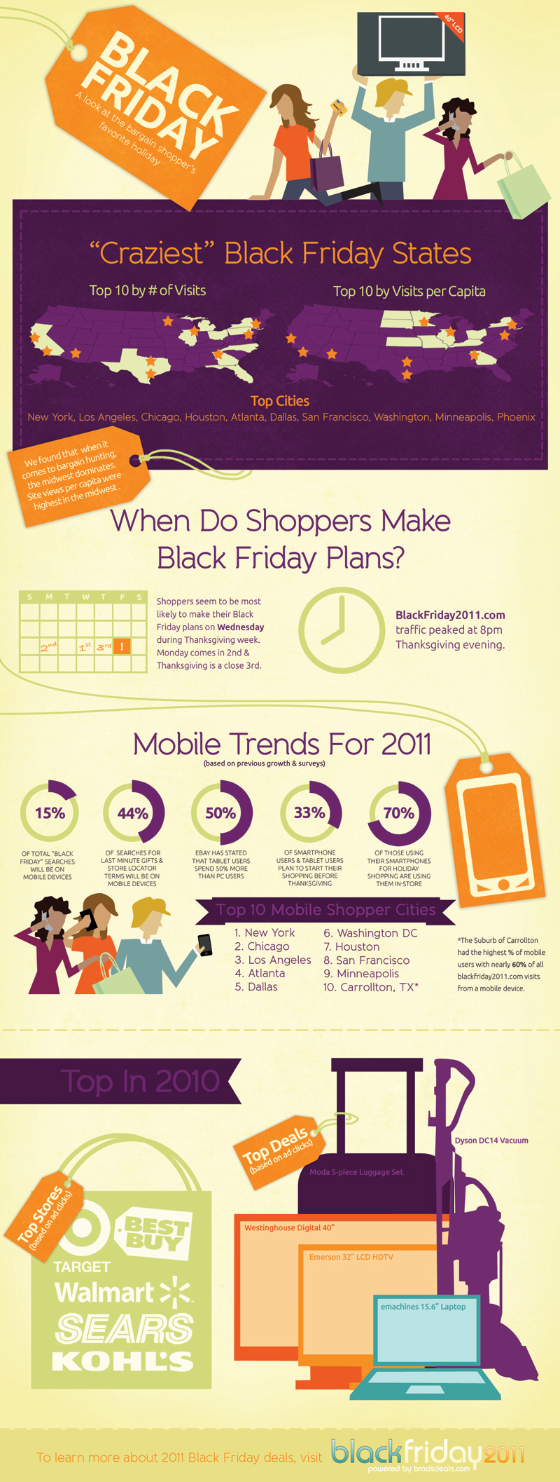
In honor of our upcoming shopping holiday, Crazy for Black Friday Deals from BradsDeals takes a look at some of the stats behind Black Friday (day after Thanksgiving) shoppers.

BradsDeals created a Crazy for Black Friday Deals infographic to illustrate historical Black Friday figures as well as the shopping trends and predictions for this year’s holiday.

If you live in Minnesota, congratulations, you live in the most Black Friday crazy state in the country. And while Black Friday fans in major cities like New York, Los Angeles and Chicago may be more likely to cruise Black Friday deals on their smart phones than shoppers in smaller towns, the Dallas suburb of Carrollton blows everyone out of the water with 60% of Black Friday searches happening on mobile devices. WOW.

I live near Carrollton, but I wouldn’t consider it a particularly tech-savvy area.  Apparently, they’re good with mobile shopping…who knew?

Of course, I get tons of Black Friday infographics submitted to the site, but I really liked the design of this one.  The information is visualized in a clear, easy-to-understand design. The visuals are simple and relate to the data.  Maps for cities, calendar for days shppers make plans, doughnut diagrams for percentages and silhouettes of top products.

On the other hand, there doesn’t seem to be a cohesive story to this infographic.  It’s a collection of disconnected data points about top cities, mobile trends, top products and when shoppers make plans.  Also, the design is missing a list of the data sources, the URL for readers to find the original posting, a copyright or creative commons claim and recognition of the designer.  Why should we trust any of these statistics?

Thanks to Amanda for sending in the link!