About
Randy Krum
President of InfoNewt.
Data Visualization and Infographic Design

Infographic Design

Infographics Design | Presentations
Consulting | Data Visualizations

DFW DataViz Meetup

Join the DFW Data Visualization and Infographics Meetup Group if you're in the Dallas/Fort Worth area!

Search the Cool Infographics site

Custom Search

Subscriptions:


Feedburner

The Cool Infographics® Gallery:

How to add the
Cool Infographics button to your:

Cool Infographics iOS icon

- iPhone
- iPad
- iPod Touch


Read on Flipboard for iPad and iPhone

Featured in the Tech & Science category

Flipboard icon

Twitter Feed
From the Bookstore

Caffeine Poster

The Caffeine Poster infographic

Entries in developer (4)

Thursday
Jul092015

How to Pick Your First Programming Language

How to Pick Your First Programming Language infographic

Udacity presents, How to Pick Your First Programming Language infographic. Your decision depends a lot on where and the job you are aiming for. Check out the graphic for some tips.

If you haven’t picked your first programming language, the programming world is your oyster. Yet with evangelists for every language telling you their language is the best, choosing one to start with can be incredibly overwhelming. We’ve looked at the data for the top ten programming languages in the US (based on IEEE Spectrum data) to help you pick the best language to start with based on your priorities in lifestyle, location, and career potential.

Python is a popular, well-paid language, being versatile enough to be used in many different applications, while Javascript is used widely across the country, and can be a good choice if you don’t want to relocate for a job. Although some newer programming languages, such as Swift, are not included, you shouldn’t discount the growth of their popularity. Career opportunities in iOS development using Swift, similar to Android development using Java, will increase as the field of mobile app development continues to expand.

There are many factors involved in choosing your first programming language. This data can help you figure out what works for you.

Good rundown of the stats behind the programming language careers. I'm not sure that Google searches in the best gauge of language popularity. Maybe something like number of projects on GitHub might have worked better.

The footer should include the URL back to the original infographic landing page, not just the main front page for Udacity.

Thanks to Lindsay for sending in the link!

Tuesday
Feb112014

The "Perfectly Optimized" Page

 The Perfectly Optimized Page infographic

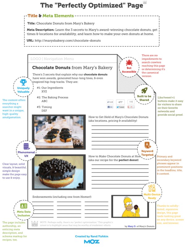
The “Perfectly Optimized” Page infographic states that there is no such thing as a “Perfect Page”. But don’t be discouraged! Moz.com presents 3 key points to be followed to increase user happiness and outreach.

One important takeaway from this post should be that modern on-page SEO is about juggling competing priorities. In general, my recommended ordering of those priorities is as follows:

  1. Create a page that is uniquely valuable to your targeted searchers.
  2. If at all possible, make the page likely to earn links and shares naturally (without needing to build links or prod people).
  3. Balance keyword targeting with usability and user experience, but never ignore the critical elements like page titles, headlines, and body content at the least.

There’s no such thing as a “perfectly optimized” page, but I took a stab at drawing up the mythical beast anyway.

Over time, what’s “perfect” might change, and new services, platforms, and areas of optimizational opportunity could arise. But for the past few years (notwithstanding some newer tactics like Google’s rel=author), the model described in this post has held relatively stable. The “O” in SEO is getting broader, and I think that’s a wonderful thing for marketers of all stripes. Targeting an algorithm instead of people is far worse than hitting both birds with the same handful of optimization stones.

This is a great us of infographics and data visualziations as part of a larger article.  The infographics can stand on their own and be shared online, but also fit inn perfectly with the text article.  This specific design is more of a blueprint diagram without showing and data, but has been very popular by itself.

Found on Hubspot.com and Hombrehormiga1

Wednesday
Nov202013

The Online Shopping Cart Experience

Shopping Cart Experience infographic

Online shopping is a convenience that a lot of people take advantage of. But the convenience varies. The Shopping Cart Experience infographic from checkoutoptimization.com finds the optimal situation to make customers happy.

Over the course of the last few years, I have been in and out of the details of conversion rate optimization. My career at a digital marketing agency affords me the privilege of working with some of the top brands in the world. I am equally lucky to know some great entrepreneurs with very small businesses. Among the fascinating things that I get to see every day and across the spectrum is how much of an impact a small improvement at the checkout makes.

Simply, more sales equals more sales. Given finite resources to optimize a thousand different things, I’m awestruck that the shopping cart is not a greater focus. And as sites have changed in incredible ways over the last few years, shopping carts remain unchanged.

In 2009 I thought about this issue and started researching attributes across a number of shopping carts. It was a story of small diversity and great uniformity. I started writing a book on the subject, but I shifted focus to double down and grow a separate business. (Which has been extremely rewarding and I now get to work with a growing group of talented, bright, extremely funny people that are accomplishing amazing things for the world’s coolest brands, but that’s another story.) A couple of months ago, I came back to the idea of checkout optimization, and thought it would be really interesting to compare my 2009 research to the current state of things.

And that’s how this infographic came to be. My hope is that this is useful to anyone curious about shopping cart design patterns, or perhaps someone looking for a standard to measure up against. Let me know what you think, and you want more like this, you can sign up here.

Nice overview of the differences sites choose when setting up checkout pages on e-commerce sites.  Some of the subtle visualizations work very well, like the multiple pages shown behind the numbers in the User Friendly section.  However, some values aren’t visualized at all, like the percentages for the different merchant features.

The infographic landing page explicitly asks people to repost the infographic with links back to the original page, but sadly, most people don’t do that.  The landing page URL should be included in the infographic image itself so readers can find the original when bloggers don’t include the link.

Thanks to Nicholas for sending in the link!

Monday
Jul292013

A #Sworcery Infographic


A Sword and Sworcery Infographic

Two years ago Superbrothers: Sword and Sworcery EP was one of the first great games released that was designed specifically for the Apple iPad. Designed by Capybara Games, the game was also later released on iPhone, Android, Windows PC, Linux and Mac based on the huge success of the iPad version.

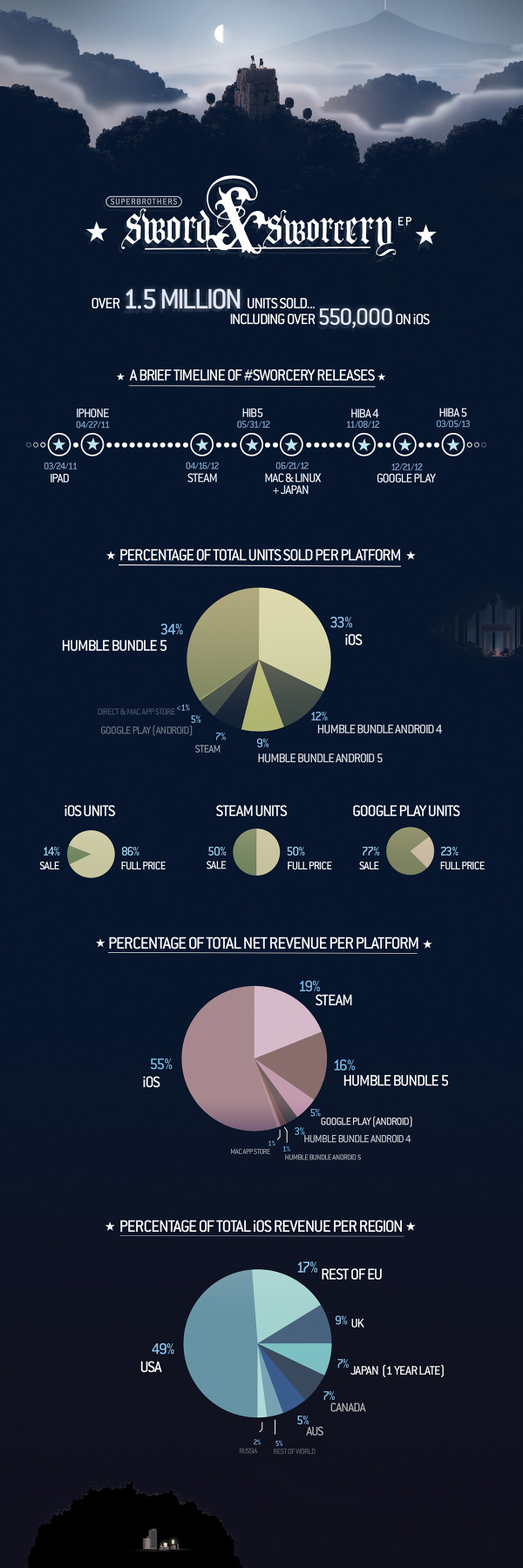
To celebrate the 2nd anniversary, Capybara Games released the Sword and Sworcery Infographic, and that’s cooler than a Trigon Trifecta!  (Also available on the SwordAndSworcery.com site)

From the Capybara Games site:


On March 24th, 2011 Superbrothers: Sword & Sworcery EP launched on iPad. The first hours after its release were exciting, stressful, celebratory and even terrifying (as game-centric twitter feeds exploded). We watched as the game hit the top 10 paid games chart before we were even featured. Leading up to launch we knew we had made something cool. After launch we knew there was an audience that appreciated it.

Over the next 2+ years, we brought the game to PC, Mac & Linux. We collaborated with the amazing folks from 8-4 to create a version specifically for Japan. With the help of Apportable, we brought the game to Android. We joined our close friends in the most successful Humble Indie Bundle of all time, and joined a great Android Bundle as well.

With over 1.5 million copies sold, it’s pretty obvious that #Sworcery has been a resounding success. And we’d like to share a few details of that success with you. There’s not that many titles out there that began on iOS and made their way to this many other platforms over time, so we hope that this info is helpful in some way/shape/form.


From such a visual game design, I would have liked to see the chart labels as icons of the companies instead of just text labels. Even better as 8-bit icons similar to the design of the game.


As I mention about many infographic designs, the URL to the original infographic landing page should be included in the footer of the design so readers can find the full-size version of the infographic. I had to shrink the infographic image to fit on the blog, like many people, and I always try to link back to the original source. Not everyone is good about linking, and you want the readers to be able to find their way back.

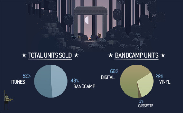
As a bonus mini-infographic, they also released some of the stats behind the music by rockstar & critically acclaimed composer Jim Guthrie soundtrack, Sword & Sworcery LP - The Ballad of the Space Babies, also available on the iTunes store.

Jim Guthrie Stats infographic

Found on The Verge and Daring Fireball.