The "Perfectly Optimized" Page
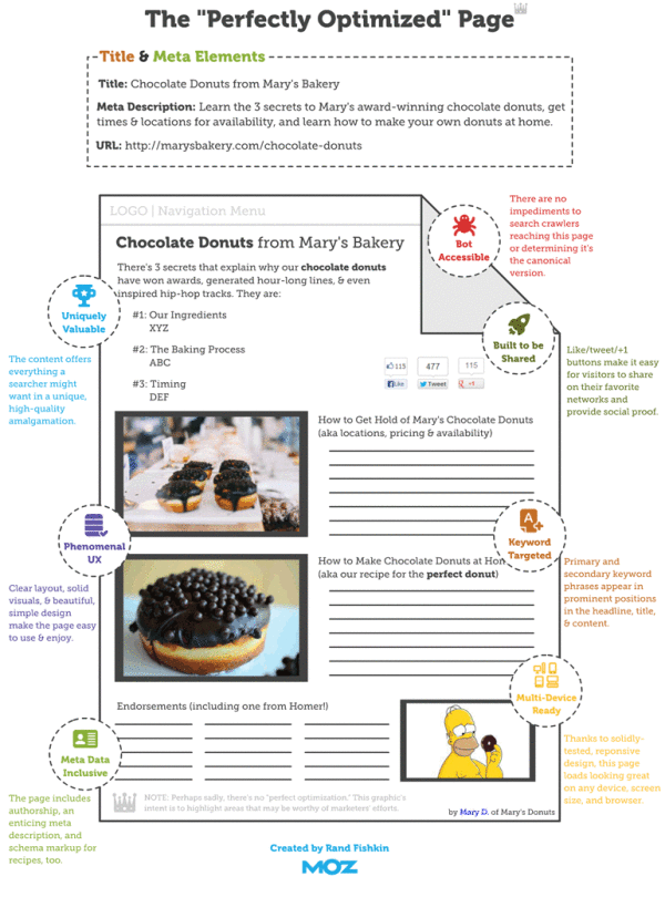
The “Perfectly Optimized” Page infographic states that there is no such thing as a “Perfect Page”. But don’t be discouraged! Moz.com presents 3 key points to be followed to increase user happiness and outreach.
One important takeaway from this post should be that modern on-page SEO is about juggling competing priorities. In general, my recommended ordering of those priorities is as follows:
- Create a page that is uniquely valuable to your targeted searchers.
- If at all possible, make the page likely to earn links and shares naturally (without needing to build links or prod people).
- Balance keyword targeting with usability and user experience, but never ignore the critical elements like page titles, headlines, and body content at the least.
There’s no such thing as a “perfectly optimized” page, but I took a stab at drawing up the mythical beast anyway.
Over time, what’s “perfect” might change, and new services, platforms, and areas of optimizational opportunity could arise. But for the past few years (notwithstanding some newer tactics like Google’s rel=author), the model described in this post has held relatively stable. The “O” in SEO is getting broader, and I think that’s a wonderful thing for marketers of all stripes. Targeting an algorithm instead of people is far worse than hitting both birds with the same handful of optimization stones.
This is a great us of infographics and data visualziations as part of a larger article. The infographics can stand on their own and be shared online, but also fit inn perfectly with the text article. This specific design is more of a blueprint diagram without showing and data, but has been very popular by itself.
Found on Hubspot.com and Hombrehormiga1
 code,
code,  design,
  developer,
  landing page,
  web
web 


Reader Comments (6)