The Internet Map
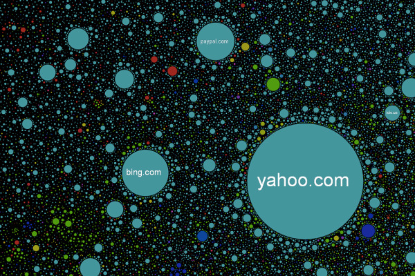
The Internet Map is an interactive, zoomable design that uses a combination of algorithms and the Google Earth API to display 350,000 websites as sized circles representing their overall traffic.
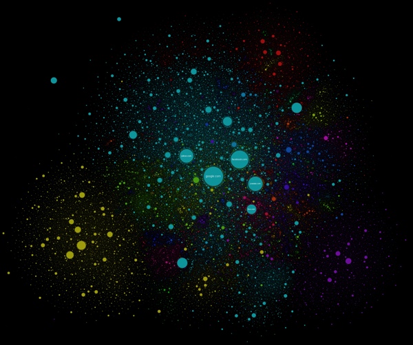
Designed by Ruslan Enikeev, the color-coding shows the country affiliations.
Like any other map, The Internet map is a scheme displaying objects’ relative position; but unlike real maps (e.g. the map of the Earth) or virtual maps (e.g. the map of Mordor), the objects shown on it are not aligned on a surface. Mathematically speaking, The Internet map is a bi-dimensional presentation of links between websites on the Internet. Every site is a circle on the map, and its size is determined by website traffic, the larger the amount of traffic, the bigger the circle. Users’ switching between websites forms links, and the stronger the link, the closer the websites tend to arrange themselves to each other.
Semantic web
The map of the Internet is a photo shot of the global network as of end of 2011 (however, baloons show actual statistics from Alexa). It encompasses over 350 thousand websites from 196 countries and all domain zones. Information about more than 2 million links between the websites has joined some of them together into topical clusters. As one might have expected, the largest clusters are formed by national websites, i.e. sites belonging to one country. For the sake of convenience, all websites relative to a certain country carry the same color. For instance, the red zone at the top corresponds to Russian segment of the net, the yellow one on the left stands for the Chinese segment, the purple one on the right is Japanese, the large light-blue central one is the American segment, etc.
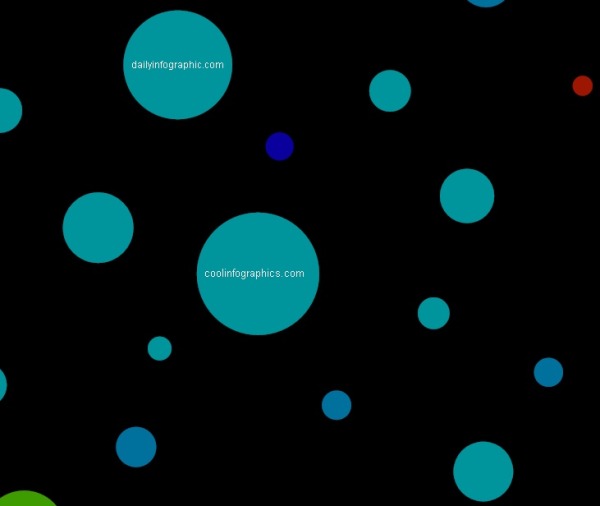
I even found Cool Infographics on the map!
Found on Fast Company


 Randy
Randy


Reader Comments (2)