About
Randy Krum
President of InfoNewt.
Data Visualization and Infographic Design

Infographic Design

Infographics Design | Presentations
Consulting | Data Visualizations

DFW DataViz Meetup

Join the DFW Data Visualization and Infographics Meetup Group if you're in the Dallas/Fort Worth area!

Search the Cool Infographics site

Custom Search

Subscriptions:


Feedburner

The Cool Infographics® Gallery:

How to add the
Cool Infographics button to your:

Cool Infographics iOS icon

- iPhone
- iPad
- iPod Touch


Read on Flipboard for iPad and iPhone

Featured in the Tech & Science category

Flipboard icon

Twitter Feed
From the Bookstore

Caffeine Poster

The Caffeine Poster infographic

Entries in research (21)

Thursday
Jul072016

Which Foods Are Really Healthy?

Is Sushi ‘Healthy’? What About Granola? Where Americans and Nutritionists Disagree

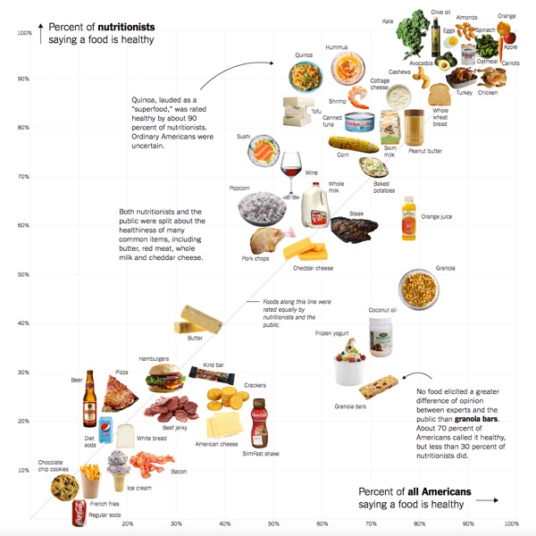
After surveying nutritionists and Americans, the NY Times has plotted the results, showing some surprising disagreements. Is Sushi ‘Healthy’? What About Granola? Where Americans and Nutritionists Disagree charts the differences in opinion, but where do you stand?

We surveyed Americans and a panel of nutrition experts about which foods they thought were good or bad for you.

Is popcorn good for you? What about pizza, orange juice or sushi? Or frozen yogurt, pork chops or quinoa?

Which foods are healthy? In principle, it’s a simple enough question, and a person who wishes to eat more healthily should reasonably expect to know which foods to choose at the supermarket and which to avoid.

Unfortunately, the answer is anything but simple.

The results suggest a surprising diversity of opinion, even among experts. Yes, some foods, like kale, apples and oatmeal, are considered “healthy” by nearly everyone. And some, like soda, french fries and chocolate chip cookies, are not. But in between, some foods appear to benefit from a positive public perception, while others befuddle the public and experts alike. (We’re looking at you, butter.)

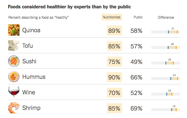
They also created some supporting graphs that highlight the major differences. This one shows the largest differences where many more nutrition experts consider these foods to be healthy than the general public.

Foods considered healthier by experts than by the publicThanks to Karen for sharing on Facebook!

Monday
May232016

Dogs Hate Hugs

Dogs Hate Hugs infographic

The Dogs Hate Hugs infographic from Pet Insurance U reveals the surprising fact that dogs really don't like being hugged.

This infographic shows humans why, in spite of this whole hugging fiasco, dogs are still your best friends. Do dogs hate hugs? Researchers studied pictures of humans hugging dogs, and 81.6% of the dogs showed visible signs of distress, discomfort, stress or anxiety.

Designed by NowSourcing, this is a good example of an infographic highlighting an insight that is probably surprising to the audience. Infographics should share some insight or knowledge learned from data research that will actually teach the readers something new.

I have one major issue with the way they visualized their data. The statistic of "Oxytocin levels rise by 57.2% when dogs play with their owners" is visualized with a non-zero baseline, making the increase in the bar chart appear to by a 10x difference. This visualization is extremely misleading. Don't adjust the scale of the y-axis to over-emphasize a change in the data!

Thanks to Brian for sending in the link!

Thursday
Nov122015

Does Scouting Work?

The Does Scouting Work? infographic was created by the Boy Scouts of America based on the results of a study done by Tufts University comparing scouts to non-scouts. The infographic focuses on the four key points from the study and their statistical findings.

The Boy Scouts also created a downloadable PDFpresentation slides and a press release based on the same results and design. This is a great way to leverage the design assets that were created in multiple formats.

Current and former Scouts have always felt that Scouting has made a difference in their lives, and now a study out of Tufts University has found that Scouting does in fact have a measurable, positive impact in the character development of young people.

The study, funded by the John Templeton Foundation, involved nearly 1,800 Cub Scouts and 400 non-Scouts under the age of 12, and was conducted over three years. It sought to measure the difference Scouting makes in young people’s lives as those positive changes were happening.

“After three years, Scouts reported significant increases in cheerfulness, helpfulness, kindness, obedience, trustworthiness, and hopeful future expectation,” said Dr. Richard M. Lerner, who led the study at Tufts University. “In our control group of non-Scouts, there were no significant increases, and in some cases (e.g., religious reverence) there was an observed decrease, which was quite striking.”

In addition, the study found a direct correlation between the amount of time boys spent in Scouting and the positive impact realized—those who spent more years in the program reported higher character attributes. Scouts who were more engaged also reported higher character attributes. And those who attended regular meetings reported higher character attributes compared to those with lower attendance.

It's always great to hear about a program's success when it comes to helping develop kids. By highlighting the research's four best results, they don't end up bombarding a reader with too much information. This could be enough to encourage a parent to enroll their kid in Scouts, or entice a curious reader into learning more about the study and scouts in general.

The infographic appears to have been designed by the national office of the Boy Scouts of America and published here. Many other scouting sites have reposted the infographic, and it would really be helpful to readers to have the URL to the original infographic page in the infographic image. That way readers can find their way back to the original design.


Wednesday
Jul292015

The Science Behind Creating Buyer Personas

The Science Behind Creating Buyer Personas infographic

The Science Behind Creating Buyer Personas infographic from WSI does a good job explaining why personas are way more than just demographic information. Too many companies don't dig deep enough when creating buyer personas to really understand their customers' decision making process.

A buyer persona can be one of the most powerful tools in helping you devise effective marketing strategies.

Wikipedia defines a buyer persona as “fictional characters created to represent the different user types that might use a site, brand, or product in a similar way.”

The process and resulting personas are particularly useful for businesses who recognize the value of content-marketing. The secret of content marketing is hiding in plain site: if you want your business to be found by prospective clients, referred by existing clients, lauded by critics, you need to start by creating great content that they will want to read.

Personas are a great foundation to identify the topics that are of interest, and the voice you should use to communicate them.

This infographic is a fun way of looking at how to go about this process. It isn’t easy, but it is extraordinarily valuable!

Sometimes infographics tell stories about concepts or processes instead of large data sets or statistics. This one uses icons and illustrations to help marketers understand how complicated building buyer personas can be.

Oddly, the infographic appears to be hosted on the MarketingProfs website instead of WSI. I couldn't find an original infographic landing page from WSI.

Tuesday
Aug192014

Voice of the Photographer: Photographers Actively Engaged in Growing Skills

Voice of the Photographer: Photographers Actively Engaged in Growing Skills infographic

The field of Photography evolves quickly due to advances in technology. Eyefi has uncovered the latest trends in the field and have organized them into the Voice of the Photographer: Photographers Actively Engaged in Growing Skills infographic.

There’s just no arguing that today’s most prominent photographers are evolving at the speed of technology. Those that remain relevant do so by merging their visual talents with the latest advances, like WiFi SD cards, cloud storage, and new ways of lighting and photo manipulation.

Photographers at the top of their game must maintain a staunch dedication to continuous improvement as well. Thankfully, the web provides a bevy of opportunities to hone their craft, from top-ranking bloggers to photography-focused online magazines.

To find out exactly how and where today’s best photographers are expanding their knowledge base, Eyefi.com, creators of innovative WiFi cards, apps, and cloud services, in partnership with influencer marketing agency Evolve!, reached out to their accomplished user base with a myriad of relevant questions. The results showcase where the most influential photographers online are spending their time, money, and efforts to advance their abilities. Some are professionals, while others are hobbyists; but all these folks know how to move us with their visual storytelling skills. Check out the fascinating infographic below to learn more about the photography world’s current ever-evolving habits and trends.

I love seeing all of this survey research data shown in a visual, infographic form.  It’s so much more engaging and easier for the audience to understand.

When visualizing data with grids of icons, rows with 10 icons across are the easiest for your readers to understand.  This design includes some odd row quantities like 12, 13 and 20 icons across, which are not intuitive to the audience.  Our number system is Base-10, and icons shown in groups of 10 are the easiest to comprehend.

Thanks to Katie for sending in the link!

Thursday
Aug292013

Consumer Attitudes to SMS Marketing and Texts Alerts

Consumer Attitudes to SMS Marketing and Texts Alerts infographic

The Consumer Attitudes to SMS Marketing and Texts Alerts infographic is the results of a survey done by Text Marketer. The survey was conducted to find out the consumers’ view on receiving text alerts from companies. 

The infographic is based on an exclusive survey of over 1,350 consumers in to their attitudes to SMS marketing. 

The results highlight that 84% of customers want to receive appointment reminders, 61% want order confirmations and 89% would like delivery notifications via text; showing there are a lot of ways to market through this channel that customers love. 

48% of consumers are also likely to respond to a text from a company they have previously purchased from. Consumers love special offers by text and like to be able to ask questions to companies via text messages.

Since the data is from their own survey research, there are no additional data sources cited.  The purpose of the first section is to establish the credibility of the data, but the total number of respondents alone isn’t enough.  Surveys like this target specific consumers, and use screener questions to target a specific portion of the population.  What type of consumers were surveyed for this report?

The visualizations of the data are clear, and the iPhone illustrations for the results of each question break apart the data nicely.  It’s a little hard for readers to understand that the lineup of iPhones is meant to add up to the total of 100% of respondents for each question.

The footer should include a copyright notice, and the URL back to the original infographic landing page so readers can find the full-size version if a link is not available.  A link to the source data would increase the credibility of the data too.  Instead, the landing page has a link to the home page of Text Marketer as the data source link, which means public access to the numeric data is not available.

Thanks to Mike for sending in the link!

Thursday
Dec132012

The New Christmas Tradition...Artificial Christmas Trees!

The New Christmas Tradition...Artificial Christmas Trees! infographic

Wow!  Apparently the U.S. has completely converted over to artificial Christmas trees while no one was looking!  The Redefining Christmas Traditions infographic from Tree Classics is a summary of findings from two Nielsen studies in both 2011 and 2012 and information from the American Christmas Tree Association.

Every Christmas tradition begins somewhere, and those of us who follow Christmas tree trends know that more and more families are building their holiday traditions around artificial Christmas trees. Find out who’s buying artificial, where they live, and why more and more people are choosing artificial in our infographic of real vs fake artificial Christmas tree facts. If you’re thinking of starting a family tradition of your own, consider buying a Pre Lit Christmas Tree from Tree Classics and start making holiday memories that will last year after year!

The design does a great job of jumping to the main point right away.  A huge majority of homes in the U.S. use artificial Christmas trees for the holidays.  This is the Key Message of the design, and it communicates that fact in less than 5 seconds to the readers.  So even if they don’t read the rest of the design, they still understand the main point.  Also, what makes a popular infographic is bringing to light some surprising, unexpected information to the readers.

The shear magnitude of the number was surprising to me, and I think it will be to a lot of readers.  We see real live Christmas trees being the symbol of home and family traditions in the media, but the reality is that 3.5x more homes display artificial trees than live ones.

All of the important design elements are there.  Focused topic, clear data visualizations to support the Key Message, respectable sources cited, copyright statement and the URL to the original infographic so readers can find the full-size version.

Designed by InfoNewt with designer Jeremy Yingling

Wednesday
Sep262012

How Much Does SEO Cost?

How Much Does SEO Cost? infographic

How Much Does SEO Cost? is generally a mystery in the online marketing world.  The range is certainly big, from under $50/month up to the unbelievable price of over $250,000/month!  This informative infographic shares the results of custom research from SEOmoz, and was designed by AYTM.

How much does SEO cost? How much time do you have to discuss the various models and prices out there! However, a new survey sheds some light on the subject.

Over 500 people and companies who offer search engine optimization services were asked about how their models. Turns out, it’s most common to charge $100 to $150 per hour, in the US. But by-the-hour consulting is only one of four nearly co-equal ways of charging.

Also popular is project-based pricing, where the average price is between $2,500 to $5,000, in the US. That’s also the same average price for those who buy on a monthly retainer basis. Fixed prices on a contract basis is also a popular way that SEO is sold, but no averages were provided.

The survey was conducted by SEOmoz and compiled into the infographic below by AYTM:

From a design standpoint, there are a lot of things I like about this infographic.  

The consistent columns for regions of the world make the layout very easy to follow.  The data is also organized nicely by starting with basic demographic data to provide a foundation to the reader before getting into “The Main Event” - the main research results.

The data visualizations are fairly simple, and very easy for the reader to understand.  I also like the variety of data visualization methods; no one wants to see all bar charts.  The color scheme is also simple, which visually implies a certain level of authority.  By taking complex data and designing simple visualizations, the design shows the readers that SEOmoz has a clear understanding of the content.

The actual values are not included in the design, which is disappointing.  Since this was custom primary research, I have no way to validate the data visualizations without seeing the data, and that reduces the credibility of the entire design.  From a sharing perspective, it’s hard to quote interesting statistics in a text Tweet or Facebook post without having the numbers to work with.

Legends are Evil!  My biggest complaint is their use of legends in a few sections.  In those charts, the colors are visually hard to differentiate, and the reader has to work very hard to understand which pie slice or bar goes with each color.  This is only a problem in the Agency Type and Common Client Types sections.  The rest do a good job of connecting the data labels directly to the visualization.

The footer should include some type of copyright statement, and the URL for readers to find the original infographic landing page.

Found on Visual Loop

Tuesday
Jun052012

Market and Competitive Intelligence Trends

Market and Competitive Intelligence Trends

Meidata brings us the Market and Competitive Intelligence Trends infographic that covers the sources and uses of competitive intelligence online and related Internet trends that affect the availability of information.

Meidata is a company in Israel, but has clients from around the world.  The infographic is based on their own internal information from global customers and system statistics, so this information is not available anywhere else in the world.

Designed by Robert Ungar at Meidata, the design is colorful and easy to follow.  A great design overall.  One of his best design accomplishments is the language translation.  More than merely pasting the translated text, the design has to account for the change in direction between Hebrew and English, and still tell a smooth story.

You can view the original design in Hebrew, and they just released an English language version (above) on their site, and you can download either the English PDF or the Hebrew PDF.


Thanks to Shaul from Meidata for sending in the link, providing the information and the English translated version.

Friday
Mar162012

Client Infographic: Streamlining your Digital Life with the new iPad

With the Apple event last week announcing the release of the new iPad, the Streamlining your Digital Life with the new iPad infographic from NextWorth takes a look at the history of the electronic devices that the iPad has replaced in our lives.  A true multifunctional device, the iPad has replaced many of our separate gadgets.

The digital world is converging on a revolutionary all-in-one device, the powerful, brand-new iPad. These are the iconic portable devices that led to (and are to some extent being replaced by) Apple’s innovation.

The lines are color coded to connect the types of devices in the timeline, and show any devices that had multiple functions of their own (like the Eee PC 701).  Using a treemap in the iPad image, it also shows the amount of time spent using the different functions on the iPad from average consumers.  The use of illustrations instead of photographs of all these devices keeps the design simple and focused on communicating the data.

Finally, using their own internal data, an assortment of prices are shown of the current maximum values that consumers can get by trading in their now-obsolete gadgets.  With a handful of the right gadgets, you could easily get enough money back to pay for a brand new iPad!

All of the essential information is included in the design: data sources, brand logo, URL of the original high-resolution infographic landing page, company logo, copyright statement and even a mention of the designer (nice job Jeremy!).

This was an infographic design from my own company, InfoNewt, and of course, the team at NextWorth was fantastic to work with!