About
Randy Krum
President of InfoNewt.
Data Visualization and Infographic Design

Infographic Design

Infographics Design | Presentations
Consulting | Data Visualizations

DFW DataViz Meetup

Join the DFW Data Visualization and Infographics Meetup Group if you're in the Dallas/Fort Worth area!

Search the Cool Infographics site

Custom Search

Subscriptions:


Feedburner

The Cool Infographics® Gallery:

How to add the
Cool Infographics button to your:

Cool Infographics iOS icon

- iPhone
- iPad
- iPod Touch


Read on Flipboard for iPad and iPhone

Featured in the Tech & Science category

Flipboard icon

Twitter Feed
From the Bookstore

Caffeine Poster

The Caffeine Poster infographic

Entries in children (7)

Thursday
Nov122015

Does Scouting Work?

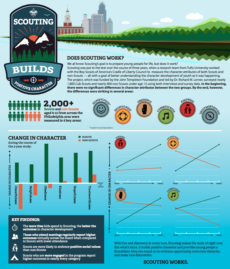
The Does Scouting Work? infographic was created by the Boy Scouts of America based on the results of a study done by Tufts University comparing scouts to non-scouts. The infographic focuses on the four key points from the study and their statistical findings.

The Boy Scouts also created a downloadable PDFpresentation slides and a press release based on the same results and design. This is a great way to leverage the design assets that were created in multiple formats.

Current and former Scouts have always felt that Scouting has made a difference in their lives, and now a study out of Tufts University has found that Scouting does in fact have a measurable, positive impact in the character development of young people.

The study, funded by the John Templeton Foundation, involved nearly 1,800 Cub Scouts and 400 non-Scouts under the age of 12, and was conducted over three years. It sought to measure the difference Scouting makes in young people’s lives as those positive changes were happening.

“After three years, Scouts reported significant increases in cheerfulness, helpfulness, kindness, obedience, trustworthiness, and hopeful future expectation,” said Dr. Richard M. Lerner, who led the study at Tufts University. “In our control group of non-Scouts, there were no significant increases, and in some cases (e.g., religious reverence) there was an observed decrease, which was quite striking.”

In addition, the study found a direct correlation between the amount of time boys spent in Scouting and the positive impact realized—those who spent more years in the program reported higher character attributes. Scouts who were more engaged also reported higher character attributes. And those who attended regular meetings reported higher character attributes compared to those with lower attendance.

It's always great to hear about a program's success when it comes to helping develop kids. By highlighting the research's four best results, they don't end up bombarding a reader with too much information. This could be enough to encourage a parent to enroll their kid in Scouts, or entice a curious reader into learning more about the study and scouts in general.

The infographic appears to have been designed by the national office of the Boy Scouts of America and published here. Many other scouting sites have reposted the infographic, and it would really be helpful to readers to have the URL to the original infographic page in the infographic image. That way readers can find their way back to the original design.


Friday
Jan172014

Where in the World are the Best Schools and the Happiest Kids?

The Best Schools and the Happiest Kids infographic

The best test scores don’t always mean the happiest kids at school.  The Best Schools and the Happiest Kids visualizes the results from a worldwide survey of over 500,000 15-year-olds globally.

The Organisation for Economic Co-operation and Development’s triennial international survey compared test scores from 65 countries. Happiness was ranked based on the percentage of students who agreed or disagreed with the statement “I feel happy at school.” Test scores were ranked based on the combined individual rankings of the students’ math, reading, and science scores.

I can’t tell for sure, but it appears that Jake Levy, Data Analyst at BuzzFeed created this data visualization based on the data from OECD survey results.  Infographics like these often get shared without the rest of the article, so it’s important to include all of the necessary framing information in the graphics itself.  Title, descriptive text, sources, URL, publishing company, copyright, etc.

Thanks to Ron Krate on Google+ for posting

Monday
May202013

Common Causes of Tummy Aches in Children

Common Causes of Tummy Aches in Children infographic

Common Causes of Tummy Aches in Children from Tummy Calm is guide for all parents, because all kids get unexplained stomach aches at some point.   The infographic does a good job of clearly walking the audience through the potential symptoms, causes and remedies.

A tummy ache can be a frustrating symptom to understand in small children.  While it’s a common problem, there are a wide variety of potential causes.  This infographic reviews many potential causes of stomach ache and offers pros and cons to potential remedies.

Designed by InfoNewt, this infographic is much more visual explanation and less data visualization.  Health-related topics are also designs that you need to be careful with.  You want to provide good information to the audience, but you don’t want to be interpretted as advising medical care.  The design was carefully worded to be helpful to parents, but also reviewed by a pediatrician to make sure the information presented didn’t cross the line into providing medical advice.

Friday
Apr262013

The Importance of Childhood Education

A helpful infographic for soon-to-be parents. The Importance of Childhood Education infographic from SchoolTutoring Academy takes information about kids with early childhood education and attention and compares them to kids who did not. But it isn’t all bad news for moms, the infographic gives a few tips on how to survive being a stay-at-home mom as well as some positive job information. Then see how the United States matches up with other countries on early childhood education.

While there can be no denying the heavy importance of early education for a child, this education infographic delves much deeper by looking at how future success in life can often be predetermined by the quality of early eduction.

It also explores the often overlooked importance the role the parent plays, especially the Mother. How important is it for Moms to stay at home with their children during early learning? What steps can working Moms take to secure the best educational foundation for their child? All these topics are researched presented in the infographic. The last segment compares the different education paths taken by countries from around the world. From birth to age 7, we look at the different educational institutions that counties from Canada to Germany to Italy to the United States use to start their children’s educations.

If you have any comments or thoughts on the information included in this infographic or education in general, please use our comment section below. You can also see our previous infographic discussing the cost of rising education.

Although the information included in the design is great, this infographic has a lot of text.  Too much text.  That much text in a design will turn away potential readers even before they start.

Thanks to Shell for sending in the link!

Tuesday
Feb052013

How to Find A Missing Child Using Social Media

How to Find A Missing Child Using Social Media infographic

Find Your Missing Child is a new infographic design by the team at JESS3.com for FindYourMissingChild.org.

Find Your Missing Child (FYMC) was founded after social media and email helped successfully find one missing child.  FYMC’s goal is to educate families about the community-building powers of social media and email to help in the search for a missing child.

The design does a good job of walking the reader through the statistics and benefits of engaging with social media as a tool in the search for a missing child.  The path provides a clear sequence of information for the readers to follow.

Some of the statistics are impressive, and would make a bigger impression on the reader if they had been visualized.  Big numbers are not data visualizations, and many designs make the mistake that using a big font makes the numbers more impressive.  An infographic should put those values into context for the reader by visualizing them.

In the footer, the URL to the infographic landing page is missing and would be helpful to readers that want to find the original full-size infographic.

Thanks to Jarred for sending in the link!

Thursday
Apr262012

The Eagle Scout Infographic

The Eagle Scout infographic is a new design from the Boy Scouts of America, and shows them experimenting with using infographics to share their message.  It’s odd that I can’t find any mention of it on Scouting.org, but found it posted on the Bryan On Scouting blog, which is the official blog from Scouting Magazine, and posted in the official BSA Twitter stream (@boyscouts).  There’s also a high-resolution PDF file available for download if anyone wants to print it out.

My son just bridged over to Boy Scouts from Cub Scouts, and their national office is here in the DFW area, so I was naturally interested.  This is a really good first attempt at an infographic design from their design team, but makes a few mistakes visualizing the data.

  • Good use of the red, white and blue color scheme.  It’s clearly scouting, and specifically related to Eagle Scouts
  • The data being presented is fantastic since only the BSA would have access to many of these statistics.
  • I love the choices of imagery used.  The embroidered patches and icons used for the scouts keeps the design clean and easy to read.  Many BSA publications use a lot of full-color photos of the scouts, and that would have added too much visual noise to an infographic design.
  • The BSA logo at the top clearly identifies this as an official publication, but it’s missing a title.  What should we call this infographic?  Why should I read this infographic?  Something like “100 Years of Eagle Scouts: By The Numbers” would have worked nicely.
  • The information included will change over time since the data is a current snapshot of the state of Eagle Scouts.  2,151,024 Eagle Scouts as of what date?  The infographic should more clearly identify the date that the data is gathered from, because people will be looking at this for years on the Internet.
  • Filling unusual shapes to show percentages is always a challenge.  With images like the hand icon and the globe you can’t just calculate the height of the colored area like a bar chart.  You have to calculate the AREA of the space to be colored, or you end up with false visualizations like these.
  • The same is true for sizing shapes, like the people icons for the Average Age of Eagle Scouts visualization.  You have to size the overall AREA of the shapes to match the data being presented, which is hard with complex shapes.  You can’t just change the height.
  • The space shuttle avoids this issue by only coloring a rectangular shape in the middle, turning it into a stacked bar chart, but the visualization doesn’t match the data.  The red colored section is visualizing more than 60 astronauts as Eagle Scouts, when the number shown is only 40.
  • I love the Eagles by Decade data, but avoid 3D charts.  The 3D effect doesn’t add anything to the data being presented and it’s incosistent with the rest of the design.  The data tells a great story, and clearly shows that Boy Scouts continues to grow strongly and is a viable organization in the 21st century.
  • I like this use of the word cloud for Notable Eagles, but don’t change the font sizes because in infographic design this is assumed to convey data.  With Brave and Loyal in larger fonts, it implies that these are more important than all of the other virtues.  The virtues should all be one, consistent font size, and the names should all be a second font size.
  • At the bottom, there should be a copyright (or Creative Commons) statement, and a URL for readers to be able to find the original high-resolution version. 

Thanks to Dean for sending in the link!

Monday
Jan162012

Learning to Love Tennis

Learning to Love Tennis is a cool infographic describing the major changes within the USTA’s rules for kids playing tennis.  Designed by Digital Surgeons, the infographic visualizes some the biggest changes like court sizes, raquet sizes and net height.  Also, including things like comparing the calorie burn of different sports help show the reader why tennis is such a great sport for kids.

The game of tennis has been scaled for youth play.  To date, tennis has been the only major sport without equipment and field of play dimensions specific to children.  By introducing smaller and lighter racquets, balls with different compression ratios, lower nets and scaled court sizes, kids can begin playing and competing earlier.  Earlier participation and play increases engagement and reduces frustration associated with using adult-sized racquets that kids find clunky and heavy, or court sizes that are simply too large for children to effectively navigate.  Far too many of our country’s youth are huddled around the TV or tethered to a video game controller.  These new rules provide the means to get kids off the couch and engage in an activity that they can continue for life.

Overall, I really like this design.  The style is eye-ctaching and information is laid out in an easy-to-read manner.  I like most of the visuals, and there are only a couple things I would change:

  • The grid of 30 kid icons showing 70% of Kids Quit Sports isn’t accurate.  The visual is 22/30 kids , which is 73.3%  This type of visual always works better as a grid of 100.  Don’t make your readers count icons to figure out what you’re showing them.  Rows of 6 are just odd, and tought to understand.
  • One of the biggest differences is the new balls used by different ages.  It would have been nice to visualize the difference in bounce for each ball to help the reader understand.
  • The Average Height, Stride Comparison and Average Weight is lost in the design, because it’s all text.  In an infographic that makes it less important and the reader just skips over that section.
  • At the bottom should be the URL to the official landing page so readers can find the original infographic.

This is a really huge initialative for the USTA, and the new rules are complicated to understand for parents.  An infographic is a fantastic way to simplify their message, and I think this will help them out a lot.

Thanks to Pete for sending in the link!