It’s not just a sausage in a bun; it’s a beautiful blank canvas. It’s a hot dog, which is a foodstuff eaten worldwide. Here are 40 distinctive varieties from around the globe — from iconic NYC “dirty water dogs” to fully loaded South American street-cart dogs to Japanese octo-dogs. There is a tubesteak out there for every craving that ever was.
Infographics and visuals have become the lifeblood of storytellers, be it marketers, professors, presenters, etc. They are constantly battling short attention spans, information overload, and little vested interest from their audience. The smart marketer knows their target, and comes with a battle plan to defend against all of these things. This is where visuals come in.
Reasons to Use Visuals
We’ve relied on visuals for everything from street signs and movie banners to websites and presentations. Using visuals to express information has long been a part of our history. Here are just a few more reasons to use them in your presentations and marketing efforts:
1.Getting Attention
A visual makes information stand out more than just text alone. Studies estimate that between 50-80% of the human brain is dedicated to forms of visual processing.
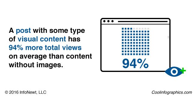
On social media, they simply take up more real estate than their text only counterparts. A post with some type of visual content has 94% more total views on average than content without images, according to MDG advertising.
2.Simplicity
As humans, we’re simply wired to receive rich visual information, and can understand more complex information when it is presented visually. Infographics are a great way to provide your audience with context when displaying statistics that are otherwise meaningless.
3.Credibility
Credibility is one of the biggest reasons to use visuals. Put a statistic in an article and it is questioned. Put a statistic in a visual and it is fact.
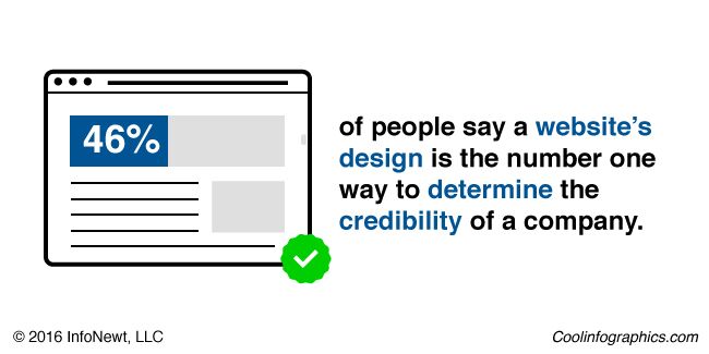
In fact, every form of visual information lends credibility to what is presented. 46.1% of people say a website’s design is the number one way to determine the credibility of a company, according to theStanford Persuasive Technology Lab.
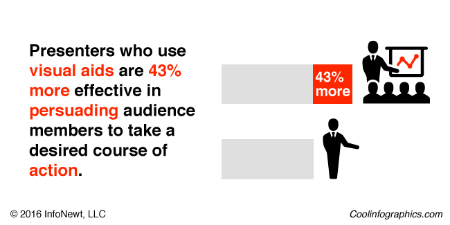
This works the same way in presentations. In 1986, a 3M-sponsored study at the University of Minnesota School of Management found that presenters who use visual aids are43% more effective in persuading audience members to take a desired course of action.
Use This Power Responsibly
In light of this information, it is important to use this responsibly. Providing accurate information is the most important thing content marketers and visual storytellers will do. No matter how beautifully crafted your infographic or visual is, it can be destroyed by one misrepresented fact, or out-of-context statistic.
Update on Thursday, March 31, 2016 at 3:33PM by
Randy
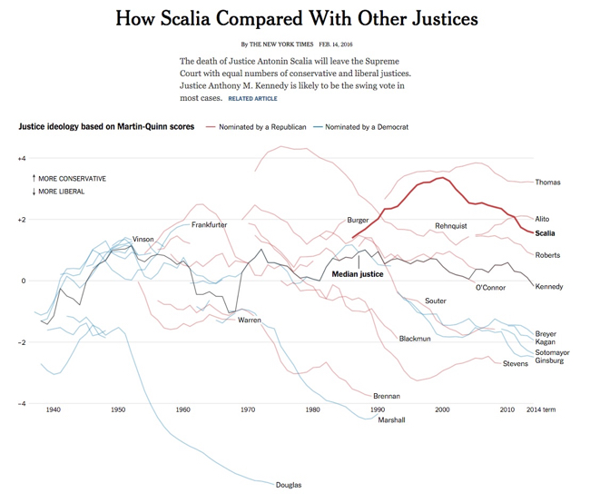
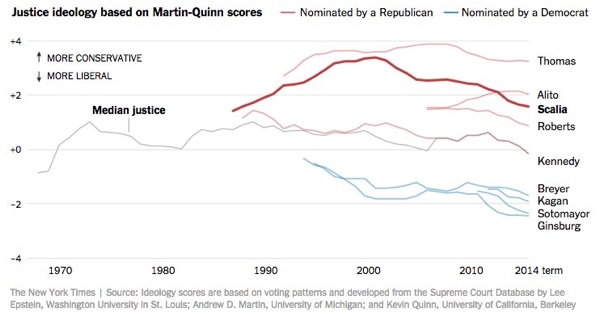
The death of Justice Antonin Scalia will leave the Supreme Court with equal numbers of conservative and liberal justices. Justice Anthony M. Kennedy is likely to be the swing vote in most cases.
For social media, they published a simplified version that just shows the current Justices:
Why is this design so good? Here are my thoughts on why this chart design is great:
Minimal chart legend. The color key shows only 2 colors to designate the party of the nominating President. The names of all the Justices are built into the chart itself, which keeps that important information tied to the data in the reader's field of view. Default charts in MS Office would have created a different color for every Justice, and made this chart confusing and visually noisy.
Minimal axis labels. Notice the x-axis only shows a label for each decade. You don't need to know where 2004 is specifically. I think they could have minimized further to just the first and last years.
Use of opacity. Justice Scalia is the main story of the visual, so his line is heavier weight and bright color. This is a great use of preattentive attributes! All of the other Justices are shown is lighter colors for reference, and the main story stands out.
Minimal grid lines. There are a lot of lines on this chart, so only a few gridlines are included to keep the chart as simple as possible.
Minimal Text on the page. The chart is connected to a full article, but on this landing page the data visualization tells the story all by itself. The description text on the page is only two sentences long, leaving the visual as the visual centerpiece.
If you want to see data like this about your account specifically, check out the Instagram analytics tool I released: PicStats.com
When I’m speaking at a conference, one of the most common questions I’m asked is what do I think the future of social media is. I’m not great at distant future predicting, but I do believe the story of the present and near-future of social media is visual content. From the impact of images and video on Facebook and Twitter to the new crop of media-centric social platforms like Instagram and Pinterest, it’s clear that inbound marketers need to be turning out great visual content.
I recently spent some time collecting a large Instagram database and analyzing it to identify the characteristics that make images work (or not work). The result is the infographic below. If you’re curious about the nerdy details of the dataset, there are details at the bottom of it.
Be sure to come see me present my all new edition of The Science of Social Media next week in Boston at INBOUND. I’ll be speaking on Wednesday the 17th at 1:45PM. There will be tons of never before seen data, including lots about visual content. Oh, and follow me on Instagram!
I like the simplified charts in this infographic. Removing the unnecessary gridlines, axes and other chart clutter helps them clearly communicate their content to the readers.
The footer should include a copyright (or Creative Commons) license statement and the URL to the infographic landing page so readers can find the original full-size version when bloggers repost the infographic without a link. I always include a link back to the original but most do not.
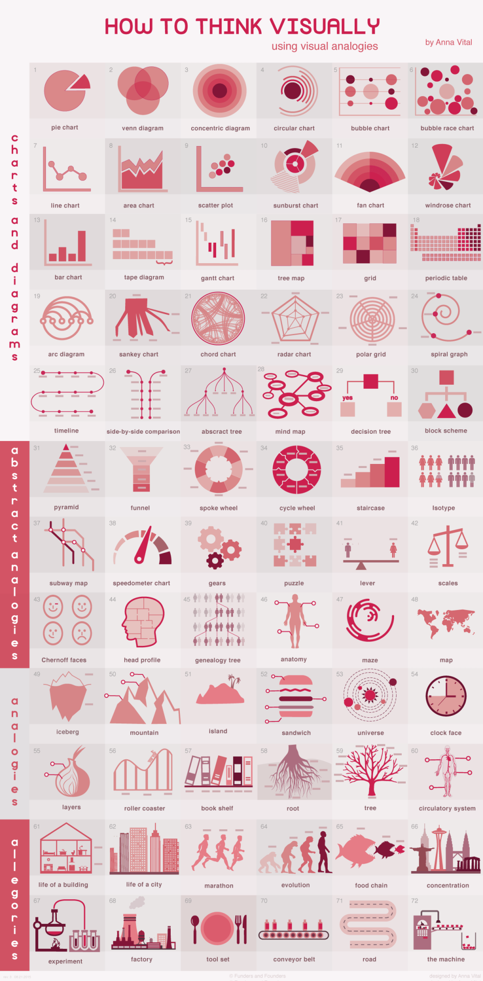
How to Think Visually Using Visual Analogies infographic from Anna Vital gives a great variety of examples for anyone to use when you create your own graphics. It begins with the most recognizable visuals, circle graphs and diagrams. Further down are abstract analogies. They are reminiscent of physical objects, but they are simplified and abstract. Next, we have regular analogies that look like the physical objects you are familiar with. The final category are allegories. These are stories, or a series of analogies. The key is that these stories are familiar enough that we don’t have to retell them, but we should analogize every part of them.
Most research in cognitive science explores how we see things but little research is done on how we understand what we see.
Understanding is the ultimate test of how good your visualization is. So how can you make people understand? Show something familiar and analogize. If you know nothing else about visualization but pick the right analogy you are more than half way there. This is what a professional designer does - and there is no substitute for analogies.
How do you choose the right analogy? In this grid I organized analogies from the abstract down to the more detailed. I grouped them by similarity in shape. The goal is to enable you to quickly see the possibilities and “try them on” your information. With time you’ll be able to do all of this in your head. But for now this is a shortcut.
As part of the infographic landing page, Anna has included a text description of each visual analogy. For the story on each graphic, read more at anna.vc
It’s only August, but voting is already underway for the March 2016 South By Southwest (SxSW) Interactive conference. Long thought of as the breeding ground for new ideas and creative technologies, we can gleam industry insights from the SXSW Interactive Festival. This year, I decided not to wait until the conference to delve into the veritable buffet of groundbreaking panels vying for festival space. This year’s PanelPicker interface received more than 4,000 proposals, which is an all-time record!
While a quick search of infographics yields only 11 results, a mere TWO actually have the word “Infographics” in the title. The industry discourse has shifted away from “how-to” models to “how to do it right.” Infographics have become a key format of the larger conversation: Visual Storytelling.
A quick search for “Visual Storytelling” yields over 200 talks in PanelPicker, along with hundreds more for “data visualization” and “visual content”. Infographics are now used as one of many effective tools in the Marketer’s toolbox, and an accepted part of the larger conversation happening in the content marketing industry.
Visual storytelling is vital to content marketing success. The following types of visual content are at the forefront of the proposals for next year’s SXSW Interactive Festival.
The social media world has been slow to adopt GIFs, with Facebook only just embracing the truncated clips this year. The average human attention span in 2015 is 8.25 seconds, so these bite-sized animations are the perfect for telling a complete story in a short amount of time. The motion in the image also captures attention on an already crowded news feed.
Slideshare and other presentation-style platforms provide a visual and interactive way to share lots of information. With millions of visitors per month, Slideshare is an easy way to have your presentations seen by a large audience.
Real-time storytelling has increased in popularity with the rise of live feed social platforms like Periscope and Meerkat. The ease of execution and the sheer scope of the audience made these two platforms instantly successful. While Meerkat took the prize for most buzzed app at last year’s SXSW, Periscope has the weight of Twitter behind it and has become the more successful of the two.
I couldn’t get through my list without mentioning infographics. Still one of the best ways to convey complex information in a shareable and visually appealing format, infographics should be worked into your content marketing strategy. While they are no longer the only way to tell a visual story, they remain a marketing industry staple.
Buzzword or not, visual storytelling is something we’ve all been doing since we first snapped a picture with a polaroid camera, we’re just getting better at it. Judging by PanelPicker entries alone, the 2016 SXSW Interactive Festival will be another great year for the content marketing industry.
Update on Thursday, August 27, 2015 at 7:47AM by
Randy
Creating an infographic is no simple task. A lot of time and resources go into the data research and design of a good infographic, but not always into figuring what happened after publishing it on the Internet. Where many companies miss the mark with their infographics is in their tracking efforts after the infographic has been released. Pageviews, social shares, reposts, backlinks, and more are all part of measuring the success of an infographic.
It is important to understand that infographics need as much promotional and tracking support as articles, videos, advertisements, and even the products and services their business is marketing. Learning what works and doesn’t work should be a huge part of future marketing plans.
The work of tracking an infographic starts the day it’s published online. Here are five key areas a company should focus on after they've released an infographic.
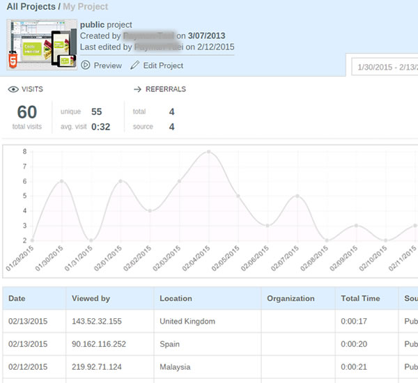
To make sure you get the most out of your infographic, make sure it is published on the company’s website on a dedicated landing page or if that’s not available, in it’s own blog post. That will provide a dedicated landing page URL as the one primary link in posts to drive all the views and backlinks to one place. By creating a landing page you can access your own web analytics to see pageviews, traffic patterns and referring sites. You also have control over which social sharing buttons to include for default text and sharing statistics.
An often overlooked ally to tracking infographics after their release is your company’s own website analytics. When you examine the metrics of the overall company website, inbound links can become a jackpot for insights about who picked up your content.
Pro Tip:
Use inbound links to keep track of pick-up, and target new outlets for future outreach efforts.
An alternate (or secondary) method would be to publish your infographic on a hosted platform like Visme or SlideShare. These platforms display the infographic within an enclosure that can be embedded and shared on other sites, and gather the analytics from all of the sites displaying the enclosure in one tracking report.
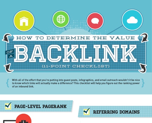
For many companies, the goal of publishing infographics is to attract links and visitors to its own website. To find all of those links, you have to go looking for them.
Pro Tip:
Use an SEO backlink tool like Majestic SEO Site Explorer, Moz Open Site Explorer, or even do a Google search of the full landing page URL (another advantage of having a dedicated landing page URL). These tools will allow you to be able to find all of those valuable backlinks.
Be sure to check the value of links from those sites. One strong link can be worth more than many weak links. Google call this PageRank, Moz calls this Authority, and Majestic calls this Trust. Choose one metric for your tracking so you are comparing the same type of score across all of the sites that link to your infographic landing page.
Go through your list of industry specific websites, blogs, and news media outlets you pitched the infographic to, and search their website to see if anything pops up (wait about a week or two before searching to give time for an article to be written).
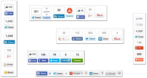
3. Social Share Counters
Social media can be used as a good indicator of how well your content is performing online, especially when looking at social shares from a specific media site pick-up. It’s important to remember that social sharing doesn’t help your own website’s pagerank, but it does build widespread awareness and exposure of your infographic content.
Pro Tips:
a. Use the counters from the social share buttons you set-up on the dedicated landing page.
b. Search Twitter (and other social media sites) for the full URL link to the landing page to find other social media posts that didn’t use your buttons but did link back to the infographic.
c. Check the social share button counters on other sites that reposted the infographic for additional sharing stats.
4. Reverse Image Search
When a blogger, media outlet, or journalist has chosen to write about your infographic, it doesn't always mean they will also take the time to include a link back to your website, or will even remember where they found the infographic. Reverse Image Search is a valuable tool to use to find reposts of your infographic that don’t link back to your website..
Reverse Image Search is a service offered by Google, Bing and TinEye. They allow you to drag and drop, upload your own image or choose an image online to start the search. The results will list all of the web pages in their index that include that image, in any size. This is the best way to find sites that posted your infographic without linking back to your landing page.
Reach out to any high value sites you find that published your infographic but didn’t include a link. Politely thank them for sharing your infographics, and ask them to add a link back to the original landing page.
5. Gather Your Results
Pull together all of the results you found into a summary that your company can use as a benchmark to evaluate future published content. Your web analytics, combined social shares, backlinks from sites and image-only posts together paint an overall picture of how well your infographic performed.
Site that have seen their own success from posting your infographic are more likely to post future infographics from you as well. Start building an outreach list of people and sites that appreciate your content.
Even the slightest effort put into tracking your infographic can significantly improve your understanding of the value of visual content. In order to understand it’s value, you have to understand its reach. Then, you can evaluate how your content is performing, and make any changes needed to make future content more likely to garner the pick-up and exposure your team or company seeks.
Remember, you can’t improve what you don’t measure!
Are there any other tracking methods you use to keep track of your infographics or other visual content? How do you measure success for infographic (or any visual content)?
Update on Wednesday, July 15, 2015 at 3:02PM by
Randy
The 6 Principles of Design is an elegant design that visually shows the readers many of the ways design can visually communicate information. Designed by FOLO, a firm in Ahmedabad, India.
This infographic visualises the six guiding principles of Unity/Harmony, Balance, Hierarchy, Scale/Proportion, Dominance/Emphasis, Similarity & Contrast. How one applies these principles determines how successful a design may be.
Simple colors, minimal text and white space work together to tell a clear story.
Took me a while to find the original design. The footer should include the URL directly to the infographic landing page to make it easier for readers to find the original. Most people that share infographics, don’t include the link back to the original. They just share the image file.
Visuals communicate complex ideas into something more digestible. Large amounts of text make it harder for our brains to find pertinent information in a timely manner. This problem can be remedied quite easily, by adding images and visuals into marketing yourself.
Visuals can help turn a complex idea into something more easily digestible, with less effort and time spent by the person viewing it. By putting extra work in on your end, you position yourself to leave a more lasting impression, and stand out from a pile of resumes. Especially when marketing yourself to a recruiter or HR department - making it easier for them to understand your most important work. In Cool Infographics, I cover how visuals are 6.5 times more likely to be remembered than text alone, and there’s no better time to be remembered than when you’re applying for a new job.
Below are five ways to start marketing yourself visually right away:
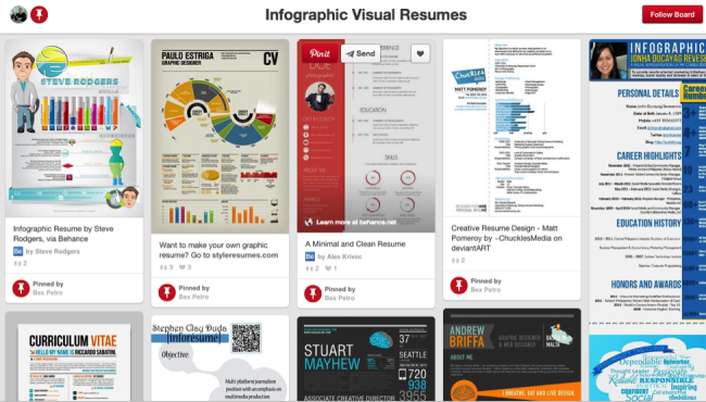
1. The Infographic Resume
Pinterest Board Gallery of over 900 Infographic Resumes
Infographics are an excellent visual tool to have in your arsenal. They are the pinnacle of displaying complex information in an easily digestible way. Either pay a talented infographic designer, or do one yourself. If you’re not comfortable using graphics design software, check out an excellent free option online like Visme.co - that will have you designing infographics in no time.
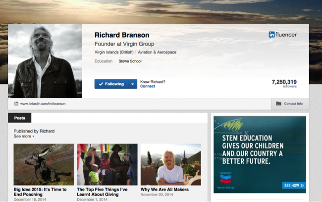
It should be no big surprise that a prospective employer will look at your LinkedIn profile prior to checking you out in person. LinkedIn allows you to add photos and visually rich imagery, so take advantage of these opportunities. If you add companies that Linkedin recognizes to your work history, your profile will automatically display their logos.
Examples could be photos of you working at a trade show, product prototypes you designed, or a photo of you giving a presentation (LinkedIn has Sl SlideShare integration, so embed the presentation in your profile as well). Other images or PDF files work as well, like an advertisement you designed.
3. Create A Visual Portfolio of Your Work
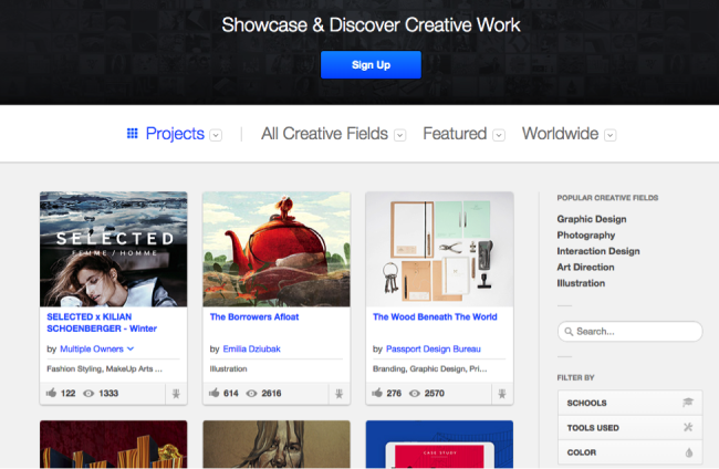
Talking about your creative work only goes so far, you need to provide visuals. Visuals help the employer see what you’re capable of, and gives you the opportunity to control the work they see. Websites like Behance and Dribble are excellent options for creatives of all types. Not only do you get to upload all of your projects, but you get to interact with their creative communities as well - having the chance to inspire others, and be inspired yourself.
4. Create a Blog Post to Provide More Information and Visuals of Your Work
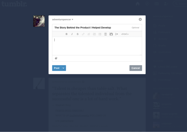
A resume should be a brief overview of skills, previous employment, education, and best works. One page is best. If you would like to expound further upon your projects, then create a blog post - loaded with visuals - that delves deeper into your work. Tumblr is a great free option for keeping a personal blog.
Include links to any additional content you publish in your Linkedin profile and even on your text resume. Make it as easy as possible for hiring managers and recruiters to find your work.
5. Content Curation
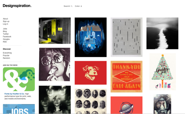
Similar to the idea of creating a blog post to highlight your best work, create a content curation site to highlight the best infographics, articles, quotes, YouTube videos, podcasts, brands, inspirational work, thought leaders, TED talks, and books you’re reading. Show your future employer that you have a passion for gaining knowledge, and are an expert in your field. Pinterest is a great option, and if you’re looking for a design-centric curation site, Designspiration has got you covered.
What other ideas would you recommend?
Update on Wednesday, December 24, 2014 at 9:34AM by
Randy
On iOS 8 launch day, The Evolution of iOS from iOS 1- iOS 8 infographic is a timeline of the iOS systems from 7 Day Shop. The infographic shows the evolution of the home screen, app icons, and the most noteworthy features.
This week saw the launch of the highly anticipated iPhone 6, iPhone 6 Plus and iWatch. Apple also announced that iOS 8, the operating system that will run both of the new iPhones will be made available for download on September 9th, 2014.
In light of the evolutionary change of the iOS, we decided to dig a little deeper to the first ‘iPhone OS’ right through to it’s latest iteration iOS 8. It’s development both in the hardware and software front over just only 6 years is beyond remarkable.
We have charted the evolution of the home screen, app icons and the most noteworthy features of each iOS.
It’s a tall design with a lot of information, but the visuals help out tremendously. There’s way too much text in this design, and they chose to make the font size too small to fit it all in. For the new features added with each major upgrade I would remove the text descriptions, and just keep the titles. Keep the design simple.
This is a good example of an informative infographic capitalizing on a hot trending topic. There’s no hard sales pitch or even a call-to-action. This makes people more willing to share the infographic, and 7DayShop.com just put their logo in the footer to claim credit and build their overall awareness and credibility. They should have included the URL link to the original infographic on their site to help readers find it. Especially on a design this big, because most blog and social shares will post a smaller thumbnail version.
Are the new features compelling you to upgrade to iOS 8? Did you order the new iPhone 6? Let me know in the comments!


 food,
food,