About
Randy Krum
President of InfoNewt.
Data Visualization and Infographic Design

Infographic Design

Infographics Design | Presentations
Consulting | Data Visualizations

DFW DataViz Meetup

Join the DFW Data Visualization and Infographics Meetup Group if you're in the Dallas/Fort Worth area!

Search the Cool Infographics site

Custom Search

Subscriptions:


Feedburner

The Cool Infographics® Gallery:

How to add the
Cool Infographics button to your:

Cool Infographics iOS icon

- iPhone
- iPad
- iPod Touch


Read on Flipboard for iPad and iPhone

Featured in the Tech & Science category

Flipboard icon

Twitter Feed
From the Bookstore

Caffeine Poster

The Caffeine Poster infographic

Entries in visual (320)

Tuesday
Jun042013

The Makings of a Modern Home

The Makings of a Modern Home infographic

Keeping up with technology is always a full time job. Now even your home can have technology upgrades. The Makings of a Modern Home infographic from In Style Modern helps keep all of us current with information on updating your home with the newest technology.

There isn’t a text description on the landing page, or even in the infographic itself.  The reader is left to determine if these are real, current technologies or a forecast of what’s coming.  Personally I think it walks the line between the two.  The Nest Thermostat is very real, but self driving cars aren’t available to the public yet.

This design would have been better in landscape orientation, where the information could have connected more easily with the locations shown in the isometric house illustration.  I understand why they chose to use the Tall Format though, to make the display on the blog and in services like Pinterest easier.

Thanks to Therese for sending in the link!

Thursday
May022013

Connecting The Dots

Connecting The Dots infographic Habitat for Humanity

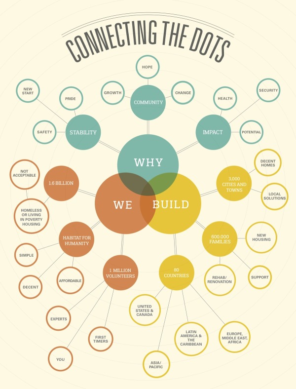
Connecting the Dots is a mind map design from Habitat for Humanity.  It was published in the May 2013 edition of their own magazine, Habitat World, and made available online as a PDF download.

Learn more about how Habitat builds homes, communities and hope.

I really like the combination of the Venn diagram in the center and the mind map nodes that extend outward.  The sizes of the circles doesn’t have any meaning, just sized to fit the text.  This is a really good way for Habitat for Humanity to tell their story with a visual explanation.


Tuesday
Feb262013

Manhattan Building Heights as Land Value

Manhattan Building Heights infographic

Manhattan Building Hieghts by radicalcartography.net is an indirect measure of land value based on building height. The infographic is shaped like Manhattan itself, and the actual building’s color darkness shows their heights in their correct locations.

You can also see an alternate design using assessed tax value as the data set, and how that maps out land value differently.  

Found on http://visual.ly


Friday
Jan182013

Brockhaus Encyclopedia Infographics

Brockhaus Encyclopedia Infographics

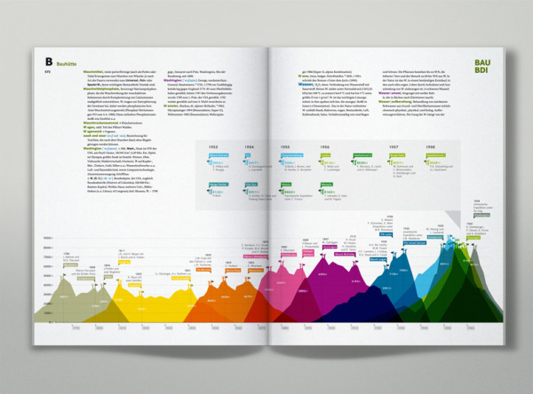
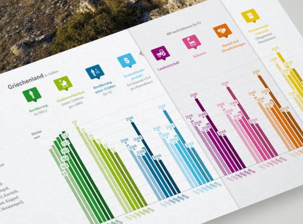
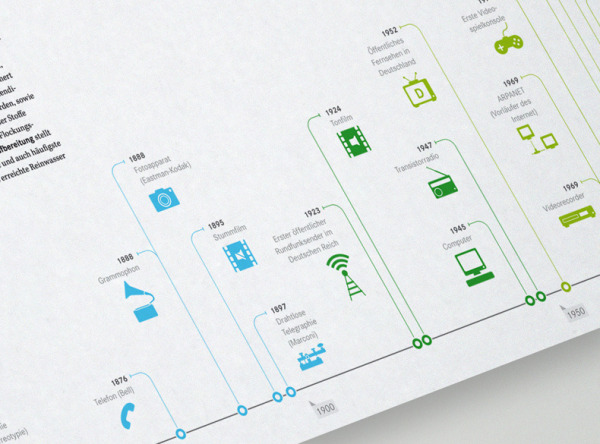
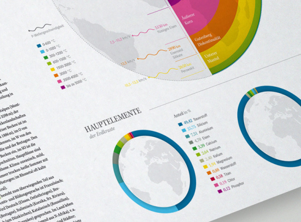
Check out the Brockhaus Encyclopedia Infographics, infographics and data visualizations in the new German Brockhaus Encyclopedia!  Designed by oberhaeuser.info, the design studio of Martin Oberhäuser.

Series of info graphics for brockhaus, a large encyclopedia publisher from germany. The info graphics visualize several statistics and informations of topics like: the worlds highest mountains and their first ascent, the languages of the world, comets close to the earth, world oceans, ecology, media evolution and so on. One graphic shows the evolution of the world population from 1950 to 2050. Six transparent pages (one for each 20-year period) overlap each other.

These are some beautiful designs.  I’m sorry an English version isn’t available.

Found in the Behance 100 Most Appreciated Projects of 2012

Brockhaus Encyclopedia Infographics

Brockhaus Encyclopedia Infographics

Brockhaus Encyclopedia Infographics


Wednesday
Jan022013

Comparing NFL Stadium Screens

Comparing NFL Stadium Screens infographic

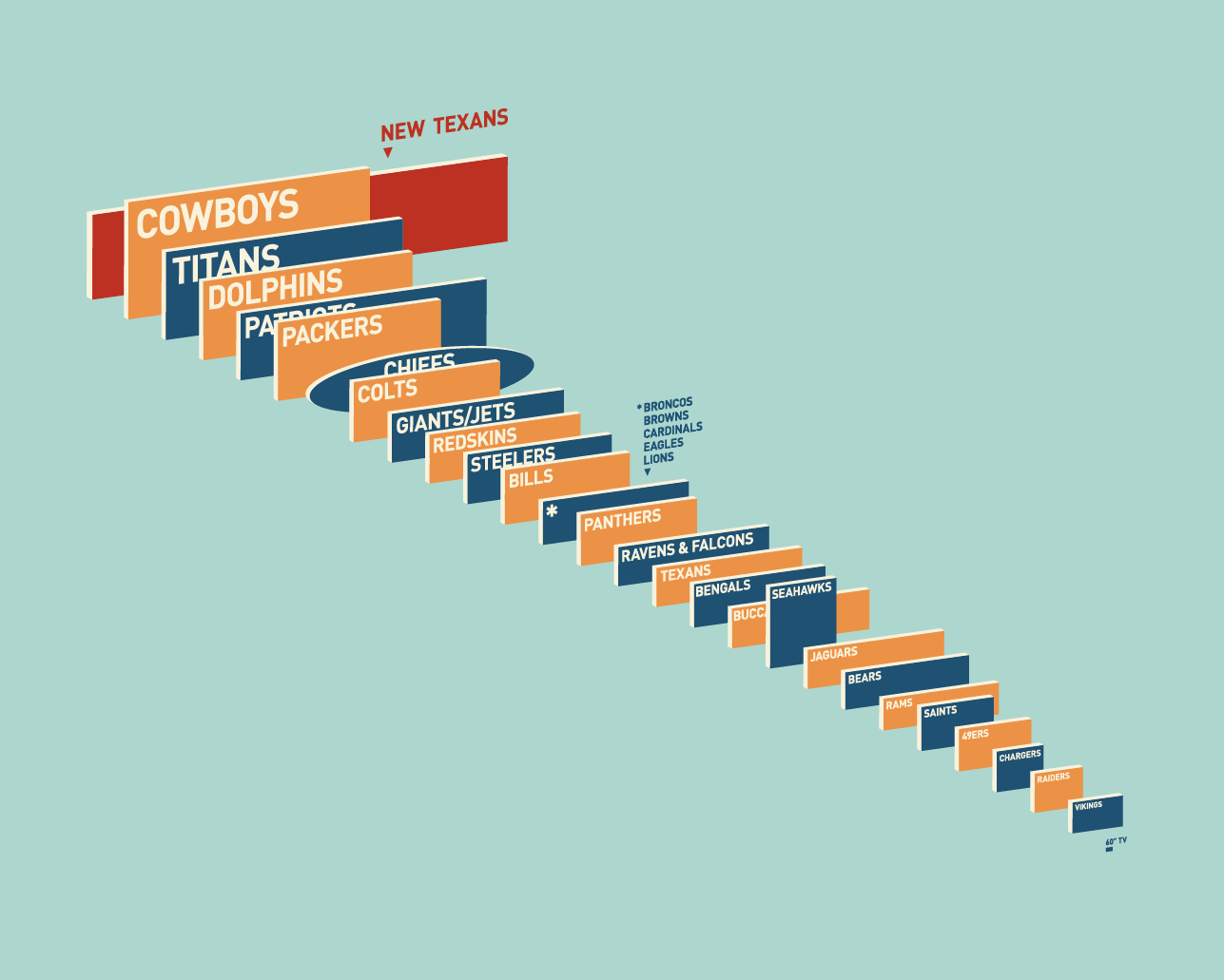
This visual comparison of NFL Video Screens was uploaded by reddit user dbeat after the announcement of the new video display being built for the Houston Texans’ Reliant Stadium.

I would have liked to see a link to the data behind all of the screen sizes, but this visual representation does a great job of telling one story really well.  The readers can easily find their favorite team, and understand how they stack up.

Found on FlowingData and Deadspin

Tuesday
Nov062012

Daylight Savings Time Explained

Daylight Savings Time Explained infographic

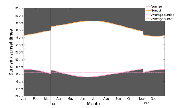
Daylight Savings Time Explained designed by a Visual.ly member under the name Germanium, visually explains the end result of recognizing Daylight Savings Time.  DST is used mostly in North America and Europe, while most of the world does not change their clocks.

I tried to come up with the reason for the daylight saving time change by just looking at the data for sunset and sunrise times. The figure represents sunset and sunrise times thought the year. It shows that the daylight saving time change marked by the lines (DLS) is keeping the sunrise time pretty much constant throughout the whole year, while making the sunset time change a lot. The spread of sunrise times as measured by the standard deviation is 42 minutes, which means that the sunrise time changes within that range the whole year, while the standard deviation for the sunset times is 1:30 hours. Whatever the argument for doing this is, it’s pretty clear that reason is to keep the sunrise time constant.

By visualizing the daylight hours, the reader can see the pattern.  Both the change in total hours, and the impact of daylight hours on their normal day.

The reasoning for DST is very controversial, but now we can see the impact clearly.

Wednesday
Oct102012

The Noun Project

Building a Global Visual Language from The Noun Project on Vimeo.

The Noun Project is beauty in its simplicity.

I post this video for two reasons:

  1. Even though there are no statistics in the video, I do consider this to be an infographic video.  The video is a visual explanation that “shows” the audience icons and illustrations that convey the meaning of representing human concepts in visual form.

  2. The Noun Project is a fantastic effort to design universal icons.  The idea is to design and gather illustrations of concepts that cross languages and cultures, and then make tham available to everyone under Creative Commons license to use in their own designs.  Obviously good for infographic design, but also for presentations, websites and even school reports.

From the Noun Project About Page:

Creating, Sharing and Celebrating the World’s Visual Language

The Noun Project is a platform empowering the community to build a global visual language that everyone can understand.

Visual communication is incredibly powerful. Symbols have the ability to transcend cultural and language barriers and deliver concise information effortlessly and instantaneously. For the first time, this image-based system of communication is being combined with technology to create a social language that unites the world.

Anyone can also register and submit their own designs to be considered for inclusion in the library.

Like designed by Marwa Boukarim from The Noun Project


Friday
Sep142012

Life of a Cask: Wine to Whiskey

 Life of a Cask: Wine to Whiskey infographic

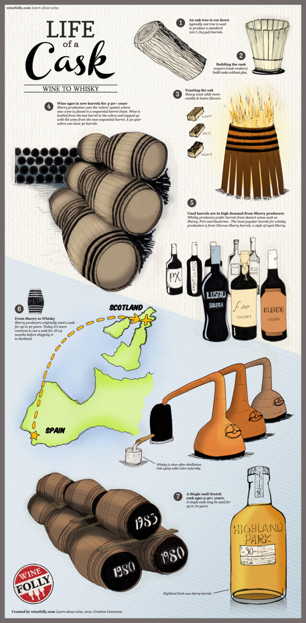
Wow! Who knew that the Cask would be so valuable! It is a key ingredient to making our favorite wine and whiskeys! See how Scotch depends on Sherry in the infographic Life of a Cask: Wine to Whiskey from winefolly.com.

An infographic on the life of a cask, from wine to whiskey. Find out where casks start their life and see how Scotch is dependent on Sherry.

Cask Facts

  • Used wine barrels are in high demand for Scotch and whisky production.
  • Distilleries prefer Oloroso Sherry casks and other dessert wine casks such as Port and Sauternes for aging whisky.
  • Sherry producers use larger casks called Hogheads (250 L) and Butts (500 L).
  • Some distilleries own forests in America where they source quercus alba (white oak) to produce casks.
  • Distilleries often loan unused casks to Sherry producers to ‘season’ them.
A Single malt Scotch cask ages 3-40+ years. A single cask may be used for up to 70 years

Nice visual explanation.  Easy to follow with a focused message that isn’t crowded with a bunch of additional factoids.  

The text is a little too small to read without zooming in closer, and there should be a URL at the bottom linking back to the original infographic landing page.  Otherwise, how can people find the original version they can read when a blog doesn’t link back correctly?

Just in time for the weekend too, it’s making my thirsty…

Thanks to Justin for sending in the link!

Tuesday
Sep112012

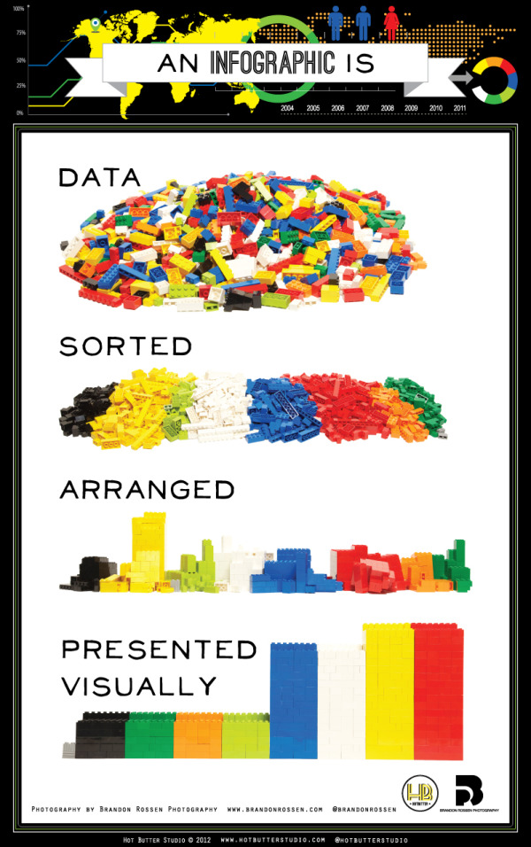
What is an Infographic? (explained with LEGOs)

 What is an Infographic? infographic

This infographic from Hot Butter Studio presents the idea of infographics in, well, an infographic! What is an Infographic? Data sorted, arranged, and presented visually! (And in a fun LEGO design!)

This is an infographic about what is an infographic. Using Lego blocks and photography we wanted to show that.a good infographic is simple and requires very little text.

Simple and fun, this is a really good design that has had some phenomenal success in social media sharing.

Thanks to Karyn for sending in the link!

Wednesday
Aug292012

American Sugar Consumption

American Sugar Consumption Infographic

OnlineNursingPrograms.com visually shows the readers that they are eating WAY too much sugar with the American Sugar Consumption infographic. It is an eye opener to see how much more we are consuming than the recommended amount and that it can be harmful for us.  It is even going to be difficult to cut back, because sugar is as addictive as cocaine!

 The consumption of sugar will always be an issue for nutritionists and health buffs everywhere. As long as sugar remains a large part of the American diet, we will continue to hear about all the negative effects sugar can have on the body. As someone who is studying nursing, it’ll be important to understand how the overconsumption of sugar may cause many health problems in the future. Many may ask: Is this concern exaggerated? Absolutely not. Sugar is in everything and it has contributed to the growing obesity epidemic in the United States. Since 1990, sugar intake has increased by 40 lbs a year. Is it a coincidence that the obesity rate has increased by 20 percent? As a nurse, you will see many cases in which a reduction of sugar intake could have gone a long way to ensuring less visits to the hospital. It’ll be important as a nurse to educate your patients on why sugar is bad and why they should limit their consumption of sugar. This infographic will show you just how getting your daily sugar fix may be contributing to many short term and long term health issues.

This is a great infographic design.  It’s eye-catching, and uses data visualizations to put the statistical values into context for the readers.  I like the simple color scheme, the use of piles of sugar (like the wheelbarrow and the dumpster) and the real world objects used to provide scale (soda cans and gallon jugs).

Only a couple things I would suggest to improve the design:

  • The average adult easts 22 teaspoons of sugar per day, but the visualization shows 24
  • The average child eats 32 teaspoons of sugar per day, but 33 spoons are shown in the visualization
  • The URL link to the original infographic landing page should be in the footnotes

Thanks to Emily for sending in the link!