About
Randy Krum
President of InfoNewt.
Data Visualization and Infographic Design

Infographic Design

Infographics Design | Presentations
Consulting | Data Visualizations

DFW DataViz Meetup

Join the DFW Data Visualization and Infographics Meetup Group if you're in the Dallas/Fort Worth area!

Search the Cool Infographics site

Custom Search

Subscriptions:


Feedburner

The Cool Infographics® Gallery:

How to add the
Cool Infographics button to your:

Cool Infographics iOS icon

- iPhone
- iPad
- iPod Touch


Read on Flipboard for iPad and iPhone

Featured in the Tech & Science category

Flipboard icon

Twitter Feed
From the Bookstore

Caffeine Poster

The Caffeine Poster infographic

Entries in visual (320)

Sunday
Aug052007

Periodic Table of the Internet


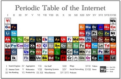
Wellington Grey has created a graphic representing some of the internet's most popular sites in a familiar layout. The Periodic Table of the Internet groups the most popular sites on the web in categories like Search Engines, Aggregators, Operating Systems, Blogs, Social Networking, etc. Each individual block links to its respective site.

Saturday
Aug042007

Executive Salary Comparison


Portfolio.com has a number of good interactive infographics on their News & Markets/Multimedia page.

This Salary Comparison is simple but hugely informative showing the difference in number and visual representation of size, but also over time as you move the slider on the left. In 2005 the difference between the average worker and the CEO is so large it doesn't fit on the screen anymore. But that is down from 2000 when the difference was the largest at 548x.

Thursday
Aug022007

Imagining the Tenth Dimension


Ten dimensions are really hard for most people to understand. Especially since our lives are constrained to only four dimensions. This video from tenthdimension.com does an EXCELLENT job of using pretty simple animation and illustrations to explain the 10 dimensions of our universe.

This video is really good, even if you're not a physicist.

Tuesday
Jul242007

Gapminder on Google!


Here it is! Live on Google. Gapminder is the Trendalyzer software used by Hans Rosling and acquired by Google. It's now online at Google, but it looks like an early test. I'm not sure if you can use your own data yet or not, but that is one of the goals.

Check out all of the Gapminder tools, and see more presentations using the Gapminder software at www.gapminder.org

Tuesday
Jul242007

Hans Rosling @ TED 2007

Here's part two, when Hans Rosling followed-up his 2006 presentation with updated software in 2007. It looks like he's been able to get more data from the UN also.

He gets really excited while describes what's happening as the software animates the data about world health.

Tuesday
Jul242007

Hans Rosling @ TED 2006

Hans Rosling is a professor from Sweden who is an expert in world health, but has pioneered some amazing ways to look at massive amounts of data. I mean truly AMAZING. I can think of at least a dozen uses for this software to help visualize changes over time. Don't let the topic scare you, this is incredible to watch.

The Trendalyzer software (recently acquired by Google) turns complex global trends into lively animations, making decades of data pop.
This video is one of the TED Talks videos from the 2006 TED Conference.

http://www.ted.com/talks/view/id/92

Tuesday
Jul242007

Consumer Product Jungle


unaesthetic.net has posted this fantastic high-res image of a grocery store. This is the nightmare of working in consumer products (like I do). The challenge is getting your product to stand out in this jungle and getting the consumers' attention.

This is a different type of infographic. There are no numbers or values, but you still get the message. Consumer products is a hard business.

This is now hanging on the wall in my office. A constant reminder of all the noise that our products must get through to reach a consumer.

Sunday
Jul222007

Death and Taxes 2008

NEW Death and Taxes infographic for 2008!


It is the 2008 Federal discretionary budget of the United States. is a representational poster of the federal discretionary budget; the amount of money that is spent at the discretion of your elected representatives in Congress. Basically, your federal income taxes. The data is from the President's budget request for 2008. It will be debated, amended, and approved by Congress by October 1st to begin the fiscal year.
So this is what the President is asking for, not the final budget. Compare this to the final 2007 discretionary budget from my earlier post.

An interactive Flash version is online at www.thebudgetgraph.com/poster.

Sunday
Jul222007

Stop Smoking Infographic


Healthbolt.net has a great infographic about how your body reacts to stopping smoking and when it actually starts to recover. It a great combination of a timeline with a description of the symptoms that smoking quitters experience over the period of time.

Information is power, and the understanding of what to expect gives quitters to power to overcome those symptoms. Too many go back to smoking because they didn't understand what they were experiencing was normal.

They had started by selling this as a high-quality poster, but now its available free as an 18MB PDF for anyone to print. Kudos to them to making this availble free to smokers trying to quit everywhere.

Sunday
Jul222007

Jonathan Harris TED Talks 2007

Jonathan Harris is working on some cool, interesting, fascinating but weird stuff. This is his presentation at TED 2007 about We Are Fine and his new project Universe. You can see this on the TED site here.

Universe is now live at universe.daylife.com, and you can enter a news topic and watch it graphically associate all of the relevant stories in the media about that topic. This would be really cool for consumer products too, but sadly that doesn't exist.

The TED Talks are now available on iTunes as free video podcasts. I've been watching some older ones from 2002-2007.

Page 1 ... 28 29 30 31 32