About
Randy Krum
President of InfoNewt.
Data Visualization and Infographic Design

Infographic Design

Infographics Design | Presentations
Consulting | Data Visualizations

DFW DataViz Meetup

Join the DFW Data Visualization and Infographics Meetup Group if you're in the Dallas/Fort Worth area!

Search the Cool Infographics site

Custom Search

Subscriptions:


Feedburner

The Cool Infographics® Gallery:

How to add the
Cool Infographics button to your:

Cool Infographics iOS icon

- iPhone
- iPad
- iPod Touch


Read on Flipboard for iPad and iPhone

Featured in the Tech & Science category

Flipboard icon

Twitter Feed
From the Bookstore

Caffeine Poster

The Caffeine Poster infographic

Entries in visual (320)

Tuesday
Sep182007

Bed Sheets for Couples


My wife got the biggest laugh out of these. Found on Information Aesthetics, these double bed sheets are printed with a ruler starting at the center and measuring outward. You can always tell whose side you're on because the ruler is printed to be read when you are in the bed.

The sheets are from DesignWise, a store chain with designer products in Portugal, Spain and France. DESIGNWISE is a brand that edits original products and objects created by Portuguese designers.

Wednesday
Sep122007

Personal Pies


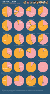
Craig Robinson from Flip Flop Flyin' charted his current existence with the use of pie charts in his Personal Pies project. Although amusing to look through, I think this demonstrates really well how shallow pie charts are, and how much information depth can be lost with charts.

Monday
Sep102007

The Bloomberg Makeover

Three design firms took on the challenge of re-designing the Bloomberg terminal interface, and the results were fantastic. The challenge came from Portfolio.com. The original article is here, but the fantasy terminals are here with an interactive interface that lets you highlight and zoom in on particular features. The design above is from thehappycorp.com and is my personal favorite.

Bloomberg claims to be constantly improving their interface design, but it still looks like runs on DOS and is straight out of the 80's.


Here is the desing from IDEO.com:


And one from Ziba.com:

Monday
Sep102007

Analytics according to Captain Kirk


This is fun one from Matt Bailey, founder of SiteLogic.com.

You can read his full description here, but the point is the use of images in the chart so you can visualize the relationship between separate pieces of information. Phasers represent fights in each episode, Kirk's photo represents affairs during the episode with Captain Kirk and the colored shirts show fatalities of an actor in that colored shirt in that particular episode. Proving once and for all that being a red-shirted ensign is a hazardous job on the Enterprise.

Thursday
Sep062007

Running the Numbers


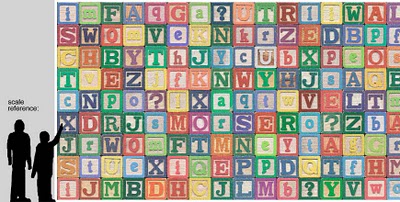
Chris Jordan has created some fantastic photographic artwork depicting the massive scale of some statistics about American life. This is where infographics actually become artwork.

The image above "Depicts nine million wooden ABC blocks, equal to the number of American children with no health insurance coverage in 2007." The complete image is 16 feet tall x 32 feet wide.

There are 17 different images available to view on his website. You can see the images magnified there to show the small pieces that each image is made from. Each image is based on an actual statistic about American life.

FYI: This series will be exhibited at the Paul Kopeikin Gallery in Los Angeles, opening Sep 8. More info at www.paulkopeikingallery.com.

Tuesday
Sep042007

Microsoft Car HUD


Found on arstechnica.com, this one has me really excited. I have been disappointed for at least two decades that real HUDs (Heads-Up Displays) have not become standard, or even available as a third party product for our cars. Now a US patent application from Microsoft has been published showing a possible future HUD for your car.

More than just your speed, with today's technology we should have things like incoming caller-id, compass direction, outside temperature, current playing music title, live GPS map and distance to the car in front of us showing around the edges of our windshields.

We can only cross our fingers and hope that this would some day become a reality.

Monday
Sep032007

VizThink Conference 2008


Early registration to the VizThink 2008 conference will end on September 15th. The conference is in San Francisco Jan 27-29. I won't be able to attend, but I hear that this is a great conference for people who make a living creating visual presentations, infographics, brainstorming sketches, etc.

Out friend David Gray from XPLANE is one of the conference facilitators (speakers).

A big THANKS to the folks at VizThink for adding a link to Cool Infographics on their VizThink Blog!

Sunday
Sep022007

Visual Tire Pressure


Infographics don't have to be complicated. This is a very simple, real-world example of an infographic system to monitor the tire pressure on your car called Accu-Pressure Caps. A set of four gauges screw onto your tire's valve stems, and the air pressure pushes the green indicator completely out. As tire pressure begins to drop, so does the green indicator revealing a yellow indicator, and ultimately the red indicator. The key here is to buy the set of caps to match the tire pressure you want to maintain on your car.

An alternative is from aviationupgrade.com, which is a battery operated version. These always start with the tire pressure when you screw them on, and when the pressure drops by 4psi the LED light on the end starts blinking to get your attention.

Thursday
Aug302007

What does 16 Million colors look like?


From David Naylor's blog, a color map that includes all 16.8 million RGB colors.

Tuesday
Aug282007

A Day of Diggs


This one is really interesting. Stamen Design took one day of digg.com and visualized the user activity. The explanation is really cool, and can be found here on content.stamen.com. Stamen works with Digg on a number of the tools available in Digg Labs.

Red dots represent people that have been on Digg for a while, yellow is a good mix, and blue is new users. So when a story is predominantly blue, it represents a story that is attracting a bunch of new users to Digg.