About
Randy Krum
President of InfoNewt.
Data Visualization and Infographic Design

Infographic Design

Infographics Design | Presentations
Consulting | Data Visualizations

DFW DataViz Meetup

Join the DFW Data Visualization and Infographics Meetup Group if you're in the Dallas/Fort Worth area!

Search the Cool Infographics site

Custom Search

Subscriptions:


Feedburner

The Cool Infographics® Gallery:

How to add the
Cool Infographics button to your:

Cool Infographics iOS icon

- iPhone
- iPad
- iPod Touch


Read on Flipboard for iPad and iPhone

Featured in the Tech & Science category

Flipboard icon

Twitter Feed
From the Bookstore

Caffeine Poster

The Caffeine Poster infographic

Entries in visual (320)

Thursday
Dec132007

The Chicago Tribune Website


From VisualComplexity.com, here's a project that mapped out the Chicago Tribune Website using a Radial Grouping method. It was created by Graham J. Wills at Bell Laboratories, but it looks like the link to the original graphic is down.

Wednesday
Dec122007

NodeTrix: A Hybrid Visualization of Social Networks


NodeTrix was a study of social networks by Nathalie Henry, Jean-Daniel Fekete, and Michael J. McGuffin from France and Canada. Natalie presented their results at the InfoVis conference in Sacramento, CA in November.

Friday
Dec072007

Cooking Infographics


Found on SimpleComplexity.net, Cookz (coo.kz) is a website under development that illustrates recipes with visual infographics. There is an example up now for chocolate chip cookies.

More details are found on flickr, under the user macro girl:

The visual equivalent of a thesis - work from my final semester in Visual Communications.

Tuesday
Dec042007

Apple's Tipping Point: Macs For The Masses


From Paul Nixon on nixlog.com. In 2005, Apple finally released products from both the Mac line and the iPod line that reached the masses. This created the Tipping Point Effect that has rocketed Apple products and stock in the last two years. Rock on!

The Sweet Spot. Until January 2005, Apple had no iPod or PC products that served the mass market. With the launch of iPod Shuffle and Mac mini they have finally converged two product paths with the mass market in mind. This will not only drive more iPod sales (via the Shuffle), but also fulfill the promised "halo" effect of the iPod products as PC users jump to the Mac mini.
Thanks to Karen for the submission

Monday
Dec032007

Infographic Airport Video

I came across this on Janine Swainston's blog:

The animated story of one man's epic journey, created entirely from public domain symbols. In other words, an airport story told in the language of airport infographics.

Saturday
Nov242007

Visualizing the Aging Process


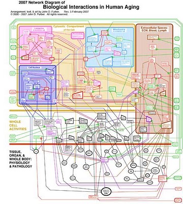
Created by John D. Furber at Legendary Pharmaceuticals, this is a visual representation of the biology behind aging using a network diagram. A large format image is available for printing here.

From VisualComplexity:

John D. Furber of Legendary Pharmaceuticals has put together a visual model of aging referred to as 'The 2007 Network of Biological Interactions in Human Aging' that shows the interactions between various subcellular, cellular, extracellular matrix and organ system. This is a great representation of aging as it demonstrates no root cause but rather a network of problem areas that are interlinked. The goal of systems biology would be to flush this out in great detail allowing one to zoom in down to the specific genomic and proteomic components of aging. Systems biology would also pursue such a model to have a functional runtime component to it such that variables could be tweaked and changes introduced to predict impact elsewhere in the various biological networks.

Thursday
Nov222007

Timeline of Space Exploration


Newsweek has a cool interactive timeline showing all of the 150+ missions sent into space. Its organized by year (of course) but also by object of destination (planet/moon/asteroid). You can click on a year and zoom in to see specific dates of each launch. Rolling your mouse over any dot gives you the name and details of the mission.

Found on Information Aesthetics.

Monday
Nov052007

Visuwords


Visuwords is a new website that visually shows the relationships between words. More than an online dictionary or thesaurus. The relationships are shown graphically like a mind-map.

Visuwords™ online graphical dictionary — Look up words to find their meanings and associations with other words and concepts. Produce diagrams reminiscent of a neural net. Learn how words associate.
Found on LifeHacker.

Wednesday
Oct312007

Stranger Than Fiction

This video is the introduction to the movie Stranger Than Fiction, full of infographics. It's been around for a while, but I thought I would share it too.

Sunday
Oct282007

Where we live...


Found on Data Mining, this is an interactive graphic from Time magazine showing the population density in America as a histogram. Similar to my earlier post on World Population Density, this one focuses on just America, and adds the 3d element to the visual.