About
Randy Krum
President of InfoNewt.
Data Visualization and Infographic Design

Infographic Design

Infographics Design | Presentations
Consulting | Data Visualizations

DFW DataViz Meetup

Join the DFW Data Visualization and Infographics Meetup Group if you're in the Dallas/Fort Worth area!

Search the Cool Infographics site

Custom Search

Subscriptions:


Feedburner

The Cool Infographics® Gallery:

How to add the
Cool Infographics button to your:

Cool Infographics iOS icon

- iPhone
- iPad
- iPod Touch


Read on Flipboard for iPad and iPhone

Featured in the Tech & Science category

Flipboard icon

Twitter Feed
From the Bookstore

Caffeine Poster

The Caffeine Poster infographic

Entries in bubble (10)

Tuesday
Feb062018

The ICO Explosion of 2017

4 Years of ICO Activity infographic

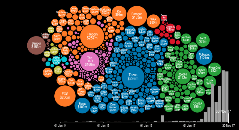
ICO, or Initial Coin Offering, is a method of fundraising that doesn't sell equity of the company, but selling things called "tokens" or new forms of cryptocurrency. The method has been around for years, but the actual boom didn't start until mid 2017.The 4 Years of ICO Activity infographic from The Next Web shows a summary of the investments made. The video version below gives a more detailed timeline of when and where the companies obtained their investments.


Token sales and initial coin offerings (ICO) were certainly the hottest buzzwords of the year for thousands of recreational cryptocurrency enthusiasts and seasoned investors alike. But have you ever wondered precisely how much money was poured into this trend this year? There’s a visualization that can give you an idea.

Cryptocurrency startup Elementus has compiled a nifty animated visualization that shows every token sale that has successfully raised at least $100,000 since 2014. The graph also displays the entire cashflow that went into these ICOs, with detailed month-by-month information for the past four years.

As you will notice in the video below, following some minor activity for the first three years, all hell breaks lose around May 2017. You can see tens of ICOs kick off around the same time, securing millions in financial backing from cryptocurrency enthusiasts and investors.

To put all of this data together, Elementus went straight to the source and collected this information first-hand, gleaning the figures directly from the Ethereum and Bitcoin blockchains.

We searched for every token, crowdsale, and multisig wallet we could find,” wrote Elementus founder and UPenn adjunct lecturer Max Galka. “We then identified the corresponding owners and added up the total amount of contributed funds – taken either from the blockchain itself or as reported by the fundraiser.”

Found on thenextweb.com

Monday
Mar042013

2012 SEO Tactics

2012 SEO Tactics infographic

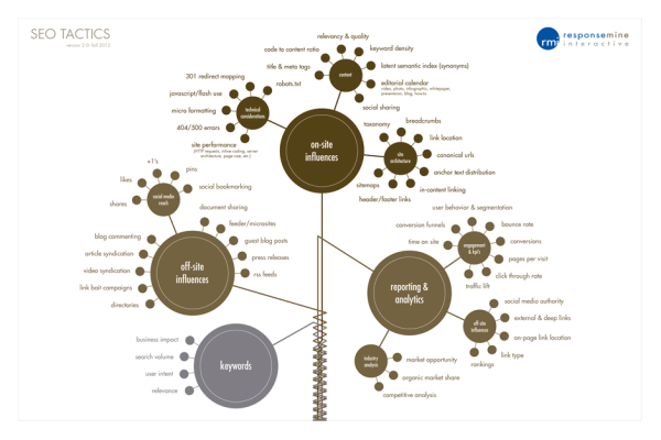
The 2012 SEO Tactics infographic from Response Mine Interactive breaks down the tactics they use to get the highest rankings for their clients in 2012, and expect them to stay the same for the majority of 2013. The four main tactics are on-site influences, off-site influences, reporting & analytics, and keywords.  

These are the components of a dominating SEO campaign. It’s a simple infographic listing and weighting every tactic we employ to gain top rankings for our clients and make them millions of dollars. Expect this chart to stay current through most of 2013.

A Little History

Since 2001, RMI has managed direct response digital marketing campaigns for world class companies like Rooms to Go, The Home Depot, Staples, Travelzoo and Hallmark. 

But does it come in a poster?!

Yes! If you would like a FREE 36x24 color poster simply email your name and address to deborah.fisher@responsemine.com and we will send it to you. 

Free Downloads

The poster and large format graphic was such a huge hit last year we’ve decided to take it a step further, Desktop Wallpaper. Simply choose the size that fits your monitor resolution. It should open in another tab/window then just right-click and save the file locally. Enjoy: 1024x7681280x8001280x10241366x7681440x9001680x10501920x10801920x12002560x1440.

Found on http://visualoop.tumblr.com

Wednesday
Aug312011

Who Owns The Beer Brands?

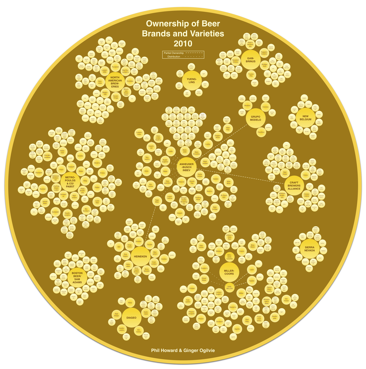
That beer you’re drinking from that cool independent brewery may not be what you think.  Another very cool data visualization from Philip H. Howard and Ginger Ogilvie at Michigan State University called Concentration in the US Beer Industry.  Similar to their last project visualizing the soft drink industry in The Illusion of Diversity, this new project shows the breweries and individual beers owned by the top 13 companies.

There is an appearance of great diversity in the number of brands and varieties of beer sold in the United States. The beer industry, however, is dominated by a relatively small number of firms.

AB InBev owns, co-owns or distributes more than 36 brands, for example, while MillerCoors controls at least 24 more. MillerCoors also brews Metropoulos & Company’s products under contract (thus the company that controls Pabst and 21 other brands is a “virtual” beer company).

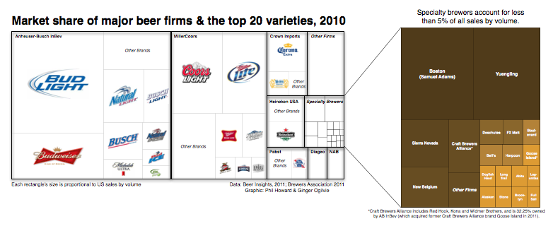
Only meant to show which companies own which beer brands, the three bubble sizes are used to show parent companies, brewery brands and individual beer brands.  They designed a separate treemap visualization to show market share.

Because these are large visualizations, they have posted them within zooming viewers on the Michigan State University site.

Found on Flowing Data.

Thursday
Apr142011

Eat, Drink and Be Thrifty: #infographic video

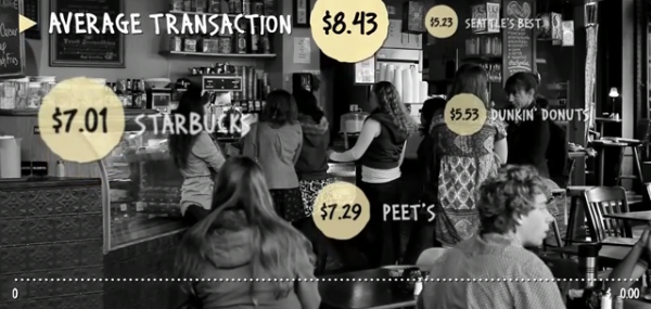
New infographic video from Mint.com,  Eat, Drink and Be Thrify uses their data to visualize the statistics behind monthly spending habits.
So how does your spending on food and dining compare to that of your peers? Using aggregate and anonymized data on Food & Dining spending from Mint.com, we created the video above to highlight some of the most interesting trends we found in Mint’s data, from average transaction at a variety of coffee shops, grocery stores and fast food restaurants, to the time of year when Mint users spend the most — or the least — in those categories.
Thursday
Jan202011

The Illusion of Diversity: Visualizing the Soft Drink Industry


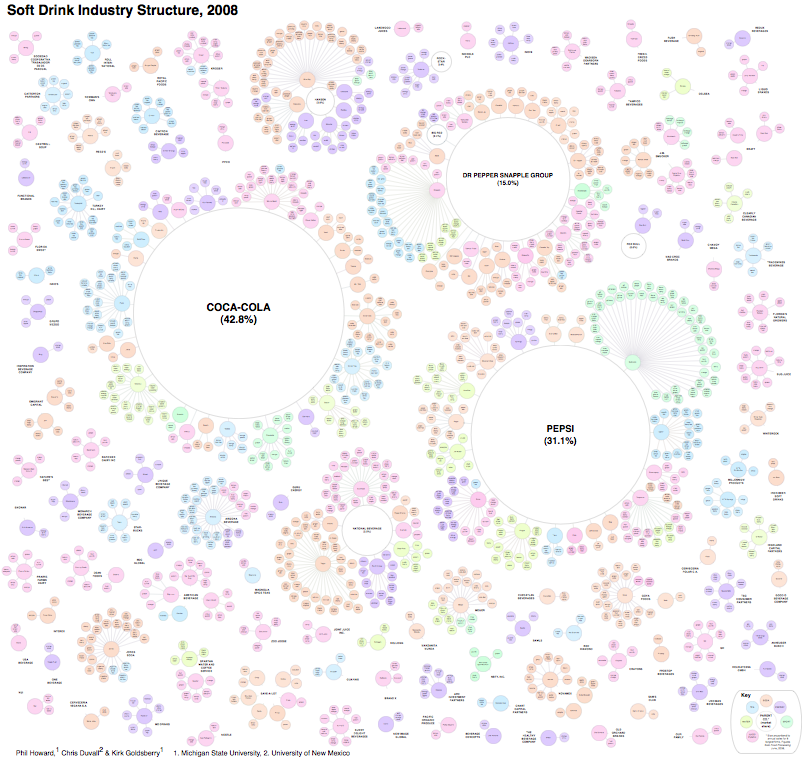
Very cool visualization from Philip H. Howard at Michigan State University called The Illusion of Diversity.  It’s fairly big and hard to read, so I dropped the image link into Zoom.it to create the zoomable image above.  You can see the high-resolution image here, or download the high-resolution PDF here.

Background
Three firms control 89% of US soft drink sales [1]. This dominance is obscured from us by the appearance of numerous choices on retailer shelves. Steve Hannaford refers to this as “pseudovariety,” or the illusion of diversity, concealing a lack of real choice [2]. To visualize the extent of pseudovariety in this industry we developed a cluster diagram to represent the number of soft drink brands and varieties found in the refrigerator cases of 94 Michigan retailers, along with their ownership and/or licensing connections.

Professor Howard’s team did a lot of legwork visiting stores to gather the data, recording 987 different varieties of soft drinks from 94 food retailers in the Lansing, Michigan area.


The statement “Three firms control 89% of US soft drink sales” really means that “89% of the drinks available come from only three firms”.  The distinction is subtle, but there is no sales data included.  This is just an ownership structure.

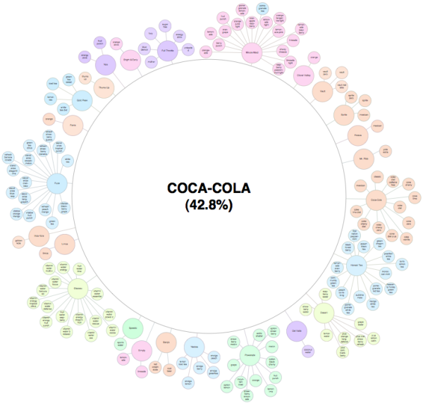
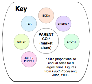
You also have pay attention to what you’re seeing.  The bubble sizes are mixed because the parent company bubbles are sized to the portion of drinks they control, but the size of the individual drink bubbles is consistent and doesn’t convey any meaning.  For the individual drink, the color-coding is what conveys meaning.

Conclusion
The illusion of diversity in the soft drink industry extends beyond obscuring ownership, as its products are primarily water and sweeteners. More research is needed on the links between pseudovariety and the consumption of energy-dense, nutrient-poor substances.

I noticed that this was created using OmniGraffle, which is a vector mapping application that I use a lot.

Found on Infosthetics.com and VizWolrd.com 

Wednesday
Apr292009

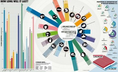
How Long Will It Last?


Good infographic from the New Scientist showing how many years we have left of our key natural resources.  Essentially these are basic bar and pie charts, but dressed up to make the overall graphic more compelling.  The message is still clear though, and the author gets his point across very strongly.

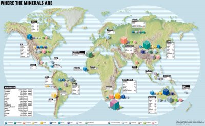
This comes from a 2007 article in the New Scientist called "Earth's Natural Wealth: an Audit" that include two more infographics as well.  The first is a map of where in the world are these natural resources are.


The next is a bubble graphic showing the scale of how much of each resource an average American will consume during their lifetime.


The Source listed on the first infographic: Armin Reller, University of Augsburg, Tom Graedel, Yale University

Found on FlowingData.com and numerous Twitter references.  Thanks Nathan.

Monday
Aug182008

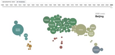
Olympics Medal Count Map


The Medal Count Map from the NYTimes.com show the total number of medals each country has won in every olympics since 1896.  Choose a year on the timeline to animate the graphic.  Rolling your mouse over a country will show the breakdown of Gold, Silver and Bronze medals and clicking will bring up a complete list of the events and medal winners.

Thursday
Jul032008

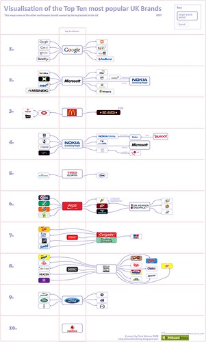
Top 10 UK Brands 2007 Visualisation


Top 10 UK Brands 2007 Visualisation, originally uploaded by visual think map.
Inspired by the infographic "Who Owns the Car Companies" that I originally posted about in October 2007, Chris Watson, from Visualthinkmap.blogspot.com, has created a cool infographic showing the owners for some of the top brands in the UK.

Great job Chris!

Monday
Nov122007

Grokker


It's not new, but Grokker does a good job of searching multiple sites and mapping the data back to the user in visual form.

...a web-based enterprise search management platform that leverages the power of federated content access and visualization to maximize the value of information assets for enterprises, content publishers, libraries and other research-intensive organizations.

Tuesday
Oct232007

Who Owns the Car Companies?

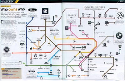
I found three different images showing the complex network of ownership between the automotive companies. Three different attempts at making these complex relationships easier to understand. This first one is a scan from a magazine, but I can't find any reference to which actual magazine it came from. Charted out like a subway map, it's pretty easy to follow.

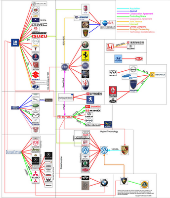
This next one from Too Many Cars is charted like a family tree, or a mind map. It's the easiest the follow, but probably the least aesthetically pleasing. Online the image is broken into smaller pictures so you can zoom closer, but is also available as a large poster in PNG or PDF formats. The data for this one is from 2006, and is the most current of the three.


This last graphic claims to show the ownership mix in the auto industry as a form of bubble chart, but I can't find any date or source data link. I think the bubble sizes represent something, like size of the company or ownership, but I can't tell. So I can't tell how accurate this is. The image is on Tinypic.