About
Randy Krum
President of InfoNewt.
Data Visualization and Infographic Design

Infographic Design

Infographics Design | Presentations
Consulting | Data Visualizations

DFW DataViz Meetup

Join the DFW Data Visualization and Infographics Meetup Group if you're in the Dallas/Fort Worth area!

Search the Cool Infographics site

Custom Search

Subscriptions:


Feedburner

The Cool Infographics® Gallery:

How to add the
Cool Infographics button to your:

Cool Infographics iOS icon

- iPhone
- iPad
- iPod Touch


Read on Flipboard for iPad and iPhone

Featured in the Tech & Science category

Flipboard icon

Twitter Feed
From the Bookstore

Caffeine Poster

The Caffeine Poster infographic

« Olympic History of World Records | Main | Evolution of Olympic Torches »
Monday
Aug182008

Olympics Medal Count Map


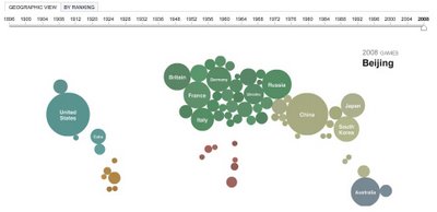
The Medal Count Map from the NYTimes.com show the total number of medals each country has won in every olympics since 1896.  Choose a year on the timeline to animate the graphic.  Rolling your mouse over a country will show the breakdown of Gold, Silver and Bronze medals and clicking will bring up a complete list of the events and medal winners.

PrintView Printer Friendly Version

EmailEmail Article to Friend

Reader Comments (3)

Hi...

If you are looking on doing this type of visualization in excel.. check http://chandoo.org/wp/2008/08/06/olympic-medal-country-year-excel-bubble-chart/

August 18, 2008 | Unregistered CommenterChandoo

The geographic view is a lot of fun. Didn't realize it was emulating where the continents basically are for about a minute.

Very cool

August 19, 2008 | Unregistered CommenterTom

aaa

October 15, 2008 | Unregistered CommenterAnonymous
Editor Permission Required
While we are migrating to a new site design, you must have editing permission for this entry in order to post comments.