About
Randy Krum
President of InfoNewt.
Data Visualization and Infographic Design

Infographic Design

Infographics Design | Presentations
Consulting | Data Visualizations

DFW DataViz Meetup

Join the DFW Data Visualization and Infographics Meetup Group if you're in the Dallas/Fort Worth area!

Search the Cool Infographics site

Custom Search

Subscriptions:


Feedburner

The Cool Infographics® Gallery:

How to add the
Cool Infographics button to your:

Cool Infographics iOS icon

- iPhone
- iPad
- iPod Touch


Read on Flipboard for iPad and iPhone

Featured in the Tech & Science category

Flipboard icon

Twitter Feed
From the Bookstore

Caffeine Poster

The Caffeine Poster infographic

Entries in population (46)

Monday
Mar202017

What 770,000 Tubes of Saliva Reveal About America

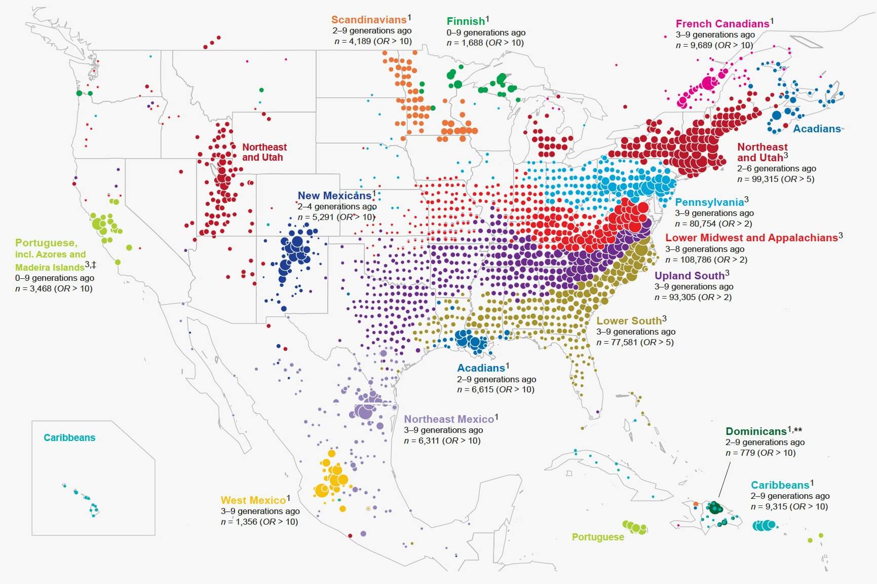
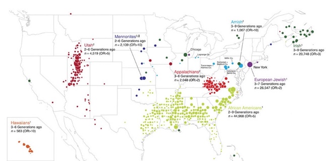
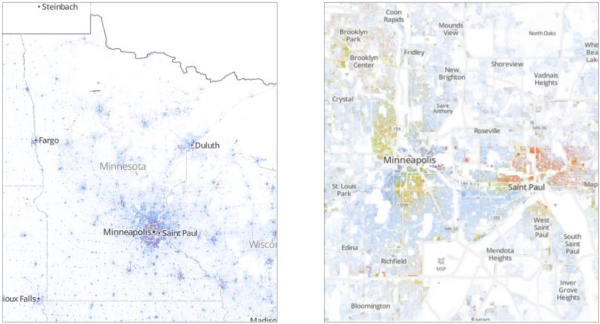
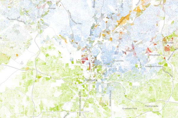
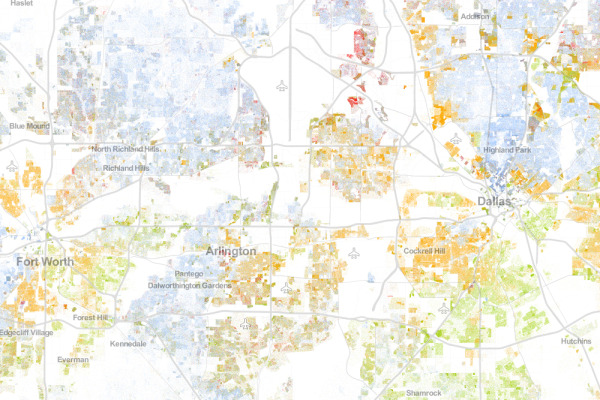
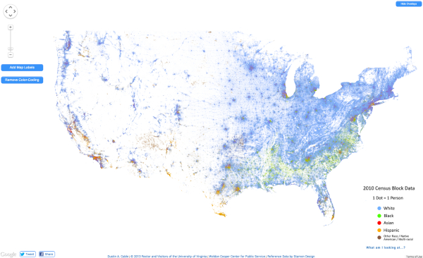
Yep, it's a Map of America’s Diversity using the genetic data from the analysis of saliva samples. Ancestry.com gathed the data from 770,000 salva samples.

This unique map shows this country’s great migrations, the echoes of our pioneer ancestors in our genes today.

Each color on the map represents a present-day community of individuals tied together through their genetics. And the location of the dots show where each community’s ancestors lived over generations.

People moved east to west, less so north to south. See how the differently colored clusters form distinct horizontal bands? The red, blue, purple, and green dots fan out from right to left. This pattern means DNA confirms the descendants of immigrants to the East Coast moved westward.

While people certainly moved back and forth from the north to south as well, if people had moved in the same volume from north to south, you’d see the bands fanning downward and not just from east to west.

But instead you can see powerful forces pushed people westward, even showing that the Mason-Dixon line separates some of the clusters.

Catherine Ball, chief scientific officer at Ancestry and the leader of the study, commented to Wired“I have to admit I was surprised by that. This political boundary had the same effect as what you’d expect from a huge desert or mountain range.”

And not only can you clearly see the migration patterns westward, you can also see distinct communities of immigrants and their descendants.

Maps were generated with the maps R package using data from the Natural Earth Project (1:50 m world map, version 2.0). These data are made available in the public domain (Creative Commons CC0).

Also from the original study:


Monday
Nov072016

Visual History of US Population

Nathan Yau from FlowingData has created a cool, new animated data visualization, Two Centuries of Population, Animated. The visualization shows the growth and spread of 

You’ve likely seen the population density map of the United States in one form or another. A lot of people per square mile reside in big cities, fewer people reside in suburban areas, and a lot fewer people reside in rural areas. Cities weren’t always cities though. Rural wasn’t always rural. If you look at people per square mile over a couple of centuries, you get a better idea of how the country developed.

The animated map above shows population density by decade, going back to 1790 and up to recent estimates for 2015. The time in between each time period represents a smoothed transition. This is approximate, but it gives a better idea of how the distribution of population changed.

Nerd Notes:


  • Nathan used R to generate the maps and FFmpeg to string the images into a video.
  • Data are originally from the Census Bureau but made much more accessible by NHGIS.


Wednesday
Aug032016

Very Few Americans Nominated Trump and Clinton

Designed by Alicia Parlapiano and Adam Pearce for the New York Times, this short series of data visualizations tell a very clear story about how Only 9% of America Chose Trump and Clinton as the Nominees For the 2016 Presidential election.

The United States is home to 324 million people. Each square here represents 1 million people.

103 million of them are children, noncitizens or ineligible felons, and they do not have the right to vote.

88 million eligible adults do not vote at all, even in general elections.

An additional 73 million did not vote in the primaries this year, but will most likely vote in the general election.

The remaining 60 million people voted in the primaries: about 30 million each for Republicans and Democrats.

But half of the primary voters chose other candidates. Just 14 percent of eligible adults — 9 percent of the whole nation — voted for either Mr. Trump or Mrs. Clinton.

Mr. Trump and Mrs. Clinton will be working to win the votes of these three groups. Polls suggest they will be separated by just a handful of squares.

If you follow the news headlines, you might think a majority of Americans are in favor of one of our two Presidential nominees, but that would be a misunderstanding of election and population statistics.

This is a fantastic example of storytelling with data, and walking the audience through the data insight step-by-step.

Found on FlowingData


Thursday
Jun092016

The U.S. Baby Bust

The U.S. Baby Bust fertility rate

The U.S. Baby Bust is shown in 5 line charts by the Wall Street Journal. Sometimes a clean & simple line chart is the best way to show your data.

The general fertility rate fell in 2015 to tie the lowest level on record. Fertility, defined as the number of live births per 1,000 women ages 15-44, has never been lower than the rate recorded last year and in 2013.

It’s no surprise that Americans are having fewer babies than in the years after World War II, when there was an incredible baby boom. And it’s of course well known that people generally have smaller families today than in the past. Add the severe economic recession that began in 2007 to the picture, and you have the elements to push the birth rate to record lows.


The U.S. Baby Bust age groups of mothers

In this second chart showing the various age groups, the rainbow of colors is a little distracting. One way to tell a specific story with this chart would be to only color the lines that have increased over time, and make the rest shades of gray. That would tell the story that the women in their 30's are the dominant growth age groups.

A separate chart highlighting the lines for teens and 20's would better tell the story of women putting off having children until they are older.

Go check out the WSJ article for the other observations they made from the data.

Friday
Jan232015

Equal Population Mapper

Equal Population Mapper Interactive Infographic

Ben Blatt has created the Equal Population Mapper infographic. The interactive version at Slate.com allows you to choose New York City, Los Angeles County, Wyoming, New Jersey, Texas, or the Coastal regions as the target population. Then you select anywhere else on the map and a red circle will appear to show how big of an area you would have to select to have an equal population to your selection.

If you throw in New York City’s other four boroughs, the Big Apple’s total population is just greater than 8 million. That’s about the same number of people who live in Idaho, Montana, Wyoming, North Dakota, South Dakota, Nebraska, and the western half of Minnesota combined.

But don’t let my New York City–centric comparisons hinder your imagination. The interactive at Slate.com lets you visualize how different parts of the country compare in population density.

Click the button at the bottom of the interactive to select Los Angeles County, for instance, and then click anywhere on the map to generate a (roughly) circular region of (roughly) equal population. The population data come from the 2010 census, and the square mileage was calculated by summing each highlighted county’s total area. You can also use New Jersey (the most densely populated state), Wyoming (the least densely populated state outside of Alaska), Texas, the coasts (the group of all counties that come within 35 miles of either the Atlantic or Pacific oceans), and, yes, New York City as the baseline for your population comparison.

Cool interactive map!

Found on Flowingdata!

Friday
Mar212014

Life Expectancy at Birth

Life Expectancy at Birth infographic

The Life Expectancy at Birth infographic by designer Marcelo Duhalde from Muscat, Oman is a fantastic data visualization of the current life expectancies by country if you were born 2013.

Average number of years to be lived by a group of people born last year (2013) if mortality at each age remains constant in the future.  The entry includes total population of both male and female components.

From a design perspective, this infographic tells one story really well.  The infographic focuses on communicating one set of data effectively (lifespan) without complicating the design with additional extraneous information.  The overall design is very attractive, and grabs the audience’s attention with a big, central visual element.  The curving bars are unusual, but have the benefit of condensing the early years so they take less space in the overall design.

At the macro level, it’s obvious there is a big difference between the various countries and continents.  The readers are drawn in to compare the details of the different countries they are familiar with.  Usually starting with where you live, and then looking to see which countries fare better or worse than your location.  Of course the data represents a massive generalization of millions of people, but does tell a great story at that higher level.

The design looks like it’s perfectly sized to be printed as a poster, but I couldn’t find any mention of one.  The sources could definitely be more specific than just listing the top level sites that data was gathered from, and the URL to the infographic landing page on Visualizing.org should have been included in the footer information.

Found on PolicyMic

Thursday
Jan092014

Great Danger for the Great White Shark

Great Danger for the Great White Shark infographic

Most people know of Great White Sharks as a dominant predator, but this powerful shark is actually nearing extinction. The Great Danger for the Great White Shark infographic from Shark Watch SA breaks down the statistics for the few remaining sharks. 

The general perception is that the great white shark population is between 3000-5000. Marine biologists conducted a five year study in Gansbaai (a small town in South Africa with the greatest population of great white sharks in the world) that revealed the population to be approximately 50% of the original estimate. This means great white sharks could be closer to extinction than black rhinos…

The data could of been visualized a little better. The infographic uses a little too much text insead of visuals to portray their data. But overall, an eye-catching graphic.

Thanks to Marine Dynamics for sending in the link!


Tuesday
Sep032013

The Racial Dot Map

The Racial Dot Map Chicago

The Racial Dot Map visualizes the 2010 U.S. Census data, where every individual person is represented by a single, color-coded dot.  The color coding shows the racial groupings gathered by the census.

This map is an American snapshot; it provides an accessible visualization of geographic distribution, population density, and racial diversity of the American people in every neighborhood in the entire country. The map displays 308,745,538 dots, one for each person residing in the United States at the location they were counted during the 2010 Census. Each dot is color-coded by the individual’s race and ethnicity. The map is presented in both black and white and full color versions.

The map was created by Dustin Cable, a demographic researcher at the University of Virginia’s Weldon Cooper Center for Public Service. Brandon Martin-Anderson from the MIT Media Lab deserves credit for the original inspiration for the project. This map builds on his work by adding the Census Bureau’s racial data, and by correcting for mapping errors.

Each of the 308 million dots are smaller than a pixel on your computer screen at most zoom levels. Therefore, the “smudges” you see at the national and regional levels are actually aggregations of many individual dots. The dots themselves are only resolvable at the city and neighborhood zoom levels.

Each dot on the map is also color-coded by race and ethnicity. Whites are coded as blue; African-Americans, green; Asians, red; Hispanics, orange; and all other racial categories are coded as brown.

The map is an interactive, zoomable map online of the entire country, and allows you to explore any U.S. locations.  Chicago is show above.

Since the dots are smaller that screen resolutions where the viewer zooms out, the data is aggregated to pixels at each level of zoom.   The Minneapolis-St. Paul metro area is highlighted on the site as an example of the aggregation.  You can see the more detailed dot pattern on the right at the higher zoom level.

The Racial Dot Map Minneapolis

I would love to see this added as a layer in Google Earth!  Wouldn’t that be cool?

Thanks to Renee for sending in the link!  Also, found on Wired.

Atlanta:

The Racial Dot Map Atlanta


Dallas-Fort Worth:

The Racial Dot Map Dallas Fort Worth


The entire U.S.

The Racial Dot Map USA

Monday
Aug262013

Where Does the Money Go?

Where Does the Money Go? infographic

Where Does the Money Go? from LifeHacker breaks down the average spending habits of U.S. consumers.

The graphic above breaks down how the average US household spends their paycheck, according to the US Department of Labor. As you can see, housing, transportation, and food are the biggest costs. Because they take so much out of our paychecks, it makes sense to concentrate on reducing spending in these areas.

Designed as a infographic piece of a larger article, the design does a good job of focusing on one data visualization.  It also has minimal text because the additional details are all included in the text of the article.

Because the graphic can be shared separately from the article, the infographic should include a mention of the article, LifeHacker’s logo, and the URL back to the original.

Monday
Mar252013

The Water Rich vs The Water Poor

The Water Rich vs The Water Poor infographic

The USA is lucky to be in the top 5 countries that have annual renewable water resources. Because of this, we are very wasteful. This is considered to be “Water Rich”.  For the countires that are considered Water Poor, they do not have the wasteful luxury, in fact 88% of fatal cases are due to inadequate water access. The Water Rich vs Water Poor infographic by seametrics.com tells the story of both water rich countries and water poor countries.

While some might say gold or diamonds, as far as human life goes, water is the world’s most precious commodity.  As the world population increases, and industry continues to expand, Earth’s freshwater reserves are being stretched dangerously thin.  See the disparity in water consumption between wealthy and underdeveloped nations.

This is a good side-by-side comparison design, that has a lot of information.  Maybe too much information, because it can be overwhelming to readers.

Thanks to Ngoc for sending in the link!


Side note: There are only 5 DAYS LEFT to participate in the Cool Infographics Start 2013 Clean charity drive!  If you are able, please visit our campaign on Charity:Water and donate to the cause of providing clear, drinkable water to everyone that needs it.