Where Does the Money Go?
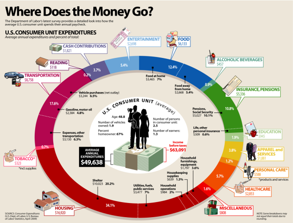
Where Does the Money Go? from LifeHacker breaks down the average spending habits of U.S. consumers.
The graphic above breaks down how the average US household spends their paycheck, according to the US Department of Labor. As you can see, housing, transportation, and food are the biggest costs. Because they take so much out of our paychecks, it makes sense to concentrate on reducing spending in these areas.
Designed as a infographic piece of a larger article, the design does a good job of focusing on one data visualization. It also has minimal text because the additional details are all included in the text of the article.
Because the graphic can be shared separately from the article, the infographic should include a mention of the article, LifeHacker’s logo, and the URL back to the original.


 Randy
Randy

Reader Comments (1)