About
Randy Krum
President of InfoNewt.
Data Visualization and Infographic Design

Infographic Design

Infographics Design | Presentations
Consulting | Data Visualizations

DFW DataViz Meetup

Join the DFW Data Visualization and Infographics Meetup Group if you're in the Dallas/Fort Worth area!

Search the Cool Infographics site

Custom Search

Subscriptions:


Feedburner

The Cool Infographics® Gallery:

How to add the
Cool Infographics button to your:

Cool Infographics iOS icon

- iPhone
- iPad
- iPod Touch


Read on Flipboard for iPad and iPhone

Featured in the Tech & Science category

Flipboard icon

Twitter Feed
From the Bookstore

Caffeine Poster

The Caffeine Poster infographic

« Where Does the Money Go? | Main | Worldwide ATM Cyber Attack »
Friday
Aug232013

The Periodic Table of Alcohol

The Periodic Table of Alcohol infographic

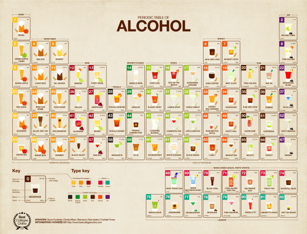
The Periodic Table of Alcohol infographic does a good job of organizing popular alcoholic drinks in the periodic table design format.  Posted on Visual.ly by designer Mayra Magalhães (mayra.artes), 

This infographic shows important information about the most famous alcoholic beverages.

It’s unclear who the infographic was designed for.  The footer of the infographic lists BestCollegesOnline.com, the landing page on Visual.ly lists the Consumer Media Network and the URL actually links to CarInsurance.org.  It looks like this design is a modification of a design from 2011 done for Best Colleges Online called the College Student’s Guide to Boozing.  I’m guessing Mayra uploaded this recently to be included as a part of her design portfolio.

The infographic has been heavily shared, and I found this version on Laughing SquidBusiness Insider, Popular Science, This is Happiness, Geekologie, and Gizmodo.

PrintView Printer Friendly Version

EmailEmail Article to Friend

Reader Comments (7)

I was disappointed when I looked close enough at this graphic to see the elements.

A table of elements should be elements and not compounds.

The periodic table of elements has things grouped by similarity and weight, and you can tell how things will mix by where they fall in the chart. This table doesn't teach anything about how to make a good drink.

If it had elements, such as whiskey, rum, vodka, orange juice, grapefruit juice, etc, and they were grouped so that you could figure out what might mix well then it would be building on a good metaphor. As it is, after looking at it once, there's no value to me in looking a second time.
August 23, 2013 | Unregistered CommenterWilliam C Bonner
William...you need a few drinks, relax...
August 24, 2013 | Unregistered CommenterJeff
i'm agree with William

first time i see the table hope find what i need.
August 25, 2013 | Unregistered Commenterfelix
In above post the infographic designer has done a good job in which he has tried his best to convey very important information about popular beverages (alcoholic). In this diagrame a viewer can get a lot of information without reading tons of pages about this article.
August 28, 2013 | Unregistered CommenterCreating Info Graphics
Great job.Nice table who make that table done a great hardwork.For that its easy to find out the type of brand of drinks..Thanks for the post.
September 2, 2013 | Unregistered Commenterden haag
Great post! A periodic table for fun. but if you want a periodic table, which is a tabular arrangement of the chemical elements, organized on the basis of their atomic numbers, electron configurations (electron shell model), and recurring chemical properties. View an interactive periodic table that has information for all elements. http://myperiodictable.us/
February 23, 2014 | Unregistered CommenterJames
Very well! Nice periodic table.It's a good way to represent chemical elements of popular alcoholic drink. First time ever see this kind of periodic table.
April 5, 2014 | Unregistered CommenterAlison R. Vaughan
Editor Permission Required
While we are migrating to a new site design, you must have editing permission for this entry in order to post comments.