About
Randy Krum
President of InfoNewt.
Data Visualization and Infographic Design

Infographic Design

Infographics Design | Presentations
Consulting | Data Visualizations

DFW DataViz Meetup

Join the DFW Data Visualization and Infographics Meetup Group if you're in the Dallas/Fort Worth area!

Search the Cool Infographics site

Custom Search

Subscriptions:


Feedburner

The Cool Infographics® Gallery:

How to add the
Cool Infographics button to your:

Cool Infographics iOS icon

- iPhone
- iPad
- iPod Touch


Read on Flipboard for iPad and iPhone

Featured in the Tech & Science category

Flipboard icon

Twitter Feed
From the Bookstore

Caffeine Poster

The Caffeine Poster infographic

Entries in animals (11)

Friday
Aug262016

Animal Migrations In Motion

Animal Migrations In Motion

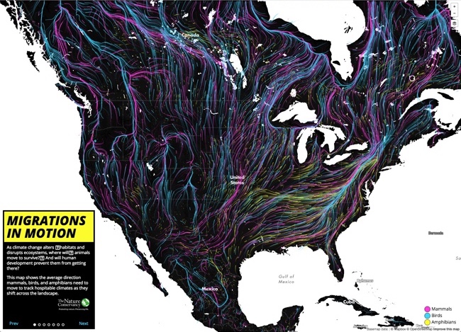
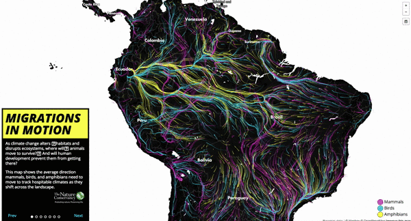
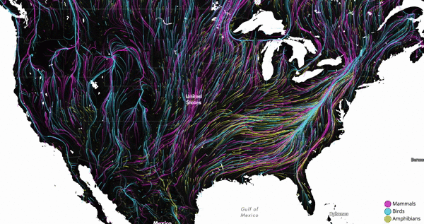
Animal Migrations In Motion is a fantastic animated & interactive data visualization of the predicted migration patterns of almost 3,000 species in North and South America as our climate changes.

As climate change alters 
habitats and disrupts ecosystems, where will
 animals move to survive?
 And will human development prevent them from getting there?

This map shows the average direction mammals, birds, and amphibians need to move to track hospitable climates as they shift across the landscape.

Researchers from University of Washington and The Nature Conservancy modeled potential habitat for 2954 species using climate change projections and the climatic needs of each species.

This map was created by Dan Majka, who works for The Nature Conservancy's North America Region science team.

This visualization would not have been possible without the incredible prior work of the hint.fm wind map, cambecc's earth wind map, and Chris Helm's adaptation of cambecc's code.

It's mesmerising to watch! Just like some of the prior designs that inspired this one listed above. It's interactive, so you can move and zoom the part of the map being shown.

The description does leave a few unanswered questions. For instance:

  • What time period is being shown here?
  • What predicted climate changes and assumptions are being used?
  • What species are shown and how were they chosen?

Found on FlowingData!

Monday
May232016

Dogs Hate Hugs

Dogs Hate Hugs infographic

The Dogs Hate Hugs infographic from Pet Insurance U reveals the surprising fact that dogs really don't like being hugged.

This infographic shows humans why, in spite of this whole hugging fiasco, dogs are still your best friends. Do dogs hate hugs? Researchers studied pictures of humans hugging dogs, and 81.6% of the dogs showed visible signs of distress, discomfort, stress or anxiety.

Designed by NowSourcing, this is a good example of an infographic highlighting an insight that is probably surprising to the audience. Infographics should share some insight or knowledge learned from data research that will actually teach the readers something new.

I have one major issue with the way they visualized their data. The statistic of "Oxytocin levels rise by 57.2% when dogs play with their owners" is visualized with a non-zero baseline, making the increase in the bar chart appear to by a 10x difference. This visualization is extremely misleading. Don't adjust the scale of the y-axis to over-emphasize a change in the data!

Thanks to Brian for sending in the link!

Thursday
May192016

Sizing Up Sharks

Sizing Up Sharks infographic National Geographic

The design team at National Geographic has published a beautiful size comparison infographic: Sizing Up Sharks, the Lords of the Sea. The parallax scrolling keeps you, the reference deep sea diver, in frame as a comparison to provide perspective for each of the various types of sharks.

Sharks range in size from largest fish on the planet to the length of your palm. See how you compare to some of these vulnerable predators that are so crucial to the ocean's health.

The tooth Illustrations are not in scale with the fish, but all the teeth are in scale to each other to show relative tooth sizes. For some reason, only a few of the smaller sharks species are shown with both the small end and high end of their size ranges.

Sizing Up Sharks infographic Great White

This engaging infographic tells one story really, really well without adding too much other data that would have cluttered the design. The diver animation and underwater sounds are a nice touch.

Thanks to Chiqui Esteban (@chiquiesteban) for posting the link!

The massive Megalodon!

Sizing Up Sharks infographic Megalodon

Tuesday
Oct212014

Where Do Designer Dogs Come From?

Where Do Designer Dogs Come From? infographic

Where do Cocker Bassets come from? The answer is from a Cocker Spaniel and a Basset Hound! Where Do Designer Dogs Come From? infographic from Time explains the breeding patterns behind the multiple breeds of dogs.

Morkies. Cockapoos. Chiweenies. These dogs may not have serious names, but they’re a serious business. Known as ‘hybrid’ or ‘designer’ dogs, these canines are bred with a purpose – to optimize the best qualities of each parent.

Unlike some mixed breeds, designer dogs are generally born from two purebred parents. Depending on the qualities of the offspring, one puppy can be like having two dogs in one. Labradoodles, for instance, were first bred from labradors (which are common guide dogs) and poodles (with a low-shed coat) to be hypoallergenic service dogs. Puggles – a cross between a pug and a beagle – usually have a muzzle of a beagle, which can eliminate breathing problems often associated with the short-nosed pug.

Not all hybrids are desirable. Designer-dog critics says genetic experimentations are exacerbating the problem of puppy mills. For instance, when a puggle inherits a short snout from a pug and the hunting instincts from the beagle, it may not have a respiratory system that’s equipped to handle all the exercise it needs. These unwanted dogs often end up in shelters.

Despite the controversy, designer breeds have made a mark on the $60 billion pet market by commanding high prices that often exceed their purebred counterparts. And so long as the market continues to demand them, cavachons, pekeapoos and schnoodles are here to stay.

Bright, colorful network connections between breeds makes for a good infographic. curved, winding connections draw in readers to follow their favorite breeds.

The circle sizes have no meaning, just sized to fit the text within, which is misleading.  Disappointingly, the stats they do have are not visualized at all. The URL to the infographic landing page should be included in the footer so readers can find the full-size original version when they find this posted on other sites that don’t include a link.

Thanks to Sue for sending in the link!

Thursday
Jun122014

The Evolution of Life Poster

The Evolution & Classification of Life poster

This beautiful “tree of life” poster does two things at once:

First, it shows how over 250 common plants, animals, and microbes are classified by biologists into domains, kingdoms, phyla, orders, families, and genera.

Second, it shows where each group fits into the evolutionary history of life according to the most up-to-date genetic research.

It also includes several extinct groups, featuring artwork by paleo-artists John Gurche and Nobu Tamura.


A “Tree of Life” in a 24” X 36” poster form, The Evolution & Classification of Life poster was designed by Matt Baker from Useful Charts, and and can be purchased on Amazon for $24.95.

There is good use of color to help organize the tree and allow the reader to understand the major section breaks.  Having the pictures of the animals as the main focus of the tree, rather than their names keeps the poster clean and not too cluttered.

Great job Matt!

Thursday
Jan092014

Great Danger for the Great White Shark

Great Danger for the Great White Shark infographic

Most people know of Great White Sharks as a dominant predator, but this powerful shark is actually nearing extinction. The Great Danger for the Great White Shark infographic from Shark Watch SA breaks down the statistics for the few remaining sharks. 

The general perception is that the great white shark population is between 3000-5000. Marine biologists conducted a five year study in Gansbaai (a small town in South Africa with the greatest population of great white sharks in the world) that revealed the population to be approximately 50% of the original estimate. This means great white sharks could be closer to extinction than black rhinos…

The data could of been visualized a little better. The infographic uses a little too much text insead of visuals to portray their data. But overall, an eye-catching graphic.

Thanks to Marine Dynamics for sending in the link!


Friday
May102013

Shark Attack!

Shark Attack! infographic

Shark Attack! is a great infographic design collaboration between Ripetungi and Joe Chernov.  Based on data from a Huffington Post article, 100 Million Sharks are Killed Annually.

Recently received a Facebook message from content marketing wizard Joe Chernov linking to the Huffington Post article 100 million sharks are killed annually.  This was an astonishing fact and the enormity of the number made it difficult to wrap your head around.  Joe also shared an idea for a graphic to add context to this fact making it easier to comprehend, while exposing the outrageous ratio of the number of people sharks kill to the number of sharks people kill.

Great data visualization that shows readers the magnitude and scale of how many sharks are killed by humans every hour.  It also puts the 11,417 sharks killed value into context by comparing it against the 12 humans killed by sharks every year.  [EDITED]

Don’t get me wrong.  I’m convinced that death by shark attack would be a horrible way to go, but some days it’s good to be at the top of the food chain on Earth.

Thursday
Jan172013

The Cheetah Animated Infographic

The Cheetah Animated Infographic

The Cheetah infographic introduces to you nature’s speed machine from Jacob O’Neal (jacobneal.com). Learn about how each body part is important to the Cheetah and why you don’t want to be on this mammal’s menu.

Did you know that cheetahs can accelerate from 0 to 60 MPH faster than a Ferrari? The amazing cheetah is the perfect example of natural specialization. They’re made for speed. Such a beautiful animal deserves a closer look!

This is definitely a cool infographic design!  I really like this use of the animated GIF image file format.  Seriously!  I REALLY like this design.  Animated GIFs have been used and abused for decades, but the use of animation here is done in a way that is very visually appealing.  It actually adds to the value of the content, and catches your attention.

One issue with animated GIF image file infographics is social sharing.  Not all social media and photo sharing services can support the animated format, so you also need a static JPG image as a backup for anyone that want to share with those service.

Thanks to Chris for sending in the link!

Monday
Dec102012

The Christmas Bugs: Adopt-A-Bug this holiday

The Christmas Bugs infographic

The Christmas Bugs infographic from Adopt-A-Bug and ChristmasTreeMarket.com helps raise awareness of the plight many bugs face as the weather begins to get cold.  This Christmas bring some tiny friends in from the cold and into your warm home when you buy a live Christmas tree for the holidays!

Adopt-A-Bug this year for the holidays!  Bringing a live tree into your home is like inviting the great outdoors into your living room.  Here are a few new friends you can make that will decorate your tree and light up your life, plus some statistics to share over your eggnog.

The design combines facts and statistics about the different types of bugs that actually live in the trees that most people use as Christmas trees.  I love the fun approach to raise awareness that there is a real risk to bringing a live Christmas tree into your home.  Check out the Adopt-A-Bug site to see all of the party bugs that you can save this Winter by bringing them into your home!

Designed by InfoNewt with designer Ray Vella, this infographic gets all the key design points right.  Nice 3-part story throughout the design, including a clear call-to-action at the end.  Copyright statement, clear sources and the URL to the infographic landing site.

Tuesday
Apr102012

How Animals See The World

Ever wonder how you look to your dog or cat? Or how about the shark as he swims towards you? (Lets hope  you haven’t thought of the second one…) Well have no fear, all your answers lie within the How Animals See The World infographic from Mezzmer

Have you ever stopped and wondered what version of the world your beloved dog or cat sees the world in?  How is their perception colored and how do they perceive you?  Most of us take for granted the gift we are granted with sight, but it may surprise some of you to find out that many animals actually have much better vision than we do.  In fact, some see the world with some precision and accuracy, they put our eyesight abilities to complete shame.  Read on to learn more about the unique ways our animal friends see the world…

The design is longer than I like for infographic, but the content is fascinating.  Not many data visualizations, but I really appreciate the designer showing comparisons between what a human sees, and the equivalent view from the animals. 

Mezzmer is an eyeglass online retailer, so this infographic topic is information relevant to their business without feeling like an ad.  A great topic selection for a Marketing infographic.

Thanks to Christina for sending in the link!