About
Randy Krum
President of InfoNewt.
Data Visualization and Infographic Design

Infographic Design

Infographics Design | Presentations
Consulting | Data Visualizations

DFW DataViz Meetup

Join the DFW Data Visualization and Infographics Meetup Group if you're in the Dallas/Fort Worth area!

Search the Cool Infographics site

Custom Search

Subscriptions:


Feedburner

The Cool Infographics® Gallery:

How to add the
Cool Infographics button to your:

Cool Infographics iOS icon

- iPhone
- iPad
- iPod Touch


Read on Flipboard for iPad and iPhone

Featured in the Tech & Science category

Flipboard icon

Twitter Feed
From the Bookstore

Caffeine Poster

The Caffeine Poster infographic

Entries in GIF (6)

Wednesday
Apr182018

Animated Visualization of First Leaf Appearance

Animated Visualization of First Leaf Appearance

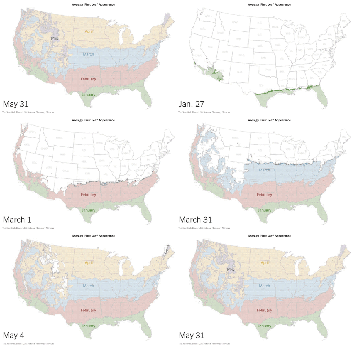
Spring is coming! Jeremy White at the NY Times has animated data from the USA National Phenology Network showing the average dates of "first leaf" across the U.S.

In some cases, an animated data visualziation is better at communicating the data to the audience than a static design. This animation clearly shows the progression of Spring across the country and you can understand the data within seconds.

Thursday
Sep152016

Introduction to Software for Magazine Design

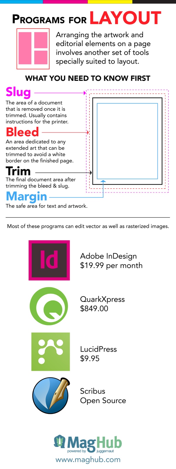
If you are interested in publishing a magazine, the Magazine Software for Design infographic from Maghub is a good tool to help you get started. The infographic tells you the difference between vector and pixel artwork, and then recommends some programs to use in your process.

Magazine publishing software can be confusing. This infographic will help you understand what to be looking for when choosing software for magazine design.

Quick read, with all the basics you need to get started. Just like a good infographic should be. For some reason they broke the infographic into 3 separate sections as separate JPG images. This makes it MUCH harder for readers to share!

Thanks to Aaron for sending in the link!

Friday
Aug212015

Visual Storytelling: The Big Trend for SXSW 2016

It’s only August, but voting is already underway for the March 2016 South By Southwest (SxSW) Interactive conference. Long thought of as the breeding ground for new ideas and creative technologies, we can gleam industry insights from the SXSW Interactive Festival. This year, I decided not to wait until the conference to delve into the veritable buffet of groundbreaking panels vying for festival space. This year’s PanelPicker interface received more than 4,000 proposals, which is an all-time record!

While a quick search of infographics yields only 11 results, a mere TWO actually have the word “Infographics” in the title. The industry discourse has shifted away from “how-to” models to “how to do it right.” Infographics have become a key format of the larger conversation: Visual Storytelling.

A quick search for “Visual Storytelling” yields over 200 talks in PanelPicker, along with hundreds more for “data visualization” and “visual content”.  Infographics are now used as one of many effective tools in the Marketer’s toolbox, and an accepted part of the larger conversation happening in the content marketing industry.

Visual storytelling is vital to content marketing success. The following types of visual content are at the forefront of the proposals for next year’s SXSW Interactive Festival.

1.    Animated GIFs
Source: Animagraffs by Jacob O'Neal

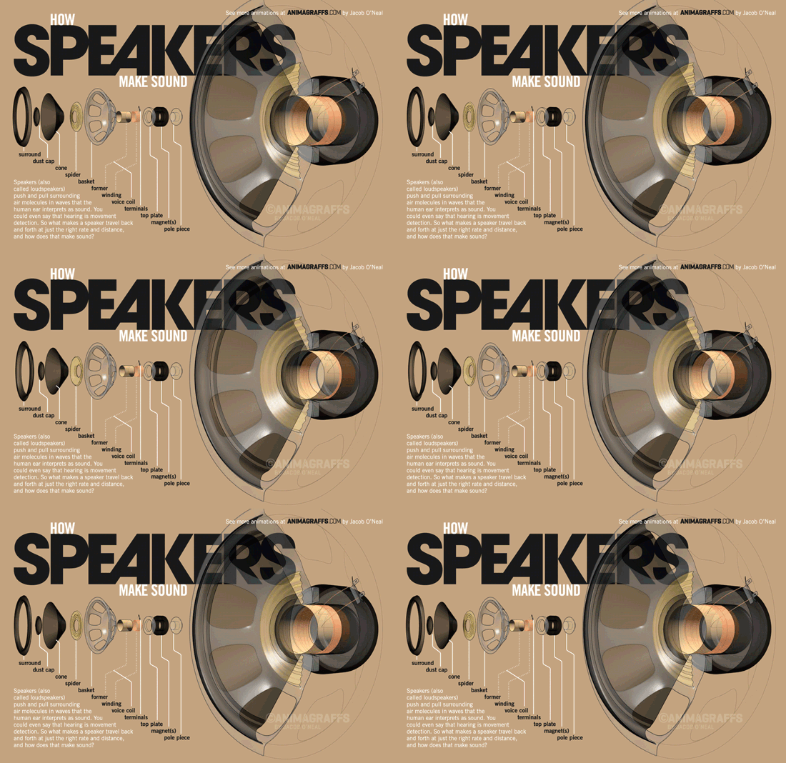
The social media world has been slow to adopt GIFs, with Facebook only just embracing the truncated clips this year. The average human attention span in 2015 is 8.25 seconds, so these bite-sized animations are the perfect for telling a complete story in a short amount of time. The motion in the image also captures attention on an already crowded news feed.

Check out these GIF-centric presentations, “Why GIFs are turning into the New Emojis on Mobile” and “Visual Storytelling - GIFs, Graphs, and Napoleon.


2.    Visual Presentations

Slideshare and other presentation-style platforms provide a visual and interactive way to share lots of information. With millions of visitors per month, Slideshare is an easy way to have your presentations seen by a large audience.

Perfect your visual presentations with “Sucking Less When Presenting Creative” and “The Power of Poise: Chi for Pitch and Presentation.”     


3.     Real-time storytelling

Real-time storytelling has increased in popularity with the rise of live feed social platforms like Periscope and Meerkat. The ease of execution and the sheer scope of the audience made these two platforms instantly successful. While Meerkat took the prize for most buzzed app at last year’s SXSW, Periscope has the weight of Twitter behind it and has become the more successful of the two.

Use these two tools to live broadcast your events, host a Q&A, or even share professional tips to a larger audience. Perfect your live-streaming with the “Live Streaming Killed Cable TV Star” and “Igniting Creativity with Periscope” PanelPicker proposals.

Twitter Periscope

Source: AdWeek


4.    Infographics

I couldn’t get through my list without mentioning infographics. Still one of the best ways to convey complex information in a shareable and visually appealing format, infographics should be worked into your content marketing strategy. While they are no longer the only way to tell a visual story, they remain a marketing industry staple.

Round out your visual storytelling prowess with great infographics. Learn how to rock your next infographic with my own proposal, “7 Deadly Sins of Infographics Design and How to Fix Them.

The Process of Designing an Infographic


Source: Visme 

Buzzword or not, visual storytelling is something we’ve all been doing since we first snapped a picture with a polaroid camera, we’re just getting better at it. Judging by PanelPicker entries alone, the 2016 SXSW Interactive Festival will be another great year for the content marketing industry.

Tuesday
May122015

How to Make an Animated GIF Infographic

How to Make an Animated GIF Infographic Part 1

How to Make an Animated GIF Infographic Part 2

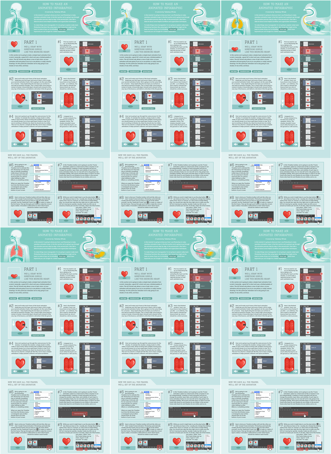
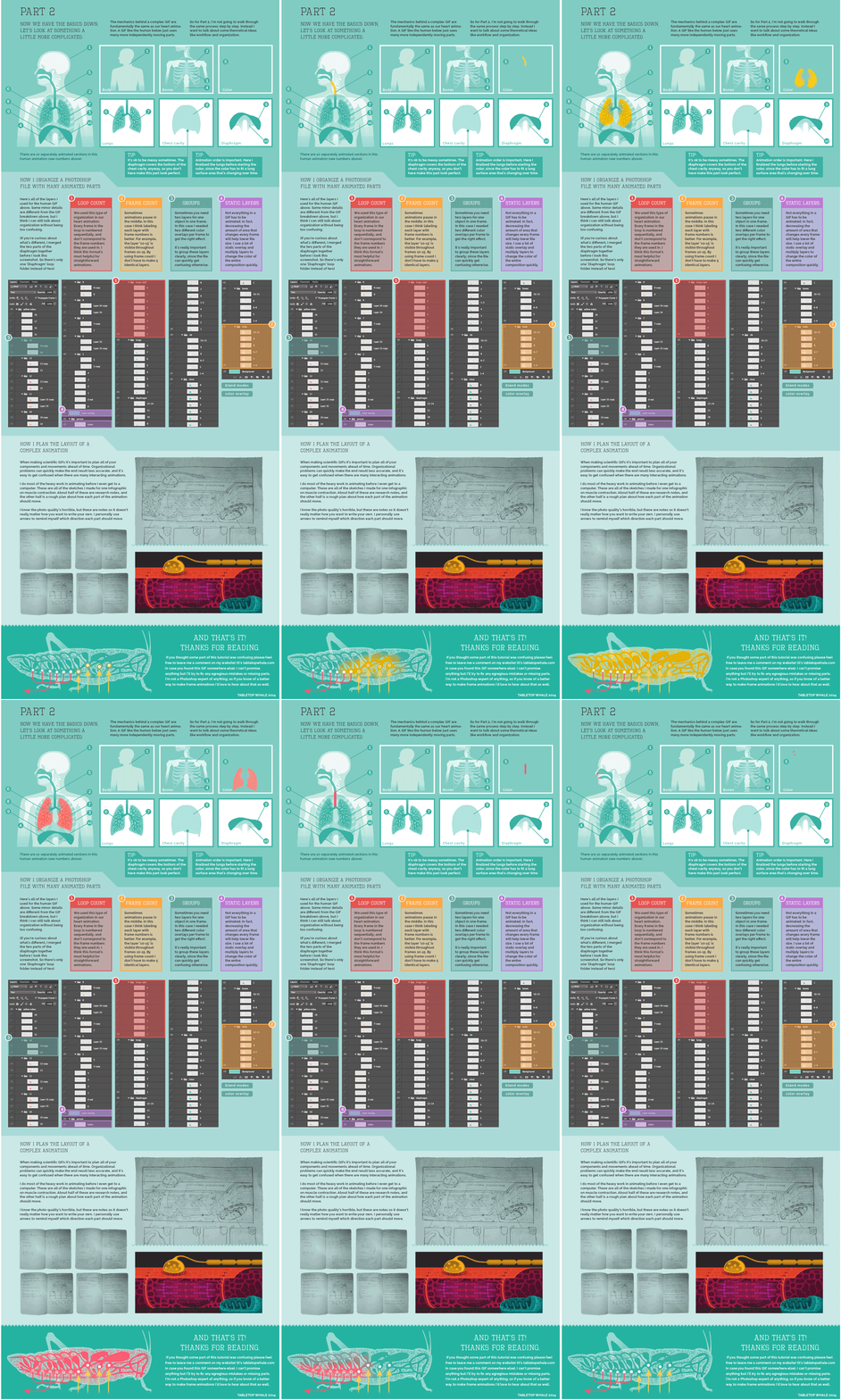
Eleanor Lutz has done some amazing design work with her company Tabletop Whale. She is known especially for her work creating animated infographics using animated GIF files. She has posted How to Make An Animated Infographic as a 2-part explanation that lays out her process in Photoshop (as an animated GIF file of course!).

Recently I’ve been getting a lot of emails asking for a tutorial on how to make animations. So this week I put together a quick explanation for anyone who’s interested. I archived it as a link on the menu bar of my website, so it’ll always be easy to find if you need it.

This is just a run-through of my own personal animation workflow, so it’s not a definitive guide or anything. There are plenty of other ways to make animations in Photoshop and other programs.

I’ve never tried making a tutorial about my own work before, so sorry in advance if it’s confusing! Let me know if there’s anything I wrote that didn’t make any sense. I’ll try to fix it if I can (though I probably don’t have room to go into detail about every single Photoshop function I mention).

I’m seeing more infographics as animated GIF image files online. Their advantage is that they are a self-contained image file that’s easy to share. No need for embed code or Javascript for readers to share the animation on other sites or social media.

I met Eleanor recently at the Malofiej Infographics World Summit, where she gave an amazing talk about her animated designs, her process, and even some discussion about when not to use animation. Check out the video interview with Eleanor by Visualoop at the conference:

Also found on VizWorld

Monday
Apr272015

Flight Patterns Deconstructed

Flight Patterns Deconstructed Animated Infographic

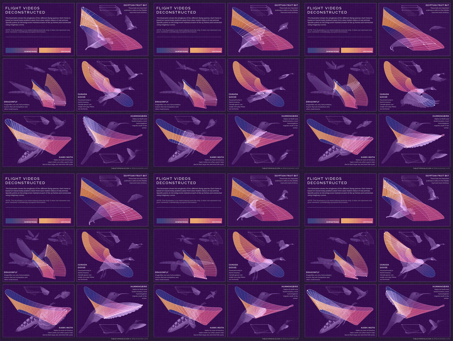
Flight Videos Deconstructed is a fantastic animated infographic design by Eleanor Lutz at TabletopWhale. Eleanor is a designer from Seattle and has a Bachelor's in molecular biology from the University of Washington. She used to work in a research lab teaching mosquitoes to fly through mazes.

This week's post isn't entirely scientific, but I thought I'd upload it anyway since it's related to animals and patterns in nature.

When I worked in an insect lab as an undergrad, I helped out with an experiment about mosquito larvae. As part of the process we used a Matlab program to manually input the larva's location during thousands of video frames.

It was a fun experiment, and I wanted to make something similar from Youtube videos. I found slow-motion videos of five flying species, and mapped out specific points on the wings during one wingbeat. I ended up with 15 frames per wingbeat, and I connected every frame using imaginary curves that went through all of the 15 mapped points.

Of course, 15 frames isn't nearly enough for any kind of factual conclusion, so this week's post is just an art exercise. But hopefully you can enjoy this as an artistic pattern based on real life :)

Animated infographics distributed as animated GIF image files are making a resurgence, and I believe it's because they are easier to share online than videos or embed code for javascript animations. They work best when the animation adds valuable context and aids the audience to better understand the information.

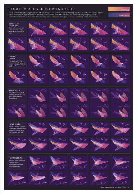
The design is also available as a printed poster that shows the flight patterns by breaking out the wing motion into multiple images.

I had the pleasure to meet Eleanor in March at the Malofiej Infographics World Summit in Spain, where her design won a Silver medal in the online design category. The design work she is doing is amazing, and her talk on animated infographics was one of the highlights of the conference.

Thursday
Jan172013

The Cheetah Animated Infographic

The Cheetah Animated Infographic

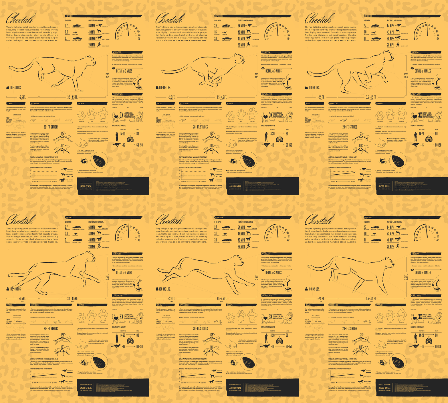
The Cheetah infographic introduces to you nature’s speed machine from Jacob O’Neal (jacobneal.com). Learn about how each body part is important to the Cheetah and why you don’t want to be on this mammal’s menu.

Did you know that cheetahs can accelerate from 0 to 60 MPH faster than a Ferrari? The amazing cheetah is the perfect example of natural specialization. They’re made for speed. Such a beautiful animal deserves a closer look!

This is definitely a cool infographic design!  I really like this use of the animated GIF image file format.  Seriously!  I REALLY like this design.  Animated GIFs have been used and abused for decades, but the use of animation here is done in a way that is very visually appealing.  It actually adds to the value of the content, and catches your attention.

One issue with animated GIF image file infographics is social sharing.  Not all social media and photo sharing services can support the animated format, so you also need a static JPG image as a backup for anyone that want to share with those service.

Thanks to Chris for sending in the link!