About
Randy Krum
President of InfoNewt.
Data Visualization and Infographic Design

Infographic Design

Infographics Design | Presentations
Consulting | Data Visualizations

DFW DataViz Meetup

Join the DFW Data Visualization and Infographics Meetup Group if you're in the Dallas/Fort Worth area!

Search the Cool Infographics site

Custom Search

Subscriptions:


Feedburner

The Cool Infographics® Gallery:

How to add the
Cool Infographics button to your:

Cool Infographics iOS icon

- iPhone
- iPad
- iPod Touch


Read on Flipboard for iPad and iPhone

Featured in the Tech & Science category

Flipboard icon

Twitter Feed
From the Bookstore

Caffeine Poster

The Caffeine Poster infographic

Entries in beer (19)

Thursday
Jan112018

Abita Beer Release Calendar 2018

Abita Beer Release Calendar 2018

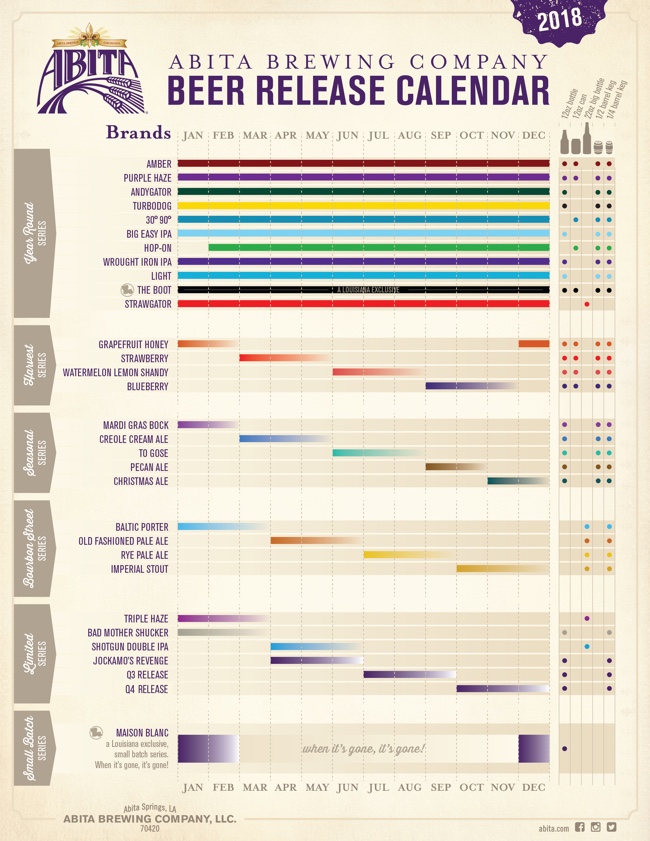
In case you're not familiar with Abita Beers, it's a fantastic brewery out of Louisiana. In addition to a core set of beers, they make a number of seasonal brews that are only available certain times of the year. This visual Beer Release Calendar is your visual guide to when you favorite brews are in season!

The new year is here and we're looking forward to another great year of brews! We've been hard at work behind the scenes planning for 2018 and wanted to share some of what we've been working on. Our 2018 Beer Release Calendar is everything we'll be releasing and boiled down to one single sheet. It's our brew bible! Of course, most of your favorites are back, but as you'll see we're bringing some beers you might recognize out of retirement and releasing a ton of new beers. In all, we'll brew and package 31 beers in 2018 and that's not counting the tons of beers we'll be experimenting with and releasing on our pilot system here at the brewery.

I really like this design. The colors come from the individual beer labels, and I appreciate the additional visualization of the available sizes. I appreciate the repeated guide to the monthly column at the bottom. The cursive font, rotated 90° is hard to read.

The gradient bars are a nice touch since those brews don't have a hard end date, they're only available until supply runs out. It looks like the designer accidentally left a few of those as gradient to white instead of gradient to the background tan color.

Monday
Nov272017

These 5 Giant Companies Control the World's Beer

These 5 Giant Companies Control the World's Beer infographic

These 5 Giant Companies Control the World's Beer infographic created by Visual Capitalist illustrates the "illusion of choice" idea. Even if a bar has 50 beers on tap, those beers and their breweries are owned by another bigger company, and there are only 5 of them! 

The next time you hit your local pub, the odds are that the pint of beer you order will come from one of five global beer conglomerates.

Together, they own hundreds of the best-known domestic, import, and craft beer brands all over the world, in pretty much any country you can name. Whether you are seeking a smooth pilsner, a creamy stout, or an old-fashioned ale to whet your whistle, this multi-national beer oligopoly has got you covered.

THE BIG FIVE

Until recently, there were actually six big conglomerates: AB InBev, SAB Miller, MolsonCoors, Heineken, Diageo, and Carlsberg. 

However, in mere weeks that will no longer be true. The world’s two largest beer companies – AB InBev and SAB Miller – are merging into one massive megabrewer. The deal, which is worth a hefty $107 billion, is expected to close by October 2016.

When it is all said and done, the merged company will have a brand portfolio that will be the envy of the industry: Budweiser, Corona, Stella Artois, Hoegaarden, Pilsner Urquell, Foster’s, Shock Top, Elysian, and Beck’s are just some of the flagship brands involved. 

That will be after likely divesting several key brands such as Blue Moon and the entire Miller line of beers to appease antitrust regulators.

THE ILLUSION OF CHOICE

As we said previously when we posted the infographic showing the illusion of choice in consumer brands, we believe it is important for you to be aware of who is supplying the different brands and goods served at your dinner table.

Each dollar you spend is a vote – make sure it goes to a product and company that you believe in.

This type of design is commonly called a "Landscape", in this case it's the Landscape of Beer Companies. They are good for showing groupings of companies, products or brands, but I'm generally not a fan because they can become too complex. This one does a good job keeping the content simple and delivering a clear message that readers can easily understand.

Found on Dailyinfographic.com.

Monday
Aug282017

The Perfect Temperatures for Beer, Wine, Coffee and More

The Ideal Temperature for Beer, Coffee, and More infographic

The Perfect Temperatures for Beer, Wine and Beverages from GB Energy Supply is no longer visible on their site, but I was able to find it on LifeHacker.

I really appreciate infographics that tell one story really well. You want the information to be clear and easy to understand for the audience. Personally, I wish it was also available in Fahrenheit.

Wednesday
Feb102016

Beer Pairings Simplified

Beer Pairings Simplified infographic

Beer Pairings Simplified is from the menu at BJ's Restaurant and Brewhouse. An infographic in the wild found IRL! A great visual guide to beer types, colors and suggested food pairings.

Beer may actually be more food-friendly than wine. There is certainly more flavor variety and it has an amazing capacity to pair with all kinds of foods BJ's encourages you to experiment. There are no wrong answers, but here are a few things to consider:

This is definitely simplified information, because the different types of beer can actually vary in color quite a bit. However, I think this design does a great job of simplifying complex information and helping the restaurant's guests make good decisions. Seasoned or expert beer drinkers will want more detailed, complex information, but this visual guide will probably be enough information for the majority of readers.


Beer Pairings Simplified Menu Photo

Tuesday
Sep162014

Beer Colors

Beer Colors Cans Visualization Infographic

Beer colors is a fun design idea that combines packaging design with beer label design, these beer label designs imitate Pantone® color chips.  Maybe more of a data visualization of colors than a true infographic, but I love it!

Concept and design based on the color of the beer. Each type of beer is associated with its corresponding Pantone color. The typeface chosen is HipstelveticaFontFamily in its bold version by José Gomes, thanks for sharing.

Designed by Spanish creative agency Txaber, this series of beer packaging labels show each brew type represented by its corresponding official color. 

Beer Colors Bottles Visualization Infographic

Found on creativebloq and BoingBoing


Monday
Oct142013

The Magnificent Multitude of Beer

The Magnificent Multitude of Beer infographic poster

The Magnificent Multitude of Beer is a cool new poster design from Pop Chart Lab.

This wall map is the most complete charting of beer ever, breaking down ales and lagers into over 100 delicious styles from hoppy IPAs to fruity lambics, and including over 500 individual beers as notable examples of each style as well as glassware recommendations. The Magnificent Multitude of Beer captures the proud work of hundreds of breweries around the world, clocks in at a staggering 60 inches by 40 inches, and is the perfect finishing touch for your man cave or lady lair.

SALE today only!  The team at Pop Chart Lab has a 15% OFF Everything sale for Columbus Day (October 14).  Use the code COLOMBO at checkout to get the discount.  The code is valid until 12:30pm EST tomorrow.

Friday
Aug232013

The Periodic Table of Alcohol

The Periodic Table of Alcohol infographic

The Periodic Table of Alcohol infographic does a good job of organizing popular alcoholic drinks in the periodic table design format.  Posted on Visual.ly by designer Mayra Magalhães (mayra.artes), 

This infographic shows important information about the most famous alcoholic beverages.

It’s unclear who the infographic was designed for.  The footer of the infographic lists BestCollegesOnline.com, the landing page on Visual.ly lists the Consumer Media Network and the URL actually links to CarInsurance.org.  It looks like this design is a modification of a design from 2011 done for Best Colleges Online called the College Student’s Guide to Boozing.  I’m guessing Mayra uploaded this recently to be included as a part of her design portfolio.

The infographic has been heavily shared, and I found this version on Laughing SquidBusiness Insider, Popular Science, This is Happiness, Geekologie, and Gizmodo.

Friday
Aug172012

The Awesome Tower of Beer!

Roth IRA The Awesome Tower of Beer infographic


The High Life in a new infographic from RothIRA.com that visualizes the awesome tower of beer you could buy if you were to save just $1 per day starting at age 25.

Getting older has its benefits—how about all the beer you can drink? All it takes is a dollar a day (and a really, really large fridge).

Want to learn more about a Roth IRA?

Designed by InfoNewt (my company), this design follows the strategy of telling one story really well.  There are hundreds of charts online showing the power of compound interest and why people should invest early for retirement.  We took a different approach to put the power of those savings into terms that young adults are more likely to relate to…BEER!

Thanks to the team at RothIRA.com for being great to work with!

Thursday
Mar222012

The Health Benefits of Guinness vs. Beer

The Health Benefits of Guinness vs. Beer is a new infographic from the team at GoIreland.com.  Primarily focused on calories, this infographic does a good job at visualizing comparisons.

We at GoIreland have rustled up a useful infographic about Guinness and other beers. But not just any infographic about booze. We recognize that folks in the 21st century are more health conscious than ever, so have combined these two facets to look at the health benefits of Guinness vs. other types of beer.

Whether you enjoy the dark stuff, or lean towards lager, the results show that a pint of one, or the other, can have positive effects on various areas of the body, such as the heart, bones and even your skin. Through painstaking research, we even worked out how many individual peanuts each drink is the equivalent to eating, how long it would take to burn off those calories and taken a look at some of the strongest beers known to mankind.

This infographic is really well designed, and it’s focused on one of my favorite drinks in the world!  The visual comparison between Guinness and a handful of light beers is clear and easy to read.  However, when they start comparing to “Regular Beer” it’s unclear what brand they are using as the average beer and where that data comes from.  I like the Running and Dancing comparisons that are fun and make understanding the differences easier to an average reader.

The only visualization error I see is the circles on the world map.  Circles have to be sized by their AREA, so if we assume the Ireland circle is the correct baseline, then the circles for values of 0.06 and 0.02 would only be a couple pixels wide.  The circles in the design are shown larger than their actual values, which is a false visualization.

At the bottom, I wish there was a URL to the original landing page for readers to get back to the original, and some form of copyright statement.

Thanks to Oli for sending in the link!

Here is an alternate, shorter and in my opinion “better” version.  What do you think?


Wednesday
Aug312011

Who Owns The Beer Brands?

That beer you’re drinking from that cool independent brewery may not be what you think.  Another very cool data visualization from Philip H. Howard and Ginger Ogilvie at Michigan State University called Concentration in the US Beer Industry.  Similar to their last project visualizing the soft drink industry in The Illusion of Diversity, this new project shows the breweries and individual beers owned by the top 13 companies.

There is an appearance of great diversity in the number of brands and varieties of beer sold in the United States. The beer industry, however, is dominated by a relatively small number of firms.

AB InBev owns, co-owns or distributes more than 36 brands, for example, while MillerCoors controls at least 24 more. MillerCoors also brews Metropoulos & Company’s products under contract (thus the company that controls Pabst and 21 other brands is a “virtual” beer company).

Only meant to show which companies own which beer brands, the three bubble sizes are used to show parent companies, brewery brands and individual beer brands.  They designed a separate treemap visualization to show market share.

Because these are large visualizations, they have posted them within zooming viewers on the Michigan State University site.

Found on Flowing Data.