About
Randy Krum
President of InfoNewt.
Data Visualization and Infographic Design

Infographic Design

Infographics Design | Presentations
Consulting | Data Visualizations

DFW DataViz Meetup

Join the DFW Data Visualization and Infographics Meetup Group if you're in the Dallas/Fort Worth area!

Search the Cool Infographics site

Custom Search

Subscriptions:


Feedburner

The Cool Infographics® Gallery:

How to add the
Cool Infographics button to your:

Cool Infographics iOS icon

- iPhone
- iPad
- iPod Touch


Read on Flipboard for iPad and iPhone

Featured in the Tech & Science category

Flipboard icon

Twitter Feed
From the Bookstore

Caffeine Poster

The Caffeine Poster infographic

Entries in comapnies (2)

Monday
Nov272017

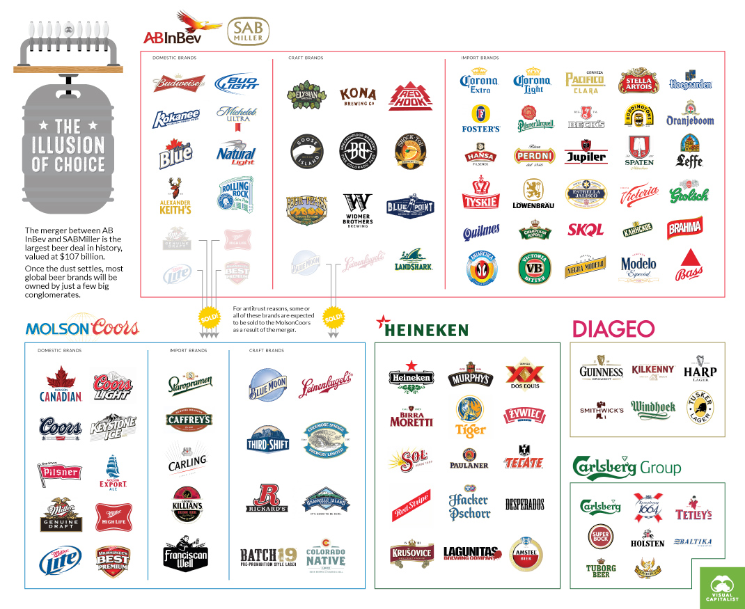
These 5 Giant Companies Control the World's Beer

These 5 Giant Companies Control the World's Beer infographic

These 5 Giant Companies Control the World's Beer infographic created by Visual Capitalist illustrates the "illusion of choice" idea. Even if a bar has 50 beers on tap, those beers and their breweries are owned by another bigger company, and there are only 5 of them! 

The next time you hit your local pub, the odds are that the pint of beer you order will come from one of five global beer conglomerates.

Together, they own hundreds of the best-known domestic, import, and craft beer brands all over the world, in pretty much any country you can name. Whether you are seeking a smooth pilsner, a creamy stout, or an old-fashioned ale to whet your whistle, this multi-national beer oligopoly has got you covered.

THE BIG FIVE

Until recently, there were actually six big conglomerates: AB InBev, SAB Miller, MolsonCoors, Heineken, Diageo, and Carlsberg. 

However, in mere weeks that will no longer be true. The world’s two largest beer companies – AB InBev and SAB Miller – are merging into one massive megabrewer. The deal, which is worth a hefty $107 billion, is expected to close by October 2016.

When it is all said and done, the merged company will have a brand portfolio that will be the envy of the industry: Budweiser, Corona, Stella Artois, Hoegaarden, Pilsner Urquell, Foster’s, Shock Top, Elysian, and Beck’s are just some of the flagship brands involved. 

That will be after likely divesting several key brands such as Blue Moon and the entire Miller line of beers to appease antitrust regulators.

THE ILLUSION OF CHOICE

As we said previously when we posted the infographic showing the illusion of choice in consumer brands, we believe it is important for you to be aware of who is supplying the different brands and goods served at your dinner table.

Each dollar you spend is a vote – make sure it goes to a product and company that you believe in.

This type of design is commonly called a "Landscape", in this case it's the Landscape of Beer Companies. They are good for showing groupings of companies, products or brands, but I'm generally not a fan because they can become too complex. This one does a good job keeping the content simple and delivering a clear message that readers can easily understand.

Found on Dailyinfographic.com.

Thursday
Mar082012

Airbnb's Global Growth

Airbnb has released a fantastic infographic, Airbnb’s Global Growth, sharing their own stats about their phenominal growth from August 2008 to February 2012.

Airbnb started in Brian and Joe’s San Francisco apartment. Today, more than five million nights have been booked on Airbnb. And although Airbnb’s roots are in the USA, more than 75% of all reservations last year were international - where either the traveler or host (or both!) was outside the United States. Check out our infographic celebrating the international growth that you’ve powered.

I think an infographic is a great way for a company to share it’s story with it’s executives, it’s shareholders, the press and the public in general.  Infographics are visual storytelling, and every company has a story to tell.

The design is beautiful!  They’ve included a wide variety of data visualization types: area chart, doughnut chart, maps, bars and illustrations.  The one complaint I have is that too many of the stats are just shown in large text.  Large fonts don’t make good data visualizations.

They made an interesting choice and included the URL for a separate page on their website about the Airbnb service, instead of linking back to the original infographic.  I know they want to promote their service, but I think this is a mistake, because a reader has to search through their blog posts to find the infographic.  A couple things missing from the bottom: a copyright statement and credit to the designer.

Thanks to Slavik for sending in the link!