About
Randy Krum
President of InfoNewt.
Data Visualization and Infographic Design

Infographic Design

Infographics Design | Presentations
Consulting | Data Visualizations

DFW DataViz Meetup

Join the DFW Data Visualization and Infographics Meetup Group if you're in the Dallas/Fort Worth area!

Search the Cool Infographics site

Custom Search

Subscriptions:


Feedburner

The Cool Infographics® Gallery:

How to add the
Cool Infographics button to your:

Cool Infographics iOS icon

- iPhone
- iPad
- iPod Touch


Read on Flipboard for iPad and iPhone

Featured in the Tech & Science category

Flipboard icon

Twitter Feed
From the Bookstore

Caffeine Poster

The Caffeine Poster infographic

Entries in interactive (29)

Thursday
Jul192018

Interactive Infographic From Coca-Cola Spain

Coca-Cola Spain is using the tool ThingLink to add animation and interactivity to their marketing infographics. ThingLink allows you to create "hotspots" that pop-up additional images, text and even videos.
Description: Coca-Cola Spain masters the art of digital storytelling by using interactive infographics on their blog.  In addition to it's attractive design, this infographic captures viewer attention with the use of motion (via GIFs).  In the infographic below, Coca-Cola shares how they have driven employment and progress in Spain since 1953. 

Wednesday
May242017

Interactive Cocktail Shaker

Interactive Cocktail Shaker interactive infographic

David McCandless and the team at Information Is Beautiful have created this impressive Guide to Cocktails in both interactive and static versions.

75+ classic cocktail recipes from the International Bartender’s Association’s list of drinks every bartender should know.

Forget old-school measures like ml and oz. We’ve calculated our own universal metric. One of any ingredient represents one part of any measuring vessel you choose: cup, spoon, lid, shoe, whatever – it’s your party! These universal recipes scale up for any level of mayhem. Enjoy! Um…responsibly of course.

Select the booze in your cabinet: our 'measurement agnostic' interactive will conjure the rest.

All of their designs are very Data Transparent, and they have made all of the data from this design available in this Google Spreadsheet listed in the footer for anyone to see.

Wednesday
Jan042017

2016 The Year In Colour

The Year in Colour Brand Union Infographic

The Year In Colour from Brand Union looks back at 2016 and the dominant colors from the news stories every day of the year.

This year, we chose to depart from traditional season’s greetings (elves toiling in grottoes) in favour of something equally fantastical: an algorithm. We scanned the news media and identified dominant colours from leading headlines for each day of 2016.

However, it is important to note that no matter how far AI has come, it cannot replace human sentiments. Sentiments like wishing you Happy Holidays and our warmest wishes for a delightful New Year. This, we are happy to do in the traditional way: from the heart.

The design is interactive. Each dot will show you the dominant news story of the day when you hover over it, and clicking takes you directly to the article and the images used to determine the colors.

I'm not sure why the rows are 14 dots across; 2-weeks of days. This would have been a little easier to navigate if it matched the 7-day row layout of a standard calendar. Instead, the months are separated, but the dots are just shown as sequential days.

Thanks to Brianna for sending in the link!

Tuesday
Aug162016

Animated and Interactive Global Shipping Visualization

This is a fantastic detailed animated and interactive data visualization of the world's Global Shipping Traffic.

You can see movements of the global merchant fleet over the course of 2012, overlaid on a bathymetric map. You can also see a few statistics such as a counter for emitted CO2 (in thousand tonnes) and maximum freight carried by represented vessels (varying units).

The merchant fleet is divided into five categories, each of which has a filter and a CO2 and freight counter for the hour shown on the clock. The ship types and units are as follows:

  • Container (e.g. manufactured goods): number of container slots equivalent to 20 feet (i.e. a 40-foot container takes two slots)
  • Dry bulk (e.g. coal, aggregates): combined weight of cargo, fuel, water, provisions, passengers and crew a vessel can carry, measured in thousand tonnes
  • Tanker (e.g. oil, chemicals): same as dry bulk
  • Gas bulk (e.g. liquified natural gas): capacity for gases, measured in cubic metres
  • Vehicles (e.g. cars): same as dry bulk

The map was created by Kiln based on data from the UCL Energy Institute (UCL EI)

You can hide the route lines and just watch the ship dots move over time. It's mezmerizing!

Thanks to Jim Hopkinson and Bill Gates for sharing on Twitter!

You can see the interactive version embedded here, or click here to take you to the full-size original site:


Wednesday
Jul132016

Global Connectivity Ranking

Global Connectivity Ranking interactive infographic world London

The Global Connectivity Ranking from Rome2rio includes a beautiful interactive data visualization showing how connected we are on a global scale. Above you can see the direct flight connections from London, the most connected city on Earth.

Just how connected are our cities?  How do we measure such connections?  How do these connections change over time?

To answer these questions, my research team at KPMG collaborated with Rome2rio to produce the Global Connectivity Ranking. We ranked all 1,212 cities on the planet which operate international airports.

The Rome2rio Global Connectivity Ranking reflects the number of international cities that a city is connected to through direct flights. It measures connections from city to city - not airport to airport. For example, the connection count for London reflects how many cities outside the UK that can be reached from any of London's 6 international airports. Rankings were computed using Rome2rio's global transit data from April 2014 and January 2016.

Choose any city on the list to animate to direct flight connections. The size of the bubbles over each city also represent the total number of connections from that city.

The default is the world view, but can also choose to focus on a single continent. Here you can see the connection from Chicago when zoomed in to only North America.

Global Connectivity Ranking interactive infographic North America Chicago


Thursday
May052016

Next Generation Interactive Scientific Poster

The Next Generation Scientific Poster project by The Muthesius Academy of Fine Arts and Design in Kiel, Germany takes scientific data visualization and designed a physical, interactive interface for audiences. As a result, they founded The Science Communication Lab as a spin-off from the academy so they could offer this expertise to researchers in the scientific community all over the world.

Check out this video demonstration on YouTube:

From their description:

The classical poster does often not offer enough space for the sheer complexity of the contents – texts, pictures, graphs and tables – used to convey scientific research today which causes inability to communicate contents and statements concisely. The classical poster also lacks an appropriate possibility for continuous updates which are necessary to include newer research results and would do justice to today‘s constant changes of information. 

The interactive poster is a a new method of presenting scientific topics in an attractive way, offering the user an easier access to the contents and a clearly improved possibility of comprehension. The illustrated topics are supposed to function self-explanatory and long-lasting which means that the viewer can decide on the depth and duration of the information process.

The interactive poster can be used for various purposes: For the internal demonstration of the research projects (poster sessions), on expert conferences and conventions in an international context. The newly developed technology -LED displays with a touch frame- can be used in a more reliable and long-lasting way than conventional projection technologies.

Thanks to Pieter Torrez from Scigrades for the link and his interview article with Professor Tom Duscher

Thursday
Apr282016

All 30,699 career shots by Kobe Bryant


The LA Times created a fantastic interactive data visualization of every shot taken by Kobe Bryant during his career. All 30,699 of them!

Kobe Bryant's 30,699th and final field goal came from 19 feet with 31 seconds left against the Utah Jazz. During his 20 years with the Lakers, he fired up more than 30,000 shots, including the regular season and playoffs.

Take a tour of key shots over his 20-year career, or explore the makes and misses over his long career on your own.

The data is sourced from stats.nba.com, and the visualization was build with leaflet and cartodb. The reader can hover over any specific dot to see the details of each shot. It's not obvious, but you can adjust the court image on the right to view the shots from the other end of the court. Color-coded for made and missed shots, you can also Tour the Data to see the most significant shots from his career, like his final shot:

Similar visualization style to the BallR visualization I posted about a few weeks ago.

For the serious fan, it's also available for purchase as a poster version for $59.95, which include more stats and visualizations from his career.

Found on FlowingData!

Monday
Mar282016

BallR: Interactive NBA Shot Charts

BallR: Interactive NBA Shot Charts

BallR: Interactive NBA Shot Charts is a tool built by Todd W. Schneider that takes the NBA's Stats API data and creates a visual representation of an NBA player's season. You can pick any NBA player and season to create the shot chart. The above infographic is an example of a hexagonal chart of Stephen Curry's Field Goal Percentage (FG%) relative to the league average within each region of the court during the 2015–16 season.

The NBA’s Stats API provides data for every single shot attempted during an NBA game since 1996, including location coordinates on the court. I built a tool called BallR, using R’s Shiny framework, to explore NBA shot data at the player-level.

BallR lets you select a player and season, then creates a customizable chart that shows shot patterns across the court. Additionally, it calculates aggregate statistics like field goal percentage and points per shot attempt, and compares the selected player to league averages at different areas of the court.

Hexagonal charts, popularized by Kirk Goldsberry at Grantland, group shots into hexagonal regions, then calculate aggregate statistics within each hexagon. Hexagon sizes and opacities are proportional to the number of shots taken within each hexagon, while the color scale represents a metric of your choice, which can be one of:

  • FG%
  • FG% vs. league average
  • Points per shot

Scatter charts are the most straightforward option: they plot each shot as a single point, color-coding for whether the shot was made or missed. Here’s an example again for Stephen Curry


Heat maps use two-dimensional kernel density estimation to show the distribution of a player’s shot attempts across the court.

Anecdotally I’ve found that heat maps often show that most shot attempts are taken in the restricted area near the basket, even for players you might think of as outside shooters. BallR lets you apply filter to focus on specific areas of the court, and it’s sometimes more interesting to filter out restricted area shots when generating heat maps. For example here’s the heat map of Stephen Curry’s shot attempts excluding shots from within the restricted area (see here for Curry’s unfiltered heat map).

Built using R's Shiny framework, I really like this interactive dataviz. The code designed to create this was also published on GitHub so anyone can check it out and try your own modifications. Very cool!

Found on Flowing Data.

Monday
Jan252016

Building Responsive Data Visualization for the Web

Building Responsive Data Visualization for the Web book cover

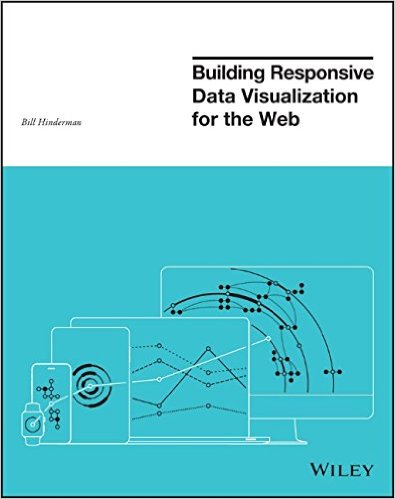
Building Responsive Data Visualization for the Web by Bill Hinderman is a new book that just came out in November. I had the pleasure of helping Bill as the Technical Editor on the book last year, and I can say it's a fantastic guide to structuring your data and building your code for interactive data visualizations that work perfectly on every screen size.

January Giveaway! This month I am giving away one signed copy to a randomly chosen winner. Register on the GIVEAWAYS page by 11:59pm CT on January 31, 2016 to be entered. A winner will be randomly selected on February 1st.

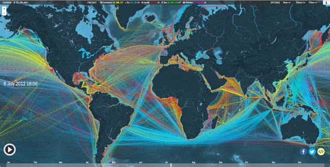
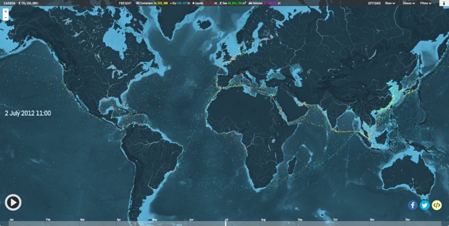
Data is growing exponentially, and the need to visualize it in any context has become crucial. Traditional visualizations allow important data to become lost when viewed on a small screen, and the web traffic speaks for itself – viewers repeatedly demonstrate their preference for responsive design. If you're ready to create more accessible, take-anywhere visualizations, Building Responsive Data Visualization for the Web is your tailor-made solution.

Building Responsive Data Visualization for the Web is a handbook for any front-end development team needing a framework for integrating responsive web design into the current workflow. Written by a leading industry expert and design lead at Starbase Go, this book provides a wealth of information and practical guidance from the perspective of a real-world designer. You'll walk through the process of building data visualizations responsively as you learn best practices that build upon responsive web design principles, and get the hands-on practice you need with exercises, examples, and source code provided in every chapter. These strategies are designed to be implemented by teams large and small, with varying skill sets, so you can apply these concepts and skills to your project right away.

Responsive web design is the practice of building a website to suit base browser capability, then adding features that enhance the experience based on the user's device's capabilities. Applying these ideas to data produces visualizations that always look as if they were designed specifically for the device through which they are viewed. This book shows you how to incorporate these principles into your current practices, with highly practical hands-on training.

  • Examine the hard data surrounding responsive design
  • Master best practices with hands-on exercises
  • Learn data-based document manipulation using D3.js
  • Adapt your current strategies to responsive workflows


I asked Bill to answer a few questions about his book:

Who is the book intended for?

The book is for a development and design team that is looking to shift toward responsive, mobile-first practices.  While it's certainly geared most toward data visualization projects, the book spends a hefty amount of time building responsive design tenets before then getting specifically into visualization.


What’s the most important thing to make a great data visualization?

In my mind, the most important thing in making a great data visualization is the output being actionable.  The goal of a visualization is always to make something more clear, right?  All of the data is already...there, in its raw form.  So the initial goal, the more achievable goal, is clarity. But making something clear, and then also making it actionable - that is - pushing the reader/viewer/user toward actually doing something with the data, is where greatness shows up.


Do you see everyone moving towards responsive data visualization, or are a lot of companies holding back?

No, I actually don't.  I see a huge amount of people holding back, really with the same reasoning that plagued responsive design in its early stages.  That being: "People don't want to do that on mobile."  Which is, quite frankly, ridiculous.  Every study Pew has put out (I reference plenty of them in the book) shows that as soon as someone is given the opportunity to do something on mobile, they do it.  Moreover, there's an increasing amount of mobile-only users, rather than simply mobile-first.  Very soon, desktop users are going to be seen as an antiquated, legacy type of use case, rather than the default.


What's the difference between Responsive Data Visualization and Responsible Data Visualization?

Responsive data visualization is the practice of building data visualizations in such a way that they adapt, respond to, and feel natural regardless of whatever device type a user is accessing them with, and whatever the data set looks like.  In this way, it is the responsible way to visualize data.  So...there isn't one, I suppose.


What do you mean in the book by “Think Small”?

So a concept that's very closely tied to responsive design is thinking mobile-first.  That is: designing first for your most limited use case: a small screen, a bad network, sloppy, finger-based gestures.  In data visualization, we actually have an even more limited use case: no screen at all.  That's where building a good API comes into play.  Thinking of the smallest, most limited use case, say, an external call to your API from a different website, and building toward that first.  That way, as you gain real estate, features, bandwidth, you are simply enhancing something that already has a great foundation.


What are your thoughts on D3.js and its future?

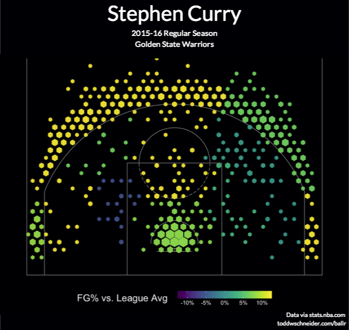
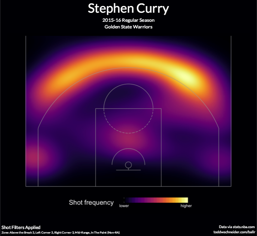
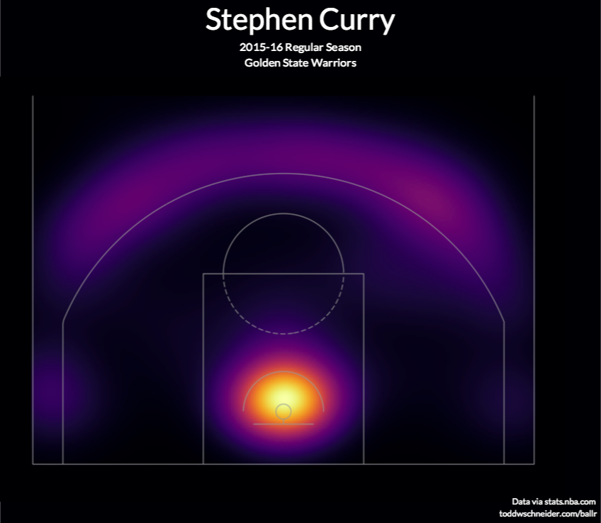
It's the best, and I love it and if I could, I would shower it with chocolates.  D3.js is, if you're able to devote a development resource to learning it, the absolute best way to create a visualization on the web, because it uses all the languages of the web.  Because it isn't some applet, or some plugin, or some...image, I suppose, it just works intuitively like you are building normally for the web.  Because of this, I think the future is bright.  Even if it were never to be updated again (which isn't the case), it would still implicitly grow in functionality as web languages evolve and grow around it.


What’s available for readers on the book website: http://responsivedatavisualization.com/?

The website has snippets from every chapter of the book, along with exercises and code samples that go along with the practice sections in the chapters.  All of the code links to GitHub, and can be forked, built locally, and compared with solutions.


Are you speaking at any upcoming presentations or webinars?

I am!  I'll be speaking at Strata + Hadoop World San Jose in March (http://conferences.oreilly.com/strata/hadoop-big-data-ca).


Where’s the best place to follow you online?

The best places to follow me online are my own website (billhinderman.com), LinkedIn (linkedin.com/in/williamHinderman), or Twitter (twitter.com/billHinderman).


Friday
Nov202015

Histography

Histography

Histography is a timeline created by Matan Stauber that visualizes every moment in history from Wikipedia as a steel ball. You can navigate the timeline by using a slider to determine what time period you would like to see. Then simply place the courser over a ball to read an event! It is very easy to navigate and tons of fun. Go to Histography to visit the full imteractive site.

Below is an article from Fast Co Design that explains the process in detail.

If every moment in human history was a single steel ball, Histography is like an 4-D Newton's Cradle, visualizing how all of these events bump up and knock up against each other on a 14-billion-year time frame. It's beautifully hypnotic—and impressively, it's all sourced from Wikipedia, which means that it keeps on updating itself.

Created by Matan Stauber, Histography is an interactive timeline spanning the Big Bang to whatever was in the news yesterday. It basically draws all historical events from Wikipedia, visualizing each as a black dot. You can click on each dot to get more information about the event it represents. These dots are then ordered chronologically from left to right, with simultaneous events being stacked vertically on top of each other. The result is that the Histography looks something like a pointillist sound wave, growing and shrinking according to how noisy a year, era, or epoch was.

There's a number of different ways you can browse Histography. The default view shows every historical event from Wikipedia's database at once, which you can then filter down by category: for example, by literature, politics, assassinations, and so on. But I think the 'Editorial Stories' view (accessible by clicking the Histography logo) is more interesting. It represents Wikipedia's database as a nearly endless spiral, which you can descend through scrolling, zooming right down to the Big Bang.

Found on FastCo Design