About
Randy Krum
President of InfoNewt.
Data Visualization and Infographic Design

Infographic Design

Infographics Design | Presentations
Consulting | Data Visualizations

DFW DataViz Meetup

Join the DFW Data Visualization and Infographics Meetup Group if you're in the Dallas/Fort Worth area!

Search the Cool Infographics site

Custom Search

Subscriptions:


Feedburner

The Cool Infographics® Gallery:

How to add the
Cool Infographics button to your:

Cool Infographics iOS icon

- iPhone
- iPad
- iPod Touch


Read on Flipboard for iPad and iPhone

Featured in the Tech & Science category

Flipboard icon

Twitter Feed
From the Bookstore

Caffeine Poster

The Caffeine Poster infographic

Entries in interactive (29)

Thursday
Jul262012

2012 London Olympic Venues

2012 London Olympic Venues infographic

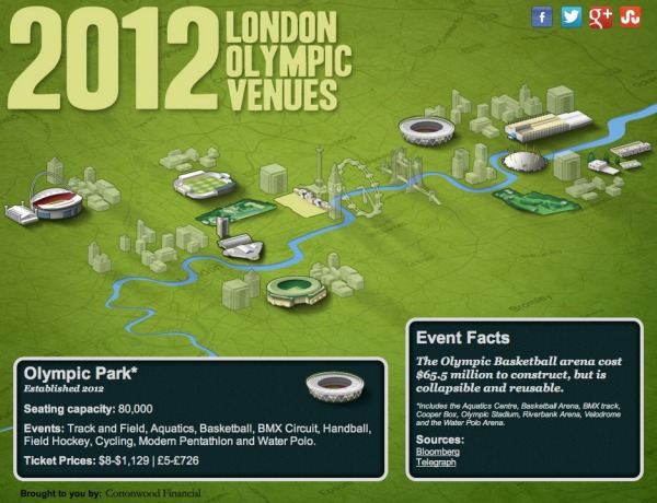
The 2012 London Olympic Venues from Cottonwood Financial’s CashStore.com site is an interactive infographic design showing facts and information about each of the main event locations in London.

The 2012 London Olympics are rapidly approaching, and they’re set to become the most expensive games yet with a budget of $14.5 billion. So what can Olympic attendees expect this year? Impressive landmarks, state of the art facilities, millions of sports fans and of course the best athletes in the world competing for the title of Olympic Champion.

Click the venues for more information on the events and ticket prices (figures in U.S. dollars and British pounds) for each one.

I really like the interactivity, but I think they used way too much text.  All of the statistics (like seating capacity and ticket prices) should have been visualized to make it easy for the reader to see.  Event icons and the Olympics are always tied together, so lining up this year’s icon designs instead of the text event names would have been more visually appealing as well.

The reader clicks on each of the venues to bring up different information, but the building illustration is the only indicator showing which venue the information is referring .  A connecting line or a highlight color to indicate which building is currently being displayed would have helped out tremendously.

It’s all designed in HTML5 too, so all of the interactivity works on mobile devices (like the iPad) as well!  Very cool!

I’m very jealous if you’re going to any of these events, but this guide could give you some idea of what to expect when you get there.

Thanks to Joe for sending in the link!

Monday
Apr022012

Jer Thorp: Make data more human

Jer Thorp works in the New York Times labs to design big data visualizations, and his great presentation from TEDxVancouver was just posted.

Jer Thorp creates beautiful data visualizations to put abstract data into a human context. At TEDxVancouver, he shares his moving projects, from graphing an entire year’s news cycle, to mapping the way people share articles across the internet.

Jer Thorp’s work focuses on adding meaning and narrative to huge amounts of data as a way to help people take control of the information that surrounds them.

He’s been involved in some great big data projects that I have posted about here on the blog previously, like OpenPaths.

Monday
Apr022012

Interactive Infographic: Coca-Cola vs. Pepsi


The Coke VS. Pepsi: The Cola Wars infographic from cnntees.com. Which side are you on?

For over a century Coke and Pepsi have been at each other’s throats in a constant struggle for a bigger piece of the billion-dollar soda market. 

Along the way the companies have picked up a slew of loyalists and fans, adamant that their cola reigns supreme. While there are countless spots online to check out the history of either company we decided to put together an interactive infographic, putting all cola war highlights together in one spot.

This is a really fascinating experiment with infographic design.  Although it appears to be a static infographic, it’s actually interactive.  If you look closely, there are two videos built directly into the middle of the infographic that play when clicked.  The growth chart at the top is also interactive.  Click on a decade, and then choose the specific year, and it displays events in each companies history related to that time period.

The interactivity is so subtle though, most people will probably miss it without me spelling it out in the title and here in the commentary.

The financial stats section is a really poor use of pie charts in the bottle caps.  The logo images work, but pie charts are for visualizing percentages.  Here, they forced the data into the cute visual, but it makes the data confusing and hard to understand.    Are the charts visualizing the percentages of each expense related to total revenue, or just arbitrarily visualizing the values to represent the comparison between the two companies?  No percentages are shown, and no values are shown for the values of the total pie.  This is forcing a round peg into a square hole.

At the bottom, it’s missing a URL to the original blog post (so readers that find this on the Internet can find the original high-resolution infographic), a copyright statement, a trademark statement and a credit to the designer.

Thanks to Ron for sending in the link!

Friday
Nov112011

Broken Appliances: Repair or Replace?


PartSelect.com brings us a cool, interactive infographic that helps customers evaluate what to do with their Broken Appliances: Repair or Replace?  Obviously a design from an appliance parts retailer showing customers why they should buy repair parts instead of replacing their appliances, but it’s really good information and doesn’t feel like a hard sell.  It is actually very valuable information for consumers.

We created this diagnostic infographic to troubleshoot some of the common problems that affect household appliances. Clicking on the pulsing dots shows each common issue and the parts required to correct the problem. Many people replace an entire appliance, which is neither cost-effective nor environmentally responsible. We displayed the average cost of replacing the appliance as well as the cost of the parts required to fix the problem (and a scale of the difficulty of the repair).

I really like the design that places the replacement parts radially around the applicances.  The color coding for cost and difficulty also works well, but it would have been better without the legend (“Legends are Evil”).  Without the 1-2-3 as the text in the arc, it could have easily said Easy-Difficult-Very Difficult in the arcs.

Apparently the length of the arcs doesn’t have any meaning, although it looks like it should.  They are just designed long enough to fit the text and the images.

Figure 1 - Layering of the symptoms animation

In addition, PartSelect posted a lengthy, thorough post about the interactive infographic development process they went through.  This is fantastic!  While I may not agree with all of the decisions they made along the way, this type of transparency and under-the-hood information is what helps build credibility and trust with customers.

The Interactive Infographic Process

The process now looks like:

  1. Project Manager decides to make an infographic with some data.
  2. Project Manager brings on board a Programmer and Designer.
  3. Project Manager must decide on the balance of technology vs audience, based on discussions with the team.
  4. Designer fleshes out some rough concepts.
  5. The team meets to discuss; each has specific input:
    1. Project Manager: vision and potential target audiences.
    2. Designer: design concepts and how to make it clean.
    3. Programmer: what is possible. Ideas based on what the technology can do which PM and designer may not be aware of.
  6. Designer creates fleshed out design.
  7. Team meets again and iterates over designs until everybody happy.
  8. Programmer puts together technical spec on how it will be built, which will influence deliverables from designer.
  9. Designer sends across deliverables decided by programmer.
  10. Programmer builds the first functional version.
  11. Team meets and probably iterates and refines design in same process.

Thanks to Stephen for sending in the link!

Thursday
Sep222011

The Evolution of the Web


The Evolution of the Web is a cool, interactive visualization from the Google Chrome team (along with Hyperakt and Vizzuality) that explores the evolution of web browsers over the last 20 years.

Over time web technologies have evolved to give web developers the ability to create new generations of useful and immersive web experiences. Today’s web is a result of the ongoing efforts of an open web community that helps define these web technologies, like HTML5, CSS3 and WebGL and ensure that they’re supported in all web browsers.

The color bands in this visualization represent the interaction between web technologies and browsers, which brings to life the many powerful web apps that we use daily.

Clicking on any of the browser icons brings up a cool visual history of the window design for each version.

Although there is a lot of data showning the version releases along the timeline, part of this design is just pretty.  The flowing colored bands seems to grow bigger over time implying increased usage of each technology, but their placement behind the broser lines doesn’t actual show which technologies were used by each browser. 

In fact, there’s a subtle marketing spin that has all of the lines converging behind the Google Chrome logo in 2008 and then exploding into the future.  And the HTML5 line seems to imply that it will take over the Internet in 2012.

Found on Flowing Data.


Friday
Jul152011

Our Choice: Interactive, Infographic iPad book

Our Choice, is a new ebook for the iPad and iPhone by Al Gore that includes many infographics and interactive data visualizations that the readers can interact with.  Intended to be the sequel to his book and presentations, An Inconvinient Truth, Our Choice brings a lot of the global warming data to life.

Mike Matas presented the book design in the TED Talk video above, and he’s the co-founder of Push Pop Press, a new digital publishing company. This is the first book from Push Pop Press, but they are working to make the software tools used to make this ebook app available to produce more ebooks.

Ignoring the message and any controversy this book will inspire, the use of data visuals in a ebook format like this is a sign of many more data visualizations to come.

Al Gore’s Our Choice will change the way we read books. And quite possibly change the world. In this interactive app, Al Gore surveys the causes of global warming and presents groundbreaking insights and solutions already under study and underway that can help stop the unfolding disaster of global warming.

Our Choice melds the vice president’s narrative with photography, interactive graphics, animations, and more than an hour of engrossing documentary footage. A new, groundbreaking interface allows you to experience that content seamlessly. Pick up and explore anything you see in the book; zoom out to the visual table of contents and quickly browse though the chapters; reach in and explore data-rich interactive graphics.

More than 30 original interactive infographics and animations

100% of Al Gore’s earnings from Our Choice will be donated to the nonprofit Alliance for Climate Protection.


The app is $4.99 in the iTunes Store, and if you purchase through this link, Our Choice ebook, a small portion will go to helping maintain the Cool Infographics site.  You can also buy the printed book from Amazon.

Friday
Apr222011

The Tweet Topic Explorer


Jeff Clark at Neoformix has created a cool, interactive tool that visualizes word frequency in a specific Twitter stream called Tweet Topic Explorer.  You can enter anyone’s Twitter ID and it will generate an interactive visual on the fly.  Above is the visualization of my Twitter ID: @rtkrum.  According to Jeff (see note below), this works in most browsers but has trouble with Microsoft Internet Explorer.

Similar to a word cloud, the area of the circles is sized based on the frequency of that word in the Twitter stream.  Words are clustered together and color-coded if they are often found together in the same Tweets.  The actual text of the Tweets is displayed next to the visual, so you can click on any word and it’s highlighted in the text as well.  Clicking on any Twitter names in the text will generate a new visualization for that Twitter user.


One issue I have is that the font size of each word is adjusted to fit within it’s circle, so longer words are naturally smaller to fit on one line withing the circle.  So even if a long word has a higher frquency (and a larger circle area) it appears smaller to the reader’s eye because the font is so small. 

I have created a new tool to help see which topics a person tweets about most often. It also shows the other twitter users that are mentioned most frequently in their tweets. I call it the Tweet Topic Explorer. I’m using the recently described Word Cluster Diagrams to show the most frequently used words in their tweets and how they are grouped together. This example below is for my own account, @JeffClark, and shows one word cluster containing twitter,data,visualization,list,venn, and streamgraph. Another group has word,cloud,shaped,post etc. It’s a bit hard to see in this small image but there is a cluster about Toronto where I live and mentions of run, marathon, soccer. Also, there are bubbles for some of the people on Twitter I mention the most often: @flowingdata, @eagereyes, @blprnt, @moritz_stefaner, @dougpete.

This application was created with the wonderful tool Processing.js which is the javascript-based extension of the Processing tool I have used in the past. Performance is very good with the Chrome browser, and decent in Firefox and Safari. It will not work in Internet Explorer (except perhaps the new IE 9) and currently crashes on iOS devices.

Anyone out there still reading?  Generate a visualization using your Twitter ID and post a link in the comments!

Outstanding job Jeff!  

Found on FlowingData

Tuesday
Oct262010

VoteEasy: Visual Election Candidate Comparison


VoteEasy is an interactive website designed by Project Vote Smart.  Very useful in America with election coming up next week.


After you choose your location, the VoteEasy site looks up the candidates specific to your area.  By entering your opinions on 12 critical issues and how important each issue is to you, the site shows you which candidates most closely match your beliefs.  Some candidates have submitted their answers, and the rest are inferred from the public records.

I made up some answers for New York since I don’t live there and don’t have any opinions on those candidates.  The site broke up the candidates into the two different Senate races and a House seat race currently on the ballot: 


You can click on a particular candidate to get specific information about them and their political record.


Found on Chart Porn and Infosthetics

Wednesday
Jul142010

Cool Infographics People on Web Trend Map!

As a visual treat, I took my Twitter list “Cool-Infographics-People” and visualized the entire list on the interactive tool Web Trend Map from iA and Craig Mod.  Visit often, and you can see the hot trends being tweeted that day by some of the best infographics people.

I don’t know how Twitter lists are doing in general, but I know that with 436 followers, the “Cool-Infographics-People” list is one of the most followed lists in the design community.  Out of the 228 lists I’ve been included on, this one is the most followed, and I see that for many other designers too.  I’d love to see (and visualize) the stats from Twitter, but most lists I see have under 10 followers.

Page 1 2 3