About
Randy Krum
President of InfoNewt.
Data Visualization and Infographic Design

Infographic Design

Infographics Design | Presentations
Consulting | Data Visualizations

DFW DataViz Meetup

Join the DFW Data Visualization and Infographics Meetup Group if you're in the Dallas/Fort Worth area!

Search the Cool Infographics site

Custom Search

Subscriptions:


Feedburner

The Cool Infographics® Gallery:

How to add the
Cool Infographics button to your:

Cool Infographics iOS icon

- iPhone
- iPad
- iPod Touch


Read on Flipboard for iPad and iPhone

Featured in the Tech & Science category

Flipboard icon

Twitter Feed
From the Bookstore

Caffeine Poster

The Caffeine Poster infographic

Entries in CEO (14)

Wednesday
Oct072009

CEO Compensation Infographic Contest Winner!


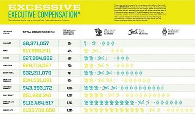
In September, GOOD magazine held an infographic contest to illustrate the top CEO compensation packages.  The above infographic by Dee Adams wins the prize!
Dee Adams’s piece “The Top 8 of CEO Compensation” does an excellent job of illustrating the massive salaries of CEOs and relating them to regular employees in a clean and simple manner. It’s our winner, and Adams will take home our prize package, including a GOOD T-shirt, a free subscription, and $250. You’ll be able to see her infographic in print in our next issue as well.
All of the entries are available for viewing here, but I wanted to include a few of my other favorites:


By Robin Richards:


By Jessica Karle:


Monday
Jun222009

Market Visual (BETA) knowledge maps


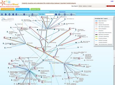
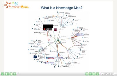
I came across Market Visual Knowledge Maps this morning.  It claims to still be in BETA, and it maps business relationships based on companies or people that you enter.  It seems to build these mind maps on the fly, and saves any maps that you have build so you can retrieve them later.


It's a service you have to pay for, but if you're looking through annual reports and SEC filings to find people and connections, this will save you a bunch of time.  There's a fully interactive sample map, as well as an introductory video.

Monday
Dec292008

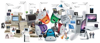
25 Years of Mac: Timeline


From Wired.com.  I like that this History of Apple isn't your traditional timeline.  It does go from left to right, but the images are mixed and overlapping.  It show a clear progression from beige to colors to white to silver.  The style also invites the viewer in to explore the details hidden in the image and find the extra images that specifically tagged with a date across the top.

Friday
Aug082008

The Ropes at Disney


Found on CartoonBrew, this circular chart from 1943 shows the development process of an animated film through the different roles within the Disney organization.  Not exactly an org chart, this is more of a process map.

How do they make those drawings move?  This chart, an separate pull-out from the 1943 booklet, The Ropes At Disney’s (see below), explains the whole process.You’ll note that it all starts with “Walt”. And his main focus was “Story” and “Direction”.

Can you tell I’m going to Walt Disney World today?


Monday
Jul072008

The iPhone Timeline

From iPhoneGold.org, is a cool little iPhone timeline.  I couldn't find an author to credit, just the website.

Found on digg.com

Thursday
Jul032008

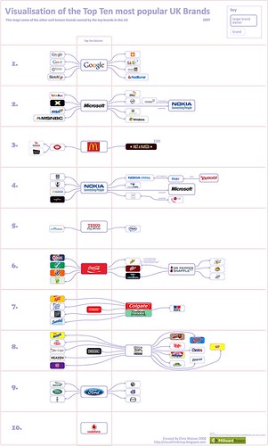
Top 10 UK Brands 2007 Visualisation


Top 10 UK Brands 2007 Visualisation, originally uploaded by visual think map.
Inspired by the infographic "Who Owns the Car Companies" that I originally posted about in October 2007, Chris Watson, from Visualthinkmap.blogspot.com, has created a cool infographic showing the owners for some of the top brands in the UK.

Great job Chris!

Saturday
May032008

Fostering Innovation at Pixar


Only a little bit off-topic. This is a great interview with Brad Bird from Pixar on how they build an environment for innovation. The lessons apply to movies, product development, design and of course designing infographics. Lesson Six is my personal favorite!

Found on Daringfireball.net

Tuesday
Mar112008

Steve Jobs photo mosaic from Apple products


This one is just fun. Steve Jobs portrait photo mosaic made from Apple products and icons from OS X. Another version of this from the same artist was used in the March 17, 2008 issue of Fortune magazine.

Found on digg.com

Thursday
Feb072008

Social Media Building

Another infographic advertisement from Elliance.com to share around your office. How do the different Web2.0 services available today address the different needs within a company? An ideal graphic to share with the people in your organization that don't really understand how they can use these new web services.

Elliance is posting a weekly series of infographics on their site to help explain their services.

Tuesday
Oct232007

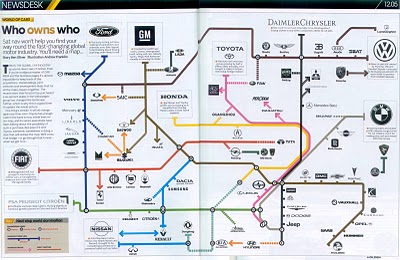
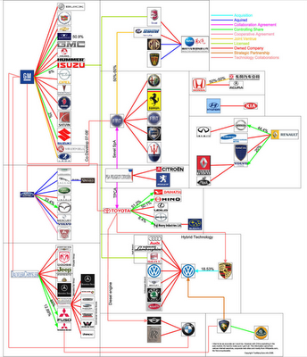
Who Owns the Car Companies?

I found three different images showing the complex network of ownership between the automotive companies. Three different attempts at making these complex relationships easier to understand. This first one is a scan from a magazine, but I can't find any reference to which actual magazine it came from. Charted out like a subway map, it's pretty easy to follow.

This next one from Too Many Cars is charted like a family tree, or a mind map. It's the easiest the follow, but probably the least aesthetically pleasing. Online the image is broken into smaller pictures so you can zoom closer, but is also available as a large poster in PNG or PDF formats. The data for this one is from 2006, and is the most current of the three.


This last graphic claims to show the ownership mix in the auto industry as a form of bubble chart, but I can't find any date or source data link. I think the bubble sizes represent something, like size of the company or ownership, but I can't tell. So I can't tell how accurate this is. The image is on Tinypic.