About
Randy Krum
President of InfoNewt.
Data Visualization and Infographic Design

Infographic Design

Infographics Design | Presentations
Consulting | Data Visualizations

DFW DataViz Meetup

Join the DFW Data Visualization and Infographics Meetup Group if you're in the Dallas/Fort Worth area!

Search the Cool Infographics site

Custom Search

Subscriptions:


Feedburner

The Cool Infographics® Gallery:

How to add the
Cool Infographics button to your:

Cool Infographics iOS icon

- iPhone
- iPad
- iPod Touch


Read on Flipboard for iPad and iPhone

Featured in the Tech & Science category

Flipboard icon

Twitter Feed
From the Bookstore

Caffeine Poster

The Caffeine Poster infographic

Entries in wealth (24)

Monday
Mar112013

Wealth Inequality in America

The Wealth Inequality in America infographic video was posted on YouTube back in November 2012.  The video is a good example of what the best infographic designs accomplish: Make the complex understandable.  

Infographics on the distribution of wealth in America, highlighting both the inequality and the difference between our perception of inequality and the actual numbers. The reality is often not what we think it is.

The data visualization in the video is very powerful and effective.  It takes the huge numbers that our brains have trouble processing, and visualizes them in a way that we can understand.  Comparing numbers puts them into context for the viewer, and comparing the different fifths of the population works very well in this instance.

The data sources are clearly listed at the end of the video, and they are even made available as clickable links in the video description on YouTube (which is very helpful).  This helps the credibility of the video tremendously.  Not many viewers (4,336,254 views as of the day I post this) will click to the links to view the source data, but they’re there.  Transparency creates credibility.

However, it’s not clear who created and is publishing the video, and this hurts the credibility a little bit, at least to a skeptic like me.  The video was uploaded by the user politizane, whose account was created just to upload this video.  No history of other videos, and no links to a company or website.  The author/designer obviously has an agenda, and spent a lot of time or money creating the video.  It would enhance the credibility even more if the viewer knew who was publishing and promoting the video.

Thanks to Doug for sending the link!

Tuesday
Dec082009

Infographic Coins!


What a great infographic product design idea!  From designer Mac Funamizu on his site, PetitInvention, Infographic Coins that use the physical analogy of a pie chart to help consumers figure out the currency, especially when visiting a foreign country.  You have to ignore some of the benefits of all round coins, but the idea is spot-on.  Feeling in your pocket, you could almost always pull out the right coin.


The round shaped coins must have a lot of benefits that other figures such as a triangle or a square donโ€™t. Also, non-rounded coins may have many demerits. Aside from those, travelers and other people who are not accustomed to the currency would be able to easily remember how much each of these coins is (as long as she knows how to read pie charts).


Wednesday
Oct072009

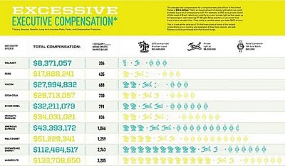
CEO Compensation Infographic Contest Winner!


In September, GOOD magazine held an infographic contest to illustrate the top CEO compensation packages.  The above infographic by Dee Adams wins the prize!
Dee Adamsโ€™s piece โ€œThe Top 8 of CEO Compensationโ€ does an excellent job of illustrating the massive salaries of CEOs and relating them to regular employees in a clean and simple manner. Itโ€™s our winner, and Adams will take home our prize package, including a GOOD T-shirt, a free subscription, and $250. Youโ€™ll be able to see her infographic in print in our next issue as well.
All of the entries are available for viewing here, but I wanted to include a few of my other favorites:


By Robin Richards:


By Jessica Karle:


Friday
Sep042009

New Hans Rosling video, using GapMinder (Must see!)

New TED Talk video of Hans Rosling talking to the U.S. State Department, "Let my dataset change your mindset".  Using the GapMinder software that was purchased by Google, Hans shows the third world isn't as far behind the U.S. as most people believe.

Wednesday
Aug262009

What is the GDP per Capita for Every Country?


Cool interactive chart on Snippets.com that shows the GDP per Capita of every country (so it claims).  It has a number of predefined groupings like Continent, UN Members, OPEC, Communist, Largest Area, etc to show comparisons.
The interactive chart below represents the GDP per capita for each country. Click on any of the buttons to view the data for that particular group of nations. You can highlight a particular country by selecting it in the dropdown box.  The data was compiled from the 2008 CIA World Factbook.

Thanks for the link Jerry!

Tuesday
Aug182009

American health care on (4) napkins


Dan Roam, author of Back of the Napkin, has posted a napkin explanation of the American Health Care debate on his blog.  It took him 4 napkins to complete his explanation, but I think he did a really good job trying to help people understand a very complex issue.

He has also published a slideshow of the complete series up on SlideShare.net


Check out Dan's great book, Back of the Napkin.


Tuesday
Aug042009

NEW Death and Taxes 2010 poster!!

First, Jess from WallStats.com has released the 2010 Death & Taxes poster.  This is one of the best infographic examples today.  It's extremely informative, and the topic has a very wide reach.  The Death & Taxes poster from 2007 was my initial post on Cool Infographics, so I'm very excited to see this update.   Now the 2010 version is available to purchase as a poster here. Great job Jess!

Second, I'm really impressed by the viewer code for the poster. It's from Zoomorama.com, and lets me embed the interactive viewer.  The built-in zoom is pretty nice, but the Quick Find index on the left side is the best part.

Friday
Jul242009

One Trillion Dollars Visualized [infographic video]

New video based on the infographics from our friend, Jess Bachman, from WallStats.com!  Created by/for Mint.com.

Trillion is the new Billion!

Wednesday
Jul222009

Obama's Credit Card Statement

Here's another one I found while I was checking out gimmiethescoop.com. From Tyler Shears, this one visualizes the last six months of Federal Reserve debt as a credit card bill.

Thursday
Feb262009

The Crisis of Credit Visualized


The Crisis of Credit Visualized from Jonathan Jarvis on Vimeo.

Video by Jonathan Jarvis, makes sense of the credit crisis.  HD version is available at http://crisisofcredit.com/


The goal of giving form to a complex situation like the credit crisis is to quickly supply the essence of the situation to those unfamiliar and uninitiated. This project was completed as part of my thesis work in the Media Design Program, a graduate studio at the Art Center College of Design in Pasadena, California.