About
Randy Krum
President of InfoNewt.
Data Visualization and Infographic Design

Infographic Design

Infographics Design | Presentations
Consulting | Data Visualizations

DFW DataViz Meetup

Join the DFW Data Visualization and Infographics Meetup Group if you're in the Dallas/Fort Worth area!

Search the Cool Infographics site

Custom Search

Subscriptions:


Feedburner

The Cool Infographics® Gallery:

How to add the
Cool Infographics button to your:

Cool Infographics iOS icon

- iPhone
- iPad
- iPod Touch


Read on Flipboard for iPad and iPhone

Featured in the Tech & Science category

Flipboard icon

Twitter Feed
From the Bookstore

Caffeine Poster

The Caffeine Poster infographic

Entries in recipes (12)

Tuesday
Mar102015

Baking Units Demystified

Baking Units Demystified infographic

Memorizing cooking unit conversions can be frustrating. Most of us just have a cheat sheet on the refrigerator that tells us that 1 Gallon= 4 Quarts. Well thanks to Andrew M.H. Alexander you might want to replace those boring magnets with the Baking Units Demystified infographic!

Infographics should simplify information and make it easier to understand without “dumbing it down.” This is a perfect example of showing the measuring relationships to make them easy to understand and even remember.

Found on Flowing Data.

Thursday
Jan152015

Starbucks Espresso Infographic Advertising

 
Can you name all 6 Espresso Classics?
Starbucks Guatemala


NOW AT STARBUCKS! The newest addition to the Starbucks menu is the Flat White. But what is the difference between The Flat white and the rest of Starbuck’s menu?

Starbucks sent this cool infographic as a content marketing piece in an email to all of their customers introducing The Flat White to their menu. The infographic visualizes the recipes for the 6 Espresso Classics. Currently available for view in most Starbucks stores around the country is an infographic that explains the differences between the styles of drinks on the menu.

The graphics in the email are actually the 3 separate images you see above, and I assume they could be changed for different people receiving the email. For example, someone else might receive an email about the Cappuccino or a different coffee flavor ad at the bottom. Good for flexibility in the emails, but bad for sharing in social media.

A product of simplicity, crafted into artistry, our baristas know that balance is key to the perfect Flat White. An extra ristretto shot ensures that it’s bolder than a latte, yet steamed milk keeps it smoother than a cappuccino. But perfection doesn’t end there—the technique for steaming and pouring the milk requires close attention as well. Steamed milk is folded into itself creating a velvety microfoam that gives the Flat White its silky texture and signature white dot.

Starbucks The Flat White

Love the cafe-style chalkboard look, and the layered drink r recipe visualization design!

Using this infographic in an email campaign is brilliant, but I wish it had been designed to also stand on its own so it could be shared online in social media easier.

Starbucks Espresso Spectrum

They use this design style throughout their entire espresso menu of drinks.

Thanks to Starbucks for sending the infographic to it’s customers! I put the separate pieces together below to make sharing easier!

Starbucks The Flat White Espresso Email Infographic

Monday
Sep292014

Chef Hari Ghotra's Key Ingredients Infographics

Chef Hari Ghotra's Key Ingredients Infographics Garlic

The Garlic, MintGinger and Chilli infographics are from Indian Chef Hari Ghotra’s blog. These informational infographics point out the key ingredients that are used in many Indian dishes, and discusses their benefits in a fun, engaging way.

I love the consistent design language and color scheme for each different ingredient.  Seasonality is visualized, but it’s disappointing to see some of the other statistics only shown as text. Big fonts are not data visualizations!

Thanks to Ellie for sending in the link! 

Chef Hari Ghotra's Key Ingredients Infographics Mint


Chef Hari Ghotra's Key Ingredients Infographics Ginger


Chef Hari Ghotra's Key Ingredients Infographics Chilli

Friday
Sep122014

Grandma's Apple Pie Infographic Recipe

Grandma's Apple Pie infographic

Delicious and informative! The Grandma’s Apple Pie infographic from Task & Tool shares the recipe to delicious success when making apple pies as a visual, illustrated recipe!

This apple pie tastes delicious. It’s inspired by Grandma Ople’s Apple Pie. The 4.8 star rating from over 5000 reviews doesn’t lie - this recipe is fantastic. 

This is our first illustrated recipe. When I’m following recipes, I hate when I start cooking and then lose my place every time I need to find the next step on the recipe. The goal of this recipe design is to make it easier to find your place with helpful illustrations.

The other thing that bothered me is having to go from the recipe instructions to ingredients list to find the right quantity of each ingredient. Abigail designed these recipes with colored icons to help you go back and forth between the recipe design and the ingredient quantities easily.

Also, these recipes are designed to look pretty =)

Fun and delicious, a great combination! I love the use of the hand-drawn chalkboard look. It is a reminder of an old fashion teaching style with an old favorite, apple pie. Good use of color, and visuals (3D and 2D) with minimal words.

They have the TaskAndTool.com URL in the footer at the bottom, but it should include the URL to the actual infographic landing page on their site. Don’t make visitors search your site to find what they are looking for.

Thanks to Gavin for sending in the link!

Friday
Sep052014

Alchemy of Tea

Alchemy of Tea Infographic Poster

The Alchemy of Tea infographic poster from SweeTooth Design Company maps out 15 traditional tea recipes from around the world, paying homage to the 4,000 year old beverage. Posters are available for $25 through the Kickstarter project, and will ship in November.  They have already exceeded their funding goal, so these will definitely go to print.

“Alchemy of Tea” is the first infographic illustration that depicts traditional tea recipes from around the world. It is not only a poster, but an informative recipe diagram of one of the most favorite drinks, tea.

There is a total of 15 tea recipes. Through mixing tea base with different ingredients, there are different results. What is more interesting is that simply by adding one or more ingredients, the entire recipe may becomes an entire different drink. 

Alchemy of Tea Infographic Poster Red Closeup

Posters will be printed in Red and Black:

Alchemy of Tea Infographic Poster Red Black

Found on http://www.fastcodesign.com

Friday
Aug152014

This for That: A Guide to Cooking and Baking Substitutions

This for That: A Guide to Cooking and Baking Substitutions infographic

You’re cooking dinner and suddenly you realize you forgot an ingredient at the store! No worries, the This for That: A guide to Cooling and Baking Solutions infographic from eReplacementParts.com can help avoid the crisis by giving you easy solutions for the common missing ingredient.

Need an egg and your neighbor isn’t home? Check our guide to baking substitutions to see what else will do!

A fantastic topic for an infographic, and can be used as a handy guide.  The Online Lifespan of this topic should also last for years!  As a suggestion, knowing that people might want to keep a printout of this design in their kitchens, a PDF version would be a nice addition.

The ingredient illustration colors blend into the background too easily. The words are easy to read but the pictures are harder to see. The infographic is also missing it’s own url at the bottom of the graphic.

The infographic is well organized as well as balances graphics with words evenly.

Found on Lifehacker.com

Friday
Sep272013

The Anatomy of Sangria

The Anatomy of Sangria infographic

A good way to start the weekend!  The Anatomy of Sangria from Wine Enthusiast Magazine is a nice visual explanation of what goes into making sangria, including different variations of ingredients.

It’s sometimes tough to know where to start when making sangria. In addition to selecting a red wine or white, there are several elements to consider: Which fruit will you use? What mixer will you add? Will you choose a savory or sweet garnish? Flavor combinations can make or break even the simplest of sangrias, so to make sure your next batch is stellar, use the guidelines below to create a version that promises to suit your palate—and your guests.

Bright, colorful design using photographs of the different ingredients is visually appealing and should get shared frequently.

This is also a great example of a long Online Lifespan topic for an infographic.  The ingredients for making sangria don’t change, so the infographic will be relevant for years to come; driving traffic and links to the website.

The footer should include a copyright statement, and the URL to the infographic landing page so readers that find this infographic on other sites can find the original full-size version.

Found on Foodista

Friday
Jun212013

Smoothie Recipes For Everything

Smoothie Recipes For Everything infographic

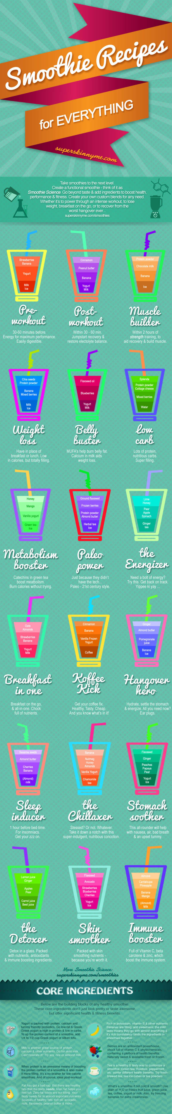
Who knew that the solution to most our problems could be solved with a smoothie?! Smoothie Recipes For Everything infographic from Super Skinny Me gives you the ingredients and visually represents the amount of each that should put in. Trying to lose weight? Want to de-stress? Or maybe just want a bedtime drink. This infographic has it all.

Is there anything as versatile, adaptable and convenient as a smoothie? I doubt it. Nor are there many things as universally beloved.  Smoothies are scrumptious, indulgent concoctions that tickle the taste buds and, inexplicably, with every sip make you feel just a little bit happier and make the world a little bit friendlier. The smoothie is so much greater than the sum of it’s parts. And just to prove the smoothie can do no wrong, it can actually make you more awesome too.

Smoothies contain a smorgasbord of ingredients, and depending on what you throw in, smoothies can ascend from mere flavorsome delight and sweet-tooth satisfier to the dizzying heights of muscle-building, energizing, health-enhancing superdrink. Why eat just one superfood, when you can combine a load of goodness into one easily digestible drink? Plus, it’s super quick and absurdly easy to prepare, making it weirdly efficient not just nutritionally, but generally. Created in the 1940’s, but perfectly designed for 21st century living.

Smoothies can be tailored to suit your own needs. And while the flavors are virtually limitless, don’t just think about taste, but also why you’re making it. Do you want to lose weight or perhaps build muscle? Do you need a pick-me up or extra energy to power through an intense workout? Had a bad day and want to wind down? Or maybe you can’t get to sleep. With a little smoothie science, you can easily make a smoothie that doesn’t just taste good (or look pretty), but actually does something.

The major issue I have with this design is that the proportions visualized for each smoothie aren’t accurate to the recipe.  The sections are sized to fit the text, and have no relationship to the data.  Big mistake!

Also, the actual amounts of each ingredient aren’t shown.  The recipes are on the infographic landing page in the text portion, but aren’t included in the infographic itself.  The issue with infographics is that they need to include the complete information because they are shared all by themselves, without any accompanying description text.

Found on superskinnyme.com

Wednesday
Sep192012

Sip Statistics 2012

Sip Statistics 2012 infographic

A great way to wrap up the summer, the Sip Statistics infographic was a joint design project with Hotels.comTGIFriday’s and InfoNewt (my company).

The Hotels.com® Sip StatisticsTM uses data from T.G.I. Friday’s to help travelers do as the locals do and follow their drink-clinations by identifying favorite drinks in popular cities. T.G.I. Friday’s has also provided cool new summer drink recipes below to keep that summer feeling going all year round. 

The design combines Hotels.com Average Daily Room Rate information from the top U.S. cities with the geographic popularity of TGIFriday’s top summer drinks in those same cities.  A fun, engaging way to share some internal information only available from these two companies.

The room rates are clearly compared in rank order with the bar graph linked to the map locations, and the most popular drinks are also shown in rank order for each city using both unique drink galss icons and color coding.  The icons and color coding are carried down the design to the recipe section, where the drink content proportions are shown with a pie chart visualization.

Thanks to the teams at both Hotels.com and TGIFriday’s!

Friday
Feb242012

See Mix Drink: Infographic Cocktails

The See Mix Drink Cocktail Guide is a fabulous infographic drink recipe book from Brian D. Murphy (@murph_e).  Currently available for about $10 on Amazon.com, it’s on my wish list.  Featured on GQ.com back in October when it was released, I have been totally remiss by not posting about it until now.  (My apologies Brian!)

Have you tried mixing a Mojito? What about a Rusty Nail? Or a Cosmopolitan? With See Mix Drink, the first-ever cocktail book to offer instruction through info-graphics, making the drinks you love at home is as easy as, well, See, Mix, Drink.

This unique, illustrated guide graphically demonstrates how to make 100 of today’s most popular cocktails. For each drink, color-coded ingredients are displayed in a line drawing of the appropriate glassware, alongside a pie chart that spells out the drink’s composition by volume for intuitive mixing. No other cocktail book is this easy or fun. Instantly understandable 1-2-3 steps show exactly how each drink is prepared, and anecdotes, pronunciation guides, and photographs of the finished drinks will turn newbie bartenders into instant mixologists. 

The GQ.com feature has the designs for ten of the recipes from the book.  They are all simple to understand, and easy to follow.

One thing I would suggest to improve the visualization design style is to combine the key and the ingredient portions.  No need to make the reader look to both sides of the glass illustration to figure out how much of each ingredient.  Just putting the name with the amount on the left side and getting rid of the color key would eliminate an eye motion for the readers.

Thanks to Brian for sending in the link (back in October!) and congratulations on the publication!