About
Randy Krum
President of InfoNewt.
Data Visualization and Infographic Design

Infographic Design

Infographics Design | Presentations
Consulting | Data Visualizations

DFW DataViz Meetup

Join the DFW Data Visualization and Infographics Meetup Group if you're in the Dallas/Fort Worth area!

Search the Cool Infographics site

Custom Search

Subscriptions:


Feedburner

The Cool Infographics® Gallery:

How to add the
Cool Infographics button to your:

Cool Infographics iOS icon

- iPhone
- iPad
- iPod Touch


Read on Flipboard for iPad and iPhone

Featured in the Tech & Science category

Flipboard icon

Twitter Feed
From the Bookstore

Caffeine Poster

The Caffeine Poster infographic

Entries in world (200)

Friday
Jul202018

The UK's Brexit Options in the EuroZone Visualized

The team at Information Is Beautiful have visualized the different options available to the UK in EuroZones: The Brexit Landscape, and have been making updates as the situation evolves.

Brexit? The Eurozone? The European Economic Area? The European Free-Trade Area? The European Customs Union? Whaaat?

A graphic that hopefully clarifies the complex structure of the European Union and the UK’s various routes and options for Brexit.

UPDATE: 15th July 2018: The saga continues. The UK announces its ideas for a “common rulebook” and “facilitated customs arrangement”, effectively a ‘soft’ Brexit.
Hard Brexit ministers resign.

UPDATE 3rd July 2017: It’s getting complicated! Added 2 more Brexit routes. See the first version.
UPDATE 1st AUG 2017: Detailed UK opposition party Labour’s positions. Refined ‘Free Trade Brexit’ & typical negotiation times (from here). Clarified a key difference between EEA (good & services) & Customs Unions (just goods). Read a useful, clarifying article
UPDATE 28th AUG 2017: UK opposition party, Labour, has now consolidated under a “soft Brexit” position.


Monday
Jul312017

EARTH, a visualization project

EARTH, by Cameron Beccario, is a beautiful interactive, animated visualization of a few different weather features across the entire globe.

EARTH, by Cameron Beccario, is a near real-time visualization of global weather conditions forecast by supercomputers. This vivid capture depicts intricate, dramatic swirling patterns of wind streamlines reminiscent of oil paintings of the Impressionists.

CAMERON BECCARIO'S creation, Earth. depicts wind patterns on a global scale. The artist began with a wind map of Tokyo, where he lives, and then he took on the world. You can see his animated creation at earth.nullschool.net.

You can spin the globe and zoom in on any area in the World. Opening the setting panel lets you change the data that is being displayed; from wind to ocean waves to particulates in the atmosphere.


To support his project, you can purchase prints of some of the high-resolution images from Point.B Studio 

Designed in D3, all of the source code is also available at https://github.com/cambecc/earth. Of course the project was inspired by the Wind Maps visualization by Fernanda Viégas and Martin Wattenberg, that I have posted about before.

Thursday
Oct062016

7 Times Technology Almost Destroyed The World

7 Times Technology Almost Destroyed The World infographic

7 Times Technology Almost Destroyed The World is a scary infographic from Hudman.

The importance of thoroughly testing new technology is highlighted in this infographic. We take a light-hearted, yet terrifying look at how close the human race has come to destroying all life on planet earth.

Fun, engaging information! From a design perspective, there's way too much text in this infographic, and the font size is too small to easily read. So much text, it will probably turn away many readers before they read any of the information.

Simplify, simplify, simplify! Shorter descriptions and larger icons or illustrations will draw in readers to engage with the infographic.

Friday
Aug262016

Animal Migrations In Motion

Animal Migrations In Motion

Animal Migrations In Motion is a fantastic animated & interactive data visualization of the predicted migration patterns of almost 3,000 species in North and South America as our climate changes.

As climate change alters โ€จhabitats and disrupts ecosystems, where willโ€จ animals move to survive?โ€จ And will human development prevent them from getting there?

This map shows the average direction mammals, birds, and amphibians need to move to track hospitable climates as they shift across the landscape.

Researchers from University of Washington and The Nature Conservancy modeled potential habitat for 2954 species using climate change projections and the climatic needs of each species.

This map was created by Dan Majka, who works for The Nature Conservancy's North America Region science team.

This visualization would not have been possible without the incredible prior work of the hint.fm wind map, cambecc's earth wind map, and Chris Helm's adaptation of cambecc's code.

It's mesmerising to watch! Just like some of the prior designs that inspired this one listed above. It's interactive, so you can move and zoom the part of the map being shown.

The description does leave a few unanswered questions. For instance:

  • What time period is being shown here?
  • What predicted climate changes and assumptions are being used?
  • What species are shown and how were they chosen?

Found on FlowingData!

Tuesday
Aug162016

Animated and Interactive Global Shipping Visualization

This is a fantastic detailed animated and interactive data visualization of the world's Global Shipping Traffic.

You can see movements of the global merchant fleet over the course of 2012, overlaid on a bathymetric map. You can also see a few statistics such as a counter for emitted CO2 (in thousand tonnes) and maximum freight carried by represented vessels (varying units).

The merchant fleet is divided into five categories, each of which has a filter and a CO2 and freight counter for the hour shown on the clock. The ship types and units are as follows:

  • Container (e.g. manufactured goods): number of container slots equivalent to 20 feet (i.e. a 40-foot container takes two slots)
  • Dry bulk (e.g. coal, aggregates): combined weight of cargo, fuel, water, provisions, passengers and crew a vessel can carry, measured in thousand tonnes
  • Tanker (e.g. oil, chemicals): same as dry bulk
  • Gas bulk (e.g. liquified natural gas): capacity for gases, measured in cubic metres
  • Vehicles (e.g. cars): same as dry bulk

The map was created by Kiln based on data from the UCL Energy Institute (UCL EI)

You can hide the route lines and just watch the ship dots move over time. It's mezmerizing!

Thanks to Jim Hopkinson and Bill Gates for sharing on Twitter!

You can see the interactive version embedded here, or click here to take you to the full-size original site:


Wednesday
Jul132016

Global Connectivity Ranking

Global Connectivity Ranking interactive infographic world London

The Global Connectivity Ranking from Rome2rio includes a beautiful interactive data visualization showing how connected we are on a global scale. Above you can see the direct flight connections from London, the most connected city on Earth.

Just how connected are our cities?  How do we measure such connections?  How do these connections change over time?

To answer these questions, my research team at KPMG collaborated with Rome2rio to produce the Global Connectivity Ranking. We ranked all 1,212 cities on the planet which operate international airports.

The Rome2rio Global Connectivity Ranking reflects the number of international cities that a city is connected to through direct flights. It measures connections from city to city - not airport to airport. For example, the connection count for London reflects how many cities outside the UK that can be reached from any of London's 6 international airports. Rankings were computed using Rome2rio's global transit data from April 2014 and January 2016.

Choose any city on the list to animate to direct flight connections. The size of the bubbles over each city also represent the total number of connections from that city.

The default is the world view, but can also choose to focus on a single continent. Here you can see the connection from Chicago when zoomed in to only North America.

Global Connectivity Ranking interactive infographic North America Chicago


Tuesday
Jul122016

Made in France

Made in France Raconteur Infographic Sankey

The Made In France infographic by Raconteur uses a Sankey Diagram to plot the many-to-many relationships of top exports with top destination countries.

Infographic outlining French exports and top 10 importers, alternative exports including caviar, cigars and horsemeat and most popular markets

France exported $572 billion of goods in 2015, making it the sixth largest exporter in the world. While aircraft, cars and medicine are the country's highest-value goods, there are many other exports to varied markets.

I'm confused by the introductory paragraph. I don't see aircraft, cars or medicine in the data visualization or represented anywhere else. Did they just choose 8 random product categories they wanted to include?

Showing the two separate values for "Total Exports" and "Total of Top 10 Importers" is confusing. Especially when the Top 10 value is shown within the sankey diagram, but broken apart and connected to the 18 countries shown across the bottom of the visualization.

I really appreciate the magnifying glass interactive feature on the landing page! I like this approach better than the standard zooming interface you soo on many other large, complicated infographics.

Made in France Raconteur Infographic Magnify

Friday
Jun242016

How Britain Voted in the E.U. Referendum

How Britain Voted in the E.U. Referendum map infographic

Britain voted on Thursday to part ways with the European Union. The vote was incredibly close, and this choropleth map visualization from the NY Times tells an intriguing story.

Britain has voted to leave the European Union, a historic decision sure to reshape the nation’s place in the world, rattle the Continent and rock political establishments throughout the West.

The margin of victory startled even proponents of a British exit. The “Leave” campaign won by 52 percent to 48 percent. More than 17.4 million people voted in the referendum on Thursday to sever ties with the European Union, and about 16.1 million to remain in the bloc.

Britons voted on Thursday to leave the European Union. The Leave side led with 17.4 million votes, or 52 percent, versus the Remain side’s 16.1 million, or 48 percent, with a turnout of around 72 percent.


Friday
Jun032016

The Global Air Transportation Network

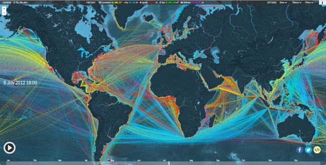
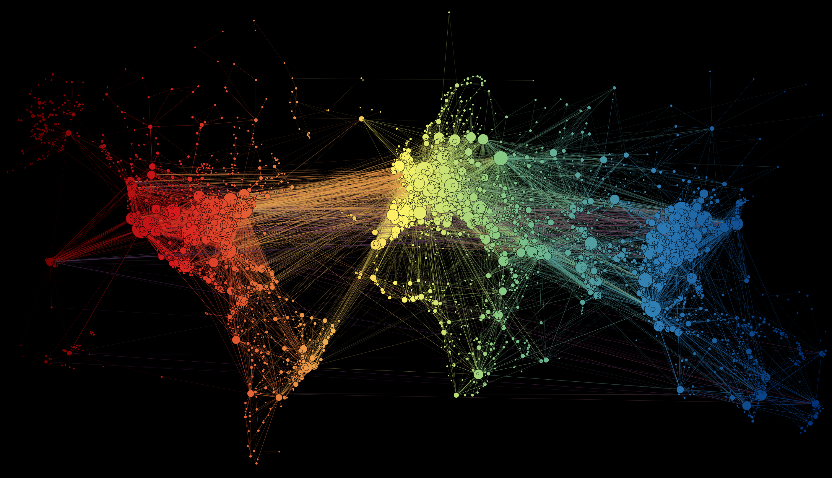
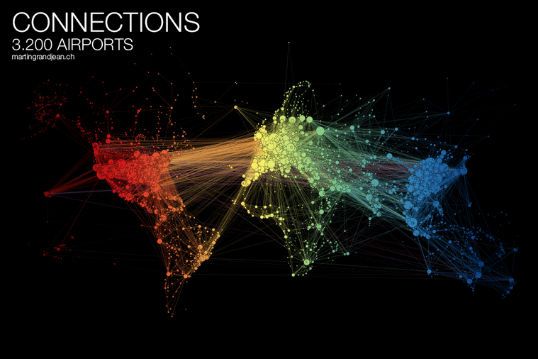
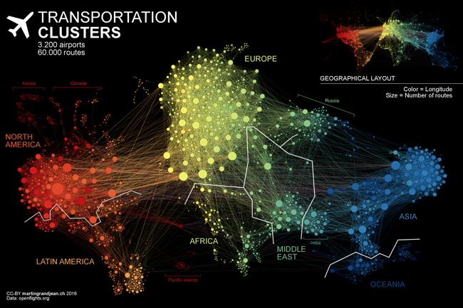
The Transportation Clusters infographic is a force-directed map of the 3,275 global airports and all of the connecting flight routes. Designed by Martin Grandjean, each bubble represents an individual airport and the bubble sizes represents the number of flight routes (37,153 routes in total) based on OpenFlights.org data.

People travel not just more frequently, but increasingly far and quickly. Mapping the connections between all the airports worldwide is a fascinating network visualization exercise.

This post (which may be followed by further experimentations in this area) is an attempt to make explicit the network behind air transport. The structure of the relationships has an impact on the spatial distribution of nodes in a graph. Let’s see how this landscape is reorganized without geographical constraints.

This “map” is the result of the application of a force-directed layout algorithm on a graph of 3.275 airports (37.153 single routes – the weighted total is higher because many airlines take the same route), based on OpenFlights.org data. Naturally, network geography is not completely disrupted: the continents are mostly visible and regions are generally in their original position (with the exception of the Pacific islands that connect Asia and America – imagine this graph in three dimensions, with the Pacific Ocean behind). Major observations: India is more connected to the Middle East than to South and East Asia. The Russian cluster is very visible, connecting airports in Russia but also in many former Soviet republics. Latin america is clearly divided between a South cluster and a Central American cluster very connected with the U.S.

The force-directed layout spaces the bubbles apart so there are no overlapping bubbles. The color coding is a color spectrum based on longitude, and generally groups airports from the same continent together. The total number of flights is much higher than the number of routes because many airlines share the same routes. I would like to see a version that weights the connecting lines with the number of flights that share that same route.

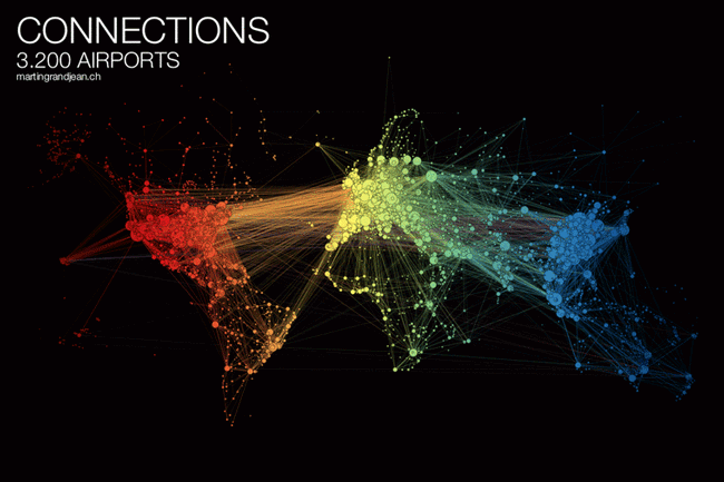
Here you can see the original map with the bubbles accurately located geographically, but a lot of overlap based on close proximity of the airports:

Martin also published a cool animated GIF and YouTube video of the change from geographical to force-directed layout.


Found on FlowingData

Thursday
Jun022016

Diabetes: The Silent Scourge

Diabetes: The Silent Scourge infographic

Diabetes: The Silent Scourge is a great 2-page spread infographic designed by Adolfo Arranz for the Today newspaper in Singapore. A worldwide growing health issue!

An estimated 422 million adults globally were living with diabetes in 2014, compared with 108 million in 1980. The global prevalence (age-standardised) of diabetes has nearly doubled since 1980, rising from 4.7 per cent to 8.5 per cent in the adult population. This reflects an increase in associated risk factors such as being overweight or obese. Over the past decade, diabetes prevalence has risen faster in low- and middle-income countries than in high-income countries. Infographic spread page for Today newspaper.

Diabetes: The Silent Scourge infographic newspaper photo

Notice the creative use of half-circles proportionally sized to match the "By Region" data. This accurately represents the data, but only take half the space on the page!

The use of many different visualization methods also helps the readers understand that there are many different data sets being shown. Slopegraphs, rose diagrams, colored map, bar charts, stacked bar charts and the half-circles all shown different facts about the diabetes epidemic.

Great work Adolfo!