About
Randy Krum
President of InfoNewt.
Data Visualization and Infographic Design

Infographic Design

Infographics Design | Presentations
Consulting | Data Visualizations

DFW DataViz Meetup

Join the DFW Data Visualization and Infographics Meetup Group if you're in the Dallas/Fort Worth area!

Search the Cool Infographics site

Custom Search

Subscriptions:


Feedburner

The Cool Infographics® Gallery:

How to add the
Cool Infographics button to your:

Cool Infographics iOS icon

- iPhone
- iPad
- iPod Touch


Read on Flipboard for iPad and iPhone

Featured in the Tech & Science category

Flipboard icon

Twitter Feed
From the Bookstore

Caffeine Poster

The Caffeine Poster infographic

Entries in movies (48)

Wednesday
Mar072018

Which Sci-Fi Movie Should I Watch?

Which Sci-Fi Movie Should I Watch flow chart

Which Sci-Fi Movie Should I Watch flow chart from Fish 4 Parts is a reccomendation of a Sci-Fi films based on your genre of choice. 

If you’re wondering which film to watch tonight or this weekend, there’s a few we’d like to recommend. According to your taste, of course! We’ve focused on the best of Sci-Fi. If you fancy some Sci-Fi horror, comedy, action or something a bit different, but don’t know what to watch, take a look at this graphic!

Thanks to Dave for sending in the link!


Wednesday
Jul192017

Disney Live Action Movies: Best (And Worst)

Disney Live Action Movies: Best (And Worst) infographic

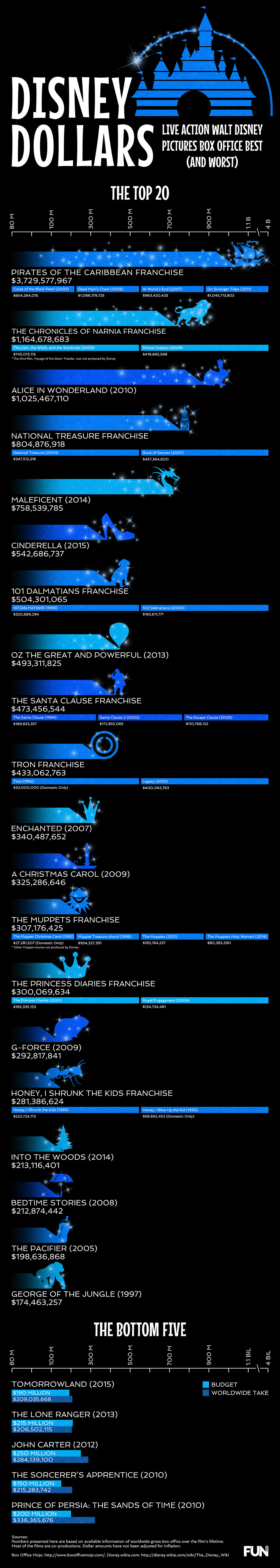
The Disney Dollars infographic from FUN.com compares the total box office revenue for all of Disney's live action movie franchises.

Disney live action films have a long history of wonderful stories, memorable characters, and some big (and by big we mean humongous) box office wins. While the company started in 1923 in animation, quite successfully, they didn’t start making 100% live-action films until the 1950s. Just like the animated films, it didn’t take them long to create a classic (or two or three or four). Remember the frightening steam-punk fantasy of 20,000 Leagues Under the Sea, or the whimsical world of Mary Poppins, or the three-dimensional wizardry of Tron? Even those classics can’t compare to the sheer box office juggernauts of the past two decades. Disney owned the blockbuster with Pirates of the Caribbean, the remakes like Alice in Wonderland and Cinderella, and who could let the holidays go by without a viewing of The Santa Clause…. Of course, with so many films being made, there have been some box office clunkers, as well. Poor Tomorrowland…

This infographic tracks all the live action films that made the top Disney dollar, and lost plenty of Disney dollars, as well.

I understand the overall bar chart design, with bars for the total of each franchise. However, the breakdown of the movies included in each franchise doesn't the distribution of each movies contribution correctly. those are just equal rectangles that span the width of the infographic.  The individual movies should visually show their contribution proportional to the total!

I don't like the scale cheat for the Pirates of the Caribbean franchise. Visually it misleads readers since the franchise has earned almost four times the revenue as the Narnia series.

Also, the length of the Narnia bar is just plain WRONG! Based on the data and the descending order it's supposed to be longer than the Alice in Wonderland bar.

Tuesday
Jul112017

Fictional Travel Times Compared

Fictional Travel Times Compared Infographic

The Fictional Travel Times infographic from TravelMath compares the speeds from many fictional characters and vehicles from comics, TV and movies.

The universe is a big place – being faster than a speeding bullet is a crawling pace when it comes to interplanetary travel. Science fiction authors have needed to bend the laws of physics to create engines that are capable of going faster than light in order to complete these journeys in any reasonable amount of time. For this reason, there are a handful of superheroes who can travel faster than light, and in some cases, back in time.

See how your favorite superheroes and ships stacked up below, and read our methodology at the end to learn more about the science behind these fictional travel times.

What's your opinion on using Log scales in infographics?

Personally, I don't think enough people are data visualizaiton literate enough to visually understand log scales. Many readers will not understand why the bars don't seem to match the numbers, or won't read the numbers and assume the length of the bars is linear.

Thoughts?

Found on CBR.com

Tuesday
Jun062017

The Sci-Fi Timeline

The Sci-Fi Timeline

The Sci-fi genre contains some fantastic and horrifying ideas about the future, but how far away are they? The Sci-Fi Timeline created by Glow places classic sci-fi movies and games on a very long timeline.

We're all used to seeing movies and games set in the future, but often the date can seem a bit abstract.

We've brought together some of our favourites to show yo the timeline and where they all fit. There were some surprises!

See for yourself, and decide if the writers got it right!

Thanks to David for the link!

Tuesday
May242016

Massive Infographic of Star Wars A New Hope

Star Wars A New Hope Infographic

This is a massive infographic depicting the entire story of Star Wars IV: A New Hope. Printed it measures 123m long (over 400ft). Online this infographic is 1,024 pixels wide by 465,152 pixels long! Designed by illustrator and graphic novelist Martin Panchaud, it was designed in Adobe Illustrator CC.

SWANH.NET is an adaptation of Star Wars Episode IV in a style that was inspired by infographics. One story in one piece of 123 meters length.

It was created with Adobe Illustrator CC in 2016. Its exact measures are: 1024 x 465152 px / 27 x 12307 cm / 10.6 x 4845.3-inch

This long ribbon reminds the ancient Chinese script rolls that had to be rolled in and rolled out simultaneously in order to be read. I like this stretch between ages, cultures, and technologies.

However, internet likes short stories and summaries, quickly understandable contents. With my work I aimed to create a contrast to that.

These are only a few small pieces. You go immediately to the SWANH site to view the entire, fantastic infographic!


Martin also posted a number of great images as a Making Of feature to show the development process of the infographic.

Wednesday
Apr202016

How Much Would Darth Vader's Suit Cost?

How Much Would Darth Vader's Suit Cost? infographic

How Much Would Darth Vader's Suit Cost? After Shade Station added up all the state of the art equipment like augmented reality in his helmet, his suit being on par with a NASA space suit, as well as all the medical bills from his prosthetic limbs. The total cost was around $18.3 Million! No worries though, the dark side always seems to have enough money to spend.

Darth Vader is arguably the most memorable character from the Star Wars universe, and his suit is one of the most iconic costumes in film history. But how much would that suit cost in real life?

Quick and easy infographic that does a good job of telling one story really well. I would have visualized the different expenses to show show where most of the money goes.

Thanks to Dave for sending in the link! 

Wednesday
Oct212015

How To Make Your Movies Better

How To Make Your Movies Better infographic

How to Make Your Movies Better is a great infographic from Moviehouse Eatery, which is a new movie theater concept in Texas.

This is a fantastic use of an infographic, to show the simple step-by-step process of buying tickets and going to the movies. Using infographics as how-to information about your products and services is a highly effective way to communicate directly to your customers.

Notice how the simple design makes the overall process feel easy before you even start to read any of the instructions. It's not cluttered with a lot of text, which keeps this design easy to read.

I would recommend making the overall length of the infographic shorter. This one includes large illustrations, nicely spaced out, but the length can be intimidating. I would keep the content the same, but make the illustrations smaller to reduce the length.

Also, the footer should include a copyright (or Creative Commons) license statement, and the URL to the infographic landing page so readers can find the original, full-size version.

Tuesday
Apr282015

Avengers Comic Book Cover Colors Data Visualization

Avengers Comic Book Cover Colors Data Visualization

Jon Keegan at the Wall Street Journal has created a fascinating interactive data visualization of the last 50 Years of ‘Avengers’ Comic Book Covers Through Color

When Marvel’s “Avengers: Age of Ultron” opens in theaters next month, a familiar set of iconic colors will be splashed across movie screens world-wide: The gamma ray-induced green of the Hulk, Iron Man’s red and gold armor, and Captain America’s red, white and blue uniform.

How the Avengers look today differs significantly from their appearance in classic comic-book versions, thanks to advancements in technology and a shift to a more cinematic aesthetic. As Marvel’s characters started to appear in big-budget superhero films such as “X-Men” in 2000, the darker, muted colors of the movies began to creep into the look of the comics. Explore this shift in color palettes and browse more than 50 years of “Avengers” cover artwork below. Read more about this shift in color.

Each cover illustration is broken down into its own color band that displays the amount of each color used.

The data visualization is a fantastic display of how the color use has changed over the last 50 years. The left column has the full waterfall of colors, and the center column displays the color breakdown of each specific color. You can see each cover illustration by hovering over any specific color band.

Here’s the whole 50+ years in the full color waterfall. I can see the overall trend has moved to darker colors and more black in the cover illustrations.


Friday
Apr032015

Best Film Awards From Around the World

 'Best Film' Awards From Around the World infographic

In America, winning an Oscar is a dream come true for people in the film industry; however, the award is not one of a kind! There are many ‘Best Film’ Awards From Around the World and Robert Shaw has created this infographic to illustrate the coveted trophies.

The awards illustrated here represent only a small fraction of the festivals that celebrate achievements in cinema throughout the world. It is by no means a definitive list.

The criteria for this infographic was to include awards that hold a dedicated trophy or statuette for an overall ‘Best Film’ category, presented in ceremony for at least four years. However, some exceptions do appear in order to show as many nations as possible.

I think the size of this infographic is the primary message. I know many people don’t like tall infographics, but in this case that is the primary design element. It’s also eye-opening information because I would guess that most readers would have no idea that there are this many different film award organizations in other countries.

Thanks to Robert for sending in the link!

Monday
Mar022015

Stories of the Past and Future

xkcd Stories of the Past and Future

Stories of the Past and Future is an awesome timeline design from Randall Monroe at xkcd.com depicting the differences between when movies and TV shows were released, and the time periods they depicted. I printed off the large version and starting adding a few more on my own.

Thanks to Tweets from Nathan Yau @flowingdata and Alberto Cairo @albertocairo!