About
Randy Krum
President of InfoNewt.
Data Visualization and Infographic Design

Infographic Design

Infographics Design | Presentations
Consulting | Data Visualizations

DFW DataViz Meetup

Join the DFW Data Visualization and Infographics Meetup Group if you're in the Dallas/Fort Worth area!

Search the Cool Infographics site

Custom Search

Subscriptions:


Feedburner

The Cool Infographics® Gallery:

How to add the
Cool Infographics button to your:

Cool Infographics iOS icon

- iPhone
- iPad
- iPod Touch


Read on Flipboard for iPad and iPhone

Featured in the Tech & Science category

Flipboard icon

Twitter Feed
From the Bookstore

Caffeine Poster

The Caffeine Poster infographic

Entries in awards (4)

Friday
May012015

Food Poisoning Outbreaks Digested

Food Poisoning Outbreaks Digested infographic

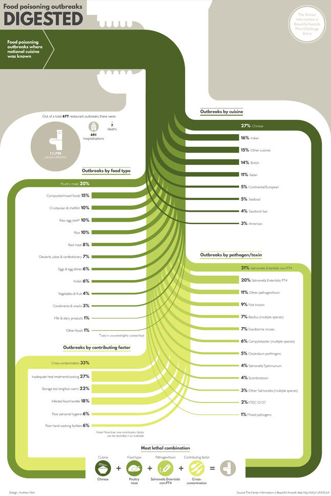
The Food Poisoning Outbreaks Digested infographic is the static graphic winner for the Food Poisoning challenge put on by Kantar Information is Beautiful Awards. Designed by Andrew Park, the infographic ranks the number of food outbreaks within different categories like specific cuisine or the toxin/pathogen. 

Using a Sankey diagram, the visualisation charts the percentage breakdown for food poisoning outbreaks by national cuisine, food type, pathogen/toxin and contributing factor where the cuisine type was known.

The diagram concludes with the “most lethal combination”, highlighting the top factors that led to an outbreak.

I thought it would add context to frame the Sankey diagram in a human body, as though it was being eaten and spreading through the body like a disease.

I really like this approach to a Sankey Diagram that breaks the original total into four different categories of data.

Friday
Apr032015

Best Film Awards From Around the World

 'Best Film' Awards From Around the World infographic

In America, winning an Oscar is a dream come true for people in the film industry; however, the award is not one of a kind! There are many ‘Best Film’ Awards From Around the World and Robert Shaw has created this infographic to illustrate the coveted trophies.

The awards illustrated here represent only a small fraction of the festivals that celebrate achievements in cinema throughout the world. It is by no means a definitive list.

The criteria for this infographic was to include awards that hold a dedicated trophy or statuette for an overall ‘Best Film’ category, presented in ceremony for at least four years. However, some exceptions do appear in order to show as many nations as possible.

I think the size of this infographic is the primary message. I know many people don’t like tall infographics, but in this case that is the primary design element. It’s also eye-opening information because I would guess that most readers would have no idea that there are this many different film award organizations in other countries.

Thanks to Robert for sending in the link!

Thursday
Feb122015

Who's Going to Malofiej 23?

Malofiej 23 conference workshop speakers

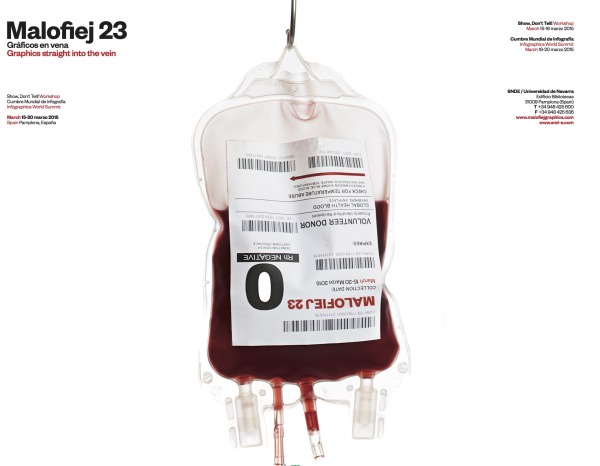
The Malofiej 23 Workshop days will be March 15-18, 2015, and the Infographics World Summit conference will be March 18-20, 2015. Malofiej 23 will be held this year in Pamplona, Spain by the Spanish Chapter of the Society for New Design (SNDE). The line up of speakers looks amazing! I’ll be giving a talk, but I can’t wait to hear some of these other fantastic speakers!

Here’s the link to download the conference program PDF:

Malofiej 23 conference workshop program

This year I have will have the honor of both speaking during the conference, and acting as a judge for the Malofiej Awards. I’m putting together a new presentation titled “The Seven Deadly Sins of Infographics Design” that I will present during the conference portion.

If you have plans to attend the workshop or conference, let me know and we can arrange to meetup.

Thursday
Feb272014

The Best Pictures from the Academy Awards

The Best Pictures from the Academy Awards infographic


The Best Pictures infographic from Beutler Ink is an iconic timeline through the history of the Academy Awards winners for Best Picture.  Can you identify the movies from the icons?

Beutler Ink celebrates the 2014 Oscars with a poster commemorating each of the past 85 Best Picture winners. See how many movies you can recognize from the icon alone.

This is a fun design that draws the readers in by challenging them to identify the past winners based on the icons or illustrations shown for each film.  I could only identify about half of them, so I appreciated the answers included in the footer.

The big lesson we can learn from this design, is that once an infographic image is published online, it takes on a life of its own.  Infographics are usually shared online by people without any of the accompanying text that the publisher included on the original infographic landing page.  Because of this, all of the relevant information needs to be included in the infographic image file itself, or it gets lost when people share it.

In this case, the audience would have no idea that the award winning pictures in this design are from the 2014 Academy Awards (popularly known as the Oscars).  The landing page includes the introductory description text “Every Best Picture winner since the inception of the Academy Awards…” but there’s no introduction in the infographic design itself.  There are literally hundreds of different types of Film Awards (see http://en.wikipedia.org/wiki/List_of_film_awards), and the audience doesn’t know what this infographic is sharing without that introduction.  It needs to be included in the the infographic itself.

There’s no information that identifies this design is relevant for 2014.  Infographics are generally available online for years, and for a timeline based design, it’s important to clearly state the timeframe represented.  When someone finds this design in 2016, the section for “This Year’s Nominees” won’t be accurate.  Additionally, if they update this design next year, there should be a clear way to identify the version based on the timeframe shown.

Also, when readers find this infographic shared on other sites, they have no way to find the original without a URL.  The URL to the original infographic landing page should be included in the footer.

Thanks to Jarred for sending in the link!  Also found on Visual.ly