About
Randy Krum
President of InfoNewt.
Data Visualization and Infographic Design

Infographic Design

Infographics Design | Presentations
Consulting | Data Visualizations

DFW DataViz Meetup

Join the DFW Data Visualization and Infographics Meetup Group if you're in the Dallas/Fort Worth area!

Search the Cool Infographics site

Custom Search

Subscriptions:


Feedburner

The Cool Infographics® Gallery:

How to add the
Cool Infographics button to your:

Cool Infographics iOS icon

- iPhone
- iPad
- iPod Touch


Read on Flipboard for iPad and iPhone

Featured in the Tech & Science category

Flipboard icon

Twitter Feed
From the Bookstore

Caffeine Poster

The Caffeine Poster infographic

Entries in blog (14)

Tuesday
Jan062015

Infogr.am Acquires Infographics Blog Visualoop

Infogr.am Acquires Infographics Blog Visualoop

Big news in the world of infographics. In December, the online design site Infogr.am closed a deal to acquire the infographics blog and news site Visualoop.

December 3, Riga. – Infogr.am, the company behind the popular infographic creator, has acquired Visualoop, one of the leading data visualisation news sites from Brazil. The website covers infographics and data visualisation in English and Portuguese languages.

“Our ambition is the make Visualoop the leading data visualisation blog in the World,” says Uldis Leiterts, co-founder and CEO of Infogr.am: “It would strengthen our presence in Brazil, it would also support the social mission of Infogr.am to educate and raise the overall interest in data visualization” Along with acquisition Infogr.am reveals a Portuguese version it’s web-based infographic creator.

I included Infogr.am in the Cool Infographics book chapter covering design tools, but it’s great to see them expanding their capabilities with this acquisition and other new endeavors like increasing global data literacy with Infogram.org.

Congratulations to Tiago Veloso, the Founder and Editor of Visualoop! Tiago has been a long-time friend of Cool Infographics, and supporter of the infographics design community as a whole. I asked Tiago for a brief comment about the acquisition…

“As you imagine, Randy, this is a very special moment for Visualoop, and for me personally. The deal with Infogr.am allows me to dedicate myself full time to both websites (English and Portuguese), and that without having to deal with all those concerns websmasters usually face, (you know what I mean, right?). And it also made me revisit old projects and ideas that go way beyond that notion of ‘blog’ that people are perhaps used to, when hearing the name Visualoop - so, who knows what will come out of all this! :).”

I hope we see some new and exciting things out of the partnership between Visualoop and Infogr.am!

Monday
Dec012014

The Internet Is a Zoo: The Ideal Length of Everything Online

The Internet Is a Zoo: The Ideal Length of Everything Online infographic

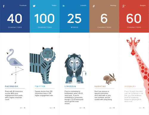
Short, sweet, and to the point! The Internet Is a Zoo: The Ideal Length of Everything Online infographic from a partnership between SumAll and Buffer explains the fine line between when extra words are helpful, and when they become too much information. Whether you are posting a facebook post to your friends, or a blog post to your avid followers. This infographic will help make sure your posts reach the most readers!

Have you ever woken up in cold sweat in the middle of the night wondering exactly how many characters long a tweet should be to get the most engagement, or how many words long a blog post should be so that it actually gets read?

Ok, that may just be me, but knowing exactly how many characters a Facebook post should be or what the ideal subject line length is should be endlessly fascinating (and useful) information to most people who are active on social media.

So, to make all this data digestible and easy to understand, we partnered with our awesome friends over at Buffer to produce an infographic that shows the optimal length of pretty much everything on the internet.

Great design that tells one story really well, totally focused on the length of posts on different social media platforms. The footer should include the URL to the infographic landing page so readers can find the full-size original when the infographic is posted without links.

They went one fantastic step further, and created a more print friendly version near the bottom of the landing page that spans multiple printed pages. The pages are formatted to fit on standard Letter-size paper or in presentation slides. This is a great example of using the research and design from the original infographic to share the information in additional formats.

Infographic was found on SumAll

Wednesday
Jul022014

Secrets of a Killer Blog Post: Images

Secrets of a Killer Blog Post: Images infographic

It can be hard to run a successful blog. Here at Cool Infographics, we strongly believe in graphics and images (big surprise right?). But if you still need a little persuading, the Secrets of a Killer Blog Post: Images infographic can tell you more great things about images and what they can do for your blog.

You already know that well-researched, high-quality content is the backbone of a killer blog post. But don’t underestimate the importance of a strong visual component when you’re composing your latest and greatest update for your audience

The human brain processes images in as little as 13 milliseconds—less than the blink of an eye.

A post with an image is far more enticing to the bounce-happy readers of the Internet than one without, and is more likely to be shared on social media as well.

There’s a lot of information in this one!  Everything this design mentions about photos and images applies to posting infographics as well.

Published by whoishostingthis.com

Friday
May302014

What Makes the Perfect Blog Post?

What Makes the Perfect Blog Post? infographic

What Makes the Perfect Blog Post? infographic from blogpros.com takes information gathered from 100 highly ranked blog posts and puts it together so we can learn from those best practices.  Even though the infographic can stand on its own, it was published as a companion piece to a much more detailed article.

Always interested in what goes into the best content we can publish, we recently performed an analysis of 100 top blog posts across a number of popular sites, including Forbes, Mashable, KISSMetrics and SearchEngineWatch. The data speaks for itself, but the conclusions are up to you. What do you see in the data? Here’s what we think.

The simple color palette makes the data visualizations very easy to read.  Some of them are very well know publishing tips like providing social sharing buttons and including images.  I don’t believe that the number of characters in a title has any bearing on its success, but good titles are very important.

I don’t know if any of these factors had any influence on whether these blog posts were popular or not.  These are purely observations by the designer and may be considered to be correlated instead of causing blog post success.

Wednesday
Apr232014

11 Essential Ingredients Every Blog Post Needs

11 Essential Ingredients Every Blog Post Needs infographic

If every blog followed the 11 Essential Ingredients Every Blog Post Needs in this infographic, they would be much more successful. From opening with a bang to killer bullet points, this infographic uses intriguing words to increase the uniqueness of it’s take home message. Created by copyblogger.

So. You think you’ve got yourself a good blog post.

You chose your writing style. You knocked out the first draft. You allowed it to sit for an hour or a day.

Now it’s time to edit that bad dog — ruthlessly. So that it has a fighting chance in the trenches.

You’ll want to pay attention to the details like avoiding goofy, but common,grammar mistakes. You’ll want to choose your words carefully so you say what you mean.

This will allow you to shed excess copy so that you have a lean, muscular article.

But you’re not done. You also must ensure that your blog post has all of the essential ingredients it needs.

Ingredients like these, as presented in this infographic by our lead designer Rafal Tomal. Print it, pin it, but whatever you do … use it.

No numbers or data, but this well-designed infographic clearly walks the reads through a sequence of tips for blog post writing.  Illustrations help relate to each point, and make them more memorable, but I don’t understand a few of them (Why does an alien UFO abduction represent a good subhead?  I would have like to see some statistics to back up why there are good blogging tips.

Yay!  The URL in the footer takes readers straight to the infographic landing page on the copyblogger site, which makes it easy for everyone to find the original infographic and the supporting article.


Found on Google+ and Reviews N Tips

Wednesday
Nov132013

How to Setup Google Authorship in 6 Minutes

How to Setup Google Authorship in 6 Minutes infographic

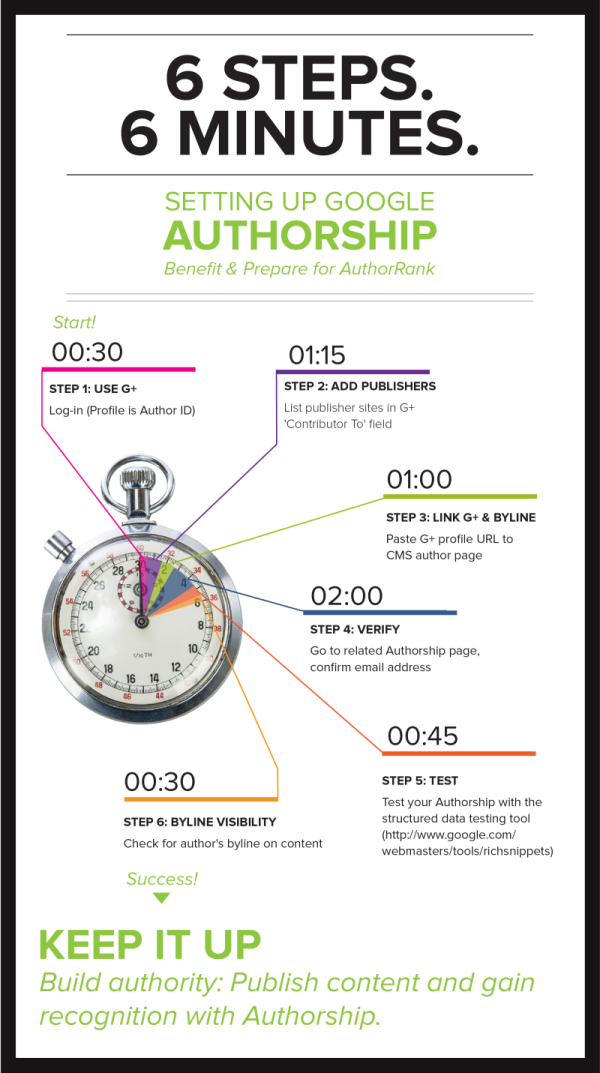
How to Setup Google Authorship in 6 Minutes is simple, clear, focused design from Brafton.

Google Authorship helps brand publishers personalize the custom content they post to their websites. Studies show that including an author’s byline and headshot in search engine results pages (SERPs) increases clicks and may eventually improve PageRank. 

Brafton’s “Content marketing, meet Authorship” resource outlines everything a savvy marketer must know to benefit from Google technology, and our accompanying infographic makes it even easier to setup Authorship on a given site. (Our downloadable resource includes a print-friendly version of this graphic!) Follow these six steps (in about six minutes) to be on your way to publishing online content using Google Authorship. Don’t forget to read our related blog: Why It’s Time to Embrace Authorship, and download our free resource.

This infographic design keeps it simple for readers by telling one short story really well.

Knowing that the PNG image file of the infographic will be shared on other sites, the design should have included the Brafton logo, a copyright statement, and the URL for readers to follow to find the original, full-size version of the infographic.  Not all bloggers are good about linking back to the original landing page.

Wednesday
Oct092013

An Infographic Profile of the Modern Travel Blogger

An Infographic Profile of the Modern Travel Blogger

An Infographic Profile of the Modern Travel Blogger from the Sandymount Hotel in Dublin, Ireland, takes a closer look at answering the question “Who are these travel bloggers?”

As today marks the start of the TBEX European Conference – the world’s largest gathering of travel bloggers, writers and new media content creators – we thought we would celebrate their choice of Dublin as this years’ venue with an infographic profile of the modern travel blogger.

Today and tomorrow, Dublin will play host to scores of travel bloggers and writers, but what makes a contemporary travel blogger? It’s an interesting and pertinent question – it’s a demanding occupation (albeit a fun one!) and one that requires a huge amount of hard work, dedication and the potential of not making a huge amount of money, at least in the formative years.

So what’s the average profile of the modern travel blogger? How old are they? What countries do they visit? How do they monetise their writing and what contemporary technology do they utilise to facilitate their writing? To answer these questions and numerous others, we completed an in-depth survey of travel bloggers, giving us some revealing and unique insights into what makes up a travel blogger.

Rather than present all our finding in a page of text, we thought we’d turn them into a far more eye-catching format, so here’s our infographic profile of the modern travel blogger:

The design is clean with a great color palette.  It’s easy for readers to look through the information quickly.

A few of the statistics are shown in text only, while others are visualized.  The stats in text only will be perceived as less important by readers, and I don’t think that was the intent of the designers.  If the data is important enough to include in the infographic, they should also be visualized.

Thanks to David for sending in the link!

Thursday
Aug012013

Choosing a CMS for Your Business

Choosing a CMS for Your Business infographic

This graphic will help you figure out what is the best Content Management System (CMS) for you and your business. Discover what a CMS is, types of CMS, popular CMS, market shares and advantages with, The Most Popular CMS for Your Business Needs infographic posted on Dot Com Infoway

Chennai, India Dot Com Infoway (DCI), a premier IT company providing offshore IT outsourcing solutions to businesses across the globe, has announced the release of its latest infographic, titled “Content Management Systems: Choosing the Right One for Your Business Needs”. The infographic provides a top to bottom look at various CMSs and chalks out a road map for organizations, businesses and individuals looking to choose content management systems perfect for their needs.

The infographic outlines the fundamentals of content management systems, the industries in which they find use and the types of CMSs available. It is replete with information, data, statistics and illustrations such as the date of initial release, the platform used, the latest version, the number of themes it has, average setup and customization cost, average monthly maintenance cost, the number of websites using the CMS, the popular websites that use the platform and the top industries using the CMS.

“With the recent exponential growth of nightly builds of CMSs’ modules and plugins, we thought this would be the perfect time to showcase the CMS industry with an infographic that provides users with an all-around perspective. Our run through of key aspects of various CMSs, will help firms make better business decisions by taking advantage of all the information at their disposal,” said Venkatesh C. R., CEO of Dot Com Infoway.

The infographic also provides statistics on the market share of various content management systems. Based on the analysis and research data, WordPress, with a market share of 54.4%, has a competitive advantage over other top CMSs. Following WordPress, (with margins of difference of more than 45%) are Joomla and Drupal with market shares of 8.9% and 7% respectively.

Personally, I run this site on the Squarespace.com CMS platform, and I’m very surprised that it wasn’t listed in the infographic.  I realize there are over 1,200 CMS platforms, so they had to make some hard choices about which ones to include.

The design does a good job of using the platform logos to clearly identify the different players.  I wish the numerical data associated with each platform was visualized instead of just shown in text.  It very hard for a reader to compare the costs or stats between the platforms when all of the data is only in text.

Also, the data is not clearly sourced.  The sites where the data was gathered from are listed, but no specific links the pages with the actual data used, like market share numbers.  Most of the source sites are actually lookup and comparison tools, so it would be hard to list specific URLs for some of the data.

Found on bestinfographics.co

Tuesday
Apr302013

White House will be Posting More Infographics

White House Infographics

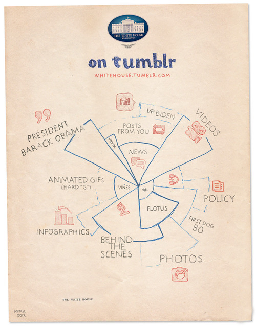
The White House has just started posting on Tumblr, and released the White House on Tumblr infographic you see above to kickoff the blog.  I’m pleased to see infographics as a large section of the content they are planning, but also a little bit worried.

We see some great things here at the White House every day, and sharing that stuff with you is one of the best parts of our jobs. That’s why we’re launching a Tumblr. We’ll post things like the best quotes from President Obama, or video of young scientists visiting the White House for the science fair, or photos of adorable moments with Bo. We’ve got some wonky charts, too. Because to us, those are actually kind of exciting.

They’re not kidding about the “Wonky charts!”  I look at this design and think “Huh?”  The infographic appears to be a stylized form of a coxcomb chart or rose diagram, but not really.  It’s definitely an aesthetic design all about style without substance.  The design is just supposed to imply the different types (and maybe the amounts) of content they intend to publish.  There isn’t any real data or numbers behind the chart, and the hand-drawn aspect reinforces that this is just suggestive of what we should expect to see in the future.  

Visually, I guess it also suggests that the content might cover multiple categories.  So posts about the FLOTUS (First Lady of the United States) might include photos, behind-the-scenes information and posts about Bo, the First Dog.

No real chart would have overlapping pie slices.  Slices of a true Rose Diagram (credited to Florence Nightingale) would have equal angles that add up to 360° or 100%, and with varying radii, the area of each slice would represent the value of each section.

The staff at the White House has posted infographics on the official White House blog before (which I critiqued here and here).  I love that this helps raise the awareness and credibility of infographics aas a whole!

Wednesday
Jun272012

12 Things To Do After You've Written A New Blog Post


12 Things To Do After You've Written A New Blog Post infographic

The 12 Things To Do After You’ve Written A New Blog Post infographic from DivvyHQ is a self help guide that everyone who likes to post blogs could use. Also, it’s in a comically large printable design that I recommend! Instructions are below.

In early 2011, I was asked to guest blog for the Content Marketing Institute, which actually came from a consistent blog commenting strategy that I have executed for years. With their heavy focus on “how-to” content, I whipped up a post on the “12 Things You Need to Do After Writing a New Blog Post”. The checklist-style post was well received with thousands of retweets, likes and shares.

Now fast forward to March 2012. The infographic craze is in full swing, so I was perusing my content archives looking for something that I could turn into a good visual. I quickly recalled many CMI comments talking about how they had printed out the text-based checklist and had it pinned to their cube wall. BINGO! The rest is history…in the making.

Printing Instructions

  1. Click the infographic above to open the PDF version.
  2. Save it to your computer/hard drive.
  3. Open the PDF in Adobe Acrobat or any PDF Reader application.
  4. Hit Print.
  5. In the PDF print setting dialog box, look for “Tile Scale” or “Print Scale” and set the percentage to 54%. Your print preview should now be showing that the infographic will print on three 8.5 x 11 sheets. If not, adjust the scale percentage until it fits.
  6. Hit Print.
  7. Tape the pages together.
  8. Check your to-dos.
  9. Hang it on your wall.
  10. If you need help managing your blog or social media activities, you may want to try our 30-day free trial.

There’s no data shown in this design, it’s more of a process flow infographic.  Although it would have been nice in the infographic version of Brody’s process to show some of the stats behind why each of these activities is valuable to online marketing.

As a process infographic design, the content is very cool and the design matches.  It’s easy-to-read, icon illustrations support the content, minimal text descriptions and I love the added instructions to print it out across three pages to become a reference guide in the real world.