About
Randy Krum
President of InfoNewt.
Data Visualization and Infographic Design

Infographic Design

Infographics Design | Presentations
Consulting | Data Visualizations

DFW DataViz Meetup

Join the DFW Data Visualization and Infographics Meetup Group if you're in the Dallas/Fort Worth area!

Search the Cool Infographics site

Custom Search

Subscriptions:


Feedburner

The Cool Infographics® Gallery:

How to add the
Cool Infographics button to your:

Cool Infographics iOS icon

- iPhone
- iPad
- iPod Touch


Read on Flipboard for iPad and iPhone

Featured in the Tech & Science category

Flipboard icon

Twitter Feed
From the Bookstore

Caffeine Poster

The Caffeine Poster infographic

Entries in White House (4)

Monday
May202013

The Obama Energy Agenda: Gas Prices 2013

The Obama Energy Agenda: Gas Prices 2013 infographic

The White House has released a new infographic in April 2013, The Obama Energy Agenda, Gas Prices.  We have seen the White release a number of infographics as a communication tool, and they have consistently been getting better.

Gas Prices

Explore the infographic to learn about President Obama’s all-of-the-above energy strategy.

The prior Energy Agenda infographic I reviewed was in April of 2011, and it was a rough, early attempt at an infographic design for online publication.  This design is significantly better, and has a number of good points to highlight that all designers can learn from.

First, the data visualizations are well done with the chart axes clearly labeld and units of measure clearly shown.  The color scheme is simple and easy to understand, but some of the small, gray text is hard to read on the white background.

Second, the big issue with the prior designs was the lack of sources for the data.  This design does a good job of citing the source of data for each visualization (chart).  For an administration that is attempting to increase transparency, the sources are still very vague.  I would like to see URL links to the actual reports or data sets referenced to make it easy for readers to check out the data on their own.  Instead, most of the sources are listed as just “EIA” which is the U.S. Energy Information Administration.  Certainly a step in the right direction, but could have much done better.

Third, there isn’t an obvious, clear Key Message.  Most readers only look at an infographic for less than 5 seconds, and it’s the designer’s responsibility to communicate the key message in that short time.  The rest of the information should tell a good story, and support the Key Message, but isn’t required reading.  There’s a lot of data shown in this design.  Probably too much data.  It’s hard for readers to understand the flow of information because there is both top-to-bottom sequence of sections and side-by-side charts.

The area chart in the center of the design draws the reader’s attention because it is so large in relation to the rest of the charts.  This visually implies that it is the most important data in the whole design, but I’m not sure that was the intent.

After reading through the whole design, I believe that the Key Message is “The Obama Administration has supported increased domestic drilling for oil, but that hasn’t lowered gas prices at the pump.  We need to do more.”  An infographic design should make this message very clear and easy to understand without having to read through the entire design.

What do you think?

Tuesday
Apr302013

White House will be Posting More Infographics

White House Infographics

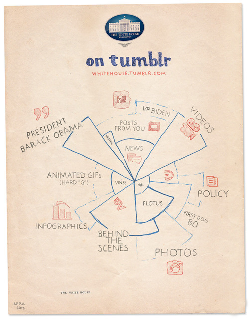
The White House has just started posting on Tumblr, and released the White House on Tumblr infographic you see above to kickoff the blog.  I’m pleased to see infographics as a large section of the content they are planning, but also a little bit worried.

We see some great things here at the White House every day, and sharing that stuff with you is one of the best parts of our jobs. That’s why we’re launching a Tumblr. We’ll post things like the best quotes from President Obama, or video of young scientists visiting the White House for the science fair, or photos of adorable moments with Bo. We’ve got some wonky charts, too. Because to us, those are actually kind of exciting.

They’re not kidding about the “Wonky charts!”  I look at this design and think “Huh?”  The infographic appears to be a stylized form of a coxcomb chart or rose diagram, but not really.  It’s definitely an aesthetic design all about style without substance.  The design is just supposed to imply the different types (and maybe the amounts) of content they intend to publish.  There isn’t any real data or numbers behind the chart, and the hand-drawn aspect reinforces that this is just suggestive of what we should expect to see in the future.  

Visually, I guess it also suggests that the content might cover multiple categories.  So posts about the FLOTUS (First Lady of the United States) might include photos, behind-the-scenes information and posts about Bo, the First Dog.

No real chart would have overlapping pie slices.  Slices of a true Rose Diagram (credited to Florence Nightingale) would have equal angles that add up to 360° or 100%, and with varying radii, the area of each slice would represent the value of each section.

The staff at the White House has posted infographics on the official White House blog before (which I critiqued here and here).  I love that this helps raise the awareness and credibility of infographics aas a whole!

Thursday
Sep062012

White House Infographic: Extending Middle Class Tax Cuts

Extending Middle Class Tax Cuts Infographic

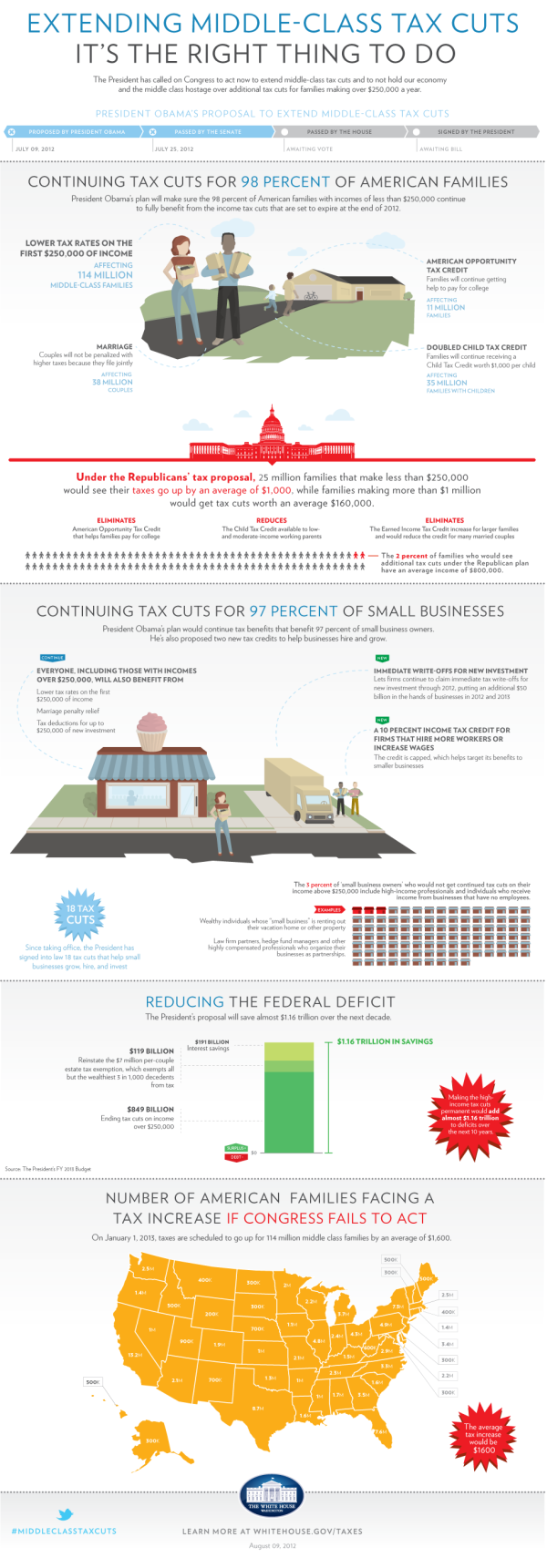
Here is a new infographic from the White House illustrating why Obama’s plan to Extend Middle Class Tax Cuts is the right thing to do. The infographic points out the pro’s for why it should be passed and what will happen if it isn’t passed.  I’m certainly not pushing a political bias, but I thought it would helpful to take a close look at some issues with the design.

From the White House:

Unless the the House of Representatives takes action before January 1, 2013, a typical middle-class family of four will see their taxes go up by $2,200 in the coming year.

President Obama is fighting to prevent that from happening. He is pushing lawmakers to get this done.

What we should do right now is give middle-class families and small business owners a guarantee that their taxes will not go up next year,” he said. “When families have the security of knowing that their taxes won’t go up they’re more likely to spend, and more likely to grow the economy. When small business owners have certainty on taxes and can plan ahead they’re more likely to hire and create new jobs. And that benefits all of us.” – President Obama


A few thoughts:

  • I like the progress bar design to visually show the current status of the issue.
  • Overall, the text is very small.  Even  when viewing the full-size resolution version on the landing page, some of the text is hard to read.
  • Sources are only listed for one statistic the Reducing the Federal Deficit section.  Where does the rest of the data come from, and why should we believe it?
  • Visualizing the stats in the first section would have been very helpful to put the numbers into context.  They should show the reader that 114 Million Middle-Class Families is a certain percentage of the total number of families in the U.S.
  • Nice use of red color to show the opposing proposal.  From a design standpoint, red = bad/negative so this visually shows the opposing plan with a subconscious negative bias.
  • The visualization of 100 people icons is correct, but would be easier for the reader to understand if it was organized in rows of 10.  Our number system is Base-10, so that’s how readers understand data.
  • Again, the rows of 15 small office buildings are hard for the reader to understand.  They should be rows of 10 to be immediately understandable.
  • The U.S. map should be display the values as a heat map.  States with higher values would have full color, and states with lower values would have lighter shades of the same color in accordance to the values.  Don’t make the reader read all of the text values and hunt to figure out the higher and lower values.  You don’t want to make your readers work that hard, when you can visualize it easily for them.
  • The “Learn more…” statement at the end is a good call-to-action at the end of the infographic, but they should also include the URL of the infographic landing page so people can find the original.

The White House has been experimenting with infographics for about a year now.  You can see my thoughts about two previous examples of The Obama Energy Agenda and The Resurgence of the American Automobile.

What do you think about the design?  What do you like, or would have done differently?

Found on the White House webpage

Friday
Jun102011

White House Infographic: The Resurgence of the American Automotive Industry


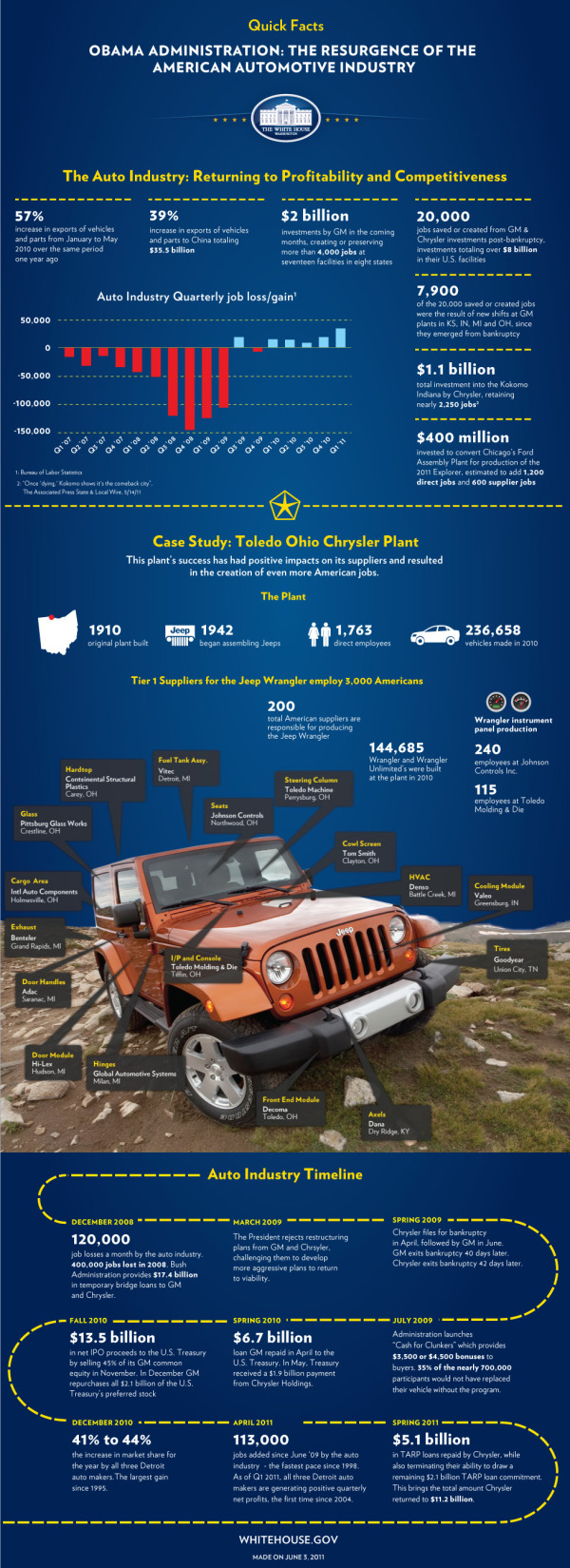
The team at the White House released The Resurgence of the American Automotive Industry infographic on the White House Blog last week in conjunction with President Obama’s visit to Toledo, OH and the JEEP manufacturing plant there.

Today, President Obama will travel to Toledo, Ohio where he will visit the Chrysler Group’s Toledo Supplier Park – an operation that employs more than 1,700 workers producing Jeep Wranglers, Jeep Liberties, and Dodge Nitros.  Just two years ago, Chrysler was filing for bankruptcy, and President Obama made the tough decision to support the restructuring of the company rather than allow it to fail – which would have cost tens of thousands of American jobs.

Today, Chrysler is repaying its government loans six years ahead of schedule and posted five consecutive quarters of operating profit.  Earlier this week, the National Economic Council released a new report on the resurgence of the American automotive industry.  Over the past two years, the auto industry has added 113,000 jobs - the fastest pace of job growth in the auto industry since 1998.

Check out this infographic that highlights some of the key successes in the auto industry since 2009.

I wrote a long critique of the last White House infographic about Obama’s Energy Plan (The Obama Energy Agenda: The White House attempts an #Infographic).  This one improves on some of the design issues I had with the last one.  I like that the White house is being consistent with the design style, and you can tell at a glance that this one is obviously in the family of official infographics from the White House.

Citing sources is still an issue for these infographics from the White House.  There are two sources cited and referenced, but many more statistics are included without any source.  For example, where does the “39% increase in exports of vehicles and parts to China” come from?  There are many statistics that could have been visualized to reduce the amount of text as well.  Listing a bunch of numbers in bold text doesn’t make for a good infographic design.

I love the inclusion of the Jeep photo with information mapped on top.  Much more interesting and engaging to the reader than what could have been a list of 17 suppliers, and more interesting than plotting them on a map of the U.S.

The timeline is pretty boring.  The dotted line could have been tire tracks, and way too much text that could have been data visualizations.

Thanks to Mary Kaye for sending me the link!