


White House will be Posting More Infographics
 Randy
Randy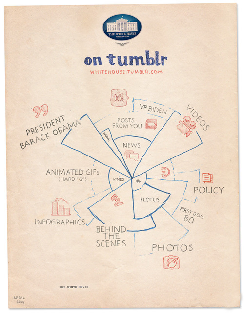
The White House has just started posting on Tumblr, and released the White House on Tumblr infographic you see above to kickoff the blog. I’m pleased to see infographics as a large section of the content they are planning, but also a little bit worried.
We see some great things here at the White House every day, and sharing that stuff with you is one of the best parts of our jobs. That’s why we’re launching a Tumblr. We’ll post things like the best quotes from President Obama, or video of young scientists visiting the White House for the science fair, or photos of adorable moments with Bo. We’ve got some wonky charts, too. Because to us, those are actually kind of exciting.
They’re not kidding about the “Wonky charts!” I look at this design and think “Huh?” The infographic appears to be a stylized form of a coxcomb chart or rose diagram, but not really. It’s definitely an aesthetic design all about style without substance. The design is just supposed to imply the different types (and maybe the amounts) of content they intend to publish. There isn’t any real data or numbers behind the chart, and the hand-drawn aspect reinforces that this is just suggestive of what we should expect to see in the future.
Visually, I guess it also suggests that the content might cover multiple categories. So posts about the FLOTUS (First Lady of the United States) might include photos, behind-the-scenes information and posts about Bo, the First Dog.
No real chart would have overlapping pie slices. Slices of a true Rose Diagram (credited to Florence Nightingale) would have equal angles that add up to 360° or 100%, and with varying radii, the area of each slice would represent the value of each section.
The staff at the White House has posted infographics on the official White House blog before (which I critiqued here and here). I love that this helps raise the awareness and credibility of infographics aas a whole!

Reader Comments