


Alberto Cairo - What Makes an Infographic Cool?
 Randy
RandyGUEST POST by Alberto Cairo
A ‘cool’ infographic is one that not only forces you to stop and stare at it with awe, but also —and above all— one that gives you insights that you would not get otherwise. ‘Cool’ infographics reveal patterns and trends that lie buried below mountains of data and facts. They make complexity clear without compromising its integrity.
To be truly ‘cool’, an infographic needs to be honest, truthful, deep, and elegant. It can be fun, too, but it needs first to respect the intelligence of its potential readers, and be designed not just to entertain them, but to enlighten them. A bunch of out of context numbers or grossly simplistic charts surrounded by pictograms or illustrations is never a ‘cool’ infographic. Quite the opposite is true. The primary goal of ‘cool’ infographics is not to ‘bring eyeballs’ or ‘go viral’. Those are by-products. If you design with just those objectives in mind, you will end up having not an infographic, but perhaps a colorful but ultimately worthless poster. Any truly ‘cool’ infographic is a tool for rational understanding, an instrument to discuss relevant ideas and phenomena.

As an example, I would like you to visit this very simple but very smart interactive graphic by The Washington Post. See how carefully the information is layered and dosed in it. Notice how it first highlights some important facts (“Drug killings down”, “Most dangerous age…”) and then it lets you explore the data at will. It is beautiful, it is informative, it is useful. And it is extremely cool.

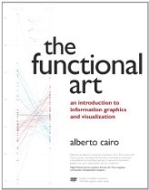
Alberto Cairo teaches infographics and visualization at the School of Communication of the University of Miami. He is the author of the book The Functional Art: An Introduction to Information Graphics and Visualization (PeachPit Press, 2012). He has been a consultant and instructor with media organizations and educational institutions in more than twenty countries.
LINKS
Twitter: @albertocairo
School of Communication: http://com.miami.edu/

Reader Comments