About
Randy Krum
President of InfoNewt.
Data Visualization and Infographic Design

Infographic Design

Infographics Design | Presentations
Consulting | Data Visualizations

DFW DataViz Meetup

Join the DFW Data Visualization and Infographics Meetup Group if you're in the Dallas/Fort Worth area!

Search the Cool Infographics site

Custom Search

Subscriptions:


Feedburner

The Cool Infographics® Gallery:

How to add the
Cool Infographics button to your:

Cool Infographics iOS icon

- iPhone
- iPad
- iPod Touch


Read on Flipboard for iPad and iPhone

Featured in the Tech & Science category

Flipboard icon

Twitter Feed
From the Bookstore

Caffeine Poster

The Caffeine Poster infographic

Entries in caffeine (11)

Friday
Jan062017

Does Coffee Really Make You More Productive at Work?

Does Coffee Really Make You More Productive at Work? infographic

63% of Americans can't get through the work day without coffee. Does Coffee Really Make You More Productive at Work? infographic explores our cultural obsession with coffee. Turns out that coffee boosts your speed, not your talent so tasks that require quality over quantity do not benefit from caffeine. Toll Free Forwarding tells us how and when to drink coffee for it to be most effective. 

Could you start the day without your morning cup of coffee?   Latest research shows that 61% of Americans can’t get through the day without a cup of java, and even that’s 2% down from 2013.   Let’s face it, ever since the Europeans discovered coffee in the 1600s, it’s been an infatuation of the western world.  This magic brew that makes you vibrant and productive isn’t just an addictive substance, it’s a cultural phenomenon.  

Coffee shops are often credited as the birthplace of the Enlightenment, the American and French Revolutions, and even the Shins!   But what role does coffee have in the workplace?  Does it actually make us more productive or is it mankind’s most effective placebo? This infographic goes in-depth to explain just how coffee affects our daily routine, and how we can nurture our caffeine fixes without over-doing it.   So sit back with your bagel and morning brew, and enjoy the only Infographic that dares to ask: “Does Coffee Really Make You More Productive at Work?”

There's a lot of good information in this design, and it's organized nicely in sequence from top-to-bottom. Most of the information is visualized with good, related illustrations or icons.

It's odd that this infographic comes from Toll Free Forwarding, a company whose business has nothing to do with coffee. This is a challenge for relevance in the SEO world, and if this infographic becomes popular, it still may not have a significant benefit to the publisher because it will be promoting keywords unrelated to their business.

Thanks to Jennie for sending in the link!

Wednesday
May232012

Fast Facts on Coffee Consumption 

Fast Facts on Coffee Consumption infographic


Pouring in Your Cup: Fast Facts About Coffee Consumption is a good infographic from Hamilton Beach.

This is a good example of a company publishing an informative, marketing infographic about a topic related to their products (coffee makers), without feeling like a sales pitch or ad for their products.  However, I don’t think there is a clear story told by the infographic.  It’s generally a bunch of coffee and caffeine statistics put together in an infographic without a clear message.

I like the design and the simple color palette.  Most of the visualizations are clear and easy to understand except the bunch of coffee cups lined up in the middle.  I think each cup is supposed to represent the 20 cups/week the average office worker drinks, and all of the cups together is supposed to represent a year of coffee consumption.  When you line up images like this, the rows really should have only 10 images each for the reader to easily understand the quantity.  So, there should be 52 cups to represent the whole year, but there are only 48 cups shown.

There are a handful of stand-alone statistics that are just shown in text, that could have been visualized.  The clock image shown next to the stats “24 minutes a day” should have had a highlighted portion showing 24 minutes.  I like the male/female symbols used on the coffee cups, and the Venn-diagram style of coffee blends is great.

I’m going to go pour myself my third cup of coffee this morning…

Found on Infographics Showcase, Infographic Pics and Infographipedia

Wednesday
Jun152011

Caffรจ Italiano: 50 Types of Italian Coffee


Caffè Italiano is another mouth-watering infographic from CharmingItaly.com.  I love how they took what could have been a standard drink ingredients visualization one step further and designed it as a menu board for an Italian coffee bar.

For Italians, coffee break is a sort of ritual in which the conviviality is a key point. Around a good coffee you can have a chat, take a few minutes for yourself and relax. It’s not just about inserting something into the stomach.

For Italians, drinking a good coffee is a pleasure: it is something to be sipped and not to be swallowed down; it is something to relish in the fullness of its flavour.

This is why a bad coffee gets Italians in a bad mood, while a good coffee can make their day!

When you enter an Italian Bar, around the clock, pay attention on what’s around you: we bet you won’t find 10 people ordering the same type of coffee!

The types of coffee in the Infographic are written in Italian, so you will be able to order them in the right way at the Bar!

The only problem is that there isn’t any guide or legend for the reader to understand the meaning behind the different colored portions of each drink.  They look carefully designed to be accurate to the how the drinks are mixed, but that effort is lost without an explanation.

Thanks to Paolo for sending in the link!

Wednesday
Nov032010

How Coffee Affects the Global Economy


How Coffee Affects the Global Economy is a new infographic on Mint.com and designed by Column Five Media.

We don’t technically need coffee to survive (though many would argue just the opposite), yet this popular pick-me-up fuels not only our daily energy levels, but the global economy as well. The coffee industry thrives in countries like Brazil, Vietnam and Colombia: the world’s leading coffee exporters. Meanwhile, coffee drinkers around the world love their daily morning brew like no other drink. In the United States alone, we consume more than 66 billion cups of coffee per year. Some of us love our java so much, in fact, that we even observe a national coffee holiday, September 29.

There are a handful of statistics included that aren’t visualized, which does seem odd.  For example, “40% of this coffee is now gourmet” could easily have been visualized.

Tuesday
Jan262010

Caffeine and Calories

Check out another great caffeine infographic, The Buzz vs. The Bulge, by David McCandless from Information Is Beautiful.  Another great spin on caffeine in drinks, this one plots caffeine content on the X-Axis, and calories on Y-Axis.

I love that there are also some foods mixed in with the drinks like a dark chocolate car, a butter croissant and coffee ice cream (brilliant).

When I started working on my Caffeine Poster, this hadn’t come out yet.  One the reasons I choose caffeine as the data to visualize for my project was because there weren’t any good visuals to be found at that time.  I definitely wanted to acknowledge David’s great work.

Monday
Jan252010

Photos of The Caffeine Poster


I tried out the poster printing service from PosterBrain.com last week and printed out a couple copies of The Caffeine Poster.  I've never posted the full, high-resolution image online, but I used it with PosterBrain to print it out fullsize 24" x 36". (Apologies for my not-quite-professional photos)


The poster is gorgeous!  I'm so impressed by the PosterBrain service, and the quality of their prints.


You really should try their service.  I uploaded the file on Sunday, and paid only $24.99 each to have them printed with free shipping.  I received the posters on Friday by standard USPS mail.  They were beautifully packaged with sheets of tissue separating the posters.


Monday
Jan252010

Making-Of The Caffeine Poster - Part 3


How did you pick which drinks to include?

The original spreadsheet with the caffeine calculations had about 100 drinks on it, but that made the image WAY too crowded.  Looking back, I could have made the images smaller to fit more drinks onto the poster, so maybe the next version will have more.

For the coffee side, I picked some of the most widely available coffee shops, and I also only picked one drink from each.  Starbucks alone had 20-30 different drinks I could have listed.

For the drinks side, I picked the drinks that were most widely available at the grocery stores in the DFW area.  It may be different regionally, but the local region was all I had to work with.


Dude, where’s the TEA?!?

I posted this in the comments, but I know I left tea out of the graphic (along with thousands of other drinks). It was actually hard to cull down the wide assortment of drinks down to only the ones I included. Not a tea drinker myself, tea didn’t make the cut (Kevin Rose would be disappointed, I know).  It’s very crowded in the under 100mg space, so tea didn’t make the cut.  Based on the feedback I got, I’ll include it if a next versions happens.

FWIW, tea averages between 40-70mg of caffeine in each 8oz cup


Can I buy a copy of The Caffeine Poster?

I haven’t setup the poster for sale, but I did keep the high-resolution images offline so I could make it available if there was interest.  The images on Flickr are certainly high-resolution enough to read the details, but they won’t print very nicely as a 24” x 36” poster.  So far, I haven’t heard from many people who wanted to buy a copy.

I also got some feedback that The Caffeine Poster makes a good infographic, but maybe not a great poster.  To be a great poster, it probably need more details and other additional information to make the viewer curious to step closer and read more.

However, I did have a few copies printed for myself…of course.


Will there be a next version?

Probably.  I’ve got some other projects in the works, so there’s no telling how long it will take.  You suggestions on what to change or add are very welcome.


The is the end of the Making-Of posts.  I got so many questions about the behind-the-scenes stuff that I moved all of The Caffeine Poster posts together on a separate page.  Check out the Caffeine Poster link at the top of the page.

Wednesday
Jan202010

Making-Of The Caffeine Poster - Part 2

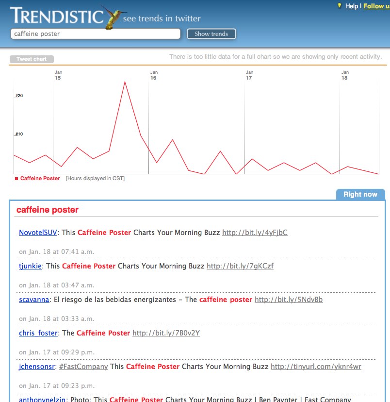
This is Part 2 in the continuing the series to share the details behind creating The Caffeine Poster.  I am going to create one web page to combine all of these Making-Of notes together, and I’ll post a link to that in Part 3.

Where did the data come from?

There was no one, single complete source for the data.  A number of the company websites have their caffeine content listed in the Nutrition Facts of product information, so if it was available I used their own information.

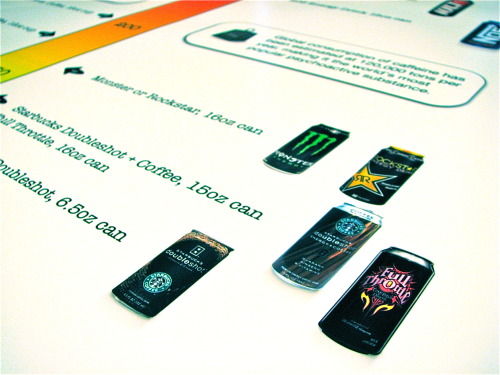
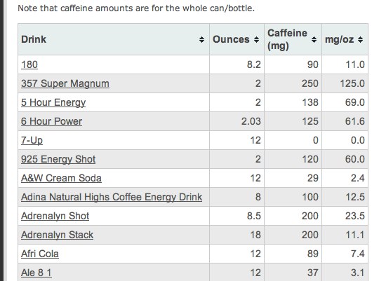
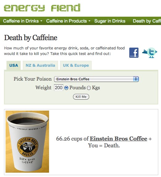
EnergyFiend.com has the largest database I found of caffeine contents in drinks and foods.  If I found different values for the caffeine content on different websites, I would just use an average.


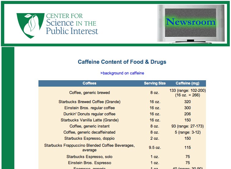
The Center for Science in the Public Interest also has the caffeine content listed for many drinks.


As a side note, EnergyFiend also has this great Death By Caffeine calculator!


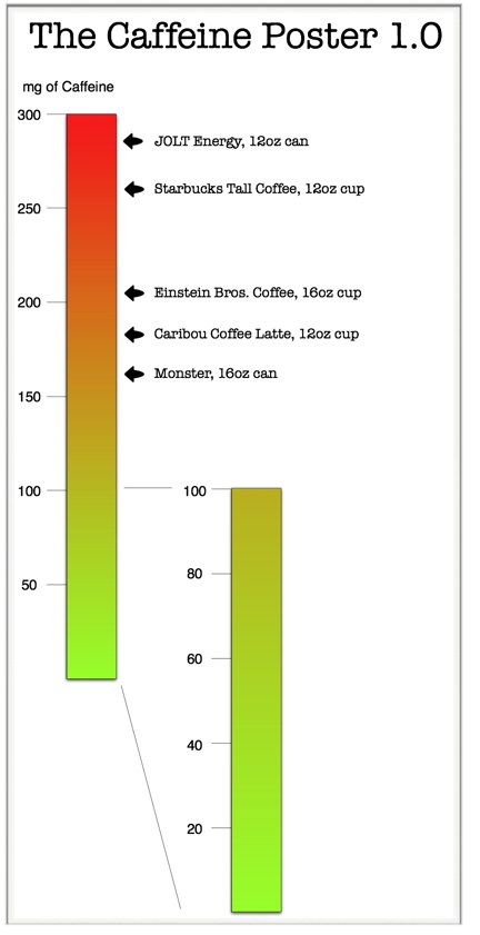
The drinks come is many different sizes.  Why didn’t you standardize the drinks sizes?

This was probably the feedback I’ve heard most often since posting the infographic.  I posted a short answer in the comments, but here I can provide some additional explanation.

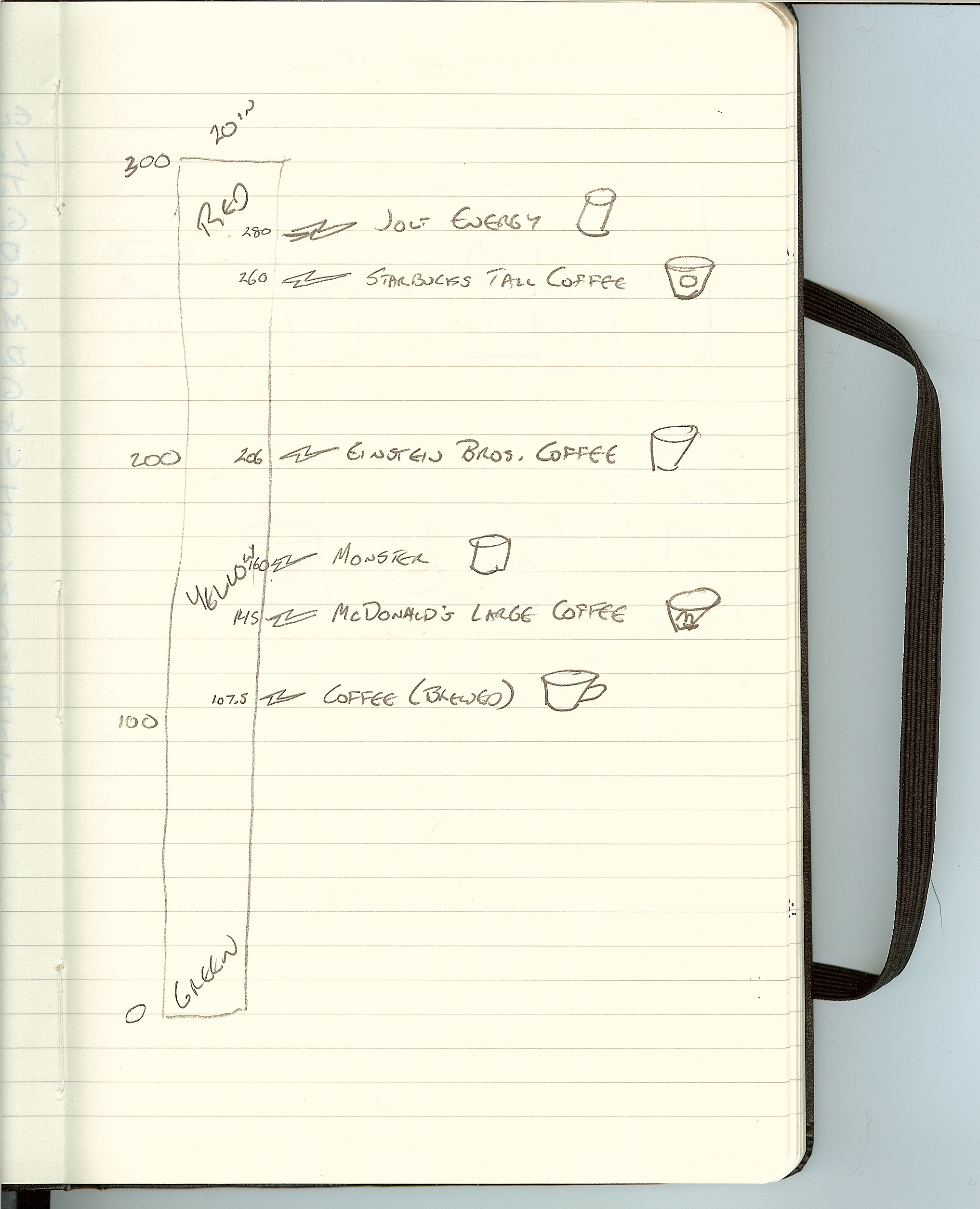
First, the data itself isn;t that complicated.  I didn’t need to use any statistical software to massage the numbers.  A simple spreadsheet in Numbers takes care of all the number crunching.

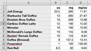
Even in this small piece of the spreadsheet, you can see a number of different drink sizes.  My choice was to either visualize column C or D.  The mg column represents the amount of caffeine you will consume from the entire drink.  The mg/oz column represents the amount of caffeine in each oz of liquid.

From a scientific point-of-view, the mg/oz is a common denominator and is probably a true apples-to-apples comparison.  This option would have shown the strength of the caffeine concentration in each formula, and you could see how much stronger the Starbucks coffee is compared to Dunkin’ Donuts.

However, my target market for the infographic isn’t the scientist that formulates the drinks, but the consumers that drink them.  Most of these drinks aren’t available in self-serve dispensers, so the consumer will drink whatever quantity they purchase (10oz, 12oz, 16oz, etc.).  By visualizing the total caffeine content of each drink, the consumer knows instantly how much caffeine they are putting into their body when they consume a drink.

For people that want to know the concentration, maybe I’ll add that as a side note for each drink in the next version.  :)


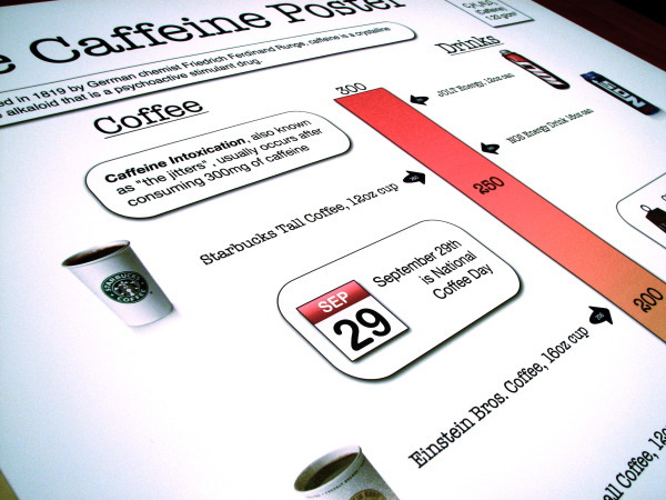
The caffeine content can differ each time you brew coffee, how did you choose only one number for each drink?

Even though caffeine content may vary from one drink to the next, all of the company sites and other websites list one average number for each drink.  Because the visual is a scale, the overall intent is to visualize the drinks in comparison to each other.  Precision wasn’t as important as showing them as higher or lower caffeine content relative to each other.

To be more exact, I could have listed ranges, and that wouldn’t have changed the drink locations on the scale.  BUT, ranges also weren’t available from the data sources, so it really wasn’t an option and I didn’t worry about it too much.

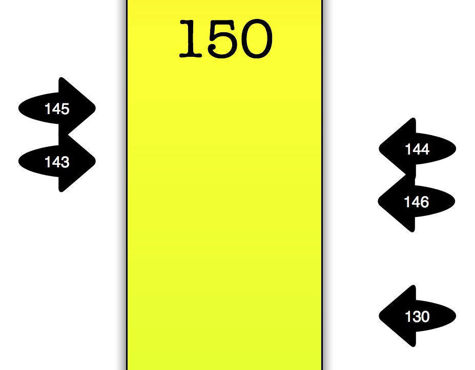
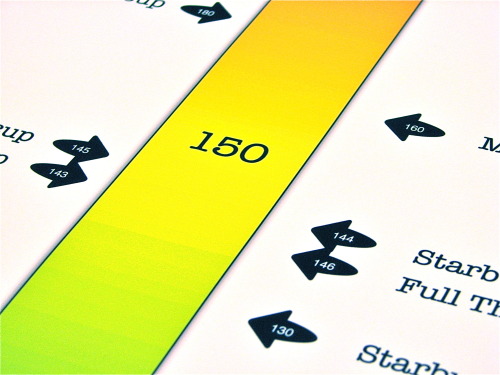
Adding the caffeine content numbers in the indicator arrows was actually a last-minute change.  Originally, I had intended not to list a specific number, because the values can vary.  Without the numbers, it leaves the actual content a little vague.

I also had some friends and designers look at an early version to get some feedback, and they would ask what the numbers were.  In the end, I decided that I personally would want to see the values if I were seeing the poster for the first time, so I added them.

Good thing I did too!  I found two drinks that were reversed and in the wrong place, so adding the numbers was a great way to check the accuracy of the design.
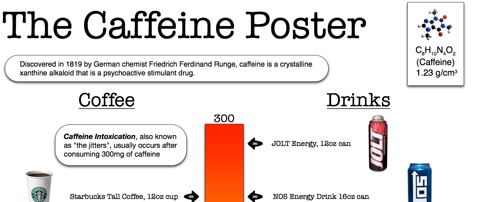
 

What is this thing?


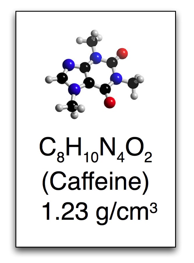
To emphasize the science behind caffeine, I included this rectangle that looks like it comes from the periodic table of elements.  Caffeine isn’t an element, so I could only use the style of the periodic table with this 3-D rendering of a caffeine molecule, the chemical formula of caffeine and the molecular weight.


More to come in Part 3…

Tuesday
Jan192010

6 Twitter Topic Visualizations for "Caffeine Poster"

The Caffeine Poster got a huge amount of traffic, specifically on Twitter, so I thought this would be a good chance to share a collection of the available, interactive twitter visualizations.  Although there are many visuals that show a Twitter user’s network of connections, these are visualizations that show conversations based on the search topic “caffeine poster” on Twitter.

SocialCollider.net, by Karsten Schmidt and Sascha Pohflepp, maps the connections within a conversation starting with a Twitter stream or search topic.

This experiment explores these possibilities by starting with messages on the microblogging-platform Twitter. One can search for usernames or topics, which are tracked through time and visualized much like the way a particle collider draws pictures of subatomic matter. Posts that didn’t resonate with anyone just connect to the next item in the stream. The ones that did, however, spin off and horizontally link to users or topics who relate to them, either directly or in terms of their content.


The Twitter Streamgraph from Jeff Clark at Neoformix.

The StreamGraph shows the usage over time for the words most highly associated with the search word. One of these series together with a time period are in a selected state and coloured red. The tweets that contain this word in the given time period are shown below the graph. You can click on another word series or time period to see different matches. In the match list you click on any word to create a different graph with tweets containing that word. You can also click on the user or comment icons and any URL to see the appropriate content in another window. If you see a large spike in one time period that hides the detail in all the other periods it will be useful to click in the area to the left of the y-axis in order to change the vertical scale.


Cloud.li, by Elbert F, creates a word cloud based on your search terms.


Trendistic will plot the tweet volume on a timeline based on your search terms.  You can click anywhere on the timeline to see the specific tweets for that time too.

Trendistic is a tool that allows you to track trends on Twitter, similarly to what Google Trends does for Google searches. It gathers tweets as they are posted, filters redundant ones and compiles the rest into one-hour intervals.

This way, it shows how the frequency of one, two, three and four-word phrases fluctuate over time. The result is a visualization of what is popular and what is not among Twitter users, and how certain events are reflected or even predicted by themicroblogosphere.

You can enter a phrase (topic) in the 
Trendistic search box to see how its frequency varies over time, or several different topics separated by commas to see how they relate (each topic will show in the chart with a specific color): try comparing ‘dinner’ and ‘breakfast’ or ‘morning’ and ‘night’ for instance, to see how powerful it can be. 


TwitterFall shows you the tweets based on your search term, and presents them as an animated waterfall.

Twitterfall is a way of viewing the latest ‘tweets’ of upcoming trends and custom searches on the micro-blogging site Twitter. Updates fall from the top of the page in near-realtime.

For popular trends, Twitter is queried from the Twitterfall server, and results arepushed to your browser, rather than your browser doing the queries, or your computerpolling our server repeatedly. This means using Twitterfall for popular trends is nicer on Twitter than other services.


 TwitRadar.com will map out a search term, a user or a hastag into a handful of different visuals.

Google Translated from Portuguese: The TwitRadar is a tool for monitoring Twitter. With TwitRadar you can track, monitor and share real-time, the subject you want. Just type the tag you want to track, the TwitRadar show, very simple and intuitive, all that is written about it on Twitter. And not to be confused with the volume of information tracked, the TwitRadar organizes the results according to the criteria that you want.

Friday
Jan152010

Making-Of The Caffeine Poster - Part 1

As much as I love infographics, I’m not a graphic designer.  I’ve created a number of graphics for my corporate jobs, but they always deal with confidential information so I can’t share those on the blog.  Up until now, all of the graphics I’ve posted about on Cool Infographics are the work of great designers around the world.  Recently, I decided to try my hand at creating one of my own to share with everyone.

If you follow me on Twitter (@rtkrum), you may have read that I started on this back in June 2009.  I haven’t had much time to spend on it, so it definitely took longer than I originally thought.  I want to share some of the decisions and solutions I came across during the process, and maybe it will help anyone reading this when they work on their own infographics.

You may say, “This is such a simple graphic, why did it take 6 months?  It looks like it should be pretty easy.”  First, I would say that I wasn’t working on it full time, but I think the exercise also highlights how much work really goes into infographic designs.  It’s not a new sentiment, but let me say that designers don’t get enough credit.


What should the infographic be about?

Of course the first question I had to tackle was what should I create an infographic about?  I wanted to find something that had a lot of publicly available data, but also a topic that hadn’t already been covered by a bunch of other graphics.  A topic of interest to a lot of people, so the audience for the infographic would also be large.  I liked the idea of caffeine content because although the data is available online, it’s not included on the government regulated Nutrition Facts on drinks.  Very few companies add it voluntarily, but for the most part you have to go find the data on your own.

Also, the data available online was predominantly text figures, so you have to scroll through pages of information to find the drink you’re looking for.  This combination of hard to find data, and hard to decipher once you find it made for a good topic.


How to calculate the data?

I created a simple spreadsheet to massage the data, and there were two ways I could have calculated the caffeine content.  Either total caffeine content (mg), or caffeine concentration (mg/oz).  Although caffeine concentration would be a good common denominator to compare drinks, it doesn’t capture how much you consumer when you actually purchase a drink.  Most of these drinks don’t come from a dispenser where you could choose how much you wanted to drink.

For example, the Starbucks Doubleshot is a very high concentration (20 mg/oz), but it comes in a 6.5oz can.  Therefore you only get 130mg of caffeine when you drink a can.  Compare that to a McDonald’s Large Coffee that has a lower concentration (9 mg/oz), but comes in a 16oz cup for a total of 145 mg.

Ultimately, I decided to visualize the consumer friendly version that would should how much you get when you make a purchase decision, and went with the total caffeine content.


What type of visual should I use?

The scale was the obvious choice to show the relative content of the drinks.  Back in June, I started with a very simple sketch in my Moleskine.


Because there are so many drinks in the lower half, my original design thought had a closeup of the 0-100mg range.  Here’s an early working version:

I didn’t like how this looked, or how much dead space in the post this would create.  So ultimately I ended up significantly cutting down the number of drinks I could include, and moving the scale to the center so I could include drinks on both sides.

You’ll also notice how muddy brown the yellow in the middle of the scale looks in these old images.  I later figured out how to do a 3-color blend instead of just a 2-color blend from red to green.


What software did I use to create the poster?

This is easily the most asked question I hear about any infographic.  I use a Mac, and really only used a small number of applications.  Here’s a list of the software packages I used:

  • OmniGraffle Pro 4.2.3 - Overall layout and creation of the final image
  • Pixelmator 1.5 - Image editing
  • Keynote 5.0.3 - Used for image editing and alpha masks
  • Numbers 2.0.3 - For the data calculations

 I will add that one of my best friends is an art director, and she helped clean up a few of the photos using Photoshop and Illustrator.  A huge “Thank You” to Steffani for her help.


More to come…

Making-Of The Caffeine Poster - Part 2