


Fast Facts on Coffee Consumption
 Randy
Randy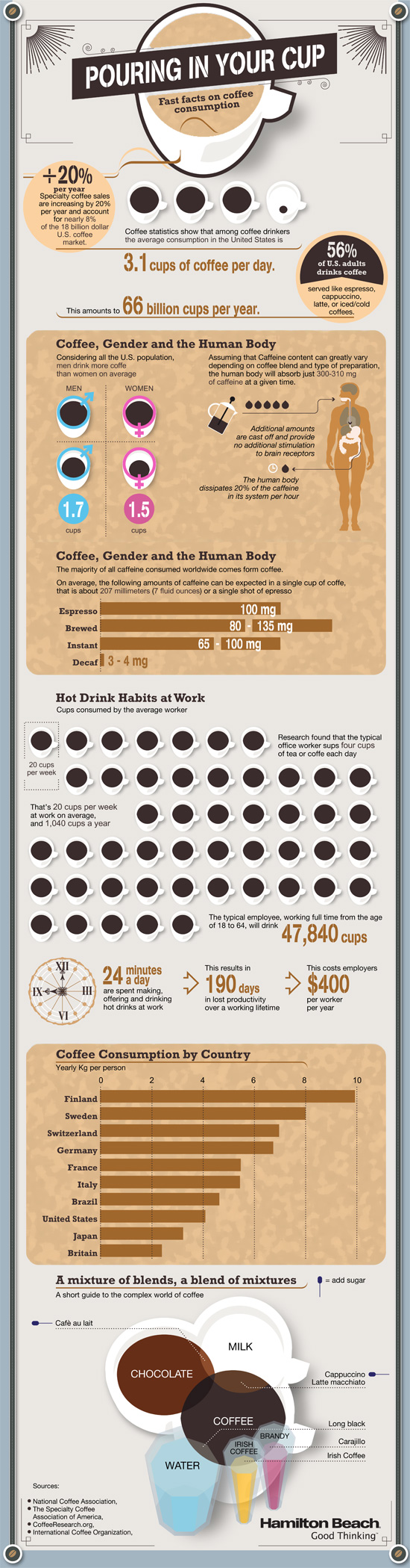
Pouring in Your Cup: Fast Facts About Coffee Consumption is a good infographic from Hamilton Beach.
This is a good example of a company publishing an informative, marketing infographic about a topic related to their products (coffee makers), without feeling like a sales pitch or ad for their products. However, I don’t think there is a clear story told by the infographic. It’s generally a bunch of coffee and caffeine statistics put together in an infographic without a clear message.
I like the design and the simple color palette. Most of the visualizations are clear and easy to understand except the bunch of coffee cups lined up in the middle. I think each cup is supposed to represent the 20 cups/week the average office worker drinks, and all of the cups together is supposed to represent a year of coffee consumption. When you line up images like this, the rows really should have only 10 images each for the reader to easily understand the quantity. So, there should be 52 cups to represent the whole year, but there are only 48 cups shown.
There are a handful of stand-alone statistics that are just shown in text, that could have been visualized. The clock image shown next to the stats “24 minutes a day” should have had a highlighted portion showing 24 minutes. I like the male/female symbols used on the coffee cups, and the Venn-diagram style of coffee blends is great.
I’m going to go pour myself my third cup of coffee this morning…
Found on Infographics Showcase, Infographic Pics and Infographipedia

Reader Comments (4)
Actually, I like this poster a lot, it's very clean and well done, so it's near-perfection makes the tiniest blemishes stand out even more.
Duplicate title: Why is the title of "Coffee, Gender and the Human Body" repeated twice in the same box? I can see that having the second title provides separation within the box, but wouldn't a different title be more appropriate? I'm sure the division could be accomplished even without additional text.
"Research found ... worked sups four cups of coffee..." - Using the words "sups" seems a little odd here. I'm hoping it's just a typo for "sips".
"Irish Coffee" seems to be an ingredient in making Irish Coffee. Shouldn't it be Irish Whiskey and whipped cream? I guess you could get away with just using Irish Cream, but that doesn't taste quite as good :)
Seriously, apart from those tiny flaws, it's an excellent infographic!
To mention a few items:
"Coffe" misspelled.
"56% of U.S. adults drinks coffee" grammatical error.
Inaccurate information (in addition to the first comment)
Cafe au Lait is not a Milk and Chocolate blend.
Cappuccino and Cafe au Lait do not have sugar.
Espresso is not explained. i.e. single? double? And the milligrams of caffeine is incorrect.
Agreed, there is no story.