About
Randy Krum
President of InfoNewt.
Data Visualization and Infographic Design

Infographic Design

Infographics Design | Presentations
Consulting | Data Visualizations

DFW DataViz Meetup

Join the DFW Data Visualization and Infographics Meetup Group if you're in the Dallas/Fort Worth area!

Search the Cool Infographics site

Custom Search

Subscriptions:


Feedburner

The Cool Infographics® Gallery:

How to add the
Cool Infographics button to your:

Cool Infographics iOS icon

- iPhone
- iPad
- iPod Touch


Read on Flipboard for iPad and iPhone

Featured in the Tech & Science category

Flipboard icon

Twitter Feed
From the Bookstore

Caffeine Poster

The Caffeine Poster infographic

Entries in weather (15)

Friday
Sep142018

Visualization of Hurricane Florence's Path

Harry Stevens from Axios created a simple but great visualization of Why Hurricane Florence is so unusual — and so dangerous. The DataViz shows what makes the path of Hurricane Florence different than all of the past major hurricanes to hit the Carolinias.

Wednesday
Apr182018

Animated Visualization of First Leaf Appearance

Animated Visualization of First Leaf Appearance

Spring is coming! Jeremy White at the NY Times has animated data from the USA National Phenology Network showing the average dates of "first leaf" across the U.S.

In some cases, an animated data visualziation is better at communicating the data to the audience than a static design. This animation clearly shows the progression of Spring across the country and you can understand the data within seconds.

Monday
Jul312017

EARTH, a visualization project

EARTH, by Cameron Beccario, is a beautiful interactive, animated visualization of a few different weather features across the entire globe.

EARTH, by Cameron Beccario, is a near real-time visualization of global weather conditions forecast by supercomputers. This vivid capture depicts intricate, dramatic swirling patterns of wind streamlines reminiscent of oil paintings of the Impressionists.

CAMERON BECCARIO'S creation, Earth. depicts wind patterns on a global scale. The artist began with a wind map of Tokyo, where he lives, and then he took on the world. You can see his animated creation at earth.nullschool.net.

You can spin the globe and zoom in on any area in the World. Opening the setting panel lets you change the data that is being displayed; from wind to ocean waves to particulates in the atmosphere.


To support his project, you can purchase prints of some of the high-resolution images from Point.B Studio 

Designed in D3, all of the source code is also available at https://github.com/cambecc/earth. Of course the project was inspired by the Wind Maps visualization by Fernanda Viégas and Martin Wattenberg, that I have posted about before.

Wednesday
Apr262017

Visualizing Climate Change

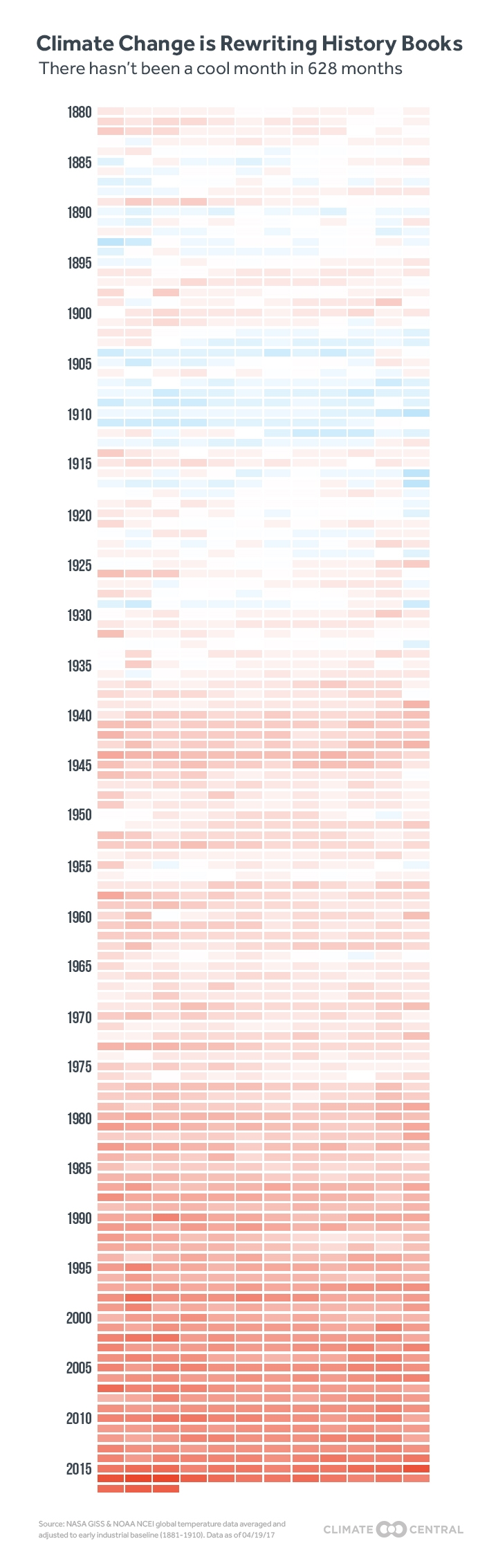
Climate Change is Rewriting the History Books is an infographic from Climate Central that uses a heatmap design style to show how average temperatures have changed over the last 137 years.

This March clocked in as the second warmest March on record when compared to the 20th century average, according to newly released data from the National Oceanic and Atmospheric Administration. NASA data published last week came to the same conclusion, comparing temperatures to a 1951-1980 baseline.

The NOAA data shows the planet was 1.9°F (1.05°C) above the 20th century average for March, the first time any month has breached the 1°C threshold in the absence of El Niño. This March is the latest freakishly hot month following three years in a row of record heat.

NOAA and NASA baselines don’t really tell the whole story. How much the world has warmed since pre-industrial times is a crucial measuring stick for international climate talks and a more accurate representation of how much climate change is altering the planet.

Using the baseline of 1881-1910, a new, more dire picture of global warming emerges. This March was 2.4°F (1.3°C) above the pre-industrial average by that measure. More notably, this March marks a whopping 627 months in a row of warmer than normal temperatures. If you were born after December 1964, you’ve never experienced a month cooler than average on this planet.

To understand what that looks like, take a peek at the global temperature chart below. Each month is represented by a box. Cool blues have been disappearing, replaced by a wave of unending heat. Climate change is likely to continue the streak of warmer than normal months into the foreseeable future as temperatures keep marching upward.

There are a few things about this design worth commenting on:

  • I'm accepting the data from NASA and NOAA at face value, because this blog discusses the visual communication and design of data. However, I can't find the data they used. It would be helpful if they provided the final data they used to build the visualization. Provide a spreadsheet with the data as an act of data transparency.
  • This looks like a great use of the Conditional Formatting capability in Microsoft Excel. If it wasn't designed in Excel, it easily could be.
  • Heatmaps or choropleth maps (ie. using color hue, density, shading, opacity, or saturation) are impossible for the reader to differentiate the exact difference between the values. You can get a general impression, but this is at the bottom of the Scale of Graphical Perception
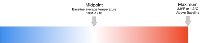
  • In a heatmap, the designer chooses the minimum and maximum values, and the data dictates all of the actual color saturations shown for each month. The minimum would be solid blue, the midpoint would be white and the maximum value would be solid red.
  • In this case, the chart colors start near the average, not the minimum value. So, all of the months from 1881-1910 are very close to white because these are the values that were used to calculate the midpoint
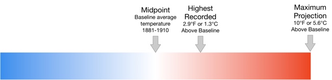
  • The maximum temperature value is 1.9° higher than the average, and that value is shown as the fully saturated red color. This is a choice by the designer, and makes the average temperatures in the highest months visually appear as very dramatic.
  • This is the default setting for a function like Conditional Formatting. It takes the maximum value in a given dataset, and correlates that to the maximum color saturation. It's up to the designer to decide if this default setting is correct for visualizing the data.


  • The article suggests that the trend will continue with warmer temperatures in the future, so an alternate choice the designer could make is to set the maximum color saturation to something like 10°F over the Baseline. The current temperatures would look much less dramatic, but it would allow for future higher temperatures to be displayed on the same scale.


The choices a data visualization designer makes has a huge impact on how the data is perceived by the audience!

Tuesday
Oct252016

Earth's Temperature Timeline

A Timeline of Earth's Average Temperature infographic

A Timeline of Earth's Average Temperature is another great data visualization design by Randall Monroe at XKCD.com! Real data and a humorous take on historical events!

A Timeline of Earth's Average Temperature since the last ice age glaciation. When people say "The climate has changed before," these are the kinds of changes they're talking about.

It's a long design on purpose. That's what drives the context of the data so strongly. 22,000 years of small changes and major historical events and then "Oh shoot..."

Found on FlowingData

Wednesday
Oct122016

How Much Warmer Was Your City in 2015?

How Much Warmer Was Your City in 2015

This is a cool interactive data visualization from the NY Times: How Much Warmer Was Your City in 2015?

Scientists declared that 2015 was Earth’s hottest year on record. In a database of 3,116 cities provided by AccuWeather, about 90 percent of them were warmer than normal. Enter your city in the field below to see how much warmer it was last year.

Temperature and precipitation data are provided by AccuWeather. The normal range of temperature is calculated by normalizing the weather from 1981 to 2010.

Data for some cities are incomplete. When actual or historical temperatures were missing, the corresponding bar is not shown for that day. The data presented here are as they were recorded on Jan. 22, 2016.

By K.K. Rebecca Lai, with additional work by Gregor Aisch

You can choose your city (or a city close to you) from the 3,116 cities included in the data. For many cities, you will see the 2015 daily temperature ranges in comparison to the normal temperature range and the historical high and low record temperatures. If historical data is not available, you will only see the comparison to the normal temperature range.


Friday
Aug262016

Animal Migrations In Motion

Animal Migrations In Motion

Animal Migrations In Motion is a fantastic animated & interactive data visualization of the predicted migration patterns of almost 3,000 species in North and South America as our climate changes.

As climate change alters 
habitats and disrupts ecosystems, where will
 animals move to survive?
 And will human development prevent them from getting there?

This map shows the average direction mammals, birds, and amphibians need to move to track hospitable climates as they shift across the landscape.

Researchers from University of Washington and The Nature Conservancy modeled potential habitat for 2954 species using climate change projections and the climatic needs of each species.

This map was created by Dan Majka, who works for The Nature Conservancy's North America Region science team.

This visualization would not have been possible without the incredible prior work of the hint.fm wind map, cambecc's earth wind map, and Chris Helm's adaptation of cambecc's code.

It's mesmerising to watch! Just like some of the prior designs that inspired this one listed above. It's interactive, so you can move and zoom the part of the map being shown.

The description does leave a few unanswered questions. For instance:

  • What time period is being shown here?
  • What predicted climate changes and assumptions are being used?
  • What species are shown and how were they chosen?

Found on FlowingData!

Thursday
Mar032016

Weather Portraits 2014 US Cities

Weather Portraits 2014 US Cities

Weather Portraits 2014 US Cities infographic poster is Nicholas Rougeux's project for visualizing weather data. The poster shows diagrams of daily wind and temperatures during one year for the most populated city in each state. He tried many different ways to visualize his data, a process that he outlined in his blog post, Making of the Weather Portraits poster. The final infographic poster can be seen above.

Each diagram includes five daily measurements for an full year in a city: wind direction, wind speed, high temperature, low temperature, and range of temperatures. 


Poster prints for 2014 and 2015 are available for purchase.

Colorful diagrams display five daily measurements for an full year in each city: wind direction, wind speed, high temperature, low temperature, and range of temperatures. Data were collected from the Quality Controlled Local Climatological Data (QCLCD) provided freely by the National Oceanic and Atmospheric Association (NOAA).

Thanks to Nick for sending in his project!

Tuesday
Dec232014

The Shapes of Snowflakes

The Shapes of Snowflakes infographic

The Shapes of Snowflakes is a fascinating categorization of crystal structures from Compound Interest, a chemistry site run by Andy Brunning in the UK. The site has a huge selection of chemistry and science related infographics.

In the Northern Hemisphere at least, the idealised vision of Christmas involves snow. Whilst no one snowflake is exactly the same as another, at least on a molecular level, scientists have none-the-less devised a system of classification for the many types of crystals that snow can form. This graphic shows the shapes and names of some of the groups of this classification.

The number of categories snow crystals can be categorised into has been steadily increasing over the years. In early studies in the 1930s, they were classified into 21 different shape-based categories; in the 1950s, this was expanded into 42 categories, in the 1960s to 80 categories, and most recently in 2013 to a staggering 121 categories.

Science meets Christmas!

You can also download a high-resolution PDF version.

Wednesday
Mar132013

Beautiful Animated Wind Maps

The static image above doesn’t do these maps justice.  Go see the Wind Map on the Hint.fm site to truly appreciate the design work from artists Fernanda Viégas and Martin Wattenberg.

An invisible, ancient source of energy surrounds us—energy that powered the first explorations of the world, and that may be a key to the future. This map shows you the delicate tracery of wind flowing over the US. 

The animation is mezmerizing, and the interactive piece allows you to click-to-zoom in closer to any part of the map to see much more detail in a specific region.  The main page shows the map based on the most current weather information, but the Gallery page has some snapshots linked to specific points in time (like Hurricane Sandy).  I love that even the speed legend on the side is animated!

You can also buy a poster version as an art print.

Thanks to Jeff Jarvis for sharing this on Google+!