About
Randy Krum
President of InfoNewt.
Data Visualization and Infographic Design

Infographic Design

Infographics Design | Presentations
Consulting | Data Visualizations

DFW DataViz Meetup

Join the DFW Data Visualization and Infographics Meetup Group if you're in the Dallas/Fort Worth area!

Search the Cool Infographics site

Custom Search

Subscriptions:


Feedburner

The Cool Infographics® Gallery:

How to add the
Cool Infographics button to your:

Cool Infographics iOS icon

- iPhone
- iPad
- iPod Touch


Read on Flipboard for iPad and iPhone

Featured in the Tech & Science category

Flipboard icon

Twitter Feed
From the Bookstore

Caffeine Poster

The Caffeine Poster infographic

Entries in election (24)

Tuesday
Sep042018

Extremely Detailed 2016 Election Map

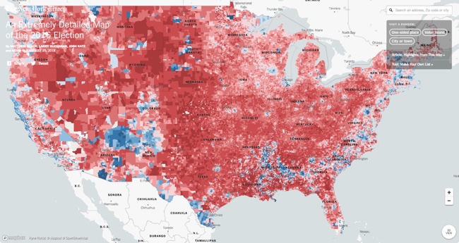
The New York Times has published An Extremely Detailed Map of the 2016 Election, and it's fascinating to explore! 

Their full article, Political Bubbles and Hidden Diversity: Highlights From a Very Detailed Map of the 2016 Election, examines some of the more interesting patterns, insights and inconsistencies.

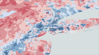
The election results most readers are familiar with are county maps like the ones we produce at The Times on election night. But votes are cast at a much finer unit of geography — in precincts, which may contain thousands of voters but in some cases contain only a handful. Our previous election maps contained results for about 3,100 counties; here we show results for more than 168,000 voting precincts.

The interactivity is really well done, made possible through the integration with MapBox, and you can zoom in to view the data down to the smallest voting precincts. Pop-up information will tell you the exact number of votes at the precinct level.

Here's an animated journey (accelerated) around the country to 14 major cities:

Wednesday
Aug092017

Landslide for the "Did Not Vote" Candidate in the 2016 Election!

From BrilliantMaps, this is the Did Not Vote Election Map, showing the magnitude if all voting-eligible adults that did not actively vote in the 2016 Presidential election. A Presidential candidate needs 270 Electoral College votes to win. The "Did Not Vote" candidate would have have gathered 41% of the total votes from the voting eligible population, and 471 votes from the Electoral College! A Landslide!

The map above shows what the 2016 US Presidential Election results would have been if votes not cast for Hillary, Trump or one of the third party candidates had gone to fictional candidate “Did Not Vote.”

 As a percentage of eligible voters, Clinton received 28.43% (65,845,063) of all votes compared to Trump’s 27.20% (62,980,160) and Did Not Vote’s 44.37%(102,731,399).

Total voter turnout was estimated to be 55.3% of the voting age population and 59.0% of the voting eligible population.

Map created using 270 To Win, based on reddit user Taillesskangaru’s posts here and updated here.

Disclaimer: The map above was accurate as of January 17th, 2017. Totals below were true at the time of writing but may no longer currently be accurate as additional votes and recounts are conducted.

Thanks to Mike Wirth for sharing on Facebook!

Wednesday
Mar012017

A Visual Explanation of Gerrymandering

A Visual Explanation of Gerrymandering

The Washington Post recently published this simple but very effective visual explanation of Gerrymandering: How to steal an election: a visual guide

Gerrymandering -- drawing political boundaries to give your party a numeric advantage over an opposing party -- is a difficult process to explain. If you find the notion confusing, check out the chart above --  adapted from one posted to Reddit this weekend -- and wonder no more.

Suppose we have a very tiny state of fifty people. Thirty of them belong to the Blue Party, and 20 belong to the Red Party. And just our luck, they all live in a nice even grid with the Blues on one side of the state and the Reds on the other.

Now, let's say we need to divide this state into five districts. Each district will send one representative to the House to represent the people. Ideally, we want the representation to be proportional: if 60 percent of our residents are Blue and 40 percent are Red, those five seats should be divvied up the same way.

This is a great example of using data visualization to explain a complex process. The use of the matrix of squares to represent people simplifies the context and keeps the audience attention focused on the groupings.


Thursday
Aug252016

Examining the Real Cost of Donald Trump's Wall

Building Donald Trump's Wall infographic

Real Money has done the math and shared their findings in the infographic Examining the Real Cost of Donald Trump's Wall, designed by DesignBySoap. It appears that the actual cost of the wall would end up being 2-3 times more expensive than the publicly released estimate. Luckily, even many of his supporters do not believe he will build the wall. You can see the details of Trump's plan, as well as some statistics on how Americans feel about it in the infographic above.

Thanks to John for sending in the infographic!

Tuesday
Aug092016

Comparing Presidential Election Forecasts

Comparing Presidential Election Forecasts

In addition to their own forecast, the NY Times maintains a great graphic Comparison of Presidential Election Forecast Models showing the current results from of seven different election forecasts based on statistical models, expert predictions and even betting markets. The results are updated daily, so check the NY Times site for the most current information!

How Other Forecasts Compare

The New York Times is one of many news organizations to publish election ratings or forecasts. Some, like FiveThirtyEight or the Princeton Election Consortium, use statistical models, as The Times does; others, like the Cook Political Report, rely on reporting and knowledgeable experts’ opinions. PredictWise uses information from betting markets.

We compile and standardize these ratings every day into one scoreboard for comparison.

Each organization’s state-by-state ratings. Viewed together, the differences between the models become much clearer.

They also publish this simple complete prediction comparison showing the total predictions from each group:

Although they have built this in HTML5 on the website, anyone could create a similar comparison graphic style using Conditional Formatting in Excel. This is a great way to highlight differences and outliers in a table of data!

Wednesday
Aug032016

Very Few Americans Nominated Trump and Clinton

Designed by Alicia Parlapiano and Adam Pearce for the New York Times, this short series of data visualizations tell a very clear story about how Only 9% of America Chose Trump and Clinton as the Nominees For the 2016 Presidential election.

The United States is home to 324 million people. Each square here represents 1 million people.

103 million of them are children, noncitizens or ineligible felons, and they do not have the right to vote.

88 million eligible adults do not vote at all, even in general elections.

An additional 73 million did not vote in the primaries this year, but will most likely vote in the general election.

The remaining 60 million people voted in the primaries: about 30 million each for Republicans and Democrats.

But half of the primary voters chose other candidates. Just 14 percent of eligible adults — 9 percent of the whole nation — voted for either Mr. Trump or Mrs. Clinton.

Mr. Trump and Mrs. Clinton will be working to win the votes of these three groups. Polls suggest they will be separated by just a handful of squares.

If you follow the news headlines, you might think a majority of Americans are in favor of one of our two Presidential nominees, but that would be a misunderstanding of election and population statistics.

This is a fantastic example of storytelling with data, and walking the audience through the data insight step-by-step.

Found on FlowingData


Tuesday
May172016

Election Exodus - Moving to Canada?

Election Exodus - Moving to Canada infographic

Frustrated by the U.S. Presidential candidates? Ready to just pack up and move the Canada? The Election Exodus infographic from SpareFoot looks closer at what it would take for Americans to move North to Canada.

Trump or Clinton.

The prospective of either of these presidential frontrunners emerging victorious in November is too much for many Americans to bear.

A shocking number of U.S. citizens would consider a move to Canada—15 percent if Hillary Clinton is elected and 20 percent if Donald Trump is elected, according to recent polls.  (To be fair, we’re willing to bet there would be plenty of supposed defectors under President Sanders or Cruz as well.)

The question remains: How serious are these people? And how hard is it to move to Canada?

The answers to these questions and more lie below:

Designed by NowSourcing, this is a visually busy take on the side-by-side comparison style of infographic. A lot of text, and many of the statistics are not visualized, which makes it harder for readers to understand all of the information.

Thanks to Brian for sending in the link!

Friday
Nov072014

The Most Detailed Maps from the Midterm Elections

The Most Detailed Maps from the Midterm Elections North Carolina infographic

The team at the NYTimes has published these fantastic Most Detailed Maps from the Midterm Elections.

Why are we so confident these are the most detailed maps you’ll ever see from the 2014 Senate elections? Precincts are the smallest level of geography for publicly-reported election results. There were more than 175,000 precincts in the United States in 2012, fifty times the number of counties. The maps here show precinct-level results, where available, from some of the closest Senate races.

Maps exclude early votes in counties that do not report them by precinct. Some precinct boundaries are approximate.

I would call these Pop-Up Infographics, where the map is static, but additional details are shown in a pop-up frame when you hover over each voting precinct.

The Most Detailed Maps from the Midterm Elections Louisiana Infographic

Found on Flowing Data, and thanks to Mike Wirth for posting on Facebook!

Tuesday
Oct262010

VoteEasy: Visual Election Candidate Comparison


VoteEasy is an interactive website designed by Project Vote Smart.  Very useful in America with election coming up next week.


After you choose your location, the VoteEasy site looks up the candidates specific to your area.  By entering your opinions on 12 critical issues and how important each issue is to you, the site shows you which candidates most closely match your beliefs.  Some candidates have submitted their answers, and the rest are inferred from the public records.

I made up some answers for New York since I don’t live there and don’t have any opinions on those candidates.  The site broke up the candidates into the two different Senate races and a House seat race currently on the ballot: 


You can click on a particular candidate to get specific information about them and their political record.


Found on Chart Porn and Infosthetics

Wednesday
Oct202010

Brazilian Presidential Elections infographic

From TwitRadar.com is a cool tracking map of Twitter posts during August 2010 related to the Brazilian Presidential Election and the candidates.  Data is captured from www.twiteleitoral.com.br

It describes the daily variations on the number of quotations for the top 2 more mentioned candidates, Dilma and Serra. It also points out “of the curve” campaign or media events that took affect on the twitter chattering.

Norton Amato Jr. and his team were gracious enough to translate it into English for readers of Cool Infographics, and here is the original:

Big thanks to Norton and his team!  Great job!