


The Caffeine Poster, How Much Caffeine Are You Drinking? [new infographic]
 Randy
Randy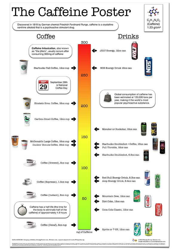
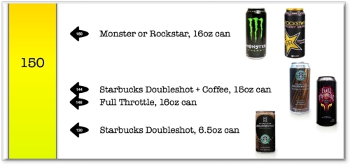
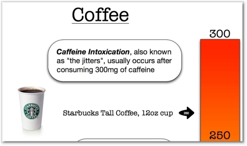
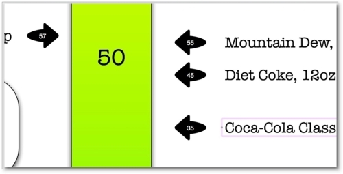
You are what you drink. With so many drinks today claiming to be “energy drinks”, I wanted a little visual clarification, so I made The Caffeine Poster. With coffee drinks on one side and canned cold drinks on the other, you can quickly see how much of a caffeine “hit” (in mg) you will get after consuming. What’s especially interesting is many of the drinks have a very high caffeine mg/oz ratio, but the drink is so small you don’t get that much total caffeine.
I’ve been working on my own infographic for 6 months now off-and-on when I can make time. I figured that I’ve been running this infographic blog for a few years now, it’s time to start putting up my own work. Most of the data visualization I’ve designed are confidential to the company I make them for, so I wanted to create some infographics that I can publish on the blog.
The Caffeine Poster is supposed to help with one decision in your life. If you’re going to grab a caffeine drink during the day (or evening), which drink should you consume? I tried to stay focused on telling one story really well. I’ve heard from others that this may make for a really good infographic, but may not make a great poster because a good poster would have a much deeper level of detail. I like it, and we’ll see what king of responses I get.
I absolutely want to hear your feedback. Please add your comments below or send me a note. What do you think? I’ve also got requests to print and offer this as a poster. We’ll see if there is enough interest…
Also, I’m planning to post as “Making-of” article on what it took to create this infographic.
Making-Of The Caffeine Poster - Part 1
Making-Of The Caffeine Poster - Part 2
Making-Of The Caffeine Poster - Part 3
THANKS: A big thanks to Fast Company for posting about The Caffeine Poster on the Fast Company blog. The Caffeine Poster was the most popular story of the week on Fast Company!
