About
Randy Krum
President of InfoNewt.
Data Visualization and Infographic Design

Infographic Design

Infographics Design | Presentations
Consulting | Data Visualizations

DFW DataViz Meetup

Join the DFW Data Visualization and Infographics Meetup Group if you're in the Dallas/Fort Worth area!

Search the Cool Infographics site

Custom Search

Subscriptions:


Feedburner

The Cool Infographics® Gallery:

How to add the
Cool Infographics button to your:

Cool Infographics iOS icon

- iPhone
- iPad
- iPod Touch


Read on Flipboard for iPad and iPhone

Featured in the Tech & Science category

Flipboard icon

Twitter Feed
From the Bookstore

Caffeine Poster

The Caffeine Poster infographic

Entries in movies (48)

Monday
Oct212013

Cars of the Silver Screen

Cars of the Silver Screen infographic

Cars of the Silver Screen infographic by moneysupermarket.com.

Looking for car insurance can be a time consuming and expensive business. However, if you were trying to insure some of these film treasures you might expect a few extra zeros on the end of your premium! From the Ford Mercury that James Dean famously drove in his last film, Rebel Without a Cause, to the brand new Audi R8 e-tron that Tony Stark drives in Iron Man 3, cars have played a massive part in iconic film history.

However, it is not always the ultra-cool cars that steal the limelight in blockbuster movies. Quite often the most memorable cars are the most unlikely. Take, for instance the Cadillac ‘Ecto-1’ that the Ghostbusters used to get around the busy New York streets, or the Volkswagen Beetle that got into so many scrapes in the Herbie movies.

To celebrate these unlikely heroes, we’ve taken a look at the timeline of great cars of the silver screen.

Interesting topic choice for Money Super Market.  For successful infographics, choosing a relevant topic with related keywords and search criteria can make a big difference.  Good link bait brings views and links from readers that are interested in the topic, and ideally even raises awareness with potential customers.

I’d like to hear your opinion.  Is this infographic about cars from movies relevant to a site that helps people find car insurance?  Leave your thoughts in the comments.

Thanks Paul for sending in the link!

Wednesday
Oct162013

The Ultimate Loss

The Ultimate Loss infographic

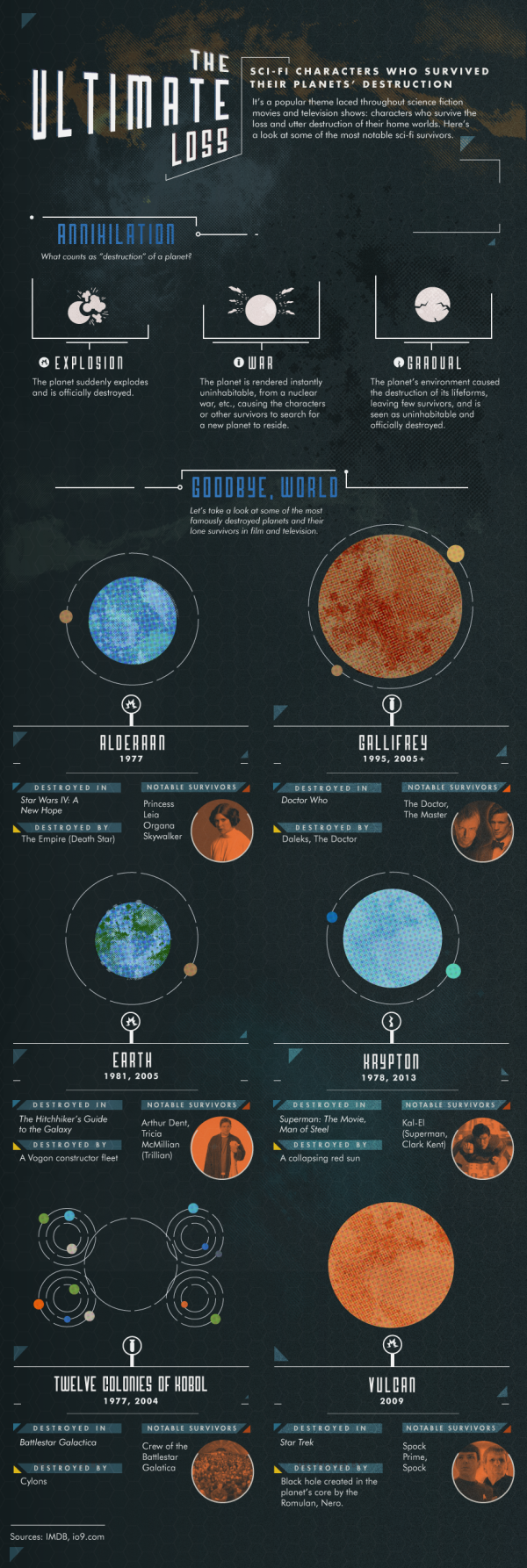
The Ultimate Loss infographic from Confused highlights some of the most famous SciFi characters that are the last survivors of their home worlds destruction.

Sci-Fi characters who survived their planets’ destruction.

It’s a popular theme laced throughout science fiction movies and television shows: characters who survive the loss and utter destruction of their home worlds.  Here’s a look at some of the most notable sci-fi survivors.

Knowing the infographic image will be shared on other sites, this design is missing some crucial information in the footer.  The biggest omission is a mention or logo from the company that published it, Confused.com.  The footer should also include a copyright statement, and the URL to the infographic landing page where readers can find the original full-size version.

Found on visualnews.com

Wednesday
Sep042013

The Guide to Star Trek Uniforms

The Guide to Star Trek Uniforms infographic

The Gude to Star Trek Uniforms infographic from Costume Supercenter. Make sure you know what uniform your wearing!

When the original Star Trek television series started, male and female officers wore similar outfits. The male Star Trek uniforms consisted of black pants, black boots and a velour shirt with the symbol on the left side. Females wore the same type of shirt, with black boots and tights, and a black skirt, although in some cases they wore black pants. The color of shirt worn identified the branch the crew member belonged to. Those in green shirts worked for command personnel, while beige stood for operations, and blue was for medical personnel only. The velour shirts were changed to nylon shirts starting in the third season. You can find many of the Star Trek Costumes here.

Don’t be the red-shirted ensign!

The footer of the design should include the copyright information and the URL to the original infographic landing page so readers can see the full-size infographic.  The Costume Supercenter logo should also be somewhere on the design to connect the infographic to the publishing company.

Found on Visual.ly

Monday
May132013

Is Elon Musk The Real Life Tony Stark?

Is Elon Musk The Real Life Tony Stark? infographic

With the new Iron Man movie in theaters, everyone has Tony Stark on the mind. But have you noticed the scary similarities between the fictional character and Elon Musk? The Is Elon Musk The Real Life Tony Stark? infographic from vcars.co.uk gives us the breakdown on each guy and then summarizes the similarities and differences.

Definitely a fun design.  I wish they had visualized any of the data for easier comparison, like height and net worth.

Thanks to Meilen for sending in the link!

Tuesday
Apr092013

JAWS

JAWS infographic

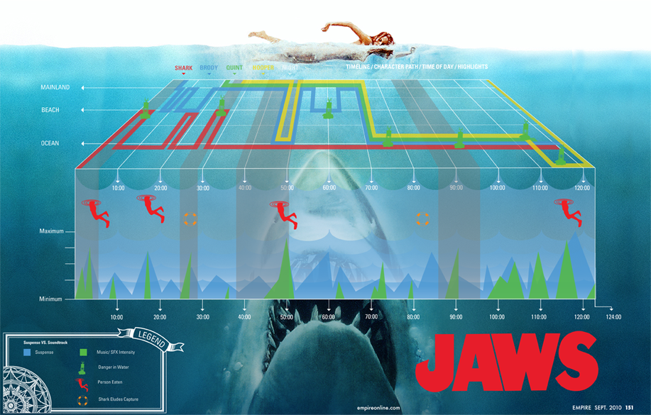
I’ve been meaning to post this one for a long time.  JAWS, designed by Robert Machuga, uses the design style of the movie poster to create this cool infographic that visualizes multiple dimensions of data from the movie.

From Robert:

This project was an assignment in my senior year at the Hartford Art School where my class had to dissect a movie and translate it into an infographic Each of the colored lines represents the location of each of the main characters in the film divided into beach, mainland, and ocean. The red icons represent each time a human was eaten while the green buoy icons represent danger in the water. The orange lifesaver icons appear when the shark eludes capture and the timeline across the bottom spikes in green at points of musical intensity while the blue spikes are moments of suspense. 

In approaching this project I really had to sit down with the film and the remote, fast forwarding and rewinding, trying to find the most pivotal events and themes that I could use to depict this movie in a static visual. I was trying to capture the thrill of the movie without loosing the story in the graph so I tried to break it down to it’s simplest forms. After many rounds, encouragement and great advice from professor John Nordyke I was left with the graph I have now. 

Nice job Robert!

Monday
Jan282013

James Bond: 50 Years of Movies

James Bond: 50 Years of Movies infographic

James Bond: 50 Years of Movies infographic from hrblock.com is all about Bond, James Bond. See the top grossing films, iconic bond accessories and more.

It’s been almost 50 years since Sean Connery first delivered those now-legendary words on the big screen.

And 22 films later (with #23 on the way in November), the super suave super-spy known as 007 is celebrating a half century of fast cars, money and martinis on October 5th. To mark the milestone, we’ve put together an infographic taking stock of all that is Bond.

Very nice design.  My only suggestion would be to visualize more of the dollar figures shown instead of just showing them in text.  I appreciate that all of the dollar values have been inflation adjusted to 2012 dollars.

Thanks to Jane for sending in the link!

Monday
Oct152012

The History of Film infographic poster

The History of Film infographic poster

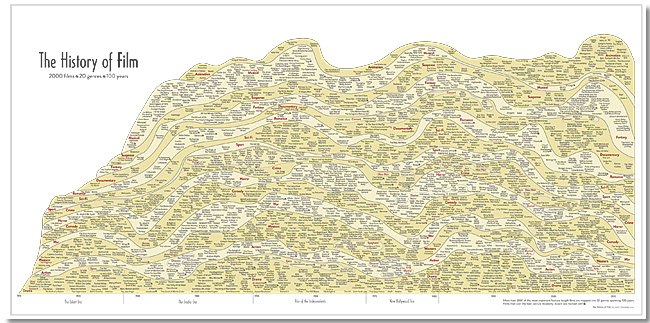
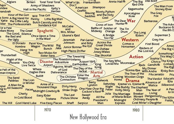
New infographic poster by Larry Gormley from HistoryShots.  The History of Film plots out the most important films of the last 100 years into a beautiful, flowing timeline that visually separates the films by 20 different genres.

This graphic chronicles the history of feature films from the origins in the 1910s until the present day. More than 2000 of the most important feature-length films are mapped into 20 genres spanning 100 years. Films selected to be included have: won important awards such as the best picture Academy Award; achieved critical acclaim according to recognized film critics; are considered to be key genre films by experts; and/or attained box office success.

The History of Film infographic poster

You can buy the 43” x 23” inch poster for $34.00 and definitely check out the zooming viewer to see the poster up close at Historyshots.com.

Great job Larry!

Monday
Sep242012

Star Wars Infographic Flowcharts

Star Wars infographics

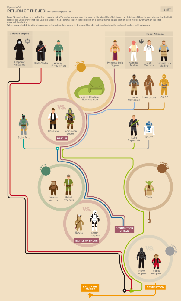
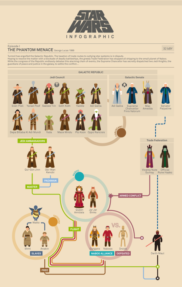
Marc Morera has designed some amazing Star Wars infographics charting the character progression, deaths and conflicts in the Star Wars movies, the animated series, comic books and major novels.  On the landing page, you will find them organized chronologically, so the Animated Series fits in between movies II and III.

Characters are illustrated as recognizable isotypes.  Each character’s plot line is color-coded, and the lines from the appropriate characters converge at circles representing the major conflicts along each story timeline. 

Star Wars infographics

The two examples shown here are reduced in size to fit on the blog, so go check out all of them on Marc Murera’s site for high-resolution versions.

Thursday
Apr052012

The Fiction to Reality Timeline

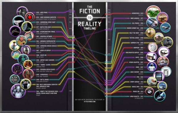
The Fiction to Reality Timeline infographic from attsavings.com brings all of cool gadgets from the future in movies into the present.  Anything is possible!

Do you remember “Star Trek” and all the great gadgets the crew members used in each episode? Or the fancy gizmos from “The Jetsons” or “Minority Report?” Ever wonder when, or if, we’ll invent technology like what we’ve seen in the fictional universe? Satisfy your craving for fictional tech with The Fiction to Reality Timeline.

Although I disagree that some of their actual technology references are the first time certain technologies have appeared in the modern world, the overall message is clear.  Things like Heads-Up Displays have been around in fighter cockpits for much longer, and the iPad wasn’t the first portable display device, just the first mainstream commercially successful device.

I couldn’t figure out if the line colors had any meaning.  Are they color-coded to match some type of category?

Where’s my flying car?!?

Thanks to Ryan for sending the link!

Monday
Oct312011

The Diabolical Diagram of Movie Monsters

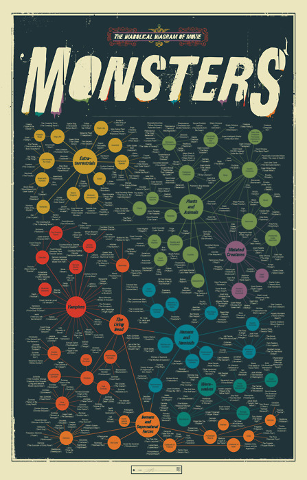
The Diabolical Diagram of Movie Monsters is a cool new poster from Pop Chart Lab.  Available in print for $30, this 24”x36” poster fits nicely in any standard poster frame.

A taxonomic breakdown of all manner of frightful creatures from the silver screen, from the very large (like Godzilla) to the rather small (like Chucky) to the very weird (like the Crawling Eye). Hundreds in all, this is the definitive guide to a universe of scarifying baddies.

Found on We Love Datavis