About
Randy Krum
President of InfoNewt.
Data Visualization and Infographic Design

Infographic Design

Infographics Design | Presentations
Consulting | Data Visualizations

DFW DataViz Meetup

Join the DFW Data Visualization and Infographics Meetup Group if you're in the Dallas/Fort Worth area!

Search the Cool Infographics site

Custom Search

Subscriptions:


Feedburner

The Cool Infographics® Gallery:

How to add the
Cool Infographics button to your:

Cool Infographics iOS icon

- iPhone
- iPad
- iPod Touch


Read on Flipboard for iPad and iPhone

Featured in the Tech & Science category

Flipboard icon

Twitter Feed
From the Bookstore

Caffeine Poster

The Caffeine Poster infographic

Entries in evolution (8)

Friday
Feb032017

The Evolution of Technology Company Logos

The Evolution of Technology Company Logos infographic

Logos are very important for a company's image, it needs to be simple and memorable. The Evolution of Technology Company Logos infographic from Vizion Online shows a few companies that have very recognizable logos. As you can see, even the professionals tweak their logos often to get the desired look and feel.

Here we have a good looking infographic that we have designed providing information about how technology company logos have evolved over the years. Check out logo evolution for companies such as Amazon, AT&T, Canon, Dell and more by viewing this logo design piece.

We hope that you enjoy this tech company logo infographic and please share it out with your friends on social media or feel free to publish it on your blog or website.

Thanks to the Picture Superiority Effect, people at more likely to remember the company logo than the company name. I talk about this in Chapter 1 of the Cool Infographics book, called the Science of Infographics. You can download an excerpt of that chapter for free HERE!

Thanks to David for sending in the link!

Thursday
Jun122014

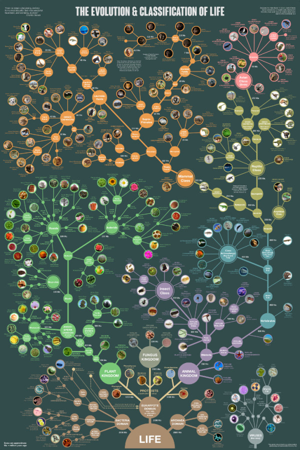
The Evolution of Life Poster

The Evolution & Classification of Life poster

This beautiful “tree of life” poster does two things at once:

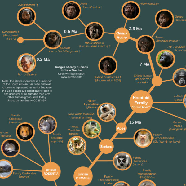
First, it shows how over 250 common plants, animals, and microbes are classified by biologists into domains, kingdoms, phyla, orders, families, and genera.

Second, it shows where each group fits into the evolutionary history of life according to the most up-to-date genetic research.

It also includes several extinct groups, featuring artwork by paleo-artists John Gurche and Nobu Tamura.


A “Tree of Life” in a 24” X 36” poster form, The Evolution & Classification of Life poster was designed by Matt Baker from Useful Charts, and and can be purchased on Amazon for $24.95.

There is good use of color to help organize the tree and allow the reader to understand the major section breaks.  Having the pictures of the animals as the main focus of the tree, rather than their names keeps the poster clean and not too cluttered.

Great job Matt!

Wednesday
Sep042013

The Guide to Star Trek Uniforms

The Guide to Star Trek Uniforms infographic

The Gude to Star Trek Uniforms infographic from Costume Supercenter. Make sure you know what uniform your wearing!

When the original Star Trek television series started, male and female officers wore similar outfits. The male Star Trek uniforms consisted of black pants, black boots and a velour shirt with the symbol on the left side. Females wore the same type of shirt, with black boots and tights, and a black skirt, although in some cases they wore black pants. The color of shirt worn identified the branch the crew member belonged to. Those in green shirts worked for command personnel, while beige stood for operations, and blue was for medical personnel only. The velour shirts were changed to nylon shirts starting in the third season. You can find many of the Star Trek Costumes here.

Don’t be the red-shirted ensign!

The footer of the design should include the copyright information and the URL to the original infographic landing page so readers can see the full-size infographic.  The Costume Supercenter logo should also be somewhere on the design to connect the infographic to the publishing company.

Found on Visual.ly

Monday
Jun032013

The History of NFL Logo Designs

The History of NFL Logo Designs infographic

Football is extremely popular in the United States. People pick sides and cheer on their teams loyaly.  The History of NFL Logo Designs infographic posted on Visual.ly tells the story of each football team’s logo through the years.

In Infographics below we are going to show you some of the interesting logo design changes across the (NFL) community with their territory maps.

Cool design that shows visual evolution of various NFL logos.

Thanks to Rachael for sending in the link!

Wednesday
Mar202013

The History of Home Heating

The History of Home Heating infographic

Fun timeline of The History of Home Heating infographic by global home improvements. See how far we’ve come in home heating and the plans for the future. With the current heating technologies, we could reduce the harm that we are doing to the planet.

This is mostly a visual explanation using illustrations, but does a good job of clearly telling the story to the readers with the sequence of evolving heating images.  The isometric, video-game style illustrations draw in the reader and make the information more engaging and interesting to read.

Thanks to David for sending in the link!

Tuesday
Jul312012

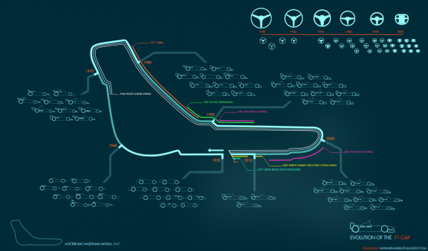
Evolution of the F1 Car: Video & Infographic

This is totally cool!  Here is an infographic animation created by Rufus Blacklock of his infographic Evolution of the F1 Car. You can find his original video on biplaneblues.blogspot.com.

All done :) here you can watch 60 years of F1 design condensed into a minute. Each car is the winning chassis from the respective seasons. The music is ‘Together’ by She.


Evolution of the F1 Car infographic 

Here is the original Evolution of the F1 Car infographic that the video was based off of. Found at biplaneblues.blogspot.com.

Woo finished! This map tracks the history of F1 cars across the circuit at Monza. Hopefully its clear enough… its my first infographic, let me know if you have any keen ideas to improve readability.

The cars are grouped into decades, around the track you can follow various innovations and driver aids, some which became banned. Top right is steering wheel development.


Thursday
May242012

The Evolution of the Handgun

The Evolution of the Handgun infographic

There have been literally thousands of different gun models, but The Evolution of the Handgun infographic from GunVault.com covers most of the major advancements in handgun design.

I really like the first two sections of this design, and I think the last section was unnecessary.  The timeline and the gun specifications sections do a good job of laying out the data and keeping it simple.  The barrel length and the calibers of each model work very nicely.  Since the # of Rounds data is quantitative, I would suggest visualizing that as a series of circles instead of a solid bar to better communicate quantity.  

The last section adds a lot of text, repeats the data from the second section and makes the overall infographic gratuitously long.  The flags showing the country of origin could easily have been added to the earlier sections.

Thanks to Archie for sending in the link!

Monday
Nov212011

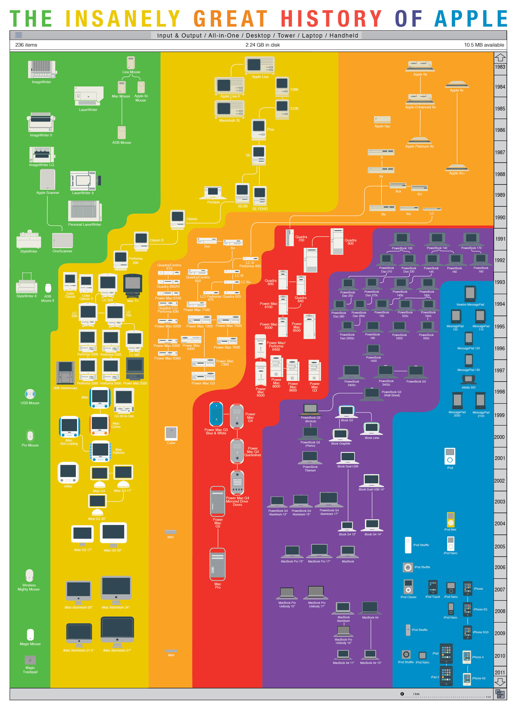
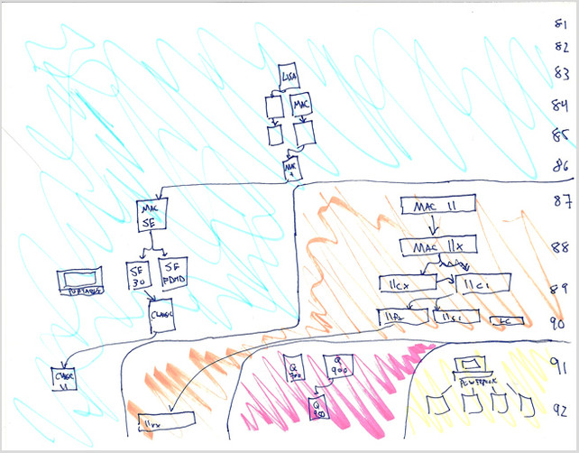
The Insanely Great History of Apple

The Insanely Great History of Apple is a cool new poster from PopChartLabs.com, where you can purchase the $25, 18”x24” poster for yourself (and many other great ones).

The world’s most comprehensive mapping of Apple products, this print shows every computer released by Apple in the last thirty years, from the original Mac through the MacBook Air. Products are sorted according to type, including the connections between various form factors which have arisen as Apple has invented—and reinvented—insanely great products.

Found on VisualNews