About
Randy Krum
President of InfoNewt.
Data Visualization and Infographic Design

Infographic Design

Infographics Design | Presentations
Consulting | Data Visualizations

DFW DataViz Meetup

Join the DFW Data Visualization and Infographics Meetup Group if you're in the Dallas/Fort Worth area!

Search the Cool Infographics site

Custom Search

Subscriptions:


Feedburner

The Cool Infographics® Gallery:

How to add the
Cool Infographics button to your:

Cool Infographics iOS icon

- iPhone
- iPad
- iPod Touch


Read on Flipboard for iPad and iPhone

Featured in the Tech & Science category

Flipboard icon

Twitter Feed
From the Bookstore

Caffeine Poster

The Caffeine Poster infographic

Entries in visual (320)

Sunday
Aug262007

Drawing Disney Characters


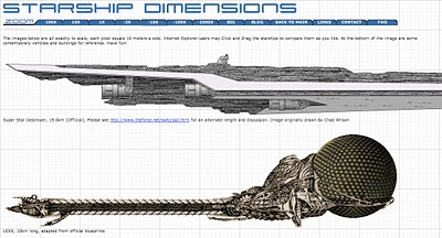
Silver Bullet Comics has an article for aspiring comic artists, but I found this little gem.

A very simple infographic demonstrating that characters much each have a distinctive shape that makes them recognizable even from a distance. Very similar to the “silhouette test” for good character drawings to be recognizable in silhouette.

Sunday
Aug262007

E-mail Analysis


Origianally from a NYTimes.com article in 2005, I found reference to this recently on Adam Smith, Esq. (A free registration to NYTimes.com is required to view the full size image)

Some Computer Science professors analyzed one week of e-mail traffic from Enron (about 500,000 emails) in May 2001 looking for patterns that would help investigators narrow down their search. This infographic is the result showing the email connections between employees

Saturday
Aug252007

Consumer Spending (5% on Tech Stuff)


From Wired magazine (issue 15.08) a treemap infographic of consumer spending in 2005. 5% of all consumer spending was on technology, and of course, Wired broke down that 5% into an expanded treemap.

Internet access +216%, Residential phone -25%. VOIP seems to be making an impact.

Thursday
Aug162007

Periodic Table of Visualization


This table is a must-see site for anyone who works creating visualizations. This website from visual-literacy.org has grouped visual methods into six categories (like Concept Visualization and Metaphor Visualization), and made it interactive so when you move your mouse over one of the specific methods it shows you an example.

This is a great resource to help inspire you to visualize your data in new ways. I find that I like trying to visualize the same data in a couple different ways to find out which works best at communicating the data to others. Ironically it's missing the visual method of laying out data into a periodic table!

Tuesday
Aug142007

How to Spot a Handgun


Found on Edward Tufte's website. Edward posted a small collection of infographics from Megan Jaegerman during her time working for the NY Times. This graphic of Spotting a Hidden Handgun, was updated and revised for Edward's book, Beautiful Evidence.

Megan Jaegerman produced some of the best news graphics ever while working at The New York Times from 1990 to 1998.
-Edward Tufte, July 2007

Monday
Aug132007

World Drinking Map


From drinkingmap.com, this map shows the legal drinking age by country. For the vast majority of the world 18 is the legal age. There are only a few countries like the U.S. that have a drinking age as high as 21.

Sunday
Aug122007

Starship Dimensions


As a follow-up to my earlier post on the Starship Comparison Poster, the Starship Dimensions website has a much more extensive library of sci-fi ships all shown to scale. There are so many here that the website is broken up into different pages from small scale up to "Big" scale. Click on the tabs across the top to pick a scale (100X, 10X, 1X, etc.).

Fantastic resource. Jeff Russell has done a great job accumulating the images and tracking down their relative sizes.

Saturday
Aug112007

XPLANE offers XPLANATIONS


XPLANE is a company whose whole purpose is professional infographics. They do a bunch of infographics for big and small companies, but also do a lot of work for Business 2.0 magazine (a favorite of mine). Check out David's post that Business 2.0 might be in trouble.

A number of infographics (called XPLANATIONS...I love it) are available free for download here.

David Grey is the CEO, and he also runs his own blog called Communication Nation.

Friday
Aug102007

World's Most Dangerous Drugs


Another good one from Healthbolt. Color coded by class, and ranked by overall harm to the human body.

Wednesday
Aug082007

2008 Presidential Campaign Finances


This interactive infographic from the New York Times website is really impressive. Using weekly data reported by the Federal Election Commission, it plots the contributions on a map of the U.S. and sizes the bubbles based on contributions from that city. It has data from every week since January 1st, so it will also "play" and animated version showing the contribution as time progresses (similar to the Trendalyzer that Google purchased from GapMinder).

You can also search for specific contributors to see which candidate campaigns they have contributed to, and how much they gave.