About
Randy Krum
President of InfoNewt.
Data Visualization and Infographic Design

Infographic Design

Infographics Design | Presentations
Consulting | Data Visualizations

DFW DataViz Meetup

Join the DFW Data Visualization and Infographics Meetup Group if you're in the Dallas/Fort Worth area!

Search the Cool Infographics site

Custom Search

Subscriptions:


Feedburner

The Cool Infographics® Gallery:

How to add the
Cool Infographics button to your:

Cool Infographics iOS icon

- iPhone
- iPad
- iPod Touch


Read on Flipboard for iPad and iPhone

Featured in the Tech & Science category

Flipboard icon

Twitter Feed
From the Bookstore

Caffeine Poster

The Caffeine Poster infographic

Entries in visual (320)

Wednesday
Aug272014

Visual Customer Service in the Social Age

Visual Customer Service in the Social Age infographic

The Visual Customer Service in the Social Age infographic created by Gryffin for TollFreeForwarding.com, describes the different social media platforms and how they could be to supplement customer service information to customers.

I’m sure you know that visual content on social media can massively improve engagement. But just how important is it?

On the web, it’s estimated that 55 percent of all traffic will be video by 2016, and mobile video traffic will increase by 1800 percent. YouTube, Instagram and Vine are currently the best platforms to maximise video engagement, so are you utilising them to their full potential in your marketing campaigns?

I like that this design takes some of the great things we know about visual information and applies it to a specific company function.  This is one way the companies can leverage the power of visual information with their customers.

It’s interesting that I couldn’t find the original infographic on either Gryffin or TollFreeForwarding.com sites.  There’s no blog post or infographic landing page on either one.

Again, we see the folk research statistic that “the brain processes visual information 60,000 times faster than text.”  This data point is quoted so often that people believe it’s true, but no one can find the research to back it up.  As far as anyone can tel, it was quoted in some marketing information from 3M in the 1980’s to support sales of transparency sheets used on overhead projects.  If you’re interest, I suggest reading these posts from Alan Levine and Darren Kuropatwa.

Found on www.mediabistro.com and Visual.ly

Monday
Aug112014

12 Reasons Your Business Needs to Get Visual

12 Reasons Your Business Needs to Get Visual infographic

If we’ve said it once, we’ve said it a million times… but once more wont hurt! Visuals are important!!! This infographic from re:DESIGN attempts to summarize the reasons why in 12 Reasons Your Business Needs to Get Visual.

The shift to the visual is evident everywhere we look, in all media — the infographic explains why.

A good, strong visual married to a good concept — with the right strategy and the right words — wins every time, especially in today’s busy, noisy media world. One thing is clear: visuals and all that traditional creative expertise brings to the table has never been more important for capturing eyeballs, expanding brand influence, and getting people to act.

Love the message and most of the points included.  Good choice of images for each section. However, big fonts are not data visualizations and the infographic looks like it’s pushing the use of bigger fonts instead of visuals. Data shown in a big font does not provide the audience with any context, not do they make the data easier to understand.

I also noticed the popular false statistic included in the design: “Visual data is processed by the brain 60,000 times faster than text.”  It’s a statistic often quoted in presentations and infographics about the value of visual information, but it’s not true.  I’d love for this statistic to be real, but no one has been able to track down the original research.  It was used decades ago in some 3M marketing materials for transparencies used with overhead projectors (yes, that long ago).  It’s quoted so often now that everyone believes it.

If this topic interestes you, check out Chapter 1 of my book, Cool Infographics, called The Science of Infographics.  There I cover the research and data behind why visual information is more effective and why infographics are so popular.  You can download a free sample PDF of the chapter on the BOOK page.

Found on re:DESIGN

Thursday
Feb062014

Shutterstock's Global Design Trends 2014

Shutterstock's Global Design Trends 2014 infographic

Shutterstock’s Global Design Trends 2014 infographics is essentially a visual press release.  Based on their own internal web stats from their users, they are sharing the most popular image searches and trends from 2013.  And of course is should be shared visually!

One of our favorite annual traditions at Shutterstock is sharing our hard-earned design-trend data with the world. For this, our third annual infographic, we used data from our 350 million all-time downloads to explore recent and emerging trends from around the globe.

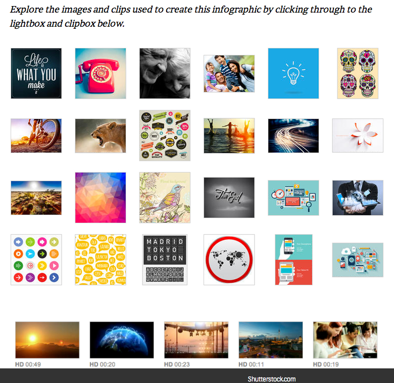
Check out the infographic below, then scroll on to view a lightbox featuring images showcased in the design, get the code to embed the infographic on your site, and share your own thoughts and insights in the comments.

Searches for infographic design elements in 2013 were up 332% compared to 2012!

Many infographics include data sources, but this one is based on their own internal data!  As a alternative, I love that they include clickable links to all of the stock photos, vectors and videos included in the design on the infographic landing page.  However, it would have been helpful to readers for the infographic to include the longer URL directly to that landing page on the Shutterstock blog, instead of just the front page.  Readers that make it that far, then have to search for the specific blog post to find the links and the original infographic.  Today, it’s the most current post and easy to find, but after a few more blog posts it will be much harder to find.


Thanks to Danny for sending in the link!

Thursday
Dec122013

How To Boost Recovery After An Injury

How To Boost Recovery After An Injury infographic

How To Boost Recovery After An Injury from BodyHeal.com.au is a visual explanation infographic that uses illustrations and icons to explain the R.I.C.E. injury treatment process.

R.I.C.E. treatment is an acronym for: rest, ice, compression, elevation. It is commonly used to speed up healing and reduce pain and swelling caused by mild-to-moderate injuries, such as sprains, strains, and bruises.

The design uses a good combination of text explanations, character illustrations, icons and story layout to educate the audience about injury treatment.  Short text explanations effectively keep the information consumption quick and easy.

Some of the text is too small when reduced to fit on a blog (like this one), so the design should have included the URL back to the infographic landing page so readers can easily find the full-size original version.


Friday
Aug302013

Infographic Cookbook - Picture Cook

Picture Cookbook infographic

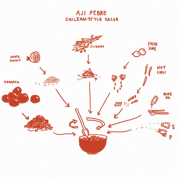
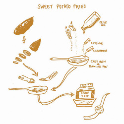
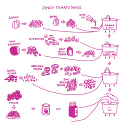
A new way to take directions for cooking, the Picture Cookbook infographic from Katie Shelly. It is an easy step by step visual explanation design that will get you to the desired tasty product, with very little use of words!

The following recipes are not intended as precise culinary blueprints. Instead they are meant to inspire experimentation, improvisation and play in the kitchen.

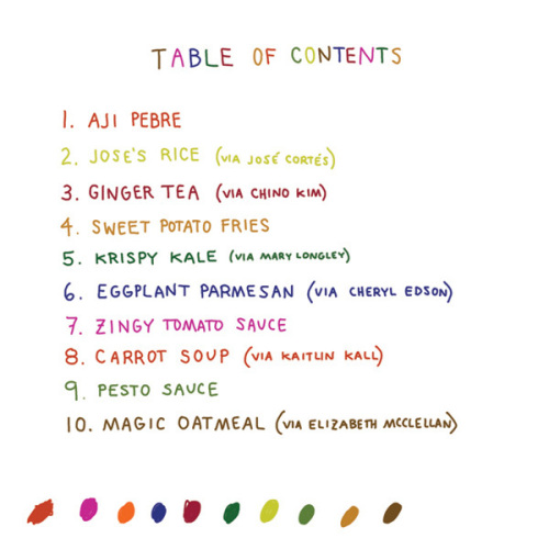
Great design work by Katie to create recipes as visual explanations.  The hand-drawn style also helps reinforce the flexible methods.  They aren’t strict, rigid recipes with sharp images and corners, but instead are more casual which allows for interpretation and change.  I love the color-coding for easy navigation within the book too.

Found on Fast Company

Available soon for purchase in print in October 2013.  I’ve already pre-ordered my copy.

Tuesday
Aug132013

How to Match Shirt and Tie Patterns

How to Match Shirt and Tie Patterns infographic

If you have some trouble balancing your serious business side with your fun side, a look at the How to Match Shirt and Tie Patterns infographic could be helpful. The infographic from Beckett Simonon shows a few examples of complicated patterns that work together, and then some to definitely stay away from.

So you’ve been wearing solid ties and shirts for a while, you think you look great but you feel is time to earn some extra style points by adding some patterns? No worries, we got you covered! Shirt and tie patterns are great if you want to stand out from the crowd, they are also fun and will bring a new life to your look. Just make sure your pattern groupings are far from making people dizzy and fall hypnotized. We made this cheat guide so you can learn the basics and develop your own combinations and style from there. Enjoy!

Great visual explanation design that stays focused, and tells one story really well.

Thanks to Nicholas for sending in the link!

Thursday
Jul252013

Inside the Courtroom

Inside the Courtroom infographic

Going to court is no laughing matter. But the Inside the Courtroom infographic from Livesay & Meyers balances seriousness with humor as it lays out the blueprint of a courtroom, then tells some funny stories about actual things said in court.

Going to court for the first time can be an intimidating experience. Whether you are facing criminal charges or find yourself in court in a divorce or custody case, remaining calm in court can really help you make your most effective case. We put together the infographic below to help you understand all the different parts of the courtroom, so you can feel at ease on your day in court. This infographic explains who people are, what they do, and where they sit. We’ve also included some interesting facts about courtrooms, and funny quotes from actual court cases.

Our experienced attorneys feel right at home in the courtroom– hopefully this information will allow you to also be at ease in front of the judge or jury.

Thanks to James for sending in the link!

Monday
Jul082013

How Startup Funding Works

How Startup Funding Works infographic

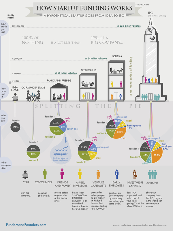
How Startup Funding Works from Funders and Founders co-founder Anna Vital does a great job of visualizing the split of equity at different stages of a company’s life.

A hypothetical startup will get about $15,000 from family and friends, about $200,000 from an angel investor three months later, and about $2 Million from a VC another six months later. If all goes well. See how funding works in this infographic:

Is dilution bad? No, because your pie is getting bigger with each investment. But, yes, dilution is bad, because you are losing control of your company. So what should you do? Take investment only when it is necessary. Only take money from people you respect. (There are other ways, like buying shares back from employees or the public, but that is further down the road.)

This is a great design that uses pie charts correctly and effectively!  This is in contrast to the many designs that use pie charts inappropriately.  This is a great example of a visual explanation that uses a combination of data visualization, illustration and text to tell a clear story.

The color coding is also effective, but for some reason they didn’t color the co-founder icon character green to match his portion of the pies.  The URL link to the original infographic landing page is also missing in the footer, so it makes it hard for readers to find the full-size original version when they see it posted on other sites.  People aren’t always good about creating links back to the original, so the URL should be included in the infographic image file itself.

Friday
Jun282013

Ba-tee-nga: Sheldon Cooper Presents Fun With Tees

Bah-tee-nga: Sheldon Cooper Presents Fun With Tees infographic

Ba-tee-nga: Sheldon Cooper Presents Fun With Tees infographic from RIPT Apparel shows every t-shirt that Sheldon Cooper from Big Bang Theory wore each episode of every season.

We have all seen The Big Bang Theory, and its awesome cast of nerds. But did you ever wonder about Sheldon’s graphic tees and how many different ones there actually were? This weeks infographic takes a look at the many shirts of Sheldon Cooper titled “Ba-TEE-nga: Sheldon Cooper Presents Fun With Tees”. Much like RIPT Apparel’s graphic tees, this is a mash-up of the famous saying Sheldon made popular; “Bazinga”, coupled with his awesome web show – “Sheldon Cooper Presents Fun With Flags”. The graphic shows all of Sheldon’s shirts from the pilot episode through season 6 episode 7. Yeh that’s a ton of Tees!

An ideal topic for an infographic!  Can you imagine how boring this would have been as a text list in a blog post?!? 

Thanks to Bill for submitting the link via Twitter!  Bazinga!

Tuesday
Jun042013

Home Energy Savings

Home Energy Savings infographic

70% of electricity in the US is generated from non-renewable sources.  The Home Energy Savings infographic provided by Accent Building Products tells us how to have an energy efficient home without sacrificing comfort.

Today it is more important than ever to make our homes more energy efficient without sacrificing home comfort. An energy-efficient home will keep your family comfortable while saving you money. Unfortunately, a lot of energy is wasted through leaky windows or ducts, old appliances, or inefficient heating and cooling systems. You can use many tips to save money and energy! This infographic details many different money saving tips and shows how we spend the money on our homes.

Infographic provided by Accent Building Productsa direct distributor of the industry’s top accent home and building products.  All products are shipped to you directly from the manufacturers’ factory.

It’s interesting from an online marketing and SEO perspective that I can find the infographic on gallery sites like Infographics Showcase, Infographics Inspiration, and Visual.ly but I was unable to find the original anywhere on the Accent Building Products website or blog.  This means that any popularity in terms of links and visitors to the infographic itself will benefit the gallery sites, but not Accent Building Products.  Only indirectly will Accent get any benefit if readers separately visit their site, but they would have to manually type in the URL because none of the infographics have a link back to the site.

This is a fun visual explanation design.  The illustrations clearly put the suggestions and data into context of the areas in the house.  There is a lot of text, but the small callouts make it easy to read.  It would have been more effective to visualize the pieces of data that are included in the design.

Thanks to Chris for sending in the link!