How Startup Funding Works
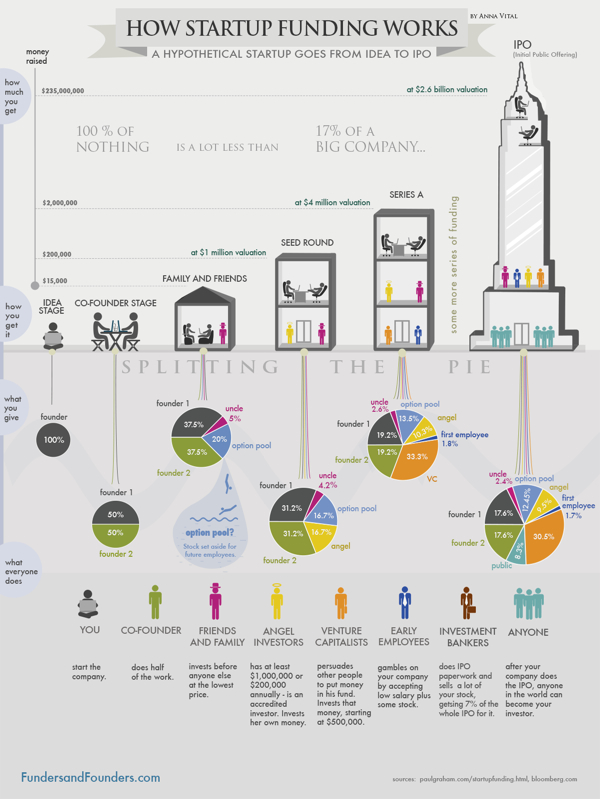
How Startup Funding Works from Funders and Founders co-founder Anna Vital does a great job of visualizing the split of equity at different stages of a company’s life.
A hypothetical startup will get about $15,000 from family and friends, about $200,000 from an angel investor three months later, and about $2 Million from a VC another six months later. If all goes well. See how funding works in this infographic:
Is dilution bad? No, because your pie is getting bigger with each investment. But, yes, dilution is bad, because you are losing control of your company. So what should you do? Take investment only when it is necessary. Only take money from people you respect. (There are other ways, like buying shares back from employees or the public, but that is further down the road.)
This is a great design that uses pie charts correctly and effectively! This is in contrast to the many designs that use pie charts inappropriately. This is a great example of a visual explanation that uses a combination of data visualization, illustration and text to tell a clear story.
The color coding is also effective, but for some reason they didn’t color the co-founder icon character green to match his portion of the pies. The URL link to the original infographic landing page is also missing in the footer, so it makes it hard for readers to find the full-size original version when they see it posted on other sites. People aren’t always good about creating links back to the original, so the URL should be included in the infographic image file itself.
 charts,
  companies,
  explanation,
  investment,
  money,
  startup,
  visual


Reader Comments (3)