About
Randy Krum
President of InfoNewt.
Data Visualization and Infographic Design

Infographic Design

Infographics Design | Presentations
Consulting | Data Visualizations

DFW DataViz Meetup

Join the DFW Data Visualization and Infographics Meetup Group if you're in the Dallas/Fort Worth area!

Search the Cool Infographics site

Custom Search

Subscriptions:


Feedburner

The Cool Infographics® Gallery:

How to add the
Cool Infographics button to your:

Cool Infographics iOS icon

- iPhone
- iPad
- iPod Touch


Read on Flipboard for iPad and iPhone

Featured in the Tech & Science category

Flipboard icon

Twitter Feed
From the Bookstore

Caffeine Poster

The Caffeine Poster infographic

« Car Sizes Through the Years | Main | Comparing Hurricane Disasters: Sandy vs. Katrina »
Tuesday
Nov062012

Daylight Savings Time Explained

Daylight Savings Time Explained infographic

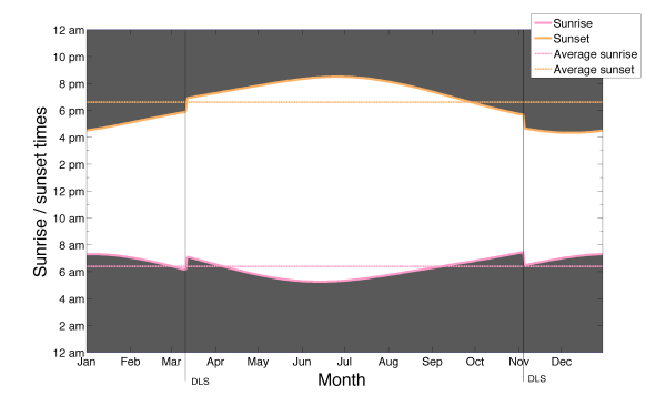
Daylight Savings Time Explained designed by a Visual.ly member under the name Germanium, visually explains the end result of recognizing Daylight Savings Time.  DST is used mostly in North America and Europe, while most of the world does not change their clocks.

I tried to come up with the reason for the daylight saving time change by just looking at the data for sunset and sunrise times. The figure represents sunset and sunrise times thought the year. It shows that the daylight saving time change marked by the lines (DLS) is keeping the sunrise time pretty much constant throughout the whole year, while making the sunset time change a lot. The spread of sunrise times as measured by the standard deviation is 42 minutes, which means that the sunrise time changes within that range the whole year, while the standard deviation for the sunset times is 1:30 hours. Whatever the argument for doing this is, it’s pretty clear that reason is to keep the sunrise time constant.

By visualizing the daylight hours, the reader can see the pattern.  Both the change in total hours, and the impact of daylight hours on their normal day.

The reasoning for DST is very controversial, but now we can see the impact clearly.

PrintView Printer Friendly Version

EmailEmail Article to Friend

Reader Comments (6)

I made a similar graphic last year when putting together a heatmap of bike usage for the Capital Bikeshare system (Washington DC)
https://docs.google.com/open?id=0B0v9YWFV5v14MTAxMjM4Y2MtM2Q1Ny00ZjNmLWJlZWEtYWRkZDI3MjdjMTI5

Its not nearly as good looking as Germanium's version - but the core data being conveyed was the bikeshare data; the Sunrise/Sunset piece was not the focus, but was helpful in identifying ridership trends as they related to light/dark conditions.
November 6, 2012 | Unregistered CommenterBilsko
And here I was hoping for an explanation why we change. I continue to hope we'll stop doing it.
November 6, 2012 | Unregistered CommenterP.A. Wilson
this looks really, really similar to the graph at the end of this tutorial, since it's basically the same graph: http://www.recursion.org/d3-for-mere-mortals/
November 7, 2012 | Unregistered Commenterwow
Informative and beneficial infographic!! Implementation of this info graphic makes people to meet their needs, by saving the usage of power.
The reason for daylight saving is two fold. Firstly, because you have an hour of extra sunlight in the afternoon after work, you have time to take the kids to the beach. Secondly, people turn their lights on a hour later, and that results in a significant saving in electricity usage.
November 10, 2012 | Unregistered CommenterJim
Hi, This is Very Informative information. Very Helpful for my business. Awesome I am impressing to Read this post Thanks..
September 6, 2014 | Unregistered CommenterJerry
Editor Permission Required
While we are migrating to a new site design, you must have editing permission for this entry in order to post comments.