About
Randy Krum
President of InfoNewt.
Data Visualization and Infographic Design

Infographic Design

Infographics Design | Presentations
Consulting | Data Visualizations

DFW DataViz Meetup

Join the DFW Data Visualization and Infographics Meetup Group if you're in the Dallas/Fort Worth area!

Search the Cool Infographics site

Custom Search

Subscriptions:


Feedburner

The Cool Infographics® Gallery:

How to add the
Cool Infographics button to your:

Cool Infographics iOS icon

- iPhone
- iPad
- iPod Touch


Read on Flipboard for iPad and iPhone

Featured in the Tech & Science category

Flipboard icon

Twitter Feed
From the Bookstore

Caffeine Poster

The Caffeine Poster infographic

Entries in scale (154)

Friday
Dec192014

The World's Loudest Noises - An Audio Infographic


Loud noises can be unpleasant. But how loud is too loud? The World’s Loudest Noises is an interactive infographic from Air Conditioning Company that explains the loudest noises in the world and how much damage they could do to your ears. So next time your air conditioning kicks on and you feel like complaining… Just remember, there is always something louder.

Turn your volume down before you start clicking!

Our initial attempt to explain how loud air conditioners are via an internet page was, in our opinion, a minor disaster.

An indisputable fact is that 99.999% of us haven’t got a clue what a decibel either sounds like or looks like! Let’s be honest, we didn’t even know ourselves precisely what a decibel was!

So we started to delve into the dark world of decibels to make the blinking things easier to understand. We initially wanted to create an amazingly informative infographic to best explain how loud our air conditioners are. However, we didn’t know where the ‘cut-off’ point should have been and we got somewhat carried away until we found the worlds loudest noise!

Despite all of our in-depth research, noise levels and decibels are still controversial and subjective. We found so many different accounts of how loud the same sound was. Indeed, most of our research showed that an aeroplane taking off is louder than a spaceship launch and surely this cannot be the case. Further investigation revealed that people forget to mention how far away they were when actually measuring the sounds. Also, based in London, we don’t live close enough to Cape Canaveral to run around waving our own decibel meter…..

Have some fun clicking around on our all-singing-and-dancing infographic below. Those of you who wish for a more academic approach can scroll to the bottom to check out our initial research.

An audio infographic! This is a new way to create an interactive infographic. Each of the sounds listed in the infographic above is clickable to play an audio sample of each noise. It’s more fun and entertaining than actually representing the decibels because there’s no way your computer speakers (or your mobile phone speakers) can reproduce some of the decibel levels shown here. Plus you have volume control.

I’m really disappointed that the vertical scale is out of proportion. The sounds should be accurately placed along the decibel scale, not just evenly spaced no matter what the values are. That’s just poor data visualization.

There’s a sharing issue that happens with an interactive infographic like this one. I was bale to get the embed code from the publisher, so all of the click-to-play sounds should work here on Cool Infographics as well. However, most people that share the infographic will only grab the JPG image file or click the sharing buttons, and that loses all of the interactivity included in the code. The sounds also don’t work on many iOS and mobile devices.

What other infographic topics could include sounds?

Thanks to David for sending in the link!

Wednesday
Oct152014

If the Moon Were Only 1 Pixel

If the Moon Were Only 1 Pixel infographic

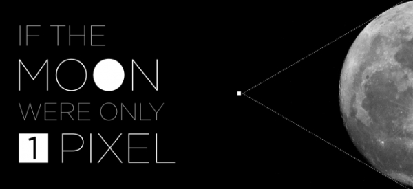
When we talk about outer space, we have a tendency to use comparisons that are not necessarily true, but still represent large distances. However, If the Moon Were 1 Pixel infographic created by Josh Worth uses pixels to accurately measure out the solar system. Explore the full interactive design here!

If the Moon Were Only 1 Pixel infographic

Picture from mic.com

I was talking about the planets with my 5-year-old daughter the other day. I was trying to explain how taking a summer vacation to Mars in the future will be a much bigger undertaking than a trip to Palm Springs (though equally as hot). I kept trying to describe the distance using metaphors like “if the earth was the size of a golf ball, then Mars would be across the soccer field” etc., but I realized I didn’t really know much about these distances, besides the fact that they were really large and hard to understand. Pictures in books, planetarium models, even telescopes are pretty misleading when it comes to judging just how big the universe can be. Are we doing ourselves a disservice by ignoring all the emptiness?

So I thought I would see if a computer screen could help make a map of a solar system that’s a bit more accurate (while teaching myself a few things about javascript, SVGs and viewports along the way).

Not that pixels are any better at representing scale than golfballs, but they’re our main way of interpreting most information these days, so why not the solar system?

I love this animated scale representation of the solar system. Just to fit on the same page, we usually see all of the planets close together in posters and text books. But in the long run, we lose grasp of how much empty space is truly around us.

Found on Mic.com

Wednesday
May142014

The Drone Survival Guide

Drone Survival Guide infographic poster

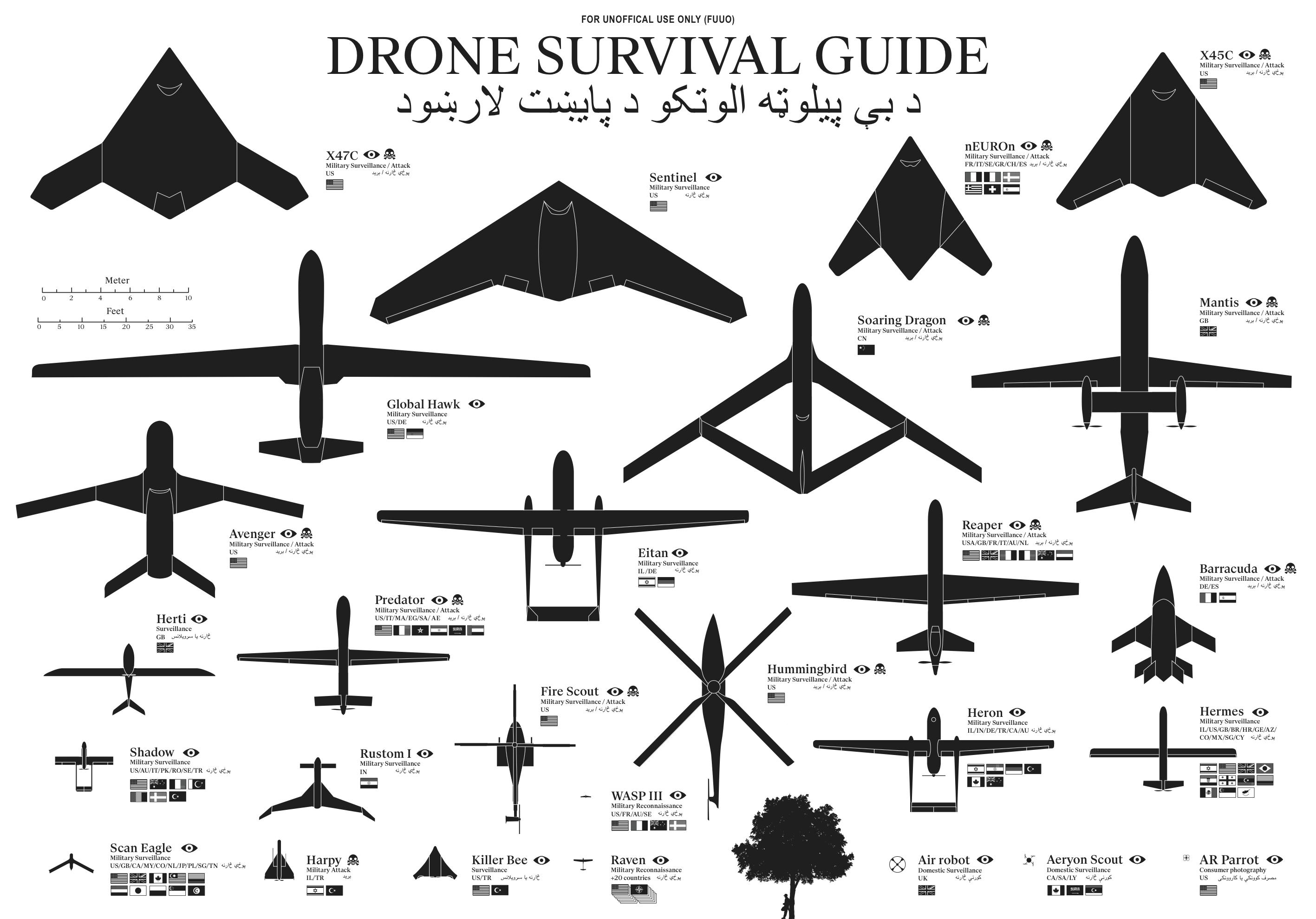
The Drone Survival Guide is a poster and online infographic that uses proportionally sized silhouettes of the most common UAVs (Unmanned Aerial Vehicles).  Designed by Ruben Pater, a self-employed artist/graphic designer from the Netherlands, the poster is available for download as a PDF.

Posters printed on aluminum reflective Chromolux ALU-E mirrored paper are available from the site for €10, which included worldwide shipping.

TWENTY-FIRST CENTURY BIRDWATCHING

Our ancestors could spot natural predators from far by their silhouettes. Are we equally aware of the predators in the present-day? Drones are remote-controlled planes that can be used for anything from surveillance and deadly force, to rescue operations and scientific research. Most drones are used today by military powers for remote-controlled surveillance and attack, and their numbers are growing. The Federal Aviation Administration (FAA) predicted in 2012 that within 20 years there could be as many as 30.000 drones flying over U.S. Soil alone. As robotic birds will become commonplace in the near future, we should be prepared to identify them. This survival guide is an attempt to familiarise ourselves and future generations, with a changing technological environment.

This document contains the silhouettes of the most common drone species used today and in the near future. Each indicating nationality and whether they are used for surveillance only or for deadly force. All drones are drawn in scale for size indication. From the smallest consumer drones measuring less than 1 meter, up to the Global Hawk measuring 39,9 meter in length. 

Concept and design by Ruben Pater. Want to know more about the motivation behind this project? Read the FAQ.

The poster is also being publicized in conjunction with the Drone Salon seminar coming up on May 23, 2014.

The drone salon aims to provide a multidisciplinary overview of challenges, opportunities and speculations on future transitions caused by the use of drone technology both in the battlefield and in the civic realm. This seminar, punctuated by demonstrations and presentations, will consist of five conversations between Malkit Shoshan, Ethel Baraona Pohl and experts in the field: lawyers, activists, civic and military drone operators, artists, novelists and designers. The conversations will bring together multiple views, examples and projects on the spatial effects of the implementation of drones in war and in peace time. The seminar is part of the ‘Drones and Honeycombs’ project and one of a series of public events on the topic of drones organised in collaboration with Studio-X, Columbia University, DPR-Barcelona, The Center for the study of the Drone in NYC and Het Nieuwe Instituut in Rotterdam.

The design is actually very similar to the SciFi Starship Comparison Chart, but on a much smaller scale.  Many people in Ruben’s audience have sent in translations for the text included in the poster, so he has posted the text in at least 32 different languages.  I would like to see those translations offered as full versions of the poster, instead of the text only, but I understand that takes a lot of work.

I’m fascinated by drones, and I own and fly one of the AR Parrot Drones you see in the bottom right corner of the poster.

Thanks to Ethel Baraona Pohl for posting on Facebook!


Tuesday
May062014

An Illustrated Guide to the Biggest Dragons

An Illustrated Guide to the Biggest Dragons infographic

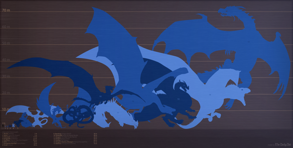
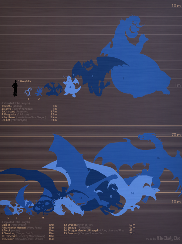
A fantastic size comparison chart, An Illustrated Guide to the Biggest Dragons infographic was published by The Daily Dot, and designed by Max Fleishman and Fernando Alfonso III.

George R.R. Martin, whose A Song of Ice and Fire novels are the basis for Game of Thrones, is currently writing a companion guide to the books, called A World of Ice and Fire. He’s recently published an extract of this guide on his blog, chronicling the history of the Targaryen invasion of Westeros, which took place several hundred years before the events of the books and the show. 

It’s got some badass dragon art, too. You can see Aegon the Conqueror standing astride his dragon mount, Balerion, the “Black Dread.” Turns out these dragons get really freaking big.

But seeing this picture got us thinking. Just how big is this dragon, and how does this bode for Daenerys’s own dragons? And how does it measure up to other famous fictional fire-breathers?

A great data visualization, but it’s missing some elements of a good sharable infographic.  Where it comes up short is that the infographic will be often shared without the rest of the text article originally published on The Daily Dot.  It needs to be able to stand independently, so the infographic image file itself should include the following:

  • A title
  • A short description of information included
  • Credit the designers
  • The URL back to the original article
  • Data sources?
  • A copyright?

I love that they also published a revised version that fits in vertical blog layouts better:

An Illustrated Guide to the Biggest Dragons vertical infographic

Found on Geekologie and Flowing Data

Friday
May022014

The Deadliest Animal in the World

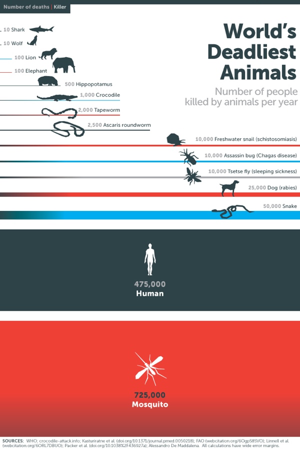
The Deadliest Animal in the World is an infographic posted by Bill Gates on his blog as part of Mosquito Week.

What would you say is the most dangerous animal on Earth? Sharks? Snakes? Humans?

Of course the answer depends on how you define dangerous. Personally I’ve had a thing about sharks since the first time I saw Jaws. But if you’re judging by how many people are killed by an animal every year, then the answer isn’t any of the above. It’s mosquitoes.

When it comes to killing humans, no other animal even comes close. Take a look:

Considering their impact, you might expect mosquitoes to get more attention than they do. Sharks kill fewer than a dozen people every year and in the U.S. they get a week dedicated to them on TV every year. Mosquitoes kill 50,000 times as many people, but if there’s a TV channel that features Mosquito Week, I haven’t heard about it.

This infographic does a number of things right from a design perspective, but the major point is that as humans we see the two-dimensional area of objects as representing the values.  This design uses both the width and height of the rectangles to visualize the scale of deaths caused by the various animals.

Sometimes it might be too subtle.  For example, the width is the same for the rectangles for tapeworms and crocodiles, but the height of the tapeworm box has twice the height to represent the value correctly.

The other thing it does well is to tell one story really well.  There’s isn’t any extraneous information like geographic locations or animal populations.  The infographic focuses on communicating one set of data.

Because the infographic will be shared online without the rest of the article, there are three piece of information that are missing from this design:

  1. The Gates Notes logo, or some type of identification of who published the infographic
  2. A copyright or Creative Commons license state to clearly identify the rights for people sharing the infographic
  3. The URL of the article where readers can find the original, full-size infographic and the associated text.

Thanks to Peter for recommending the link!

Monday
Apr142014

The Depth of the Problem

The Depth of the Problem infographic

The Depth of the Problem infographic from The Washington Post illustrates just how difficult it is to find and retrieve the black boxes from aircrafts when they go into the ocean. This infographic uses visuals of the tallest buildings inverted to help illustrate the depth, as well as other well known objects that have sunk into the ocean.

After an Australian vessel, Ocean Shield, again detected deep-sea signals consistent with those from an airplane’s black box, the official leading a multination search expressed hope Wednesday that crews will begin to find wreckage of a missing Malaysian airliner “within a matter of days.”“I believe we’re searching in the right area,” Retired Air Chief Marshal Angus Houston said.

I know some people don’t like the really long infographics, but in this case the extra long design is the key message the design is trying to communicate to the readers.  I love this type of design, because it makes the challenge of the ocean depth so easily understood.

The JPG image file itself needs to be better treated as a stand-alone infographic.  This image was part of a text article, but will be shared in social media without the rest of the article text.  It should have it’s own title and footer information like data sources, copyright, the Washington Post logo and the URL to find the original article.

Monday
Mar312014

Map of the Internet 2.0 Poster

Map of the Internet 2.0 Poster

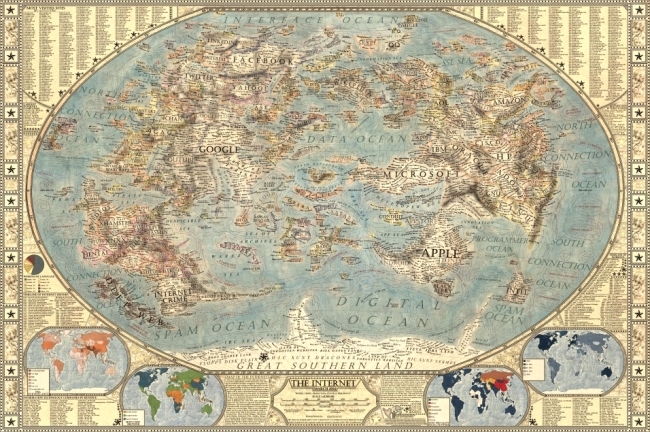
Designer Martin Vargic has released an updated version of his Map of the Internet 2.0 that creates what looks like a vintage-style map.  However, this version plots out the major websites and technology companies, with related sites grouped together on the same continent.  The sizes of the websites on the map are scaled relative to their number of visitors, so bigger sites show as bigger geographic regions.

Second version of our flagship project, the Map of the Internet.

This conceptual work of cartography treats major internet sites and enterprises such as Google, Yahoo, Microsoft, HP, and Apple like sovereign states, on a classic map of the world. To explain the dominance and relationships of these entities, they were all given a visual hierarchy that gives prominent treatment to companies with the most users (or sites with the most visitors), surrounding them with smaller countries representing related websites and services.

This poster includes one full map of the internet, 4 minimaps showcasing NSA surveillance, most used social networks, most used internet browser, and worldwide internet penetration, list of Alexa Top 500 websites, quick timeline of the Internet History, top software companies and much more!

The map includes more than 250 separate websites/enterprises as sovereign states, and more than 2000 separate labels.

A high-resolution version is available online, and you can also order 24” x 36” printed posters on Zazzle.

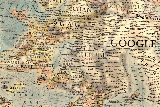
This what I call a 2nd level design, which means it’s a highly detailed design that is meant to present a ton of information to the audience.  This type of design isn’t trying to communicate a key message in a few seconds, but is intended for readers to zoom-in and explore.

Map of the Internet 2.0 Poster Zoom


Found on Business Insider

Thursday
Mar272014

Visualizing NBA Passing Frequency Data

Visualizing NBA Passing Frequency Data infographic

NBA Passing by Andrew Bergmann was designed for NBA.com.  By analyzing data gathered by SportVU technology cameras installed in NBA arenas, the line thickness represents the average number of passes per game between specific players.

Here’s a look at how starters on all 30 NBA teams share the basketball.

The thickness of the gray lines on the accompanying chart represents the average number of passes per game between two players.

A very clear picture emerges on which teams distribute the ball more evenly between players, such as the Nets, Bulls and Cavaliers. On the flip side, Chris Paul and Blake Griffin dominate passing for the Clippers, and likewise for Kevin Love and Ricky Rubio of the Timberwolves.

This is a great way to visualize this data set.  The visualization method is unique, memorable, and really makes the connections between players easy to understand.

The infographic vaguely lists the data sources at “Stats”, and the original post explains that the data is gathered from the newly installed SportsVU camera systems.  However, the actual data is still unavailable for readers to investigate on their own.  This design would have been a great opportunity for the data set spreadsheet to be shared with the audience through a public spreadsheet in Google Docs.

Knowing the infographic is going to be shared online, the image file should include the URL back to the original post on NBA.com.  Don’t make it hard for readers to fit find the original, full-size version of your infographic.

Found on Flowing Data and Fast Company

Friday
Dec202013

Icons of the Web 2013

Icons of the Web 2013 infographic poster

Icons of the Web from the open source Nmap Security Scanner Project (http://nmap.orgis an update to the hugely popular project from 2010.  This update brings all new data, a n updated interactive viewer and printed posters available for sale through Kickstarter for a limited time (until January 17th!)

The Nmap Project is pleased to release our new and improved Icons of the Web project! Since our free and open source Nmap Security Scanner software is all about exploring networks at massive scale, we started by scanning the top million web sites for 2013 (as ranked by the analytics company Alexa). We then downloaded each site’s favicon—the small icon displayed next to a site title in browser bookmarks and tabs.

We scaled the icons in proportion to each site’s monthly reach (popularity) and placed them in a giant collage. The smallest icons—for sites visited by only 0.00004% of the Internet population each month—are 256 pixels square (16x16). The largest icon (Google) is 394 million pixels. The whole collage is 5 gigapixels.

This is an update to a similar project we performed in 2010. That edition proved very popular. It was written up in the New York Times and other sites, exhibited at the Newseum in Washington D.C., and even found its way into the Guinness Book of World Records (see the press section for more). It is interesting to compare the new data with the old to see how the Internet has evolved in recent years.

Since your web browser would likely choke on a 5 gigapixel image, we’ve created the interactive viewer below. It’s divided into 813,200 small files which are only loaded as needed based on your location and zoom level. Click and drag to pan and use the mouse wheel (or toolbar) to zoom. For mouse wheel zoom, you may need to interact with the viewer first (e.g. drag something). A new feature this year allows you to hover your mouse over an icon to see the site name. You can also click on icons to visit the actual sites, but be careful with that! Even even sites with cute icons (like the cartoon Hamster) can be pornographic or worse. We have also added a fullscreen viewing option.

To find your favorite site (or your own site), type in the domain name (example: reddit.com) and hit search.

Our most common request in 2010 was for a physical poster version. We only printed them for Nmap developers last time, but now we’re making them available to anyone who orders by January 17.

An update to a very cool design.  I ordered a poster!

Check out the comparison to the 2010 poster!

Icons of the Web 2013 poster comparison

Cool Infographics is in there too!  See if you can find it.

Thanks to Fyodor for sending in the link!

Tuesday
Oct292013

How Many Jelly Beans Do You Have Left?

The Time You Have (in Jelly Beans) is a great visualization in video of how many days are available to each of us during our lives.  Created by Ze Frank from Buzzfeed.com.  What will you do with the jelly beans you have left?

Found on Elite Daily.  Thanks to Mary Kaye for the link!