Even Major News Outlets Get DataViz Wrong
Data visualization can be the most powerful, inspiring, and effective tool of a storyteller—as long as it’s accurate. However, a visualization can go horribly wrong if the designer uses the design tool incorrectly or gets the math wrong.
All too often, the underlying data is correct, but the visualization doesn’t accurately represent the corresponding values. Most of the time, it’s safe to chalk up the false visualization to an honest mistake by the designer, because it’s actually easier than you think.
Take a bubble chart, for example. A great visualization method, but it’s a common source of flawed dataviz. The reason is that design software only allows scaling or width and height adjustments to size shapes. So designers, upon reviewing the data, will sometimes mistakenly scale a circle's diameter instead of the circle’s area. This, in turn, produces radically incorrect sizes. The approach has logic to it (to some degree), but it’s inherently wrong. What should instead be done takes a bit of geometry and a spreadsheet.
“Just think about it: if you tell a software tool to scale something 200 percent, it will make it twice as tall and twice as wide. Therefore, you aren’t doubling the size of your original circle. You’re making it four time larger.”
- The Truthful Art, Alberto Cairo (@albertocairo)
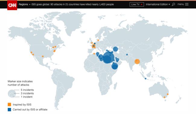
For a real-world example of this problem, take a look at CNN’s recent “ISIS goes global: 90 attacks in 21 countries have killed nearly 1,400 people,” an insightful article, serious topic, credible source with inaccurate data visualizations. Unsurprisingly, it’s a bubble chart at fault. Assuming the data gathered by CNN is accurate, the maps included in the article don’t match the data and are way off.
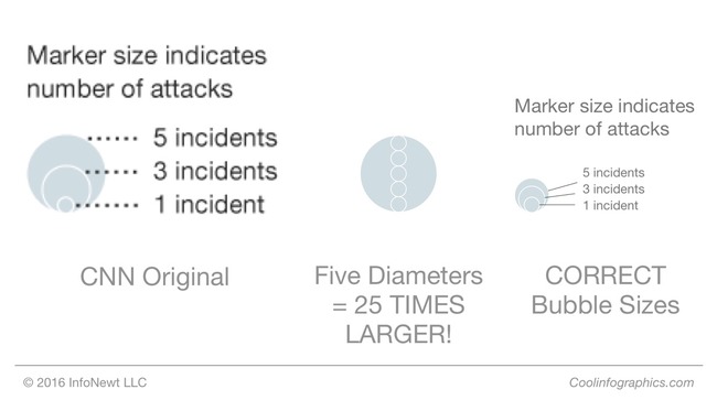
Take a close look and the size key. The circle size for five incidents is clearly shown as five times the diameter of the circle for only one incident, which creates a circle for “5 incidents” that is actually 25 TIMES LARGER, not five times larger. This drastically over emphasizes the locations on the map for the Middle East! I’ve designed the correct sizes so you can see what the bubble sizes should be.
“It’s key for data visualization designers to understand that we visually compare the sizes of objects based on the their area (not their height). Numerical values are one-dimensional, but objects on a page or screen are two-dimensional. This is where designers need to remember to use the math learned from high-school geometry class. If you didn’t do well in geometry, it’s time to take another look.”
- Cool Infographics, Randy Krum (@rtkrum)
Bubble charts are in no way the only kind of dataviz that lends itself to mishaps. In print, broadcast, and online, you’ll see a variety of charts incorrectly showing the data — pie charts not adding up to 100%, logo sizes that don’t match the data, lines of icons with a different quantity than the data, etc.
Inaccurate dataviz certainly doesn’t always happen by accident either. Creating deceptive visual context is an unethical tactic employed by researchers, companies and publications alike, typically to promote a persuasive argument. Differences can be blown out of proportion or hidden by changing the axis scale or ignoring relevant data.
Once you start looking at data visualizations as a critical thinking reader, you’ll start notice many charts that don’t match the data. Always look to make sure the designer accurately represented the information before you take any data visualization at face value.
 Data,
Data,  DataViz,
  Huffington Post,
  circles,
  data visualization,
  design,
  size
size 


Reader Comments (1)