About
Randy Krum
President of InfoNewt.
Data Visualization and Infographic Design

Infographic Design

Infographics Design | Presentations
Consulting | Data Visualizations

DFW DataViz Meetup

Join the DFW Data Visualization and Infographics Meetup Group if you're in the Dallas/Fort Worth area!

Search the Cool Infographics site

Custom Search

Subscriptions:


Feedburner

The Cool Infographics® Gallery:

How to add the
Cool Infographics button to your:

Cool Infographics iOS icon

- iPhone
- iPad
- iPod Touch


Read on Flipboard for iPad and iPhone

Featured in the Tech & Science category

Flipboard icon

Twitter Feed
From the Bookstore

Caffeine Poster

The Caffeine Poster infographic

Entries in crime (8)

Tuesday
Aug272013

World's Biggest Data Breaches Visualization

World's Biggest Data Breaches Visualization

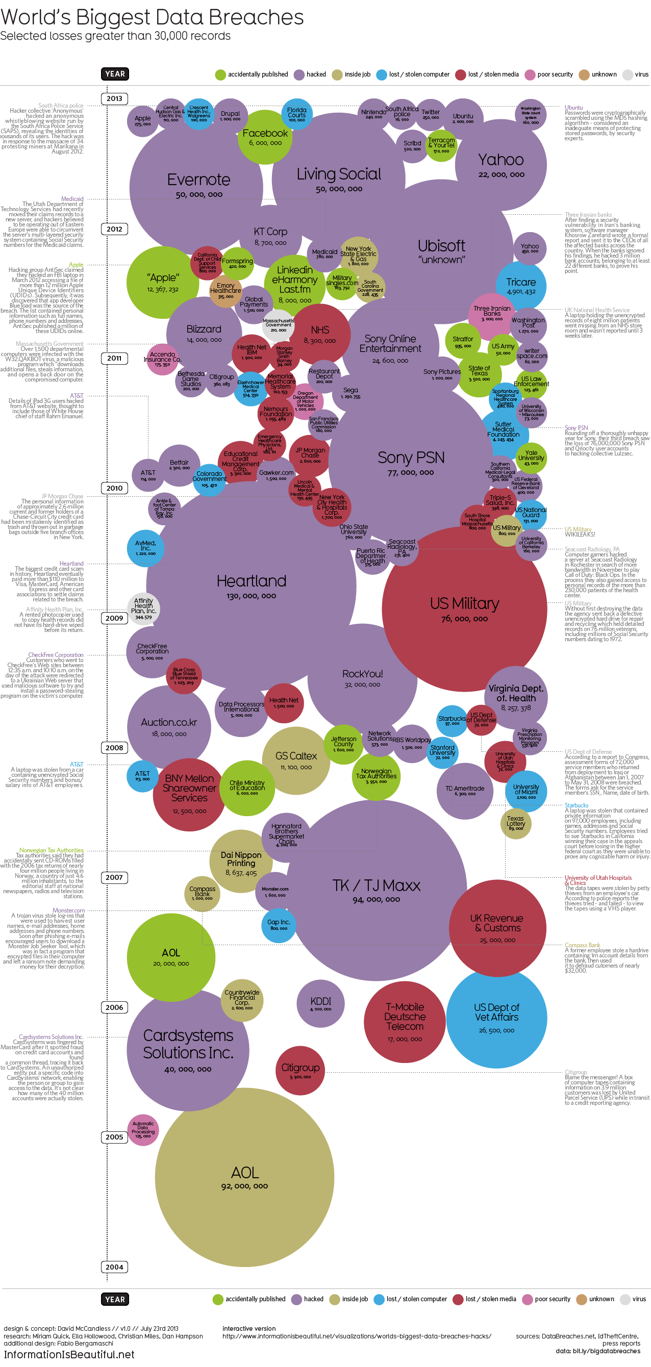
David McCandless and the team from Information Is Beautiful recently released both static (seen above) and interactive versions of the new World’s Biggest Data Breaches visualization.

This weekend, Apple’s developer site was hacked. 275,000 logins, passwords and other records potentially compromised. Two days before that, popular open-source operating system Ubuntu had its forums hacked. 1.82 million records stolen.

Are those big data breaches? Or just pin-points in the big data universe?

We’ve pulled out the interesting and funny stories out of the data. Click on the bubbles to read.

A fantastic design, the interactive version allows you to adjust the sorting, circle size and color-coding parameters.  It’s very easy for the reader to understand how one data breach fits into the overall history of stolen data.

In a move for transparency, the entire data set gathered and used in the design is available publicly to anyone through a Google Docs Spreadsheet.  Anyone can access the source data to verify the visualization or to create their own.

Found on Fast Company

Thursday
Aug222013

Worldwide ATM Cyber Attack

World Wide ATM Cyber Attack infographic

The Worldwide ATM Cyber Attack infographic from 41st Parameter talks about the international internet heist that stole $45 Million in May 2013. The infographic centers around how they did it, what they took, and then how it could of been stopped.

Most people gasped at today’s headlines about the massive, $45 million ATM heist, which was engineered by a highly-organized gang of cybercriminals. Consumers and banking executives alike have the same worry today: Is their money and account information safe?

Here at 41st Parameter, the news simply highlighted what we already knew – financial institutions are extremely vulnerable to increasingly sophisticated cyber criminals who, as in this case, are able to steal data from pre-paid ATM cards and then quickly loot machines across the globe.

Most banking systems today are connected directly or in-directly to the Internet. This brings about a multitude of unintentional exposures, all of which allows criminals to exploit them to their advantage.

Given the scale of the global credit card networks, it is almost impossible to detect every kind of attack. Similar to fighting terrorism, you can be successful in preventing something 100 times, but the bad guys only need to be successful once.

Banks and financial institutions should use all of the available data and fraud detection solutions to fight fire with fire – and build better defenses for the 21st Century. Indeed, the shocking $45M price tag for banks should be a call to action to put better protections in place. This attack is NOT the last one, and if the modus operandi proves to be successful, crooks will exploit it time and again.

Good use of an infographic as a step-by-step visual explanation.  Good source listing with the URL directly to the detailed news article.  The footer should include a copyright statement and the URL to the original infographic landing page so people can find the full-size version after seeing the infographic on other sites. 

Thanks to Caroline for sending in the link!

Thursday
Jun132013

Visualizing International Criminal Tribunals


Visualizing International Criminal Tribunals

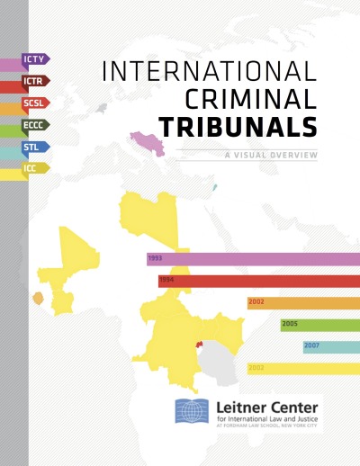
Very cool report that uses data visualization and infographics design to communicate complex information about International Criminal Tribunals from the Leitner Center for International Law and Justice at Fordham Law School, New York City.

The Leitner Center launches a new report, “International Criminal Tribunals: A Visual Overview,” providing an introduction to the work of the international tribunals and the conflicts which led to their establishment. Despite widespread interest in these tribunals and the view that they represent a definitive advance of international law and justice, there is also much confusion and misconception about their work. This new 90-page report, providing analysis and information through written summaries and detailed visualizations, aims to make the work of the courts more accessible to the general public and legal professionals alike.

Media attention dedicated to the work of the tribunals is too often superficial, and tends to confuse key distinctions between them; more informed scholarship, on the other hand, is largely confined to specialty publications, remaining inaccessible to most. “International Criminal Tribunals: A Visual Overview,” aims to provide well-researched and accessible information for anyone wishing to more fully understand these issues. This will help democratize engagement with these courts, which are tasked with delivering justice for victims of some of the world’s worst atrocities. Examples of the visual graphics in the report are included below.
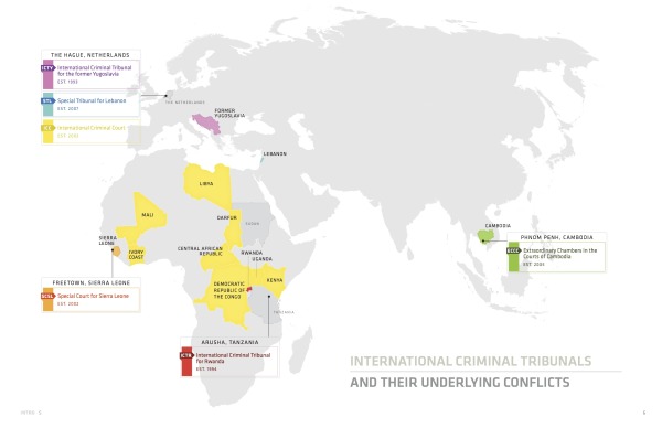
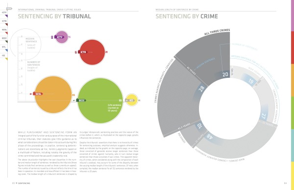
 

Awesome use of different styles of data visualization to summarize the often-complex information behind these tribunals.  Timelines, maps, area charts, polar grids, rose diagrams and treemaps.  The Case-by-Case timeline are fascinating.

The complete report is publicly available as a PDF for download.

I asked Daniel McLaughlin a few questions about the development and design of the report:

Cool Infographics: What software, websites or tools did you use to create the visualizations?

Daniel: We used Adobe Illustrator and InDesign to create the visuals for the report.

Cool Infographics: Did you create the report yourself, or use a design team?

Daniel: As a lawyer working with law students on this project, I was dependent on graphic and information design volunteers to create the visuals. The students and I carried out all the substantive research and then worked with these volunteers to figure out how best to translate it visually. Paula Airth of www.bepeculiar.com, in particular, was instrumental in bringing the project to life.

Cool Infographics: How long did the report take to design and put together?

Daniel: The report started out as a short (8-9 page) publication on the work of the international criminal tribunals. It grew into the present 90 page version as we continued to accumulate new data and the graphic/information design volunteers continued to create new graphics. All told, the research took around 4 months and the creation of the visuals/layout took another 5 months or so.

Cool Infographics: How has the use of data visualization design and social media impacted your marketing?

Daniel: The goal of this publication was to make the work of the international criminal tribunals more accessible to lawyers and non-lawyers alike. As indicated in the publication,

“There is wide awareness, though little true understanding, of the work of the international criminal tribunals.  International prosecutions of high-ranking civilian and military leaders, including former heads of state, on charges of crimes against humanity, war crimes and genocide, represent for many the ultimate condemnation of these individuals’ past actions and a measure of their fall from power. Yet, despite the tribunals’ grasp on the popular imagination, they are the subject of significant misconceptions and confusion. Much of the media coverage dedicated to their work remains superficial, at best, and largely muddles over key distinctions between various tribunals, past and present. Conversely, the more informed scholarship is largely confined to specialty publications that remain inaccessible to most. In truth, many lawyers and non-lawyers alike lack a clear understanding of the role and functioning of these increasingly-pivotal international institutions.  This publication seeks to redress this knowledge gap by providing well-researched and accessible information for those wishing to more fully understand the international criminal tribunals and the conflicts over which they have jurisdiction. An informed public is an engaged public - and the issues that animate these tribunals, including delivering justice for victims of some of the world’s worst atrocities, are too significant to be discussed solely by a small cadre of international criminal law specialists.

Notably, this publication was created in partnership with graphic and information designers so as to reach a broader public. The designers’ visualizations present information regarding the tribunals and their underlying conflicts in a direct and accessible manner to a wide range of viewers, including those without a legal background. Beyond this democratizing function, information visualization also serves to reveal important data and trends that might otherwise go unnoticed in a more conventional format. Ideally, the following information, which is current as of January 2013, would be integrated into a continually updated interactive webportal dedicated to engaging a global public on issues of international justice.

In sum, this publication aims to facilitate a broader discussion of the international criminal tribunals’ notable accomplishments, as well as ongoing shortcomings.”


Thanks to Daniel McLaughlin for sending in the link!

Friday
Oct212011

UN Against Corruption infographic video

This UN Against Corruption infographic video is actually a highlights overview of a six-part video series from the UNCAC (UN Convention against Corruption) Coalition.  This video does a good job of showing how corruption impacts societies, escpecially in third world countries.  You can view the complete series at http://www.uncaccoalition.org/en/uncac-review/uncac-review-mechanism.html

Highlights of the six-part suite of 2D infographics videos commissioned by Transparency International in collaboration with UNODC. This video infographic uses animated typography and simple, iconic animated graphics and pictograms to explain the effects of corruption on society. It also incorporates a short segment of live-action video, embedded within the context of iconic elements. It provides a compelling and fast-paced tutorial for organisations and activists on how to bring pressure to bear on governments to more effectively fight corruption.

Credits:

  • art direction: mariano leotta
  • motion graphics: alessandra leone
  • sound design: ex-directory
  • sound mixing: enrico anicito guido
  • voice over: tom tucker
  • shooting: luca fuscaldi
  • production: artereazione.org
  • commission: transparency.org

The full six-part series is now available on YouTube:

Monday
Jun202011

Drunk Driving by the Numbers


The Real Effects of Drinking and Driving is a good infographic from CarInsuranceComparison.org.  It stays focused and tells one compelling story really well.  Some of the illustrations are just that, illustrations, when they could have visualized the numbers.

Thanks to Clyde for sending in the link!

Thursday
Aug262010

Client Infographic: Beware Work-At-Home Scams!

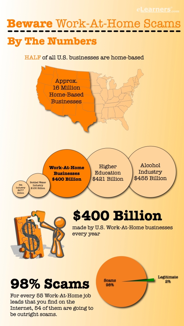
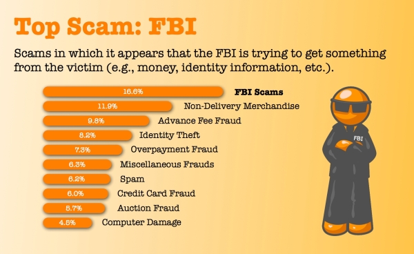
Beware Work-At-Home Scams is a recent project InfoNewt (my company) designed for elearners.com to visualize how prolific work-at-home scams are, which jobs to avoid and how individuals can protect themselves.

The data is actually fairly difficult to find and very dry.  I had to read through a number of reports from the FTC, the SBA, the IC3 (I had never heard of the Internet Crime Complaint Center!) and other news reports.  Even after reading through those reports, there was very little hard data.  To create the infographic, I needed to use the figure of Orange Man as a character figure to help visualize the information.


Done in OmniGraffle, I think the topic was a perfect example of when an infographic is really useful.  Information that is incredibly difficult for consumers to find (let alone understand), so it wouldn’t normally reach the general public.

Feedback?

You can help Digg It! 

Thursday
Sep172009

The History of Jack The Ripper (Infographic Poster)


Ryan Nussbaum is a recent graduate of the design program at Washington University in St. Louis, and he created this infographic poster mapping out the murders of Jack the Ripper.

In this exhibition panel, I mapped the possible escape routes of a chief suspect in the Jack the Ripper murders. Upon closer examination, one can see the different types of wounds and removed organs of each of the victims. The piece is meant to dispel the notion that the murders were random occurrences.

Psst…Ryan is looking for work in New York…I’m just saying.


Wednesday
Sep162009

Oxford Crime Heatmaps from the BBC


As part of the BBC launching thier new show called The Truth About Crime, they have launched a new "Crime Map" website that uses heatmaps to show real crime data for Oxford, England.  The heatmaps are visual representations of all the crime data available for the 12-month period from November 2007 to November 2008.

The website is designed to allow users to explore crime patterns, discover more about potential risks and take action to prevent crime.  The site features a specifically commissioned crime map of Oxford created with data supplied by the city's emergency services.

Why are you using heatmaps?
There are a number of methods for mapping crime. Currently, the technique most often used is to map crime data according to geographic areas such as postcodes, census output areas or police 'beat-codes'. The geographic areas chosen to map crime data – such as 'beat-codes' by the police – are often done so because these services deploy their resources according to their chosen geographical areas.
However, as these geographical areas vary greatly in size, when crime data is plotted on a map it is often difficult for a member of the general public to properly see and understand which areas have high or low crime rates. A large area may seem to have more crime than a small area even though this is simply because there is more space and people in that area. A small area with high crime might be hard to spot because it is simply physically smaller on the map, and therefore harder to see.
After extensive consultation with a host of experts in this specialist area, we have decided to use 'heatmaps' to display our crime data, since these offer a clear way for us all to see patterns of crime, without requiring us to have the expert knowledge of crime data analysts, nor a prior knowledge of arbitrary geographical areas. These 'heatmaps' represent the relative amount of crime according to a sliding scale of colour (as detailed in the "Key"), and provide a sense of the area where a type of crime is happening without disclosing the exact location that it took place – so as to protect the anonymity of victims
Heat maps such as these have not previously been used to any great extent in the UK, but have been used in the USA and Canada.
A number of different maps are available showing Crime Patterns Over Time, Burglary & Theft, Violent Crime, Anti-Social Behavior and the ability to compare to your own neighborhood (if you live in the U.K.)