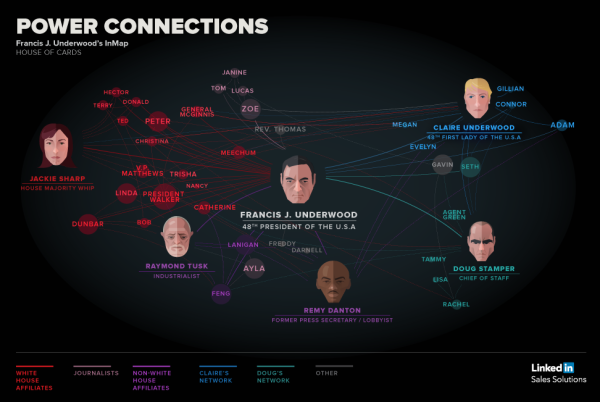
House of Cards: Power Connections
We’ve all have heard the saying, “It’s not what you know, it’s who you know.” The House of Cards: Power Connections infographic from Linkedin brilliantly uses the House of Cards show to show a good example of being connected. How powerful is your connection network?
Relationships Matter
From college internships to becoming President of the United States, who you are connected to and how you leverage those connections matters.
We wrote the post 4 sales strategy lessons from Frank Underwood to take some learnings from the show and how they can apply to your professional growth. It was an amazing use of social media that we got a response from the House of Cards Twitter profile and felt we should lean-in on some of the content.
The best way for us to illustrate the valuable connections of a character like Frank Underwood is to create a LinkedIn InMap infographic with Frank at the center.
I love the idea of using a famous fictional person to show the “Power of Connections” instead of a real person that people might not be familiar with. Color-coding is always a helpful tool to minimize words on an infographic, and it’s used well here. Also, the use of faces for the key people on the graphic break up the names to keep it interesting. However, the reasoning behind the use of different sizes of circles around the names is unclear. Always make sure to include the URL of the infographic landing page at the bottom so that viewers can find the original.
This is based on the same network map visualization tool that you can use to automatically visualize your own connections on Linkedin. Login with your Linkedin account on the Linkedin Labs page: http://inmaps.linkedinlabs.com/
Found posted on Google+ by Jason Lankow
 Characters,
  LinkedIN,
  connections,
  network,
  social media,
  tv
tv 


Reader Comments (1)