Tuesday
Jul152008
Map of the World 2.0
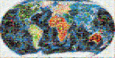
This world mosaic is created from 1,001 Web 2.0 icons/logos and each one is a clickable link to its respective site. It was created using AndreaMosaic photo software, by the team at AppAppeal.
Thanks Jelle for sending in the link!


 Randy
Randy

Reader Comments (3)
This looks interesting, but is it really a good example of a good infographic?
It doesn't seem like any of the Web 2.0 sites correspond to their supposed location on the map, and it's hard to get a read on what sites/products are actually interesting.
Am I off base?
I agree with gy. Also, Asia looks almost non-existent since it's comprised of white-ish and blue-ish buttons, which could be confused for more water.
Yeah. Infographic it ain't. The logos are also being reused throughout the map. There isn't a unique one for each square, so this doesn't even give us a sense of the number of w2.0 apps out there. It's just a link bait gimmick and we fell for it.